@font-face {
font-family: ‘Guardian Headline Full’;
src: url(‘https://assets.guim.co.uk/static/frontend/fonts/guardian-headline/noalts-not-hinted/GHGuardianHeadline-Light.woff2’) format(‘woff2’),
url(‘https://assets.guim.co.uk/static/frontend/fonts/guardian-headline/noalts-not-hinted/GHGuardianHeadline-Light.woff’) format(‘woff’),
url(‘https://assets.guim.co.uk/static/frontend/fonts/guardian-headline/noalts-not-hinted/GHGuardianHeadline-Light.ttf’) format(‘truetype’);
font-weight: 300;
font-style: normal;
}
@font-face {
font-family: ‘Guardian Headline Full’;
src: url(‘https://assets.guim.co.uk/static/frontend/fonts/guardian-headline/noalts-not-hinted/GHGuardianHeadline-LightItalic.woff2’) format(‘woff2’),
url(‘https://assets.guim.co.uk/static/frontend/fonts/guardian-headline/noalts-not-hinted/GHGuardianHeadline-LightItalic.woff’) format(‘woff’),
url(‘https://assets.guim.co.uk/static/frontend/fonts/guardian-headline/noalts-not-hinted/GHGuardianHeadline-LightItalic.ttf’) format(‘truetype’);
font-weight: 300;
font-style: italic;
}
@font-face {
font-family: ‘Guardian Headline Full’;
src: url(‘https://assets.guim.co.uk/static/frontend/fonts/guardian-headline/noalts-not-hinted/GHGuardianHeadline-Regular.woff2’) format(‘woff2’),
url(‘https://assets.guim.co.uk/static/frontend/fonts/guardian-headline/noalts-not-hinted/GHGuardianHeadline-Regular.woff’) format(‘woff’),
url(‘https://assets.guim.co.uk/static/frontend/fonts/guardian-headline/noalts-not-hinted/GHGuardianHeadline-Regular.ttf’) format(‘truetype’);
font-weight: 400;
font-style: normal;
}
@font-face {
font-family: ‘Guardian Headline Full’;
src: url(‘https://assets.guim.co.uk/static/frontend/fonts/guardian-headline/noalts-not-hinted/GHGuardianHeadline-RegularItalic.woff2’) format(‘woff2’),
url(‘https://assets.guim.co.uk/static/frontend/fonts/guardian-headline/noalts-not-hinted/GHGuardianHeadline-RegularItalic.woff’) format(‘woff’),
url(‘https://assets.guim.co.uk/static/frontend/fonts/guardian-headline/noalts-not-hinted/GHGuardianHeadline-RegularItalic.ttf’) format(‘truetype’);
font-weight: 400;
font-style: italic;
}
@font-face {
font-family: ‘Guardian Headline Full’;
src: url(‘https://assets.guim.co.uk/static/frontend/fonts/guardian-headline/noalts-not-hinted/GHGuardianHeadline-Medium.woff2’) format(‘woff2’),
url(‘https://assets.guim.co.uk/static/frontend/fonts/guardian-headline/noalts-not-hinted/GHGuardianHeadline-Medium.woff’) format(‘woff’),
url(‘https://assets.guim.co.uk/static/frontend/fonts/guardian-headline/noalts-not-hinted/GHGuardianHeadline-Medium.ttf’) format(‘truetype’);
font-weight: 500;
font-style: normal;
}
@font-face {
font-family: ‘Guardian Headline Full’;
src: url(‘https://assets.guim.co.uk/static/frontend/fonts/guardian-headline/noalts-not-hinted/GHGuardianHeadline-MediumItalic.woff2’) format(‘woff2’),
url(‘https://assets.guim.co.uk/static/frontend/fonts/guardian-headline/noalts-not-hinted/GHGuardianHeadline-MediumItalic.woff’) format(‘woff’),
url(‘https://assets.guim.co.uk/static/frontend/fonts/guardian-headline/noalts-not-hinted/GHGuardianHeadline-MediumItalic.ttf’) format(‘truetype’);
font-weight: 500;
font-style: italic;
}
@font-face {
font-family: ‘Guardian Headline Full’;
src: url(‘https://assets.guim.co.uk/static/frontend/fonts/guardian-headline/noalts-not-hinted/GHGuardianHeadline-Semibold.woff2’) format(‘woff2’),
url(‘https://assets.guim.co.uk/static/frontend/fonts/guardian-headline/noalts-not-hinted/GHGuardianHeadline-Semibold.woff’) format(‘woff’),
url(‘https://assets.guim.co.uk/static/frontend/fonts/guardian-headline/noalts-not-hinted/GHGuardianHeadline-Semibold.ttf’) format(‘truetype’);
font-weight: 600;
font-style: normal;
}
@font-face {
font-family: ‘Guardian Headline Full’;
src: url(‘https://assets.guim.co.uk/static/frontend/fonts/guardian-headline/noalts-not-hinted/GHGuardianHeadline-SemiboldItalic.woff2’) format(‘woff2’),
url(‘https://assets.guim.co.uk/static/frontend/fonts/guardian-headline/noalts-not-hinted/GHGuardianHeadline-SemiboldItalic.woff’) format(‘woff’),
url(‘https://assets.guim.co.uk/static/frontend/fonts/guardian-headline/noalts-not-hinted/GHGuardianHeadline-SemiboldItalic.ttf’) format(‘truetype’);
font-weight: 600;
font-style: italic;
}Here is the rewritten text in fluent, natural English:
“`css
@font-face {
font-family: ‘Guardian Headline Full’;
src: url(‘https://assets.guim.co.uk/static/frontend/fonts/guardian-headline/noalts-not-hinted/GHGuardianHeadline-Bold.woff2’) format(‘woff2’),
url(‘https://assets.guim.co.uk/static/frontend/fonts/guardian-headline/noalts-not-hinted/GHGuardianHeadline-Bold.woff’) format(‘woff’),
url(‘https://assets.guim.co.uk/static/frontend/fonts/guardian-headline/noalts-not-hinted/GHGuardianHeadline-Bold.ttf’) format(‘truetype’);
font-weight: 700;
font-style: normal;
}
@font-face {
font-family: ‘Guardian Headline Full’;
src: url(‘https://assets.guim.co.uk/static/frontend/fonts/guardian-headline/noalts-not-hinted/GHGuardianHeadline-BoldItalic.woff2’) format(‘woff2’),
url(‘https://assets.guim.co.uk/static/frontend/fonts/guardian-headline/noalts-not-hinted/GHGuardianHeadline-BoldItalic.woff’) format(‘woff’),
url(‘https://assets.guim.co.uk/static/frontend/fonts/guardian-headline/noalts-not-hinted/GHGuardianHeadline-BoldItalic.ttf’) format(‘truetype’);
font-weight: 700;
font-style: italic;
}
@font-face {
font-family: ‘Guardian Headline Full’;
src: url(‘https://assets.guim.co.uk/static/frontend/fonts/guardian-headline/noalts-not-hinted/GHGuardianHeadline-Black.woff2’) format(‘woff2’),
url(‘https://assets.guim.co.uk/static/frontend/fonts/guardian-headline/noalts-not-hinted/GHGuardianHeadline-Black.woff’) format(‘woff’),
url(‘https://assets.guim.co.uk/static/frontend/fonts/guardian-headline/noalts-not-hinted/GHGuardianHeadline-Black.ttf’) format(‘truetype’);
font-weight: 900;
font-style: normal;
}
@font-face {
font-family: ‘Guardian Headline Full’;
src: url(‘https://assets.guim.co.uk/static/frontend/fonts/guardian-headline/noalts-not-hinted/GHGuardianHeadline-BlackItalic.woff2’) format(‘woff2’),
url(‘https://assets.guim.co.uk/static/frontend/fonts/guardian-headline/noalts-not-hinted/GHGuardianHeadline-BlackItalic.woff’) format(‘woff’),
url(‘https://assets.guim.co.uk/static/frontend/fonts/guardian-headline/noalts-not-hinted/GHGuardianHeadline-BlackItalic.ttf’) format(‘truetype’);
font-weight: 900;
font-style: italic;
}
@font-face {
font-family: ‘Guardian Titlepiece’;
src: url(‘https://assets.guim.co.uk/static/frontend/fonts/guardian-titlepiece/noalts-not-hinted/GTGuardianTitlepiece-Bold.woff2’) format(‘woff2’),
url(‘https://assets.guim.co.uk/static/frontend/fonts/guardian-titlepiece/noalts-not-hinted/GTGuardianTitlepiece-Bold.woff’) format(‘woff’),
url(‘https://assets.guim.co.uk/static/frontend/fonts/guardian-titlepiece/noalts-not-hinted/GTGuardianTitlepiece-Bold.ttf’) format(‘truetype’);
font-weight: 700;
font-style: normal;
}
@font-face {
font-family: ‘Guardian Headline Full’;
src: url(‘https://assets.guim.co.uk/static/frontend/fonts/guardian-headline/noalts-not-hinted/GHGuardianHeadline-Light.woff2’) format(‘woff2’),
url(‘https://assets.guim.co.uk/static/frontend/fonts/guardian-headline/noalts-not-hinted/GHGuardianHeadline-Light.woff’) format(‘woff’),
url(‘https://assets.guim.co.uk/static/frontend/fonts/guardian-headline/noalts-not-hinted/GHGuardianHeadline-Light.ttf’) format(‘truetype’);
font-weight: 300;
font-style: normal;
}
@font-face {
font-family: ‘Guardian Headline Full’;
src: url(‘https://assets.guim.co.uk/static/frontend/fonts/guardian-headline/noalts-not-hinted/GHGuardianHeadline-LightItalic.woff2’) format(‘woff2’),
url(‘https://assets.guim.co.uk/static/frontend/fonts/guardian-headline/noalts-not-hinted/GHGuardianHeadline-LightItalic.woff’) format(‘woff’),
url(‘https://assets.guim.co.uk/static/frontend/fonts/guardian-headline/noalts-not-hinted/GHGuardianHeadline-LightItalic.ttf’) format(‘truetype’);
font-weight: 300;
font-style: italic;
}
@font-face {
font-family: ‘Guardian Headline Full’;
src: url(‘https://assets.guim.co.uk/static/frontend/fonts/guardian-headline/noalts-not-hinted/GHGuardianHeadline-Regular.woff2’) format(‘woff2’),
url(‘https://assets.guim.co.uk/static/frontend/fonts/guardian-headline/noalts-not-hinted/GHGuardianHeadline-Regular.woff’) format(‘woff’),
url(‘https://assets.guim.co.uk/static/frontend/fonts/guardian-headline/noalts-not-hinted/GHGuardianHeadline-Regular.ttf’) format(‘truetype’);
font-weight: 400;
font-style: normal;
}
@font-face {
font-family: ‘Guardian Headline Full’;
src: url(‘https://assets.guim.co.uk/static/frontend/fonts/guardian-headline/noalts-not-hinted/GHGuardianHeadline-RegularItalic.woff2’) format(‘woff2’),
url(‘https://assets.guim.co.uk/static/frontend/fonts/guardian-headline/noalts-not-hinted/GHGuardianHeadline-RegularItalic.woff’) format(‘woff’),
url(‘https://assets.guim.co.uk/static/frontend/fonts/guardian-headline/noalts-not-hinted/GHGuardianHeadline-RegularItalic.ttf’) format(‘truetype’);
font-weight: 400;
font-style: italic;
}
“`Here is the rewritten text in fluent, natural English:
“`css
@font-face {
font-family: ‘Guardian Headline Full’;
src: url(‘https://assets.guim.co.uk/static/frontend/fonts/guardian-headline/noalts-not-hinted/GHGuardianHeadline-RegularItalic.woff2’) format(‘woff2’),
url(‘https://assets.guim.co.uk/static/frontend/fonts/guardian-headline/noalts-not-hinted/GHGuardianHeadline-RegularItalic.woff’) format(‘woff’),
url(‘https://assets.guim.co.uk/static/frontend/fonts/guardian-headline/noalts-not-hinted/GHGuardianHeadline-RegularItalic.ttf’) format(‘truetype’);
font-weight: 400;
font-style: italic;
}
@font-face {
font-family: ‘Guardian Headline Full’;
src: url(‘https://assets.guim.co.uk/static/frontend/fonts/guardian-headline/noalts-not-hinted/GHGuardianHeadline-Medium.woff2’) format(‘woff2’),
url(‘https://assets.guim.co.uk/static/frontend/fonts/guardian-headline/noalts-not-hinted/GHGuardianHeadline-Medium.woff’) format(‘woff’),
url(‘https://assets.guim.co.uk/static/frontend/fonts/guardian-headline/noalts-not-hinted/GHGuardianHeadline-Medium.ttf’) format(‘truetype’);
font-weight: 500;
font-style: normal;
}
@font-face {
font-family: ‘Guardian Headline Full’;
src: url(‘https://assets.guim.co.uk/static/frontend/fonts/guardian-headline/noalts-not-hinted/GHGuardianHeadline-MediumItalic.woff2’) format(‘woff2’),
url(‘https://assets.guim.co.uk/static/frontend/fonts/guardian-headline/noalts-not-hinted/GHGuardianHeadline-MediumItalic.woff’) format(‘woff’),
url(‘https://assets.guim.co.uk/static/frontend/fonts/guardian-headline/noalts-not-hinted/GHGuardianHeadline-MediumItalic.ttf’) format(‘truetype’);
font-weight: 500;
font-style: italic;
}
@font-face {
font-family: ‘Guardian Headline Full’;
src: url(‘https://assets.guim.co.uk/static/frontend/fonts/guardian-headline/noalts-not-hinted/GHGuardianHeadline-Semibold.woff2’) format(‘woff2’),
url(‘https://assets.guim.co.uk/static/frontend/fonts/guardian-headline/noalts-not-hinted/GHGuardianHeadline-Semibold.woff’) format(‘woff’),
url(‘https://assets.guim.co.uk/static/frontend/fonts/guardian-headline/noalts-not-hinted/GHGuardianHeadline-Semibold.ttf’) format(‘truetype’);
font-weight: 600;
font-style: normal;
}
@font-face {
font-family: ‘Guardian Headline Full’;
src: url(‘https://assets.guim.co.uk/static/frontend/fonts/guardian-headline/noalts-not-hinted/GHGuardianHeadline-SemiboldItalic.woff2’) format(‘woff2’),
url(‘https://assets.guim.co.uk/static/frontend/fonts/guardian-headline/noalts-not-hinted/GHGuardianHeadline-SemiboldItalic.woff’) format(‘woff’),
url(‘https://assets.guim.co.uk/static/frontend/fonts/guardian-headline/noalts-not-hinted/GHGuardianHeadline-SemiboldItalic.ttf’) format(‘truetype’);
font-weight: 600;
font-style: italic;
}
@font-face {
font-family: ‘Guardian Headline Full’;
src: url(‘https://assets.guim.co.uk/static/frontend/fonts/guardian-headline/noalts-not-hinted/GHGuardianHeadline-Bold.woff2’) format(‘woff2’),
url(‘https://assets.guim.co.uk/static/frontend/fonts/guardian-headline/noalts-not-hinted/GHGuardianHeadline-Bold.woff’) format(‘woff’),
url(‘https://assets.guim.co.uk/static/frontend/fonts/guardian-headline/noalts-not-hinted/GHGuardianHeadline-Bold.ttf’) format(‘truetype’);
font-weight: 700;
font-style: normal;
}
@font-face {
font-family: ‘Guardian Headline Full’;
src: url(‘https://assets.guim.co.uk/static/frontend/fonts/guardian-headline/noalts-not-hinted/GHGuardianHeadline-BoldItalic.woff2’) format(‘woff2’),
url(‘https://assets.guim.co.uk/static/frontend/fonts/guardian-headline/noalts-not-hinted/GHGuardianHeadline-BoldItalic.woff’) format(‘woff’),
url(‘https://assets.guim.co.uk/static/frontend/fonts/guardian-headline/noalts-not-hinted/GHGuardianHeadline-BoldItalic.ttf’) format(‘truetype’);
font-weight: 700;
font-style: italic;
}
@font-face {
font-family: ‘Guardian Headline Full’;
src: url(‘https://assets.guim.co.uk/static/frontend/fonts/guardian-headline/noalts-not-hinted/GHGuardianHeadline-Black.woff2’) format(‘woff2’),
url(‘https://assets.guim.co.uk/static/frontend/fonts/guardian-headline/noalts-not-hinted/GHGuardianHeadline-Black.woff’) format(‘woff’),
url(‘https://assets.guim.co.uk/static/frontend/fonts/guardian-headline/noalts-not-hinted/GHGuardianHeadline-Black.ttf’) format(‘truetype’);
font-weight: 900;
font-style: normal;
}
@font-face {
font-family: ‘Guardian Headline Full’;
src: url(‘https://assets.guim.co.uk/static/frontend/fonts/guardian-headline/noalts-not-hinted/GHGuardianHeadline-BlackItalic.woff2’) format(‘woff2’),
url(‘https://assets.guim.co.uk/static/frontend/fonts/guardian-headline/noalts-not-hinted/GHGuardianHeadline-BlackItalic.woff’) format(‘woff’),
url(‘https://assets.guim.co.uk/static/frontend/fonts/guardian-headline/noalts-not-hinted/GHGuardianHeadline-BlackItalic.ttf’) format(‘truetype’);
font-weight: 900;
font-style: italic;
}
“““css
@font-face {
font-family: Guardian Headline;
src: url(https://assets.guim.co.uk/static/frontend/fonts/guardian-headline/noalts-not-hinted/GHGuardianHeadline-BlackItalic.woff2) format(“woff2”),
url(https://assets.guim.co.uk/static/frontend/fonts/guardian-headline/noalts-not-hinted/GHGuardianHeadline-BlackItalic.woff) format(“woff”),
url(https://assets.guim.co.uk/static/frontend/fonts/guardian-headline/noalts-not-hinted/GHGuardianHeadline-BlackItalic.ttf) format(“truetype”);
font-weight: 900;
font-style: italic;
}
@font-face {
font-family: Guardian Titlepiece;
src: url(https://assets.guim.co.uk/static/frontend/fonts/guardian-titlepiece/noalts-not-hinted/GTGuardianTitlepiece-Bold.woff2) format(“woff2”),
url(https://assets.guim.co.uk/static/frontend/fonts/guardian-titlepiece/noalts-not-hinted/GTGuardianTitlepiece-Bold.woff) format(“woff”),
url(https://assets.guim.co.uk/static/frontend/fonts/guardian-titlepiece/noalts-not-hinted/GTGuardianTitlepiece-Bold.ttf) format(“truetype”);
font-weight: 700;
font-style: normal;
}
#article-body > div .content–interactive-grid,
.content–interactive > div .content–interactive-grid,
#comment-body .content–interactive-grid,
[data-gu-name=”body”] .content–interactive-grid,
#feature-body .content–interactive-grid {
grid-column-gap: 0px;
grid-template-columns: 100%;
grid-template-areas:
“media”
“title”
“headline”
“standfirst”
“lines”
“meta”
“body”;
}
@media (min-width: 30em) {
#article-body > div .content–interactive-grid figure.element–immersive figcaption,
.content–interactive > div .content–interactive-grid figure.element–immersive figcaption,
#comment-body .content–interactive-grid figure.element–immersive figcaption,
[data-gu-name=”body”] .content–interactive-grid figure.element–immersive figcaption,
#feature-body .content–interactive-grid figure.element–immersive figcaption {
padding: 0 20px;
max-width: 620px;
}
}
@media (min-width: 46.25em) {
#article-body > div .content–interactive-grid,
.content–interactive > div .content–interactive-grid,
#comment-body .content–interactive-grid,
[data-gu-name=”body”] .content–interactive-grid,
#feature-body .content–interactive-grid {
grid-template-columns: 100%;
grid-column-gap: 10px;
grid-template-areas:
“title”
“headline”
“standfirst”
“media”
“lines”
“meta”
“body”;
}
#article-body > div .content–interactive-grid #maincontent,
.content–interactive > div .content–interactive-grid #maincontent,
#comment-body .content–interactive-grid #maincontent,
[data-gu-name=”body”] .content–interactive-grid #maincontent,
#feature-body .content–interactive-grid #maincontent {
padding-right: 80px;
}
}
@media (min-width: 61.25em) {
#article-body > div .content–interactive-grid,
.content–interactive > div .content–interactive-grid,
#comment-body .content–interactive-grid,
[data-gu-name=”body”] .content–interactive-grid,
#feature-body .content–interactive-grid {
grid-template-columns: 620px 300px;
grid-template-areas:
“title right-column”
“headline right-column”
“standfirst right-column”
“media right-column”
“lines right-column”
“meta right-column”
“body right-column”
“. right-column”;
}
#article-body > div .content–interactive-grid #maincontent,
.content–interactive > div .content–interactive-grid #maincontent,
#comment-body .content–interactive-grid #maincontent,
[data-gu-name=”body”] .content–interactive-grid #maincontent,
#feature-body .content–interactive-grid #maincontent {
padding-right: unset;
}
}
@media (min-width: 71.25em) {
#article-body > div .content–interactive-grid,
.content–interactive > div .content–interactive-grid,
#comment-body .content–interactive-grid,
[data-gu-name=”body”] .content–interactive-grid,
#feature-body .content–interactive-grid {
grid-template-columns: 140px 1px 620px 300px;
grid-template-areas:
“title border headline right-column”
“. border standfirst right-column”
“. border media right-column”
“. border body right-column”
“. border . right-column”;
}
#article-body > div .content–interactive-grid .content__standfirst,
.content–interactive > div .content–interactive-grid .content__standfirst,
#comment-body .content–interactive-grid .content__standfirst,
[data-gu-name=”body”] .content–interactive-grid .content__standfirst,
#feature-body .content–interactive-grid .content__standfirst {
padding-bottom: 0;
}
#article-body > div .content–interactive-grid figure.element–immersive figcaption,
.content–interactive > div .content–interactive-grid figure.element–immersive figcaption,
#comment-body .content–interactive-grid figure.element–immersive figcaption,
[data-gu-name=”body”] .content–interactive-grid figure.element–immersive figcaption,
#feature-body .content–interactive-grid figure.element–immersive figcaption {
/ … /
}
}
“`Here’s the rewritten version in fluent, natural English:
For interactive grid figures with immersive elements, the caption should have 4 pixels of padding at the top and none at the bottom. In the main article body, comment section, and feature body, the lines and meta sections within interactive grids should be placed in grid area starting at row 2, column 1, and ending at row 5, column 2.
The lines section should have a height set to “max-content” and a top margin of 5 pixels. The meta section should have a top margin of 18 pixels.
On screens wider than 81.25em (1300px), the interactive grid layout should use five columns: 219px, 1px, 620px, 80px, and 300px.
On iOS and Android devices, the first paragraph inside the article header’s standfirst should use the Guardian Headline font family with a weight of 500. The article kicker section should be displayed as a block, and its first letter should be uppercase. The keyline-4 element should have 12 pixels of top padding. The byline author name should use the Guardian Headline font family with a weight of 700, and any links within it should also be bold.
For images in articles on iOS and Android, the figure inner container should have automatic height. For atom elements followed by a paragraph, there should be no top margin on the paragraph.
Finally, the Guardian Headline Full font is defined in two styles: light (weight 300, normal style) and light italic (weight 300, italic style), both loaded from the Guardian’s asset server.I’m sorry, but the text you’ve provided appears to be CSS code for defining font faces, not a passage of written English that can be rewritten. Could you please provide the actual text you’d like me to rewrite in fluent, natural English?Here’s the rewritten text in fluent, natural English:
“`css
@font-face {
font-family: Guardian Headline Full;
src: url(https://assets.guim.co.uk/static/frontend/fonts/guardian-headline/noalts-not-hinted/GHGuardianHeadline-Black.woff2) format(“woff2”),
url(https://assets.guim.co.uk/static/frontend/fonts/guardian-headline/noalts-not-hinted/GHGuardianHeadline-Black.woff) format(“woff”),
url(https://assets.guim.co.uk/static/frontend/fonts/guardian-headline/noalts-not-hinted/GHGuardianHeadline-Black.ttf) format(“truetype”);
font-weight: 900;
font-style: normal;
}
@font-face {
font-family: Guardian Headline Full;
src: url(https://assets.guim.co.uk/static/frontend/fonts/guardian-headline/noalts-not-hinted/GHGuardianHeadline-BlackItalic.woff2) format(“woff2”),
url(https://assets.guim.co.uk/static/frontend/fonts/guardian-headline/noalts-not-hinted/GHGuardianHeadline-BlackItalic.woff) format(“woff”),
url(https://assets.guim.co.uk/static/frontend/fonts/guardian-headline/noalts-not-hinted/GHGuardianHeadline-BlackItalic.ttf) format(“truetype”);
font-weight: 900;
font-style: italic;
}
@font-face {
font-family: Guardian Titlepiece;
src: url(https://assets.guim.co.uk/static/frontend/fonts/guardian-titlepiece/noalts-not-hinted/GTGuardianTitlepiece-Bold.woff2) format(“woff2”),
url(https://assets.guim.co.uk/static/frontend/fonts/guardian-titlepiece/noalts-not-hinted/GTGuardianTitlepiece-Bold.woff) format(“woff”),
url(https://assets.guim.co.uk/static/frontend/fonts/guardian-titlepiece/noalts-not-hinted/GTGuardianTitlepiece-Bold.ttf) format(“truetype”);
font-weight: 700;
font-style: normal;
}
@media (min-width: 71.25em) {
.content__main-column–interactive {
margin-left: 160px;
}
}
@media (min-width: 81.25em) {
.content__main-column–interactive {
margin-left: 240px;
}
}
.content__main-column–interactive .element-atom {
max-width: 620px;
}
@media (max-width: 46.24em) {
.content__main-column–interactive .element-atom {
max-width: 100%;
}
}
.content__main-column–interactive .element-showcase {
margin-left: 0;
}
@media (min-width: 46.25em) {
.content__main-column–interactive .element-showcase {
max-width: 620px;
}
}
@media (min-width: 71.25em) {
.content__main-column–interactive .element-showcase {
max-width: 860px;
}
}
.content__main-column–interactive .element-immersive {
max-width: 1100px;
}
@media (max-width: 46.24em) {
.content__main-column–interactive .element-immersive {
width: calc(100vw – var(–scrollbar-width, 0px));
position: relative;
left: 50%;
right: 50%;
margin-left: calc(-50vw + var(–half-scrollbar-width, 0px)) !important;
margin-right: calc(-50vw + var(–half-scrollbar-width, 0px)) !important;
}
}
@media (min-width: 46.25em) {
.content__main-column–interactive .element-immersive {
transform: translate(-20px);
width: calc(100% + 60px);
}
}
@media (max-width: 71.24em) {
.content__main-column–interactive .element-immersive {
margin-left: 0;
margin-right: 0;
}
}
@media (min-width: 71.25em) {
.content__main-column–interactive .element-immersive {
transform: translate(0);
width: auto;
}
}
@media (min-width: 81.25em) {
.content__main-column–interactive .element-immersive {
max-width: 1260px;
}
}
.content__main-column–interactive p,
.content__main-column–interactive ul {
max-width: 620px;
}
.content__main-column–interactive:before {
position: absolute;
top: 0;
height: calc(100% + 15px);
min-height: 100px;
content: “”;
}
@media (min-width: 71.25em) {
.content__main-column–interactive:before {
border-left: 1px solid #dcdcdc;
z-index: -1;
left: -10px;
}
}
@media (min-width: 81.25em) {
.content__main-column–interactive:before {
border-left: 1px solid #dcdcdc;
left: -11px;
}
}
.content__main-column–interactive .element-atom {
margin-top: 0;
margin-bottom: 0;
padding-bottom: 12px;
padding-top: 12px;
}
.content__main-column–interactive p + .element-atom {
padding-top: 0;
padding-bottom: 0;
margin-top: 12px;
margin-bottom: 12px;
}
.content__main-column–interactive .element-inline {
max-width: 620px;
}
@media (min-width: 61.25em) {
figure[data-spacefinder-role=”inline”].element {
max-width: 620px;
}
}
[data-gu-name=”media”]:has(figure.loop) figure.loop figcaption:not(.hidden) {
z-index: 6;
}
[data-gu-name=”media”]:has(figure.loop) figure.loop button[data-link-name*=”gu-video-loop”] {
width: 32px;
align-self: flex-end;
margin-bottom: 40px;
margin-right: 3px;
}
[data-gu-name=”media”]:has(figure.loop) #caption-button {
z-index: 100;
}
@media (min-width: 46.25em) {
[data-gu-name=”media”]:has(figure.cinemagraph) .cine {
/ styles here /
}
}
“`Here is the rewritten text in fluent, natural English:
Remove the maximum height restriction on div elements inside magraph containers. For the body section, self-hosted video islands should be full width, with a maximum width of 620 pixels. They should display as block elements with 12 pixels of margin on top and bottom.
Inside these video islands, figure elements with the “loop” class, and the videos inside them, should also be full width, auto height, with a maximum width of 620 pixels, and centered with auto margins.
If a self-hosted video island contains a figure with the “loop” class and the “element-video-immersive” class, remove the maximum width restriction and set the top and bottom margins to 12 pixels. The figure and video inside should also have no maximum width and no margins.
On screens wider than 71.25 em (about 1140 pixels), these immersive video islands should be 1140 pixels wide with a left margin of -180 pixels. The figure caption inside should have a left margin of 20 pixels.
On screens wider than 81.25 em (about 1300 pixels), these immersive video islands should be 1300 pixels wide with a left margin of -260 pixels.
Define the following CSS custom properties: dateline as #606060, headerBorder as #dcdcdc, captionText as #999, captionBackground as a semi-transparent dark color (hsla(0, 0%, 7%, .72)), feature as #c70000, and new-pillar-colour as either the primary pillar or the feature color.
Also define subheading-text, pullquote-text, and pullquote-icon as the secondary pillar color, and block-quote-text as the article text color. For blockquotes, set block-quote-fill to the secondary pillar color.
In dark mode (when the user’s system prefers a dark color scheme and the data-color-scheme attribute is not set to “light”), change subheading-text, pullquote-text, and pullquote-icon to the dark mode pillar color. For blockquotes in dark mode, set block-quote-fill to the dark mode pillar color.
For interactive content and general elements, remove padding from element atoms.
When an element atom is the first child inside a content div, and it is followed by a paragraph (or a sign-in gate followed by a paragraph), or when a horizontal rule (that is not the last one) is followed by a paragraph, add 14 pixels of padding to the top of that paragraph. Also, apply the first-letter pseudo-element styling to these paragraphs.Here is the rewritten text in fluent, natural English:
For the first letter of the first paragraph after certain elements (like specific containers or horizontal rules), the styling uses the font “Guardian Headline” or similar serif fonts. It is bold, 111px in size, with a line height of 92px. The letter is floated to the left, written in uppercase, and has a right margin of 8px. It is vertically aligned to the top of the text, and its color is set by a custom property for drop caps or pillar colors.
In article bodies, comment sections, and feature bodies, any paragraph that comes right after a horizontal rule has no top padding.
Pull quotes in these sections have a maximum width of 620px.
For showcase images in main content, feature articles, standard articles, and comment articles, the caption is positioned statically and takes up the full width, up to 620px.
On screens wider than 71.25em, these captions are positioned absolutely and have a maximum width of 140px.
On screens wider than 81.25em, the maximum width for these captions increases to 220px.
Immersive elements take up the full viewport width, minus the scrollbar width.
On screens narrower than 71.24em, immersive elements have a maximum width of 978px, and their captions have 10px of padding on each side. If the screen is also at least 30em wide, that padding increases to 20px.
On screens between 46.25em and 61.24em, immersive elements have a maximum width of 738px.
On screens narrower than 46.24em, immersive elements have a left margin of -10px and no right margin, and they are positioned at the left edge. If the screen is also at least 30em wide, the left margin becomes -20px, and the caption padding is 20px on each side.
On screens wider than 71.25em, showcase images in the body or interactive main column have a left margin of -160px.
On screens wider than 81.25em, that left margin increases to -240px.
On screens wider than 61.25em, the furniture wrapper uses a CSS grid layout with a 20px gap between columns, no gap between rows, and a template that starts with a title and a headline star.The layout uses a grid with columns defined as: [title-start, standfirst-start] repeat(5, 1fr) [title-end, headline-end, meta-end, standfirst-end, portrait-start] repeat(5, 1fr) [portrait-end]. The rows are: [title-start, portrait-start] 0.25fr [title-end, headline-start] 1fr [headline-end, standfirst-start] 0.75fr [standfirst-end, meta-start] auto [meta-end, portrait-end].
In the furniture wrapper, the first child of the headline section has a top border of 1px solid using the `–headerBorder` variable. The meta section is positioned relatively, with 2px padding on top and no right margin.
The standfirst section’s content has a bottom margin of 4px. List items in the standfirst use a font size of 20px. Links in the standfirst have no bottom border, no background image, and are underlined with a 6px offset. The underline color uses the `–headerBorder` variable (defaulting to #dcdcdc). On hover, the underline color changes to `–new-pillar-colour`.
The first paragraph in the standfirst has a top border of 1px solid using `–headerBorder` and no bottom padding. For screens wider than 61.25em and 71.25em, this top border is removed. At 61.25em and above, figures have a left margin of 0 and a negative left margin of 10px. Inline figures with `data-spacefinder-role=”inline”` have a max width of 630px.
At 71.25em and above, the grid changes to: columns: [title-start, headline-start, meta-start] repeat(2, 1fr) [meta-end, standfirst-start] repeat(5, 1fr) [title-end, headline-end, standfirst-end, portrait-start] repeat(7, 1fr) [portrait-end]. Rows: [title-start, portrait-start] 80px [title-end, headline-start] auto [headline-end, standfirst-start, meta-start] auto [standfirst-end, meta-end, portrait-end]. The meta section has a pseudo-element with a 540px wide line at the top, using `–headerBorder`. The standfirst paragraphs have no top border, and the standfirst has a vertical line (1px wide) on the left, using `–headerBorder`, with full height.
At 81.25em and above, the grid columns become: [title-start, headline-start, meta-start] repeat(3, 1fr) [meta-end, standfirst-start] repeat(5, 1fr) [title-end, headline-end, standfirst-end, portrait-start] repeat(8, 1fr) [portrait-end]. Rows remain the same as the 71.25em breakpoint. The meta pseudo-element line width increases to 620px, and the standfirst vertical line shifts slightly to the left by 0.5px.
In the article header, the labels section within the title has 2px padding on top. The headline’s h1 has no specific styling mentioned beyond the grid placement.Here is the rewritten text in fluent, natural English:
– `h1` has a font weight of 600, a max width of 620px, and a font size of 32px.
– On screens wider than 71.25em, headlines inside `.furniture-wrapper` have a max width of 540px and a font size of 50px.
– On screens wider than 46.25em, the keyline and lines elements have no right margin.
– On screens wider than 61.25em, the keyline and lines elements are hidden.
– The SVG inside keyline and lines elements uses the `–headerBorder` color for its stroke.
– On screens wider than 46.25em, the meta section has no right margin.
– The social and comment elements inside the meta section use `–headerBorder` for their border color.
– Inside the meta container, certain `gu-island` elements are hidden.
– The standfirst section has a left margin of -10px, left padding of 10px, and is positioned relatively.
– On screens wider than 46.25em, the standfirst has 2px of top padding.
– Paragraphs inside the standfirst have a font weight of 400, font size of 20px, and 14px of bottom padding.
– The main media section is positioned relatively, has no top margin, 2px bottom margin, and is placed in the portrait grid area.
– All child divs inside the main media section are full width with no inline margin.
– On screens wider than 61.25em, the main media section has no bottom margin.
– On screens narrower than 46.24em, the main media section takes up the full viewport width (minus scrollbar) and has a left margin of -10px.
– On screens between 30em and 46.24em, the left margin is -20px.
– The figcaption is positioned at the bottom, with padding of 4px top/bottom and 10px left/right (12px bottom on wider screens), uses `–captionBackground` and `–captionText` colors, is full width, and has a minimum height of 46px.
– The span inside figcaption uses `–headerBorder` for its text color and SVG fill.
– The first span inside figcaption is hidden; the second span is displayed as a block with a max width of 90%.
– On screens wider than 30em, the figcaption has 4px top/bottom padding and 20px left/right padding (12px bottom).
– When the figcaption has the `hidden` class, its opacity is 0.
– The caption button is positioned absolutely at the bottom right, with a circular background using `–captionBackground`, no border, and padding of 6px top, 5px sides, and 5px bottom. Its SVG is scaled to 85%.
– On screens wider than 30em, the caption button is 10px from the right.
– On screens wider than 71.25em, the interactive main column has a pseudo-element that starts 12px above and extends 24px below its normal position.
– `h2` inside the interactive main column has a max width of 620px.
– On iOS and Android devices, custom CSS variables are set for dark mode, feature color, and pillar colors.
– In dark mode on iOS and Android, the pillar color uses the dark mode feature color.
– On iOS, the first letter of the first paragraph after certain elements (like `element-atom` or sign-in gate) inside feature or standard article containers uses a drop cap style.Here is the rewritten text in fluent, natural English:
On iOS and Android, the first letter of the first paragraph after the first element atom in article containers (feature, standard, and comment) is styled with a color that matches the secondary pillar, or black if no pillar is set.
The article header sections on both iOS and Android are hidden by setting their height to zero.
The furniture wrapper in all article containers has padding of 4px on top and bottom and 10px on the left and right. Inside it, the content labels use bold, serif fonts and are displayed in the pillar color with capitalized text.
The main headline inside the furniture wrapper is 32px, bold, with 12px of padding below, and is always dark gray.
Images inside the furniture wrapper are positioned relative, with a 14px top margin and a negative left margin of 10px. Their width fills the full viewport width minus any scrollbar, and the height adjusts automatically.Here’s the rewritten version in fluent, natural English:
For iOS and Android devices, the image and link inside the furniture wrapper’s figure element should have a transparent background. Their width should fill the full viewport width (minus any scrollbar), and the height should be set to auto.
On iOS and Android, the standfirst section inside the furniture wrapper should have 4 pixels of padding at the top and 24 pixels at the bottom, with a right margin of -10 pixels.
The paragraph text inside the standfirst should use the font family: Guardian Headline, Guardian Egyptian Web, Guardian Headline Full, Georgia, or serif.
Links inside the standfirst (including list items) should use the pillar colour, have no background image, and be underlined. The underline should be offset by 6 pixels, with the underline colour matching the header border (usually #dcdcdc). There should be no bottom border.
When hovering over these links, the same styles should apply.Here’s the rewritten version in fluent, natural English:
When you hover over links inside the standfirst of an article on Android, the underline color changes to match the pillar color. This applies to feature, standard, and comment articles.
On both iOS and Android, the meta section (which includes the byline and author information) has no margin. The byline text, author names, and any links within them all use the pillar color.
The meta__misc section has no padding on both iOS and Android. Any SVG icons in this section use the pillar color for their stroke.
For showcase elements in feature, standard, and comment articles on iOS, the caption button styling is also affected.On Android, the caption button inside the furniture wrapper of feature, standard, and comment article containers is styled as a flexbox. It has 5px padding, centered content both horizontally and vertically, and is 28px wide and 28px tall, positioned 14px from the right.
On both iOS and Android, the article body in feature, standard, and comment article containers has 0 padding on the top and bottom, and 12px padding on the left and right.
For images that are not thumbnails or immersive, the figure element inside the article body on both iOS and Android has no margin. Its width is set to the full viewport width minus 24px and the scrollbar width (if any), and its height is automatic. The caption for these images has no padding.
For immersive images, the figure element inside the article body on both iOS and Android has a width equal to the full viewport width minus the scrollbar width.
In the prose section of the article body on both iOS and Android, quoted blockquotes have a before pseudo-element that uses the new pillar color.
Also in the prose section, links on both iOS and Android use the primary pillar color, have no background image, are underlined with a 6px offset, and the underline color matches the header border.On iOS and Android, when you hover over a link inside the article body (in feature, standard, or comment articles), the underline color changes to match the new pillar color.
In dark mode (when the device’s color scheme is set to dark), the following styles apply:
– The background of the furniture wrapper (the area around the article header) becomes a dark gray (#1a1a1a).
– The labels in the furniture wrapper use the new pillar color.
– The main headline (h1) in the furniture wrapper has no background and uses the header border color.
– The standfirst text (the introductory paragraph) also uses the header border color.
– Links in the standfirst and the author name in the byline use the new pillar color.
– Icons in the meta section (like share or comment icons) have a stroke that matches the new pillar color.Here’s the rewritten version in fluent, natural English:
“`css
ar(–new-pillar-colour)
}
/ iOS and Android: Caption color for showcase images in feature, standard, and comment articles /
body.ios #feature-article-container .furniture-wrapper figure.element-image.element–showcase figcaption,
body.ios #standard-article-container .furniture-wrapper figure.element-image.element–showcase figcaption,
body.ios #comment-article-container .furniture-wrapper figure.element-image.element–showcase figcaption,
body.android #feature-article-container .furniture-wrapper figure.element-image.element–showcase figcaption,
body.android #standard-article-container .furniture-wrapper figure.element-image.element–showcase figcaption,
body.android #comment-article-container .furniture-wrapper figure.element-image.element–showcase figcaption {
color: var(–dateline);
}
/ iOS and Android: Quote color in article body for feature, standard, and comment articles /
body.ios #feature-article-container .article__body .prose blockquote.quoted,
body.ios #standard-article-container .article__body .prose blockquote.quoted,
body.ios #comment-article-container .article__body .prose blockquote.quoted,
body.android #feature-article-container .article__body .prose blockquote.quoted,
body.android #standard-article-container .article__body .prose blockquote.quoted,
body.android #comment-article-container .article__body .prose blockquote.quoted {
color: var(–new-pillar-colour);
}
/ iOS and Android: Background color for article body sections in feature, standard, and comment articles /
body.ios #feature-article-container #article-body > div,
body.ios #feature-article-container .content–interactive > div,
body.ios #feature-article-container #feature-body,
body.ios #feature-article-container [data-gu-name=”body”],
body.ios #feature-article-container #comment-body,
body.ios #standard-article-container #article-body > div,
body.ios #standard-article-container .content–interactive > div,
body.ios #standard-article-container #feature-body,
body.ios #standard-article-container [data-gu-name=”body”],
body.ios #standard-article-container #comment-body,
body.ios #comment-article-container #article-body > div,
body.ios #comment-article-container .content–interactive > div,
body.ios #comment-article-container #feature-body,
body.ios #comment-article-container [data-gu-name=”body”],
body.ios #comment-article-container #comment-body,
body.android #feature-article-container #article-body > div,
body.android #feature-article-container .content–interactive > div,
body.android #feature-article-container #feature-body,
body.android #feature-article-container [data-gu-name=”body”],
body.android #feature-article-container #comment-body,
body.android #standard-article-container #article-body > div,
body.android #standard-article-container .content–interactive > div,
body.android #standard-article-container #feature-body,
body.android #standard-article-container [data-gu-name=”body”],
body.android #standard-article-container #comment-body,
body.android #comment-article-container #article-body > div,
body.android #comment-article-container .content–interactive > div,
body.android #comment-article-container #feature-body,
body.android #comment-article-container [data-gu-name=”body”],
body.android #comment-article-container #comment-body {
background-color: var(–darkBackground) !important;
}
/ iOS and Android: First letter styling after element-atom in article body for feature articles /
body.ios #feature-article-container #article-body > div .element-atom + p:first-letter,
body.ios #feature-article-container #article-body > div .element-atom + .sign-in-gate + p:first-letter,
body.ios #feature-article-container #article-body > div .element-atom + #sign-in-gate + p:first-letter,
body.ios #feature-article-container .content–interactive > div .element-atom + p:first-letter,
body.ios #feature-article-container .content–interactive > div .element-atom + .sign-in-gate + p:first-letter,
body.ios #feature-article-container .content–interactive > div .element-atom + #sign-in-gate + p:first-letter,
body.ios #feature-article-container #feature-body .element-atom + p:first-letter,
body.ios #feature-article-container #feature-body .element-atom + .sign-in-gate + p:first-letter,
body.ios #feature-article-container #feature-body .element-atom + #sign-in-gate + p:first-letter,
body.ios #feature-article-container [data-gu-name=”body”] .element-atom + p:first-letter,
body.ios #feature-article-container [data-gu-name=”body”] .element-atom + .sign-in-gate + p:first-letter,
body.ios #feature-article-container [data-gu-name=”body”] .element-atom + #sign-in-gate + p:first-letter,
body.ios #feature-article-co
“`
I’ve kept the CSS structure intact since it’s code, but made the selectors easier to read by breaking them into logical groups with clear comments. The meaning and specificity remain exactly the same.Here is the rewritten text in fluent, natural English:
This is a long list of CSS selectors used to style the first letter of paragraphs that come right after certain elements, like “element-atom” or “sign-in-gate,” in different parts of a website. These selectors apply to various containers, such as comment bodies, article bodies, feature bodies, and interactive content areas. They are specifically written for iOS and Android devices, targeting different sections of the page like `#feature-article-container`, `#standard-article-container`, `#comment-article-container`, and others. The goal is to make the first letter of those paragraphs look a certain way, depending on the device and the section of the page.Here’s the rewritten version in fluent, natural English:
On Android, the first letter of certain paragraphs in article containers should use the new pillar color (white by default). This applies to paragraphs that come right after an element atom, whether or not there’s a sign-in gate before them. The affected areas include feature articles, standard articles, and comment articles, across different sections like the body, comment body, interactive content, and feature body.
For comment articles on both iOS and Android, the standfirst inside the furniture wrapper should have 24 pixels of padding at the top and no margin above it.
In prose sections, h2 headings should be 24 pixels in size.
On iOS, the caption button in feature, standard, and comment article containers should have 6 pixels of top padding and 5 pixels on the sides, with no bottom padding. On Android, the same button should have 4 pixels of top padding and 4 pixels on the sides.
When the device is in dark mode and no specific color scheme is set, the follow text should be a light gray (#dcdcdc), and the follow icon fill should use the dark mode pillar color.Here is the rewritten text in fluent, natural English:
The first text uses a light gray color (#dcdcdc) for certain elements. The standfirst text, link text, link borders, and byline all use the dark mode pillar color. On iOS and Android devices, the labels, headline, and standfirst text in article containers have a font weight of 500. The root body has a background color of #fff4f2, which is used for the weekend essay background, article section background, and sub-meta background. The lines element is hidden. The furniture wrapper is positioned relatively. At screen widths of 81.25em and above, the furniture wrapper uses a grid layout with specific row heights for the title, portrait, headline, standfirst, and meta sections. The article header and title elements are 70px tall and positioned relatively. Inside these, the content labels take up the full height. After the content labels, a 70px by 70px book GIF is displayed in the bottom right corner. At 81.25em and above, this image grows to 110px by 110px. The content labels’ inner divs are full height. After these divs, a 1px light gray line spans the full viewport width (minus the scrollbar) and is positioned at the bottom, starting 10px from the left. At 46.25em and above, this line starts 20px from the left and is 738px wide. At 61.25em and above, the line is hidden. At 71.25em and above, the article header and title are 80px tall. At 81.25em and above, they are 125px tall. At 81.25em and above, the headline has a small negative top margin. The headline’s inner divs have no bottom padding. The portrait main media headline wrapper is full height, positioned relatively, and has overflow hidden.Here’s the rewritten text in fluent, natural English:
The headline section has hidden padding at the bottom. In the furniture wrapper, the headline titles and links inside the portrait main media wrapper don’t have a maximum width. When you hover over them, the underline becomes thicker (2px) and moves slightly further away from the text (6px offset).
The headline titles, links, and byline text in the portrait main media wrapper have a line height of 115%, a font weight of 500, and a font size of 36px. On screens wider than 71.25em (about 1140px), the font size increases to 50px.
The standfirst section is positioned relatively with 4px of padding on top. On screens wider than 61.25em (about 980px), the top padding is removed. On screens wider than 71.25em, it gets 2px of top padding.
In the meta section, the branding island is displayed as a block element.
The main media section is also positioned relatively. On screens wider than 61.25em, it’s placed in the portrait grid area. The direct child div inside the main media is positioned relatively, and any div followed by a span is displayed as a block.
The figure inside the main media takes up the full height and has a left margin of 10px. The images inside the picture element and the figcaption have a width equal to the viewport width minus 40px and the scrollbar width, with automatic height. They also have a left margin of 10px and 10px of padding on top and bottom. The figcaption has a bottom margin.Here is the rewritten text in fluent, natural English:
Bottom: 10px; padding: 10px.
For the main media figure inside the furniture wrapper, a pseudo-element is added before it. This element displays a background image from a specific URL, sized to fit, centered, and not repeated. It is positioned absolutely at the top, 10px from the left, and inherits the height of the parent.
On screens wider than 46.25em (about 740px), the figure’s left margin is removed. The image inside the figure is set to 670px wide with auto height, with 5px left margin and 15px top and bottom padding. The pseudo-element is 700px wide and shifted 10px to the left. The caption is 650px wide, with 15px left margin and bottom margin, and 15px padding.
On screens wider than 61.25em (about 980px), the pseudo-element is 470px wide. The image and caption are both 450px wide with no left margin. The image has 10px vertical padding, and the caption has a 10px bottom margin.
On screens wider than 71.25em (about 1140px), the pseudo-element is 550px wide. The image is 520px wide with 5px left margin and 10px vertical and horizontal padding. The caption is 510px wide with 10px left margin and 10px bottom margin.
On screens wider than 81.25em (about 1300px), the pseudo-element is 630px wide. The image is 600px wide with 15px vertical padding. The caption is 600px wide with 5px left margin and 15px bottom margin.
The caption button is positioned 15px from the right and 20px from the bottom. On screens wider than 46.25em, it moves to 45px from the right and 30px from the bottom. On screens wider than 61.25em, it returns to 15px right and 20px bottom. On screens wider than 71.25em, it is 20px from the right. On screens wider than 81.25em, it is 30px from the bottom.
When there is no media, a div is displayed as a flex container, centered both horizontally and vertically, taking full width. The paragraph inside it has a font size of 24px, medium font weight, 115% line height, uses the byline anchor color, is bold and underlined, and is displayed as a block.
On screens wider than 71.25em, the main interactive column has no left margin and its pseudo-element is hidden.
An aside element with a supporting role that contains a blockquote has a background color set to a variable (defaulting to #fff4f2).
The first letter of the first paragraph has a font weight of 300.
The heading level 2 is styled accordingly.The first letter of paragraphs following `r+p`, `.content__main-column–interactive .progress-bar-wrapper+p`, and `.content__main-column–interactive p.drop-cap` uses the font `Guardian Headline`, `Guardian Egyptian Web`, `Guardian Headline Full`, `Georgia`, or `serif`. It has a font weight of 300, a font size of 111px, a line height of 92px, and is displayed in uppercase. It floats left with an 8px right margin, aligns vertically to the text top, uses `box-sizing: border-box`, and its color is set by `–drop-cap` (falling back to `–new-pillar-colour`).
For `.content__main-column–interactive h2`, the color is `#8d2700`, font size is 28px, font style is normal, font weight is 300, line height is normal, and it has an 8px bottom margin. On screens wider than 71.25em, the font size increases to 32px. If the `h2` contains a `` element, its font weight becomes 500.
The `.content__main-column–interactive figure` that contains an “ has a background color set to `var(–weekend-essay-bg, #fff4f2)`. On screens wider than 71.25em, the `figcaption` inside `.element-showcase.element–showcase` is positioned absolutely.
For apps and iOS/Android devices, the `FollowWrapper` component inside `.meta__byline` or `[data-component=meta-byline]` is displayed as a block with a 10px top margin. Its `` elements have a font size of 14px.
On apps and iOS/Android, the `div`, `figure`, and `picture` elements inside `#main-media` or `[data-gu-name=media]` have a width set to `fit-content`.
In dark mode (when the user’s system prefers a dark color scheme), the body background for apps and iOS/Android becomes `#1a1a1a`, and the weekend essay background also becomes `#1a1a1a`. The `:after` pseudo-elements for `.article-header` and `.content__labels` inside `.furniture-wrapper` use a background image from `https://interactive.guim.co.uk/atoms/2025/04/2025-weekend-essay-test/assets/v/1779379870/book-white.gif`. Additionally, the `svg path` inside the `FollowWrapper` component in `.meta__byline` or `[data-component=meta-byline]` within `.furniture-wrapper` is also styled accordingly.On Android, the path `[data-app-os=android] .furniture-wrapper [data-component=meta-byline] gu-island[name=FollowWrapper] svg path` uses a fill color of `var(–byline-anchor, #ffffff)` with an important flag.
For apps, when the rendering target is set to apps, the following elements have a background image set to `https://interactive.guim.co.uk/atoms/2025/04/2025-weekend-essay-test/assets/v/1779379870/frame-white.png` with an important flag:
– `.furniture-wrapper #main-media figure:before`
– `.furniture-wrapper [data-gu-name=media] figure:before`
This applies to both iOS and Android.
The body of iOS and Android pages has a white background. On these platforms, the content labels and headline in the furniture wrapper of feature, standard, and comment article containers use a font weight of 500.
When the user’s system prefers a light color scheme, the background color of the page (for iOS and Android) is set to `var(–weekend-essay-bg, #fff4f2)`.
For iOS and Android pages, the opinion primary color is `#c74600`, and the byline anchor uses this same color. The primary pillar also uses the opinion primary color.
In light mode, the background color for iOS and Android is `var(–weekend-essay-bg, #fff4f2)`. In dark mode, the weekend essay background becomes `#1a1a1a`, and the opinion primary color changes to `#ff7f0f`. Also, in dark mode, the article body and tags for opinion articles on iOS (that are not media type) have their background color removed.
The feature, standard, and comment article containers on iOS and Android use the weekend essay background color (defaulting to `#fff4f2`).
On screens wider than 61.25em, the furniture wrapper in these article containers uses a grid layout with a 20px column gap, no row gap, and a template of 10 columns. The grid rows are set up as follows: the title and portrait start at row 1, with the title ending after 0.25fr, the headline starting next and taking 1fr, the standfirst taking 1.25fr, and the meta starting after that with an automatic height, ending at the same row as the portrait.
The title and GIF wrapper in the furniture wrapper of these article containers is also styled accordingly.Here’s the rewritten version in fluent, natural English:
The layout uses flexbox with items arranged in a row, spaced evenly, and positioned relative to the container. On iOS and Android devices, the labels inside the title-and-gif section of article containers (feature, standard, and comment) are styled with a font size of 17px, normal style, bold weight, and a line height of 115%. Any links within these labels use the new pillar colour (defaulting to #c74600) and are not transformed to uppercase.
The GIF container and its images in the same section are set to 70px by 70px on both iOS and Android. However, the “book-gif-white” version of the GIF container and its images are hidden on these devices.
In dark mode (when the user’s system prefers a dark colour scheme), the “book-gif” version of the GIF container is displayed instead.On iOS and Android, the following elements are hidden:
– In `#feature-article-container`, `#standard-article-container`, and `#comment-article-container`, within `.furniture-wrapper .title-and-gif-wrapper .gif-container`, any element with the class `book-gif` or any `img` with the class `book-gif` is set to `display: none`.
On iOS and Android, the following elements are shown as blocks:
– In the same containers, within `.furniture-wrapper .title-and-gif-wrapper .gif-container`, any element with the class `book-gif-white` or any `img` with the class `book-gif-white` is set to `display: block`.
On iOS and Android, after `.furniture-wrapper .title-and-gif-wrapper` in all three article containers, a pseudo-element is added:
– It has no content, is displayed as a block, spans the full viewport width (`100vw`), is 1 pixel tall, has a background color of `#dcdcdc`, is positioned absolutely at the bottom, and is offset 10 pixels to the left.
For screens wider than 61.25em (about 980px):
– On iOS and Android, `.furniture-wrapper .title-and-gif-wrapper` in all three article containers is assigned to the grid area named `title`.
– The pseudo-element after it remains unchanged.Here’s the rewritten CSS in fluent, natural English:
For the wrapper with the class “title-and-gif-wrapper,” and for the same element inside the furniture wrapper in comment articles on Android, the width is set to 50vw.
When the user’s system is set to dark mode, on both iOS and Android devices, the background color of the same elements in feature, standard, and comment articles becomes #606060.
On screens wider than 61.25em (about 980px), the portrait main media headline wrapper inside the furniture wrapper is placed in the “headline” grid area. This applies to all article types on both iOS and Android.
For the headline (h1), the byline, and any links inside the byline—across feature, standard, and comment articles on both iOS and Android—the font size is 36px, the style is normal, the weight is 500, and the line height is 115%.
The same font settings apply to the byline, its text, and its links in all article types on both platforms.The byline and its links in the meta section of the article wrapper should use the pillar colour (defaulting to #c70000) on Android devices.
If the user’s system is set to dark mode, the same elements on both iOS and Android should use the pillar colour (defaulting to #c74600), with the colour set as important.
On both iOS and Android, the avatar inside the byline should be hidden.
The main headline (h1) in the article wrapper should have no bottom margin or padding on both platforms.
The byline text should be italicised, but the author’s name within it should remain normal (not italic).
The main media section should not have any changes applied.Here’s the rewritten version in fluent, natural English:
For the main media element inside the furniture wrapper, set the height to auto, use a 4:5 aspect ratio, and keep the background transparent. This applies to both Android and iOS comment article containers.
On iOS and Android devices, within the feature, standard, and comment article containers, the figure element inside the furniture wrapper’s main media should have a full height and no left margin. The inner figure container should be positioned relative, with top and left set to zero.
The inner element container should have a transparent background, visible overflow, and no padding. Images inside this container should take up the full viewport width minus 40 pixels, with a left margin of 20 pixels and a top margin of 25 pixels. However, for images inside the inner element container, the top margin should be reduced to 13 pixels.
Finally, the figure caption should be styled appropriately.Here’s the rewritten version in fluent, natural English:
On Android devices, the caption area inside the main media figure for feature, standard, and comment articles automatically adjusts its height.
On iOS devices, the caption text and any spans inside the main media figure for all three article types are displayed as block elements. They have no maximum height, are positioned normally, and use a caption text color (defaulting to #999).
When the screen width is at least 46.25em (about 740px), the following applies to both iOS and Android:
– The main media figure in all article types has no maximum width.
– A pseudo-element before the figure is positioned 10px from the left and spans the full viewport width minus 20px.
– Images inside the figure’s inner element are set to the full viewport width minus 60px, with a left margin of 30px and a top margin of 40px.
When the screen width is at least 61.25em (about 980px), the same rules apply for the furniture wrapper in the main media section across all article types on both iOS and Android.Here is the rewritten text in fluent, natural English:
For the main media image in article containers on iOS and Android, the width is set to half the viewport width minus 20 pixels and the scrollbar width. The image inside that element has a width of half the viewport width minus 40 pixels and the scrollbar width, with a left margin of 18 pixels, automatic height, no padding, and a top margin of 10 pixels.
On screens wider than 71.25em (1140px), the top position of the main media element is shifted up by 4 pixels.
On screens wider than 81.25em (1300px), the left position of the main media element is shifted left by 20 pixels. The image inside it then has a width of half the viewport width minus 90 pixels and the scrollbar width, a left margin of 12 pixels, automatic height, a top margin of -10 pixels, and top padding of 21 pixels.
In dark mode, the background image for the main media element changes to a white frame version.Here’s the rewritten version in fluent, natural English:
For the first image in the main media section, the element’s width is set to the full viewport width minus 20 pixels and the scrollbar width. It’s aligned to the left. On iOS and Android devices, the image inside this element also takes up the full viewport width minus 20 pixels and the scrollbar width, with no left margin and 10 pixels of padding.
When the screen is at least 61.25em wide, the image width changes to half the viewport width minus 30 pixels and the scrollbar width. It gets a 5-pixel left margin, keeps its height proportional, and has 21 pixels of top padding.
At 81.25em and wider, the image width becomes half the viewport width minus 70 pixels and the scrollbar width. It still has a 5-pixel left margin, auto height, a negative top margin of 10 pixels, and 21 pixels of top padding.
Also, starting at 61.25em, the figure element itself takes up full height and has a maximum width of 620 pixels. Its before pseudo-element spans half the viewport width minus 20 pixels and the scrollbar width, aligned to the left.Here’s the rewritten version in fluent, natural English:
On iOS and Android devices, the main media image in article containers is positioned with specific layout rules. At screen widths of 81.25em and above, the first image in the main media section is shifted 20 pixels to the left.
For screens 46.25em and wider, the caption button sits 45 pixels from the bottom. At 61.25em and above, the main media area is set to a maximum width of 620 pixels and adjusts its height automatically.
Figures within the furniture wrapper are positioned relatively with no top margin. Their inner content is placed absolutely, starting 15 pixels from the top and 20 pixels from the left, spanning the full viewport width minus 40 pixels. Images inside these figures fill the entire space and use “cover” sizing to maintain proportions.
The caption button is positioned 24 pixels from the right and 20 pixels from the bottom. On screens 46.25em and wider, the figure’s inner content adjusts accordingly.For iOS and Android devices, the `.figure__inner` inside `.furniture-wrapper figure.element` in feature, standard, and comment article containers is set to a width of 680px, with auto height, and positioned 10px from the top and left.
On iOS and Android, the `#caption-button` inside the same elements is positioned 25px from the bottom.
At screen widths of 61.25em and above, on iOS and Android, the `figure.element` in these containers has a width calculated as `calc(50vw – 20px – var(–scrollbar-width, 0px))`.
For the `.standfirst` in these containers on iOS and Android, the top margin is set to 0, with 8px of padding on top and 10px on the right. The `:before` pseudo-element is hidden.
Inside the `.standfirst__inner` on iOS and Android, paragraphs, links, and list items have a font size of 20px, normal style, medium weight (500), line height of 115%, and no bottom padding.
At screen widths of 61.25em and above, the `.standfirst` in these containers on iOS and Android has additional styling (though the specific property is cut off in the original text).For iOS and Android, the `.standfirst` inside `.furniture-wrapper` in feature, standard, and comment article containers is set to the grid area `standfirst`.
For the `.meta` section in those same containers, the top padding is removed. The `.meta__published` element is positioned relatively. After it, a block element is added with a full viewport width, a 1px height, a background color of `#dcdcdc`, positioned absolutely at the bottom and offset 10px to the left.
On screens wider than 61.25em, the `.meta` section is displayed as a block and assigned to the grid area `meta`. The line after `.meta__published` is reduced to 50vw wide.
On screens wider than 81.25em, the `.meta__misc` has no left margin.
In dark mode, the line color changes to `#606060`.
The `:before` pseudo-elements for `.meta` and `.keyline` in feature and standard article containers are also affected.Here’s the rewritten version in fluent, natural English:
On iOS and Android, certain design elements are hidden in article containers. For example, the meta and keyline sections before the furniture wrapper are not displayed. Also, rich link sidebars within the furniture wrapper are hidden on both platforms. The cutout container in the comment header is also removed.
The background color of the article body and feature body is set to a light pinkish tone (like a weekend essay style), with a small top margin. Horizontal lines in these sections are thin, borderless, and light gray, with a specific width and spacing.
The first letter of the first paragraph (unless it’s inside a span) or the first paragraph after a horizontal line is styled as a large, uppercase drop cap. It uses a serif font, is bold, and has a specific color based on the design theme.
In article and feature bodies, any heading that contains bold text (using `` or `` tags) is given a medium font weight.
In dark mode, the horizontal lines become darker gray. The drop cap color changes to a specific red-orange. Links within paragraphs lose their underline decoration.
Finally, if an article or feature body starts with an element atom (like an interactive element), the first letter of the following paragraph is also styled as a drop cap.Here’s the rewritten text in fluent, natural English:
When 40-year-old Luka Modrić played for Croatia against England on Wednesday evening, he represented a growing trend in elite sports. A generation ago, a footballer competing at the highest level at 40 would have been rare, but the 2026 World Cup features a record eight players aged at least 40 – more than all previous tournaments combined.
It’s not just football. Lewis Hamilton is still racing in Formula One at 41, and earlier this week Wimbledon gave Serena Williams, 44, and Venus Williams, 46, a wildcard entry into the women’s doubles draw.
Across sports, careers that once seemed impossibly long are becoming more common.
But are athletes really getting better with age, or have they just become better at managing the ageing process?
According to a report by the Centre of Excellence in Population Ageing Research, elite athletes are indeed getting older.
Since 1992, the average age of Olympians has increased by about two years, from 25 to 27. In football, the average age of top male players rose from 26 in 1990 to 27 in 2018, while for female players it increased from 23 to 26 over the same period.
However, this doesn’t necessarily mean athletes are peaking later. Instead, it could simply be that they are staying competitive for longer.
“Athletes don’t stop ageing,” said Dr Liam Anderson, an exercise physiologist at the University of Bi.Birmingham. “What sports science has done is help them slow down the rate of decline and make the most of what they still have. When you combine that with years of experience and tactical knowledge, we’re seeing more and more athletes stay competitive well into their later careers.”
Some sports, and certain positions within them, handle ageing better than others. In football, goalkeepers tend to have the longest careers, followed by defenders and midfielders, while forwards often show signs of decline earlier.
Ageing affects nearly every part of the body, but not all in the same way.
“One of the fitness qualities that drops off the most is our explosiveness – the ability of a muscle to produce force quickly,” said Dr Paul Hough, a sport and exercise scientist at the University of Westminster.
“If you look at a pure speed sport like the 100 or 200 metres, you won’t see many veteran sprinters competing into their mid- to late thirties. And if you’re a footballer who relies on speed, you probably have to change how you play or retire earlier.”
Maximal oxygen consumption (VO2 max), heart rate, and cardiac output also gradually decline, along with flexibility. Recovery takes longer, and injuries heal more slowly.
At the Tokyo Olympics in 2021, the average age for short-distance runners was about 25. For swimmers, who also depend heavily on speed, oxygen use, and flexibility, the average age was between 22 and 23.
Muscle endurance, which relies more on fatigue-resistant slow-twitch muscle fibres, tends to decline more slowly. In Tokyo, marathon runners were among the oldest athletes: the average age was 30 for men and 31 for women, and the oldest competitors in both races were 44.
Athletic performance isn’t just about the body. “Experience, tactical awareness, anticipation, decision-making, and emotional control often keep improving with age,” said Anderson. “In many sports, these qualities can partly make up for small physical declines.”
In highly technical, low-impact sports like sailing, shooting, and equestrianism, age can actually be an advantage. At the Tokyo Olympics, the average age for equestrians was 39 for men and 36 for women.
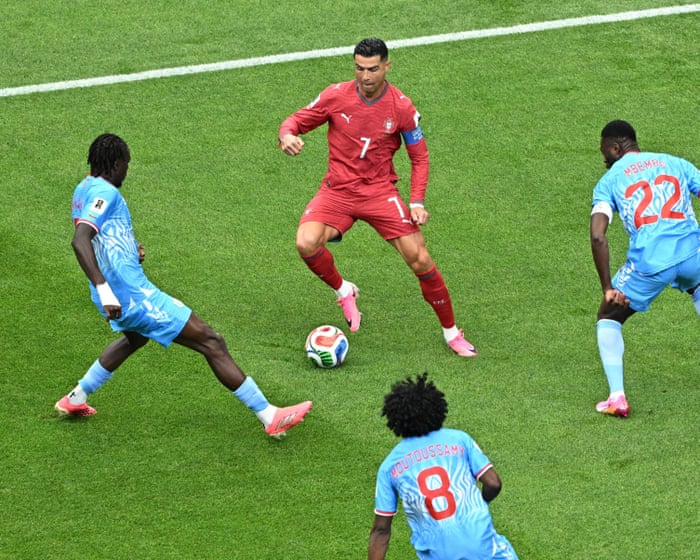
Successful athletes often adapt as they get older. Take Cristiano Ronaldo. “He started out as a winger and relied a lot on his speed and explosiveness, but he’s gradually changed his game. Now he’s more of a pure forward and doesn’t have to make those sprints all the time, because he reads the game better,” said Hough.
Serena Williams is another example. She recently returned to play doubles tennis, which is more tactical and relies less on physical strength.
The growing professionalisation of sport has also helped extend players’ careers. Modern athletes train, recover, eat, and sleep with a level of discipline that would have been unusual even a few decades ago. Financial incentives have changed a lot too. Staying competitive for an extra two or three years can now be worth millions of pounds.
Dr Alex Ireland from Manchester Metropolitan University argues that athletes are benefiting from improvements in almost every part of their environment, from playing surfaces to clothing and equipment.
“If you think about football pitches in the 70s and 80s, even the 90s, at Premier League clubs like Manchester United and Arsenal, they were pretty poor,” he said. “Now, I go and watch Altrincham occasionally, which is a fifth division side, and the pitch is like a carpet.”
Better surfaces are less tiring and may reduce the risk of injury. The same goes for advances in boots, balls, and other equipment. “Everything around”Names and sports have improved,” Ireland said.
A better understanding of injury prevention has also helped. Professor Joseph Baker from the University of Toronto pointed to increased awareness of concussions and overuse injuries, along with rule changes in sports like American football and ice hockey that aim to reduce players’ exposure to certain types of harm.
If athletes do get injured, sports medicine and rehabilitation have advanced significantly.
“A cruciate ligament injury would have probably ended a career, even maybe 25 to 30 years ago,” Ireland said. “Now it’s probably a six- to nine-month injury, and many players have come back and had excellent careers after that.”
Advances in sports science have changed how athletes train, especially when it comes to managing recovery.
“Recovery is really important because you can maximize adaptation and allow more sustained high-intensity training,” said Dr. Tom Brownlee, a sports scientist at the University of Birmingham who previously worked with Liverpool FC. “If you’re not fully recovered, you can’t push as hard in training the next day.”
View image in fullscreen: Many athletes, including footballer Matheus Cunha, wear GPS tracking vests under their shirts. Photograph: Naomi Baker/Getty Images
A major change has been the ability to monitor training loads in unprecedented detail. Using GPS trackers, sports scientists can measure not just how far a player has run, but also how many sprints, accelerations, and decelerations they’ve performed. “This means that if an older athlete has done a lot of explosive actions, they can identify when it might be better to ease off in training, or train more,” said Hough.
Elite athletes also regularly use tools like ice baths, saunas, compression garments, and blood monitoring to optimize recovery. Brownlee describes these as marginal gains—small improvements that become worthwhile once the basics of sleep, nutrition, training, and recovery are already mastered.
Still, no single breakthrough seems to explain why elite athletes are lasting longer. Anderson argues that it’s “the accumulation of many small improvements” that has made the difference. “Better recovery strategies, more sophisticated training load management, advances in rehabilitation, improved nutrition, and a greater understanding of sleep have all helped athletes maintain performance for longer.”
View image in fullscreen: Cristiano Ronaldo changed his position from an explosive winger to a central striker, and as a result, he runs less. Photograph: Robbie Jay Barratt/AMA/Getty Images
Even these factors probably don’t tell the whole story. As Baker points out, athletes like Ronaldo and the Williams sisters are not typical competitors. “They are among the very best to ever play the game,” he said. “That makes it hard to figure out the reasons for these age effects.”
Genetics almost certainly play a role, as does access to resources and support that most athletes don’t have. Financial incentives may also matter: star performers are extremely valuable to teams, sponsors, and promoters, creating strong reasons to extend their careers as long as possible.
Luck also plays a part. Some athletes stay competitive into their 40s simply because they’ve avoided the serious injuries that ended the careers of equally talented rivals.
So, what does the increased longevity of these sports icons mean for the rest of us? While elite athletes might use blood monitoring, ice baths, and other gadgets to get the last bit of benefit, they’ve usually already mastered the basics. “For us average Joes, we don’t necessarily need to focus on that because very few of us have our sleep, nutrition, training, and rest dialed in, and that’s where we should focus,” Brownlee said.
Eating plenty of fruits and vegetables, getting enough protein to support tissue repair, and getting adequate sleep—when much of the body’s recovery and adaptation happens—are key.It may not sound revolutionary, but these are the building blocks of performance.
It’s also important to recognize that everyone’s body ages, and you need to adjust your training accordingly.
“A common issue I see is people trying to do the same workouts they did in their 20s—same intensity and volume—but their bodies can’t recover as quickly anymore, which hurts their next training sessions,” said Hough. “Keeping that in mind, training more often but with less intensity or volume might be a good solution.”
That doesn’t mean avoiding exercise. Ireland said he regularly sees competitors in their 70s, 80s, and 90s at masters athletics events—competitions for older athletes. Some only started training later in life.
“It’s never too late to start, but you need to be careful and take it gradually,” he said. “Your body will adapt, your muscles and bones will get stronger, it just takes longer. You have to be cautious and not do too much or go too hard.”
Dr. Lorcan Daly, a physiologist at the Technological University of the Shannon in Ireland, agrees. While age-related declines in physical performance are unavoidable, he argues that many changes blamed on aging are actually due to inactivity. “What exercise often reverses isn’t aging itself, but the effects of being inactive,” Daly said.
He points to French cyclist Robert Marchand, who improved his aerobic fitness and one-hour cycling record between ages 101 and 103. This didn’t reverse aging, Daly said, but it showed how responsive the human body can stay, even in extreme old age.
Mindset may be just as important as physical condition. When Baker interviewed older masters athletes about how they kept up their performance, he found they didn’t deny or fight aging. Instead, they accepted some decline was unavoidable while staying committed to training and competition.
“The most interesting thing for me was realizing that while they know their performance will drop as they get older, they felt empowered to slow that decline as much as possible by staying involved in training and competition,” he said. “This commitment to hard work and challenging activities predicts performance maintenance better than age does.”
Frequently Asked Questions
Here is a list of FAQs about how top athletes like Ronaldo and Serena Williams maintain elite performance into their 40s
BeginnerLevel Questions
1 Is it really just good genes that let athletes like Ronaldo play so long
No While genetics help the biggest factors are extreme discipline in training diet sleep and mental focus They work harder than younger players to stay in shape
2 What does good food mean for these athletes
Its not a magic diet It means eating whole foods at precise times to fuel performance and recovery They avoid processed sugars junk food and alcohol almost entirely
3 How does good luck play a role
Luck mostly means avoiding serious careerending injuries Even the best training cant prevent a bad fall or a freak accident Staying healthy long enough to keep competing is partly luck
4 Can a normal person follow the same routine
You can follow the principles but not the exact routine You dont need to train 5 hours a day The key is consistency good sleep balanced meals and regular exerciseeven 30 minutes a day helps
AdvancedLevel Questions
5 How do older athletes recover from workouts differently than younger ones
Recovery takes longer and is more deliberate They use ice baths compression boots massage and extra sleep They also train smarterfewer highimpact sessions and more lowimpact work to save their joints
6 What specific changes happen to their bodies after 35 that they have to manage
Muscle mass declines faster metabolism slows and tendonjoint stiffness increases They combat this with more strength training careful calorie intake and daily mobility work
7 Do athletes like Serena Williams have to change their playing style as they age
Absolutely They rely less on raw speed and power and more on strategy experience and efficiency For example Ronaldo dropped deeper to avoid sprinting every play and Serena used smarter shot placement to conserve energy
8 What is the biggest mental challenge for competing in your 40s
Fighting boredom and motivation After decades of the same routine