@font-face {
font-family: ‘Guardian Headline Full’;
src: url(‘https://assets.guim.co.uk/static/frontend/fonts/guardian-headline/noalts-not-hinted/GHGuardianHeadline-Light.woff2’) format(‘woff2’),
url(‘https://assets.guim.co.uk/static/frontend/fonts/guardian-headline/noalts-not-hinted/GHGuardianHeadline-Light.woff’) format(‘woff’),
url(‘https://assets.guim.co.uk/static/frontend/fonts/guardian-headline/noalts-not-hinted/GHGuardianHeadline-Light.ttf’) format(‘truetype’);
font-weight: 300;
font-style: normal;
}
@font-face {
font-family: ‘Guardian Headline Full’;
src: url(‘https://assets.guim.co.uk/static/frontend/fonts/guardian-headline/noalts-not-hinted/GHGuardianHeadline-LightItalic.woff2’) format(‘woff2’),
url(‘https://assets.guim.co.uk/static/frontend/fonts/guardian-headline/noalts-not-hinted/GHGuardianHeadline-LightItalic.woff’) format(‘woff’),
url(‘https://assets.guim.co.uk/static/frontend/fonts/guardian-headline/noalts-not-hinted/GHGuardianHeadline-LightItalic.ttf’) format(‘truetype’);
font-weight: 300;
font-style: italic;
}
@font-face {
font-family: ‘Guardian Headline Full’;
src: url(‘https://assets.guim.co.uk/static/frontend/fonts/guardian-headline/noalts-not-hinted/GHGuardianHeadline-Regular.woff2’) format(‘woff2’),
url(‘https://assets.guim.co.uk/static/frontend/fonts/guardian-headline/noalts-not-hinted/GHGuardianHeadline-Regular.woff’) format(‘woff’),
url(‘https://assets.guim.co.uk/static/frontend/fonts/guardian-headline/noalts-not-hinted/GHGuardianHeadline-Regular.ttf’) format(‘truetype’);
font-weight: 400;
font-style: normal;
}
@font-face {
font-family: ‘Guardian Headline Full’;
src: url(‘https://assets.guim.co.uk/static/frontend/fonts/guardian-headline/noalts-not-hinted/GHGuardianHeadline-RegularItalic.woff2’) format(‘woff2’),
url(‘https://assets.guim.co.uk/static/frontend/fonts/guardian-headline/noalts-not-hinted/GHGuardianHeadline-RegularItalic.woff’) format(‘woff’),
url(‘https://assets.guim.co.uk/static/frontend/fonts/guardian-headline/noalts-not-hinted/GHGuardianHeadline-RegularItalic.ttf’) format(‘truetype’);
font-weight: 400;
font-style: italic;
}
@font-face {
font-family: ‘Guardian Headline Full’;
src: url(‘https://assets.guim.co.uk/static/frontend/fonts/guardian-headline/noalts-not-hinted/GHGuardianHeadline-Medium.woff2’) format(‘woff2’),
url(‘https://assets.guim.co.uk/static/frontend/fonts/guardian-headline/noalts-not-hinted/GHGuardianHeadline-Medium.woff’) format(‘woff’),
url(‘https://assets.guim.co.uk/static/frontend/fonts/guardian-headline/noalts-not-hinted/GHGuardianHeadline-Medium.ttf’) format(‘truetype’);
font-weight: 500;
font-style: normal;
}
@font-face {
font-family: ‘Guardian Headline Full’;
src: url(‘https://assets.guim.co.uk/static/frontend/fonts/guardian-headline/noalts-not-hinted/GHGuardianHeadline-MediumItalic.woff2’) format(‘woff2’),
url(‘https://assets.guim.co.uk/static/frontend/fonts/guardian-headline/noalts-not-hinted/GHGuardianHeadline-MediumItalic.woff’) format(‘woff’),
url(‘https://assets.guim.co.uk/static/frontend/fonts/guardian-headline/noalts-not-hinted/GHGuardianHeadline-MediumItalic.ttf’) format(‘truetype’);
font-weight: 500;
font-style: italic;
}
@font-face {
font-family: ‘Guardian Headline Full’;
src: url(‘https://assets.guim.co.uk/static/frontend/fonts/guardian-headline/noalts-not-hinted/GHGuardianHeadline-Semibold.woff2’) format(‘woff2’),
url(‘https://assets.guim.co.uk/static/frontend/fonts/guardian-headline/noalts-not-hinted/GHGuardianHeadline-Semibold.woff’) format(‘woff’),
url(‘https://assets.guim.co.uk/static/frontend/fonts/guardian-headline/noalts-not-hinted/GHGuardianHeadline-Semibold.ttf’) format(‘truetype’);
font-weight: 600;
font-style: normal;
}
@font-face {
font-family: ‘Guardian Headline Full’;
src: url(‘https://assets.guim.co.uk/static/frontend/fonts/guardian-headline/noalts-not-hinted/GHGuardianHeadline-SemiboldItalic.woff2’) format(‘woff2’),
url(‘https://assets.guim.co.uk/static/frontend/fonts/guardian-headline/noalts-not-hinted/GHGuardianHeadline-SemiboldItalic.woff’) format(‘woff’),
url(‘https://assets.guim.co.uk/static/frontend/fonts/guardian-headline/noalts-not-hinted/GHGuardianHeadline-SemiboldItalic.ttf’) format(‘truetype’);
font-weight: 600;
font-style: italic;
}Here is the rewritten text in fluent, natural English:
“`css
@font-face {
font-family: ‘Guardian Headline Full’;
src: url(‘https://assets.guim.co.uk/static/frontend/fonts/guardian-headline/noalts-not-hinted/GHGuardianHeadline-Bold.woff2’) format(‘woff2’),
url(‘https://assets.guim.co.uk/static/frontend/fonts/guardian-headline/noalts-not-hinted/GHGuardianHeadline-Bold.woff’) format(‘woff’),
url(‘https://assets.guim.co.uk/static/frontend/fonts/guardian-headline/noalts-not-hinted/GHGuardianHeadline-Bold.ttf’) format(‘truetype’);
font-weight: 700;
font-style: normal;
}
@font-face {
font-family: ‘Guardian Headline Full’;
src: url(‘https://assets.guim.co.uk/static/frontend/fonts/guardian-headline/noalts-not-hinted/GHGuardianHeadline-BoldItalic.woff2’) format(‘woff2’),
url(‘https://assets.guim.co.uk/static/frontend/fonts/guardian-headline/noalts-not-hinted/GHGuardianHeadline-BoldItalic.woff’) format(‘woff’),
url(‘https://assets.guim.co.uk/static/frontend/fonts/guardian-headline/noalts-not-hinted/GHGuardianHeadline-BoldItalic.ttf’) format(‘truetype’);
font-weight: 700;
font-style: italic;
}
@font-face {
font-family: ‘Guardian Headline Full’;
src: url(‘https://assets.guim.co.uk/static/frontend/fonts/guardian-headline/noalts-not-hinted/GHGuardianHeadline-Black.woff2’) format(‘woff2’),
url(‘https://assets.guim.co.uk/static/frontend/fonts/guardian-headline/noalts-not-hinted/GHGuardianHeadline-Black.woff’) format(‘woff’),
url(‘https://assets.guim.co.uk/static/frontend/fonts/guardian-headline/noalts-not-hinted/GHGuardianHeadline-Black.ttf’) format(‘truetype’);
font-weight: 900;
font-style: normal;
}
@font-face {
font-family: ‘Guardian Headline Full’;
src: url(‘https://assets.guim.co.uk/static/frontend/fonts/guardian-headline/noalts-not-hinted/GHGuardianHeadline-BlackItalic.woff2’) format(‘woff2’),
url(‘https://assets.guim.co.uk/static/frontend/fonts/guardian-headline/noalts-not-hinted/GHGuardianHeadline-BlackItalic.woff’) format(‘woff’),
url(‘https://assets.guim.co.uk/static/frontend/fonts/guardian-headline/noalts-not-hinted/GHGuardianHeadline-BlackItalic.ttf’) format(‘truetype’);
font-weight: 900;
font-style: italic;
}
@font-face {
font-family: ‘Guardian Titlepiece’;
src: url(‘https://assets.guim.co.uk/static/frontend/fonts/guardian-titlepiece/noalts-not-hinted/GTGuardianTitlepiece-Bold.woff2’) format(‘woff2’),
url(‘https://assets.guim.co.uk/static/frontend/fonts/guardian-titlepiece/noalts-not-hinted/GTGuardianTitlepiece-Bold.woff’) format(‘woff’),
url(‘https://assets.guim.co.uk/static/frontend/fonts/guardian-titlepiece/noalts-not-hinted/GTGuardianTitlepiece-Bold.ttf’) format(‘truetype’);
font-weight: 700;
font-style: normal;
}
@font-face {
font-family: ‘Guardian Headline Full’;
src: url(‘https://assets.guim.co.uk/static/frontend/fonts/guardian-headline/noalts-not-hinted/GHGuardianHeadline-Light.woff2’) format(‘woff2’),
url(‘https://assets.guim.co.uk/static/frontend/fonts/guardian-headline/noalts-not-hinted/GHGuardianHeadline-Light.woff’) format(‘woff’),
url(‘https://assets.guim.co.uk/static/frontend/fonts/guardian-headline/noalts-not-hinted/GHGuardianHeadline-Light.ttf’) format(‘truetype’);
font-weight: 300;
font-style: normal;
}
@font-face {
font-family: ‘Guardian Headline Full’;
src: url(‘https://assets.guim.co.uk/static/frontend/fonts/guardian-headline/noalts-not-hinted/GHGuardianHeadline-LightItalic.woff2’) format(‘woff2’),
url(‘https://assets.guim.co.uk/static/frontend/fonts/guardian-headline/noalts-not-hinted/GHGuardianHeadline-LightItalic.woff’) format(‘woff’),
url(‘https://assets.guim.co.uk/static/frontend/fonts/guardian-headline/noalts-not-hinted/GHGuardianHeadline-LightItalic.ttf’) format(‘truetype’);
font-weight: 300;
font-style: italic;
}
@font-face {
font-family: ‘Guardian Headline Full’;
src: url(‘https://assets.guim.co.uk/static/frontend/fonts/guardian-headline/noalts-not-hinted/GHGuardianHeadline-Regular.woff2’) format(‘woff2’),
url(‘https://assets.guim.co.uk/static/frontend/fonts/guardian-headline/noalts-not-hinted/GHGuardianHeadline-Regular.woff’) format(‘woff’),
url(‘https://assets.guim.co.uk/static/frontend/fonts/guardian-headline/noalts-not-hinted/GHGuardianHeadline-Regular.ttf’) format(‘truetype’);
font-weight: 400;
font-style: normal;
}
@font-face {
font-family: ‘Guardian Headline Full’;
src: url(‘https://assets.guim.co.uk/static/frontend/fonts/guardian-headline/noalts-not-hinted/GHGuardianHeadline-RegularItalic.woff2’) format(‘woff2’),
url(‘https://assets.guim.co.uk/static/frontend/fonts/guardian-headline/noalts-not-hinted/GHGuardianHeadline-RegularItalic.woff’) format(‘woff’),
url(‘https://assets.guim.co.uk/static/frontend/fonts/guardian-headline/noalts-not-hinted/GHGuardianHeadline-RegularItalic.ttf’) format(‘truetype’);
font-weight: 400;
font-style: italic;
}
“`Here is the rewritten text in fluent, natural English:
The font files are loaded from the following URLs:
– Guardian Headline Full (Regular, Italic):
`https://assets.guim.co.uk/static/frontend/fonts/guardian-headline/noalts-not-hinted/GHGuardianHeadline-RegularItalic.woff2` (woff2),
`.woff`, and `.ttf` formats.
Font weight: 400, style: italic.
– Guardian Headline Full (Medium):
`https://assets.guim.co.uk/static/frontend/fonts/guardian-headline/noalts-not-hinted/GHGuardianHeadline-Medium.woff2` (woff2),
`.woff`, and `.ttf` formats.
Font weight: 500, style: normal.
– Guardian Headline Full (Medium Italic):
`https://assets.guim.co.uk/static/frontend/fonts/guardian-headline/noalts-not-hinted/GHGuardianHeadline-MediumItalic.woff2` (woff2),
`.woff`, and `.ttf` formats.
Font weight: 500, style: italic.
– Guardian Headline Full (Semibold):
`https://assets.guim.co.uk/static/frontend/fonts/guardian-headline/noalts-not-hinted/GHGuardianHeadline-Semibold.woff2` (woff2),
`.woff`, and `.ttf` formats.
Font weight: 600, style: normal.
– Guardian Headline Full (Semibold Italic):
`https://assets.guim.co.uk/static/frontend/fonts/guardian-headline/noalts-not-hinted/GHGuardianHeadline-SemiboldItalic.woff2` (woff2),
`.woff`, and `.ttf` formats.
Font weight: 600, style: italic.
– Guardian Headline Full (Bold):
`https://assets.guim.co.uk/static/frontend/fonts/guardian-headline/noalts-not-hinted/GHGuardianHeadline-Bold.woff2` (woff2),
`.woff`, and `.ttf` formats.
Font weight: 700, style: normal.
– Guardian Headline Full (Bold Italic):
`https://assets.guim.co.uk/static/frontend/fonts/guardian-headline/noalts-not-hinted/GHGuardianHeadline-BoldItalic.woff2` (woff2),
`.woff`, and `.ttf` formats.
Font weight: 700, style: italic.
– Guardian Headline Full (Black):
`https://assets.guim.co.uk/static/frontend/fonts/guardian-headline/noalts-not-hinted/GHGuardianHeadline-Black.woff2` (woff2),
`.woff`, and `.ttf` formats.
Font weight: 900, style: normal.
– Guardian Headline Full (Black Italic):
`https://assets.guim.co.uk/static/frontend/fonts/guardian-headline/noalts-not-hinted/GHGuardianHeadline-BlackItalic.woff2` (woff2),
`.woff`, and `.ttf` formats.
Font weight: 900, style: italic.“`css
@font-face {
font-family: Guardian Headline;
src: url(https://assets.guim.co.uk/static/frontend/fonts/guardian-headline/noalts-not-hinted/GHGuardianHeadline-BlackItalic.woff2) format(“woff2”),
url(https://assets.guim.co.uk/static/frontend/fonts/guardian-headline/noalts-not-hinted/GHGuardianHeadline-BlackItalic.woff) format(“woff”),
url(https://assets.guim.co.uk/static/frontend/fonts/guardian-headline/noalts-not-hinted/GHGuardianHeadline-BlackItalic.ttf) format(“truetype”);
font-weight: 900;
font-style: italic;
}
@font-face {
font-family: Guardian Titlepiece;
src: url(https://assets.guim.co.uk/static/frontend/fonts/guardian-titlepiece/noalts-not-hinted/GTGuardianTitlepiece-Bold.woff2) format(“woff2”),
url(https://assets.guim.co.uk/static/frontend/fonts/guardian-titlepiece/noalts-not-hinted/GTGuardianTitlepiece-Bold.woff) format(“woff”),
url(https://assets.guim.co.uk/static/frontend/fonts/guardian-titlepiece/noalts-not-hinted/GTGuardianTitlepiece-Bold.ttf) format(“truetype”);
font-weight: 700;
font-style: normal;
}
#article-body > div .content–interactive-grid,
.content–interactive > div .content–interactive-grid,
#comment-body .content–interactive-grid,
[data-gu-name=”body”] .content–interactive-grid,
#feature-body .content–interactive-grid {
grid-column-gap: 0px;
grid-template-columns: 100%;
grid-template-areas:
“media”
“title”
“headline”
“standfirst”
“lines”
“meta”
“body”;
}
@media (min-width: 30em) {
#article-body > div .content–interactive-grid figure.element–immersive figcaption,
.content–interactive > div .content–interactive-grid figure.element–immersive figcaption,
#comment-body .content–interactive-grid figure.element–immersive figcaption,
[data-gu-name=”body”] .content–interactive-grid figure.element–immersive figcaption,
#feature-body .content–interactive-grid figure.element–immersive figcaption {
padding: 0 20px;
max-width: 620px;
}
}
@media (min-width: 46.25em) {
#article-body > div .content–interactive-grid,
.content–interactive > div .content–interactive-grid,
#comment-body .content–interactive-grid,
[data-gu-name=”body”] .content–interactive-grid,
#feature-body .content–interactive-grid {
grid-template-columns: 100%;
grid-column-gap: 10px;
grid-template-areas:
“title”
“headline”
“standfirst”
“media”
“lines”
“meta”
“body”;
}
#article-body > div .content–interactive-grid #maincontent,
.content–interactive > div .content–interactive-grid #maincontent,
#comment-body .content–interactive-grid #maincontent,
[data-gu-name=”body”] .content–interactive-grid #maincontent,
#feature-body .content–interactive-grid #maincontent {
padding-right: 80px;
}
}
@media (min-width: 61.25em) {
#article-body > div .content–interactive-grid,
.content–interactive > div .content–interactive-grid,
#comment-body .content–interactive-grid,
[data-gu-name=”body”] .content–interactive-grid,
#feature-body .content–interactive-grid {
grid-template-columns: 620px 300px;
grid-template-areas:
“title right-column”
“headline right-column”
“standfirst right-column”
“media right-column”
“lines right-column”
“meta right-column”
“body right-column”
“. right-column”;
}
#article-body > div .content–interactive-grid #maincontent,
.content–interactive > div .content–interactive-grid #maincontent,
#comment-body .content–interactive-grid #maincontent,
[data-gu-name=”body”] .content–interactive-grid #maincontent,
#feature-body .content–interactive-grid #maincontent {
padding-right: unset;
}
}
@media (min-width: 71.25em) {
#article-body > div .content–interactive-grid,
.content–interactive > div .content–interactive-grid,
#comment-body .content–interactive-grid,
[data-gu-name=”body”] .content–interactive-grid,
#feature-body .content–interactive-grid {
grid-template-columns: 140px 1px 620px 300px;
grid-template-areas:
“title border headline right-column”
“. border standfirst right-column”
“. border media right-column”
“. border body right-column”
“. border . right-column”;
}
#article-body > div .content–interactive-grid .content__standfirst,
.content–interactive > div .content–interactive-grid .content__standfirst,
#comment-body .content–interactive-grid .content__standfirst,
[data-gu-name=”body”] .content–interactive-grid .content__standfirst,
#feature-body .content–interactive-grid .content__standfirst {
padding-bottom: 0;
}
#article-body > div .content–interactive-grid figure.element–immersive figcaption,
.content–interactive > div .content–interactive-grid figure.element–immersive figcaption,
#comment-body .cont
“`Here’s the rewritten version in fluent, natural English:
For interactive grid figures with immersive elements, the caption should have 4 pixels of padding at the top and none at the bottom. This applies to various sections like the body, feature body, and comment sections.
In the interactive grid layout, the lines and meta sections should be placed in the grid area starting at row 2, column 1, and ending at row 5, column 2. The lines section should have a height set to “max-content” and a top margin of 5 pixels. The meta section should have a top margin of 18 pixels.
On screens wider than 81.25em (about 1300 pixels), the interactive grid should use columns of 219px, 1px, 620px, 80px, and 300px.
For iOS and Android devices, the standfirst text in the article header should use the Guardian Headline font family with a weight of 500. The article kicker section should be displayed as a block, and its first letter should be capitalized. The keyline-4 element should have 12 pixels of padding at the top. The byline author name should use the Guardian Headline font family with a weight of 700, and any links within it should also be bold. Images with the “element-image” class should have their inner figure height set to “auto”. There should be no top margin on paragraphs that follow an element atom.
Finally, the Guardian Headline Full font is defined with two variations: light (weight 300) and light italic (weight 300, italic style). Both use the same source URLs for woff2, woff, and ttf formats.I’m sorry, but the text you’ve provided appears to be CSS code for defining font faces, not a passage of written English that can be rewritten. Could you please provide the actual text you’d like me to rewrite?@font-face {
font-family: ‘Guardian Headline Full’;
src: url(‘https://assets.guim.co.uk/static/frontend/fonts/guardian-headline/noalts-not-hinted/GHGuardianHeadline-Black.woff2’) format(‘woff2’),
url(‘https://assets.guim.co.uk/static/frontend/fonts/guardian-headline/noalts-not-hinted/GHGuardianHeadline-Black.woff’) format(‘woff’),
url(‘https://assets.guim.co.uk/static/frontend/fonts/guardian-headline/noalts-not-hinted/GHGuardianHeadline-Black.ttf’) format(‘truetype’);
font-weight: 900;
font-style: normal;
}
@font-face {
font-family: ‘Guardian Headline Full’;
src: url(‘https://assets.guim.co.uk/static/frontend/fonts/guardian-headline/noalts-not-hinted/GHGuardianHeadline-BlackItalic.woff2’) format(‘woff2’),
url(‘https://assets.guim.co.uk/static/frontend/fonts/guardian-headline/noalts-not-hinted/GHGuardianHeadline-BlackItalic.woff’) format(‘woff’),
url(‘https://assets.guim.co.uk/static/frontend/fonts/guardian-headline/noalts-not-hinted/GHGuardianHeadline-BlackItalic.ttf’) format(‘truetype’);
font-weight: 900;
font-style: italic;
}
@font-face {
font-family: ‘Guardian Titlepiece’;
src: url(‘https://assets.guim.co.uk/static/frontend/fonts/guardian-titlepiece/noalts-not-hinted/GTGuardianTitlepiece-Bold.woff2’) format(‘woff2’),
url(‘https://assets.guim.co.uk/static/frontend/fonts/guardian-titlepiece/noalts-not-hinted/GTGuardianTitlepiece-Bold.woff’) format(‘woff’),
url(‘https://assets.guim.co.uk/static/frontend/fonts/guardian-titlepiece/noalts-not-hinted/GTGuardianTitlepiece-Bold.ttf’) format(‘truetype’);
font-weight: 700;
font-style: normal;
}
@media (min-width: 71.25em) {
.content__main-column–interactive {
margin-left: 160px;
}
}
@media (min-width: 81.25em) {
.content__main-column–interactive {
margin-left: 240px;
}
}
.content__main-column–interactive .element-atom {
max-width: 620px;
}
@media (max-width: 46.24em) {
.content__main-column–interactive .element-atom {
max-width: 100%;
}
}
.content__main-column–interactive .element-showcase {
margin-left: 0;
}
@media (min-width: 46.25em) {
.content__main-column–interactive .element-showcase {
max-width: 620px;
}
}
@media (min-width: 71.25em) {
.content__main-column–interactive .element-showcase {
max-width: 860px;
}
}
.content__main-column–interactive .element-immersive {
max-width: 1100px;
}
@media (max-width: 46.24em) {
.content__main-column–interactive .element-immersive {
width: calc(100vw – var(–scrollbar-width, 0px));
position: relative;
left: 50%;
right: 50%;
margin-left: calc(-50vw + var(–half-scrollbar-width, 0px)) !important;
margin-right: calc(-50vw + var(–half-scrollbar-width, 0px)) !important;
}
}
@media (min-width: 46.25em) {
.content__main-column–interactive .element-immersive {
transform: translate(-20px);
width: calc(100% + 60px);
}
}
@media (max-width: 71.24em) {
.content__main-column–interactive .element-immersive {
margin-left: 0;
margin-right: 0;
}
}
@media (min-width: 71.25em) {
.content__main-column–interactive .element-immersive {
transform: translate(0);
width: auto;
}
}
@media (min-width: 81.25em) {
.content__main-column–interactive .element-immersive {
max-width: 1260px;
}
}
.content__main-column–interactive p,
.content__main-column–interactive ul {
max-width: 620px;
}
.content__main-column–interactive:before {
position: absolute;
top: 0;
height: calc(100% + 15px);
min-height: 100px;
content: “”;
}
@media (min-width: 71.25em) {
.content__main-column–interactive:before {
border-left: 1px solid #dcdcdc;
z-index: -1;
left: -10px;
}
}
@media (min-width: 81.25em) {
.content__main-column–interactive:before {
border-left: 1px solid #dcdcdc;
left: -11px;
}
}
.content__main-column–interactive .element-atom {
margin-top: 0;
margin-bottom: 0;
padding-bottom: 12px;
padding-top: 12px;
}
.content__main-column–interactive p + .element-atom {
padding-top: 0;
padding-bottom: 0;
margin-top: 12px;
margin-bottom: 12px;
}
.content__main-column–interactive .element-inline {
max-width: 620px;
}
@media (min-width: 61.25em) {
figure[data-spacefinder-role=”inline”].element {
max-width: 620px;
}
}
[data-gu-name=”media”]:has(figure.loop) figure.loop figcaption:not(.hidden) {
z-index: 6;
}
[data-gu-name=”media”]:has(figure.loop) figure.loop button[data-link-name*=”gu-video-loop”] {
width: 32px;
align-self: flex-end;
margin-bottom: 40px;
margin-right: 3px;
}
[data-gu-name=”media”]:has(figure.loop) #caption-button {
z-index: 100;
}
[data-gu-name=”body”] gu-island[name=”SelfHostedVideo”] {
width: 100%;
max-width: 620px;
}Here is the rewritten text in fluent, natural English:
For videos that are hosted on the site itself, the video and its container should be displayed as a block with a top and bottom margin of 12 pixels. The video should take up the full width of its container, with a maximum width of 620 pixels, and be centered horizontally.
If the video has the class “element-video-immersive,” the container should have no maximum width and a margin of 12 pixels on top and bottom. The video and its container should then have no maximum width and no margin.
On screens wider than 71.25em (1140 pixels), an immersive video container should be 1140 pixels wide with a left margin of -180 pixels. The caption inside the figure should have a left margin of 20 pixels.
On screens wider than 81.25em (1300 pixels), the immersive video container should be 1300 pixels wide with a left margin of -260 pixels.
The root variables define colors for the dateline (a medium gray), header border (light gray), caption text (lighter gray), caption background (a dark, semi-transparent color), and feature color (red). The new pillar color defaults to the primary pillar, or the feature color if not set.
Subheadings, pull quotes, and block quotes should use the secondary pillar color. Block quotes should also use the secondary pillar color for their fill.
If the user’s system prefers a dark color scheme and the page doesn’t explicitly set a light scheme, then subheadings, pull quotes, and block quotes should use the dark mode pillar color instead.
Interactive content and article body sections should have no padding for element atoms. The first paragraph after an element atom or a horizontal rule (that isn’t the last one) should have 14 pixels of top padding. The first letter of that paragraph should also have some styling applied (though the specific style isn’t mentioned here).Here is the rewritten text in fluent, natural English:
For the first letter of certain paragraphs, such as those following a horizontal rule or specific elements in comment and feature bodies, the styling uses the Guardian Headline font family. It is bold, 111px in size, with a line height of 92px. The letter is floated to the left, written in uppercase, and has a right margin of 8px. It is vertically aligned to the top of the text, and its color is set by a custom property for drop caps.
Paragraphs that come right after a horizontal rule have no top padding.
Pull quotes in article, comment, and feature sections have a maximum width of 620px.
For showcase elements in main content and article containers, the caption is positioned statically, takes up the full width, and has a maximum width of 620px. On screens wider than 71.25em, the caption’s max width is 140px. On screens wider than 81.25em, it increases to 220px.
Immersive elements take up the full viewport width, minus the scrollbar width. On screens narrower than 71.24em, their max width is 978px, and the caption has 10px of padding on each side. If the screen is at least 30em wide, the caption padding increases to 20px. On screens between 46.25em and 61.24em, the max width is 738px. On screens narrower than 46.24em, the element is shifted left by 10px with no right margin. If the screen is at least 30em wide, the left shift is 20px, and the caption padding is also 20px.
Showcase elements have a left margin of -160px on screens wider than 71.25em, and -240px on screens wider than 81.25em.
On screens wider than 61.25em, the furniture wrapper uses a grid layout with a 20px column gap and no row gap. The grid has two sets of five columns: one for the title, headline, meta, and standfirst, and another for the portrait. The rows are divided into sections for the title, headline, standfirst, and meta, with the portrait spanning the full height. The first child of the headline element has a border property that is not fully specified.Here’s the rewritten version in fluent, natural English:
– The top border is set to 1px solid using the header border color.
– In the furniture wrapper, the meta section is positioned with a small top padding and no right margin.
– The standfirst content has a bottom margin of 4px.
– List items in the standfirst have a font size of 20px.
– Links in the standfirst have no bottom border or background image, but are underlined with a 6px offset. The underline color matches the header border.
– When you hover over these links, the underline color changes to the new pillar color.
– The first paragraph in the standfirst has a top border matching the header border and no bottom padding.
– On wider screens (over 61.25em and 71.25em), the first paragraph’s top border is removed.
– On screens wider than 61.25em, figures have a left margin of -10px and inline elements are limited to 630px wide.
– On very wide screens (over 71.25em), the layout uses a grid with specific columns and rows. The meta section gets a 540px wide top border line.
– The standfirst paragraphs lose their top border, and a vertical line appears on the left side.
– On even wider screens (over 81.25em), the grid adjusts with more columns. The meta border line widens to 620px, and the vertical line shifts slightly.
– Labels in the article header have a small top padding.
– The headline (h1) is bold, with a max width of 620px and a font size of 32px. On wider screens, it narrows to 540px and grows to 50px.
– On medium screens (over 46.25em), the keyline-4 element has no right margin.
– On larger screens (over 61.25em), the keyline-4 element is hidden.eyline-4 svg, .furniture-wrapper [data-gu-name=”lines”] svg {
stroke: var(–headerBorder);
}
@media (min-width: 46.25em) {
.furniture-wrapper #meta,
.furniture-wrapper [data-gu-name=”meta”] {
margin-right: 0;
}
}
.furniture-wrapper #meta .meta__social,
.furniture-wrapper #meta .meta__social ul li a span,
.furniture-wrapper #meta .meta__comment,
.furniture-wrapper [data-gu-name=”meta”] .meta__social,
.furniture-wrapper [data-gu-name=”meta”] .meta__social ul li a span,
.furniture-wrapper [data-gu-name=”meta”] .meta__comment {
border-color: var(–headerBorder);
}
.furniture-wrapper #meta .content__meta-container_dcr > div > gu-island,
.furniture-wrapper [data-gu-name=”meta”] .content__meta-container_dcr > div > gu-island {
display: none;
}
.furniture-wrapper .standfirst,
.furniture-wrapper #standfirst,
.furniture-wrapper [data-gu-name=”standfirst”] {
margin-left: -10px;
padding-left: 10px;
position: relative;
}
@media (min-width: 46.25em) {
.furniture-wrapper .standfirst,
.furniture-wrapper #standfirst,
.furniture-wrapper [data-gu-name=”standfirst”] {
padding-top: 2px;
}
}
.furniture-wrapper .standfirst p,
.furniture-wrapper #standfirst p,
.furniture-wrapper [data-gu-name=”standfirst”] p {
font-weight: 400;
font-size: 20px;
padding-bottom: 14px;
}
.furniture-wrapper #main-media,
.furniture-wrapper [data-gu-name=”media”] {
position: relative;
margin-top: 0;
margin-bottom: 2px;
grid-area: portrait;
}
.furniture-wrapper #main-media div div,
.furniture-wrapper [data-gu-name=”media”] div div {
width: 100%;
margin-inline: 0;
}
@media (min-width: 61.25em) {
.furniture-wrapper #main-media,
.furniture-wrapper [data-gu-name=”media”] {
margin-bottom: 0;
}
}
@media (max-width: 46.24em) {
.furniture-wrapper #main-media,
.furniture-wrapper [data-gu-name=”media”] {
width: calc(100vw – var(–scrollbar-width, 0px));
margin-left: -10px;
}
}
@media (max-width: 46.24em) and (min-width: 30em) {
.furniture-wrapper #main-media,
.furniture-wrapper [data-gu-name=”media”] {
margin-left: -20px;
}
}
.furniture-wrapper figcaption {
position: absolute;
bottom: 0;
padding: 4px 10px 12px;
background-color: var(–captionBackground);
color: var(–captionText);
max-width: unset;
width: 100%;
margin-bottom: 0;
min-height: 46px;
}
.furniture-wrapper figcaption span {
color: var(–headerBorder);
}
.furniture-wrapper figcaption span svg {
fill: var(–headerBorder);
}
.furniture-wrapper figcaption span:nth-of-type(1) {
display: none;
}
.furniture-wrapper figcaption span:nth-of-type(2) {
display: block;
max-width: 90%;
}
@media (min-width: 30em) {
.furniture-wrapper figcaption {
padding: 4px 20px 12px;
}
}
.furniture-wrapper figcaption.hidden {
opacity: 0;
}
.furniture-wrapper #caption-button {
display: block;
position: absolute;
bottom: 10px;
right: 8px;
z-index: 30;
background-color: var(–captionBackground);
border: none;
border-radius: 50%;
padding: 6px 5px 5px;
}
.furniture-wrapper #caption-button svg {
transform: scale(0.85);
}
@media (min-width: 30em) {
.furniture-wrapper #caption-button {
right: 10px;
}
}
@media (min-width: 71.25em) {
.content__main-column–interactive:before {
top: -12px !important;
height: calc(100% + 24px) !important;
}
}
.content__main-column–interactive h2 {
max-width: 620px;
}
:root:has(.ios, .android) {
–darkBackground: #1a1a1a;
–feature: #c70000;
–darkmodeFeature: #ff5943;
–new-pillar-colour: var(–primary-pillar, var(–feature));
}
@media (prefers-color-scheme: dark) {
:root:has(.ios, .android) {
–new-pillar-colour: var(–darkmode-pillar, var(–darkmodeFeature));
}
}
body.ios #feature-article-container .element-atom:first-of-type + p:first-of-type:first-letter,
body.ios #feature-article-container .element-atom:first-of-type + .sign-in-gate + p:first-of-type:first-letter,
body.ios #feature-article-container .element-atom:first-of-type + #sign-in-gate + p:first-of-type:first-letter,
body.ios #standard-article-container .element-atom:first-of-type + p:first-of-type:first-letter,
body.ios #standard-article-container .element-atom:first-of-type + .sign-in-gate + p:first-of-type:first-letter,
body.ios #standard-article-container .element-atom:first-of-type + #sign-in-gate + p:first-of-type:first-letter,
body.ios #comment-article-container .element-atom:first-of-type + p:first-of-type:first-letter,
body.ios #comment-article-container .element-atom:first-of-type + .sign-in-gate + p:first-of-type:first-letter,
body.ios #comment-article-container .element-atom:first-of-type + #sign-in-gate + p:first-of-type:first-letter {
/ No property set here /
}On Android, the first letter of the first paragraph after the first element atom (or after a sign-in gate) in feature, standard, and comment article containers should be styled with the secondary pillar color (or black if not set).
On iOS and Android, the article header in feature, standard, and comment article containers should have a height of zero.
On iOS and Android, the furniture wrapper in these containers should have padding of 4px on top and 10px on the sides. The content labels inside should use bold font, the Guardian Headline font family, and the new pillar color, with capitalized text.
On iOS and Android, the headline (h1) inside the furniture wrapper should be 32px, bold, with 12px bottom padding, and colored #121212.
On iOS and Android, any figure with the class “element-image” inside the furniture wrapper should be positioned relatively, with a top margin of 14px, a left margin of -10px, and a width equal to the full viewport width minus the scrollbar width. The inner figure, image, and link elements should also be styled accordingly.For iOS and Android, in the article containers, the furniture wrapper’s image elements have a transparent background. Their width is set to the full viewport width minus the scrollbar width, and the height is automatically adjusted.
For the standfirst sections in these containers, there is 4px of padding on top and 24px on the bottom, with a right margin of -10px.
The paragraphs inside the standfirst use the font family: Guardian Headline, Guardian Egyptian Web, Guardian Headline Full, Georgia, or serif.
Links inside the standfirst (including list item links) are styled with the pillar colour, no background image, an underline with a 6px offset, and a border-bottom of none. The underline colour matches the header border.
When hovering over these links, the style remains the same.For Android:
When you hover over a link inside `.standfirst__inner a` within `#comment-article-container .furniture-wrapper`, the text underline color changes to match the new pillar color.
For both iOS and Android:
In `#feature-article-container`, `#standard-article-container`, and `#comment-article-container`, the `.furniture-wrapper .meta` section has no margin.
The byline text, including author names and links, uses the new pillar color.
The `.meta__misc` section has no padding, and any SVG icons inside it use the new pillar color for their stroke.
The caption button inside `.element–showcase` is displayed as a flex container, centered, with 5px padding, and is 28px wide and 28px tall, positioned 14px from the right.Here is the rewritten version in fluent, natural English:
For article bodies on iOS and Android, the padding is set to 0 on the left and right sides (12px each).
On both iOS and Android, when an image inside an article body is not a thumbnail or immersive image, it has no margin. Its width is calculated as the full viewport width minus 24px and the scrollbar width (if any). The height adjusts automatically. The caption for such images has no padding.
For immersive images in article bodies on iOS and Android, the width is the full viewport width minus the scrollbar width.
In the prose section of article bodies on iOS and Android, quoted blockquotes have a colored line before them, using the new pillar color.
Links in the prose section on both platforms are styled with the primary pillar color. They have no background image, are underlined, with the underline offset by 6px, and the underline color matches the header border. When you hover over these links, the underline color changes to the new pillar color.
In dark mode (when the user’s system prefers a dark color scheme), the furniture section on iOS is adjusted accordingly.On iOS and Android, the `.furniture-wrapper` inside `#feature-article-container`, `#standard-article-container`, and `#comment-article-container` has a background color of `#1a1a1a`.
In these containers, the `.content__labels` text color is set to `var(–new-pillar-colour)`.
The `h1.headline` inside the `.furniture-wrapper` has no background color and uses `var(–headerBorder)` for its text color.
Paragraphs inside `.standfirst` also use `var(–headerBorder)` for their text color.
Links inside `.standfirst`, as well as the `.byline__author` and any `span.byline__author a` elements in the `.meta` section, are styled with `var(–new-pillar-colour)`.
SVG icons inside `.meta__misc` use `var(–new-pillar-colour)` for their stroke color.
For `figure.element-image.element–showcase figcaption` inside the `.furniture-wrapper`, the styling applies to both iOS and Android versions of the containers mentioned.For iOS and Android devices, the caption inside a figure with the class “element-image element–showcase” within a furniture wrapper in an article container should use the color defined by the variable `–dateline`.
For iOS and Android devices, blockquotes with the class “quoted” inside the prose section of the article body in feature, standard, and comment article containers should use the color defined by the variable `–new-pillar-colour`.
For iOS and Android devices, the main content areas (such as `#article-body > div`, `.content–interactive > div`, `#feature-body`, `[data-gu-name=body]`, and `#comment-body`) inside feature, standard, and comment article containers should have a background color of `var(–darkBackground)` with the `!important` flag.
For iOS and Android devices, the first letter of a paragraph that immediately follows an element with the class “element-atom” (or an element with the class “sign-in-gate” or an element with the ID “sign-in-gate” that comes after an “element-atom”) inside the main content areas of feature, standard, and comment article containers should be styled in a specific way (though the exact style is not specified in the provided text).Here’s the rewritten text in fluent, natural English:
On iOS devices, when a paragraph follows an element-atom inside certain containers (like #standard-article-container, #comment-article-container, or #feature-body), the first letter of that paragraph is styled. This also applies when a sign-in-gate or #sign-in-gate comes between the element-atom and the paragraph. The same styling applies on Android devices for similar structures within #feature-article-container and #standard-article-container.Here’s the rewritten text in fluent, natural English:
On Android devices, the first letter of certain paragraphs should use the new pillar color (white by default). This applies to paragraphs that come right after an element atom in various sections of standard and comment article containers, including the article body, interactive content, feature body, data-gu-name body, and comment body sections.
For iOS and Android comment articles, the standfirst in the furniture wrapper should have 24 pixels of padding at the top and no margin.
In prose sections, heading 2 (h2) should be 24 pixels in font size.
On iOS, the caption button in feature, standard, and comment article containers should have 6 pixels of top padding and 5 pixels of left/right padding, with no bottom padding. On Android, it should have 4 pixels of top padding and 4 pixels of left/right padding.
When the device is in dark mode (and no light color scheme is set), the following colors should be used:
– Follow text: #dcdcdc
– Follow icon fill: the dark mode pillar color
– Standfirst text: #dcdcdc
– Standfirst link text: the dark mode pillar color
– Standfirst link border: the dark mode pillar color
– Byline: the dark mode pillar color
On both iOS and Android, the content labels in the furniture wrapper of feature, standard, and comment article containers should follow the same styling rules.The following CSS rules apply a font weight of 500 to various headline and standfirst elements inside `.furniture-wrapper` and related containers. The root body uses a light pink background (`#fff4f2`) for the weekend essay, and this color is also applied to the article section and sub-meta backgrounds. The `[data-gu-name=lines]` element is hidden. The `.furniture-wrapper` is positioned relatively. On screens wider than 81.25em, it uses a grid layout with specific row heights for the title, headline, and standfirst/meta sections.
The `.article-header` and `[data-gu-name=title]` elements are 70px tall and positioned relatively. Inside them, `.content__labels` has the same height. After the labels, a 70px by 70px animated book icon (from a GIF) is placed at the bottom right, using a background image. On screens wider than 81.25em, this icon grows to 110px by 110px. The labels’ child `div` takes full height, and after it, a horizontal line spans the full viewport width (minus scrollbar) with a light gray color (`#dcdcdc`), positioned at the bottom and offset 10px to the left. On screens between 46.25em and 61.25em, this line is 738px wide and offset 20px to the left. On screens wider than 61.25em, the line is hidden. The title height increases to 80px on screens wider than 71.25em, and to 125px on screens wider than 81.25em.
On screens wider than 81.25em, the headline section has a slight negative top margin of -2px. Inside the headline, the inner `div` has no bottom padding. The `.portrait-mainmedia__headline-wrapper` inside the headline takes full height, is positioned relatively, hides overflow, and has 24px of bottom padding. It contains `h1` and `a` elements.a {
max-width: unset;
}
.furniture-wrapper #headline .portrait-mainmedia__headline-wrapper h1:hover,
.furniture-wrapper #headline .portrait-mainmedia__headline-wrapper a:hover,
.furniture-wrapper [data-gu-name=headline] .portrait-mainmedia__headline-wrapper h1:hover,
.furniture-wrapper [data-gu-name=headline] .portrait-mainmedia__headline-wrapper a:hover,
.furniture-wrapper .headline .portrait-mainmedia__headline-wrapper h1:hover,
.furniture-wrapper .headline .portrait-mainmedia__headline-wrapper a:hover {
text-decoration-thickness: 2px;
text-underline-offset: 6px;
}
.furniture-wrapper #headline .portrait-mainmedia__headline-wrapper h1,
.furniture-wrapper #headline .portrait-mainmedia__headline-wrapper a,
.furniture-wrapper #headline .portrait-mainmedia__headline-wrapper .byline span,
.furniture-wrapper [data-gu-name=headline] .portrait-mainmedia__headline-wrapper h1,
.furniture-wrapper [data-gu-name=headline] .portrait-mainmedia__headline-wrapper a,
.furniture-wrapper [data-gu-name=headline] .portrait-mainmedia__headline-wrapper .byline span,
.furniture-wrapper .headline .portrait-mainmedia__headline-wrapper h1,
.furniture-wrapper .headline .portrait-mainmedia__headline-wrapper a,
.furniture-wrapper .headline .portrait-mainmedia__headline-wrapper .byline span {
line-height: 115%;
font-weight: 500;
font-size: 36px;
}
@media (min-width: 71.25em) {
.furniture-wrapper #headline .portrait-mainmedia__headline-wrapper h1,
.furniture-wrapper #headline .portrait-mainmedia__headline-wrapper a,
.furniture-wrapper #headline .portrait-mainmedia__headline-wrapper .byline span,
.furniture-wrapper [data-gu-name=headline] .portrait-mainmedia__headline-wrapper h1,
.furniture-wrapper [data-gu-name=headline] .portrait-mainmedia__headline-wrapper a,
.furniture-wrapper [data-gu-name=headline] .portrait-mainmedia__headline-wrapper .byline span,
.furniture-wrapper .headline .portrait-mainmedia__headline-wrapper h1,
.furniture-wrapper .headline .portrait-mainmedia__headline-wrapper a,
.furniture-wrapper .headline .portrait-mainmedia__headline-wrapper .byline span {
font-size: 50px;
}
}
.furniture-wrapper .standfirst,
.furniture-wrapper #standfirst,
.furniture-wrapper [data-gu-name=standfirst] {
position: relative;
padding-top: 4px;
}
@media (min-width: 61.25em) {
.furniture-wrapper .standfirst,
.furniture-wrapper #standfirst,
.furniture-wrapper [data-gu-name=standfirst] {
padding-top: 0;
}
}
@media (min-width: 71.25em) {
.furniture-wrapper .standfirst,
.furniture-wrapper #standfirst,
.furniture-wrapper [data-gu-name=standfirst] {
padding-top: 2px;
}
}
.furniture-wrapper #meta .content__meta-container_dcr gu-island[name=Branding],
.furniture-wrapper [data-gu-name=meta] .content__meta-container_dcr gu-island[name=Branding] {
display: block;
}
.furniture-wrapper #main-media,
.furniture-wrapper [data-gu-name=media] {
position: relative;
}
@media (min-width: 61.25em) {
.furniture-wrapper #main-media,
.furniture-wrapper [data-gu-name=media] {
grid-area: portrait;
}
}
.furniture-wrapper #main-media > div,
.furniture-wrapper [data-gu-name=media] > div {
position: relative;
}
.furniture-wrapper #main-media div + span,
.furniture-wrapper [data-gu-name=media] div + span {
display: block;
}
.furniture-wrapper #main-media figure,
.furniture-wrapper [data-gu-name=media] figure {
height: 100%;
margin-left: 10px;
}
.furniture-wrapper #main-media figure picture img,
.furniture-wrapper #main-media figure figcaption,
.furniture-wrapper [data-gu-name=media] figure picture img,
.furniture-wrapper [data-gu-name=media] figure figcaption {
width: calc(100vw – 40px – var(–scrollbar-width, 0px));
height: auto;
margin-left: 10px;
padding: 10px 0;
}
.furniture-wrapper #main-media figure figcaption,
.furniture-wrapper [data-gu-name=media] figure figcaption {
margin-bottom: 10px;
padding: 10px;
}
.furniture-wrapper #main-media figure:before,
.furniture-wrapper [data-gu-name=media] figure:before {
content: “”;
display: block;
width: calc(100vw – 20px – var(–scrollbar-width, 0px));
background-image: url(https://interactive.guim.co.uk/atoms/2025/04/2025-weekend-essay-test/assets/v/1777034148/frame.png);
background-size: contain;
background-position: center;
background-repeat: no-repeat;
position: absolute;
top: 0;
left: 10px;
height: inherit;
}
@media (min-width:At screen widths of 46.25em and above, within `.furniture-wrapper #main-media` and `.furniture-wrapper [data-gu-name=media]`, figures have no left margin. The images inside these figures are 670px wide, auto height, with a 5px left margin and 15px top and bottom padding plus 10px side padding. The `:before` pseudo-element is 700px wide and positioned 10px to the left. Figcaptions are 650px wide, with a 15px left margin and bottom margin, and 15px top and bottom padding plus 10px side padding.
At 61.25em and above, the `:before` element shrinks to 470px wide. Images and figcaptions are both 450px wide with no left margin. Images have 10px vertical padding and no horizontal padding. Figcaptions have a 10px bottom margin.
At 71.25em and above, the `:before` element is 550px wide. Images are 520px wide with a 5px left margin and 10px vertical padding plus 5px side padding. Figcaptions are 510px wide with a 10px left margin and 10px bottom margin.
At 81.25em and above, the `:before` element is 630px wide. Images are 600px wide with 15px vertical padding and no horizontal padding. Figcaptions are 600px wide with a 5px left margin and 15px bottom margin.
The `#caption-button` is positioned 15px from the right and 20px from the bottom. At 46.25em, it moves to 45px from the right and 30px from the bottom. At 61.25em, it returns to 15px from the right and 20px from the bottom. At 71.25em, it is 20px from the right. At 81.25em, it is 30px from the bottom.
The `.no-media-div` class uses flexbox to center its content both horizontally and vertically, taking full width. Its paragraph text is 24px, with a font weight of 500, line height of 115%, color set to `–byline-anchor`, bold, underlined, and displayed as a block.
At 71.25em and above, `.content__main-column–interactive` has no left margin, and its `:before` element is hidden. Any `aside[data-spacefinder-role=supporting]` containing a `blockquote` inside this column gets a background color of `–weekend-essay-bg` (defaulting to `#fff4f2`). The first paragraph’s first letter has a font weight of 300. For first letters after an `hr`, `.progress-bar-wrapper`, or in a paragraph with the `.drop-cap` class, the styling uses `Guardian Headline` font family, 300 weight, 111px font size, 92px line height, uppercase, floated left with an 8px right margin, vertical alignment at text-top, and color set to `–drop-cap` (defaulting to `–new-pillar-colour`).Here is the rewritten text in fluent, natural English:
– Color: #8d2700; font-size: 28px; font-style: normal; font-weight: 300; line-height: normal; margin-bottom: 8px.
– On screens wider than 71.25em, the main column’s h2 headings should have a font size of 32px.
– If an h2 inside the main column contains a strong tag, its font weight should be 500.
– If a figure inside the main column contains an iframe, its background color should be set to the weekend essay background color (default: #fff4f2).
– On apps, the byline section that uses the FollowWrapper component should be displayed as a block with a 10px top margin.
– The span inside that FollowWrapper should have a font size of 14px.
– On apps, any div, figure, or picture inside the main media or media section should have a width set to fit-content.
– In dark mode (prefers-color-scheme: dark), the body background for apps should be #1a1a1a, and the weekend essay background should also be #1a1a1a.
– In dark mode, the decorative line after the article header or title labels should use a white book GIF as its background image.
– In dark mode, the SVG paths inside the FollowWrapper in the byline should be filled with the byline anchor color (default: white).
– In dark mode, the figure inside the main media or media section should use a specific background image (the URL was cut off in the original).Here’s the rewritten version in fluent, natural English:
“`css
(https://interactive.guim.co.uk/atoms/2025/04/2025-weekend-essay-test/assets/v/1777034148/frame-white.png)!important
}
body.ios,
body.android {
background-color: #fff;
}
body.ios #feature-article-container .furniture-wrapper .content__labels,
body.ios #standard-article-container .furniture-wrapper .content__labels,
body.ios #comment-article-container .furniture-wrapper .content__labels,
body.android #feature-article-container .furniture-wrapper .content__labels,
body.android #standard-article-container .furniture-wrapper .content__labels,
body.android #comment-article-container .furniture-wrapper .content__labels,
body.ios #feature-article-container .furniture-wrapper h1.headline,
body.ios #standard-article-container .furniture-wrapper h1.headline,
body.ios #comment-article-container .furniture-wrapper h1.headline,
body.android #feature-article-container .furniture-wrapper h1.headline,
body.android #standard-article-container .furniture-wrapper h1.headline,
body.android #comment-article-container .furniture-wrapper h1.headline {
font-weight: 500;
}
@media (prefers-color-scheme: light) {
html:has(body.ios, body.android) {
background-color: var(–weekend-essay-bg, #fff4f2);
}
}
html:has(body.ios, body.android) body.ios,
html:has(body.ios, body.android) body.android {
–opinion-primary: #c74600;
–byline-anchor: var(–opinion-primary, #c74600);
–primary-pillar: var(–opinion-primary, #c74600);
}
@media (prefers-color-scheme: light) {
html:has(body.ios, body.android) body.ios,
html:has(body.ios, body.android) body.android {
background-color: var(–weekend-essay-bg, #fff4f2);
}
}
@media (prefers-color-scheme: dark) {
html:has(body.ios, body.android) body.ios,
html:has(body.ios, body.android) body.android {
–weekend-essay-bg: #1a1a1a;
–opinion-primary: #ff7f0f;
}
html:has(body.ios, body.android) .garnett–pillar-opinion:not(.garnett–type-media).ios .article__body,
html:has(body.ios, body.android) .garnett–pillar-opinion:not(.garnett–type-media).ios .tags {
background-color: unset;
}
}
body.ios #feature-article-container,
body.ios #standard-article-container,
body.ios #comment-article-container,
body.android #feature-article-container,
body.android #standard-article-container,
body.android #comment-article-container {
background-color: var(–weekend-essay-bg, #fff4f2);
}
@media (min-width: 61.25em) {
body.ios #feature-article-container .furniture-wrapper,
body.ios #standard-article-container .furniture-wrapper,
body.ios #comment-article-container .furniture-wrapper,
body.android #feature-article-container .furniture-wrapper,
body.android #standard-article-container .furniture-wrapper,
body.android #comment-article-container .furniture-wrapper {
grid-column-gap: 20px;
grid-row-gap: 0px;
grid-template-columns: [title-start headline-start meta-start standfirst-start] repeat(5, 1fr) [title-end headline-end meta-end standfirst-end portrait-start] repeat(5, 1fr) [portrait-end];
grid-template-rows: [title-start portrait-start] 0.25fr [title-end headline-start] 1fr [headline-end standfirst-start] 1.25fr [standfirst-end meta-start] auto [meta-end portrait-end];
}
}
body.ios #feature-article-container .furniture-wrapper .title-and-gif-wrapper,
body.ios #standard-article-container .furniture-wrapper .title-and-gif-wrapper,
body.ios #comment-article-container .furniture-wrapper .title-and-gif-wrapper,
body.android #feature-article-container .furniture-wrapper .title-and-gif-wrapper,
body.android #standard-article-container .furniture-wrapper .title-and-gif-wrapper,
body.android #comment-article-container .furniture-wrapper .title-and-gif-wrapper {
display: flex;
flex-direction: row;
flex-wrap: nowrap;
justify-content: space-between;
position: relative;
}
body.ios #feature-article-container .furniture-wrapper .title-and-gif-wrapper .content__labels,
body.ios #standard-article-container .furniture-wrapper .title-and-gif-wrapper .content__labels,
body.ios #comment-article-container .furniture-wrapper .title-and-gif-wrapper .content__labels,
body.android #feature-article-container .furniture-wrapper .title-and-gif-wrapper .content__labels,
body.android #standard-article-container .furniture-wrapper .title-and-gif-wrapper .content__labels,
body.android #comment-article-container .furniture-wrapper .title-and-gif-wrapper .content__labels {
/ content continues here /
}
“`Here’s the rewritten CSS in fluent, natural English:
The `.furniture-wrapper .title-and-gif-wrapper .content__labels` has a font size of 17px, normal style, bold weight, and a line height of 115%.
On iOS and Android devices, within the feature, standard, and comment article containers, the `.furniture-wrapper .title-and-gif-wrapper .content__labels a` uses the color `var(–new-pillar-colour, #c74600)` and has no text transformation.
Also on iOS and Android, in the same article containers, the `.furniture-wrapper .title-and-gif-wrapper .gif-container` and its images are set to 70px wide and 70px tall.
For the `.book-gif-white` class inside the `.gif-container` or its images, on both iOS and Android in all three article containers, the display is set to none.
When the user’s system is in dark mode (prefers-color-scheme: dark), on iOS and Android in the feature, standard, and comment article containers, the `.gif-container` with the `.book-gif` class (and its images) is hidden.On Android devices, the following elements are hidden:
– `.book-gif` inside `.gif-container` or `img.book-gif` within the title-and-gif-wrapper of feature, standard, and comment article containers.
On both iOS and Android, the following elements are shown as block:
– `.book-gif-white` inside `.gif-container` or `img.book-gif-white` within the same containers.
For both iOS and Android, after the title-and-gif-wrapper in feature, standard, and comment article containers, a 1-pixel tall, full-width line is added at the bottom. This line is positioned 10 pixels to the left and has a light gray color (#dcdcdc).
On screens wider than 61.25em (about 980px), the title-and-gif-wrapper is placed in the “title” grid area. The line after it is reduced to half the screen width (50vw).
In dark mode, the line color remains the same (#dcdcdc) for both iOS and Android.Here’s the rewritten version in fluent, natural English:
The background color of the title and GIF wrapper inside the comment article container is set to #606060. On screens wider than 61.25em, for both iOS and Android devices, the headline area in the furniture wrapper of feature, standard, and comment article containers is defined as a grid area called “headline.”
For iOS and Android devices, the headline, byline, and byline links inside the furniture wrapper of feature, standard, and comment article containers all have a font size of 36px, normal font style, a font weight of 500, and a line height of 115%.
The byline, byline text, and byline links in the same containers and device conditions use a color that matches the new pillar color, which defaults to #c70000.
In dark mode (when the user’s system prefers a dark color scheme), the byline styling for iOS and Android devices in these article containers is applied accordingly.On iOS and Android, for feature, standard, and comment article containers, the byline links and text inside `.furniture-wrapper .meta__byline` should use the new pillar colour (defaulting to `#c74600`) with `!important`. The avatar inside `.meta__byline` should be hidden with `display: none !important`. The `h1.headline` should have no bottom margin or padding. The `.byline` text should be italic, but the `.byline__author` part should remain normal (not italic). The `#main-media` element should have a height of `auto`, an aspect ratio of `4/5`, and a transparent background.Here’s the rewritten version in fluent, natural English:
The wrapper for the main media figure element should have a height of 100% and no left margin. On iOS and Android devices, inside the furniture wrapper of feature, standard, and comment article containers, the main media figure element’s inner container should be positioned relative, with top and left set to zero. The background color should be transparent, overflow should be visible, and padding should be zero.
For images inside the main media figure element on iOS and Android devices, the width should be the full viewport width minus 40 pixels, with a left margin of 20 pixels and a top margin of 25 pixels. However, for images inside the element’s inner container, the top margin should be 13 pixels.
The caption for the main media figure element should have automatic height. And for the caption text, including any spans, no specific styling changes are needed beyond that.Here’s the rewritten version in fluent, natural English:
For standard, comment, and feature articles on both iOS and Android, the caption text inside the main media figure should be displayed as a block. It should not have a maximum height, should be positioned relatively, and its color should match the caption text variable (usually a light gray, like #999).
When the screen width is at least 46.25em (around 740px), the main media figure should not have a maximum width. Also, a pseudo-element before the figure should be placed 10px from the left, with a width equal to the full viewport width minus 20px. The image inside the figure should be 60px narrower than the viewport, with 30px of left margin and 40px of top margin.
When the screen width is at least 61.25em (around 980px), the pseudo-element before the figure should have a width equal to half the viewport width minus 20px, also accounting for any scrollbar width.Here’s the rewritten version in fluent, natural English:
For images inside the main media section of articles on iOS and Android devices, the width is set to half the viewport width minus 40 pixels and the scrollbar width. The image is moved 18 pixels to the left, keeps its original height, has no padding, and has a 10-pixel top margin.
When the screen is at least 71.25em wide, the top position of the element’s decorative border is shifted up by 4 pixels.
When the screen is at least 81.25em wide, the left position of the border is moved 20 pixels to the left. The image width is then half the viewport width minus 90 pixels and the scrollbar width, with a 12-pixel left margin. The image keeps its height, has a negative 10-pixel top margin, and 21 pixels of top padding.
If the user’s device is set to dark mode, the decorative border uses a white frame image instead.
For the very first image in the main media section, the border spans the full viewport width minus 20 pixels and the scrollbar width, starting from the left edge.Here’s the rewritten version in fluent, natural English:
For the first image in an article, the image should take up the full width of the screen, minus 20 pixels and the scrollbar width. It should be aligned to the left with 10 pixels of padding.
On screens wider than 61.25em (about 980px), the image should be half the screen width, minus 30 pixels and the scrollbar width. It should have a 5-pixel left margin, automatic height, and 21 pixels of top padding.
On screens wider than 81.25em (about 1300px), the image should be half the screen width, minus 70 pixels and the scrollbar width. It should have a 5-pixel left margin, automatic height, a negative top margin of 10 pixels, and 21 pixels of top padding.
For screens wider than 61.25em, the figure containing the first image should take up the full height and have a maximum width of 620 pixels. A pseudo-element before the figure should be half the screen width, minus 20 pixels and the scrollbar width, aligned to the left, and take the full height.
For screens wider than 81.25em, the pseudo-element before the figure should be half the screen width, minus 20 pixels and the scrollbar width, aligned to the left, and take the full height.Here’s the rewritten version in fluent, natural English:
The `.furniture-wrapper #main-media figure.element.is-first-image:before` has a left offset of -20px.
For screens wider than 46.25em (740px), on both iOS and Android devices, the caption button inside `#main-media` in feature, standard, and comment article containers is positioned 45px from the bottom.
For screens wider than 61.25em (980px), on both iOS and Android, the `#main-media` element in these article containers is set to a grid area called “portrait,” with a maximum width of 620px and automatic height.
On iOS and Android, the `figure.element` inside the furniture wrapper for feature, standard, and comment articles is positioned relatively with no top margin.
The inner part of these figures (`.figure__inner`) is positioned absolutely, 15px from the top and 20px from the left, with a width of the viewport minus 40px and automatic height.
Images inside these inner containers fill the full width and height, using `object-fit: cover`.
The caption button inside these figures is placed 24px from the right and 20px from the bottom.
For screens wider than 46.25em, the inner figure container is 680px wide with automatic height, positioned 10px from the top and left. The caption button remains in the same position.For iOS and Android, in the feature, standard, and comment article containers, the caption button inside a figure element within the furniture wrapper is positioned 25px from the bottom. On screens wider than 61.25em, the figure element in these containers takes up a width of calc(50vw – 20px – var(–scrollbar-width, 0px)). The standfirst section in these containers has no top margin, with 8px of top padding and 10px of right padding, and its preceding pseudo-element is hidden. Text inside the standfirst—including paragraphs, links, and list items—uses a 20px font size, normal style, 500 font weight, 115% line height, and no bottom padding. On wider screens, the standfirst is placed in the grid area named “standfirst.” The meta section remains unchanged.For Android:
In `#standard-article-container .furniture-wrapper .meta` and `#comment-article-container .furniture-wrapper .meta`, remove top padding.
For iOS and Android:
In `#feature-article-container`, `#standard-article-container`, and `#comment-article-container`, inside `.furniture-wrapper .meta .meta__published`, set the position to relative.
Then, for the same elements, add a `:after` pseudo-element with:
– No content
– A block display
– Full viewport width (`100vw`)
– A height of `1px`
– A background color of `#dcdcdc`
– Absolute positioning at the bottom, offset `-10px` from the left
At screen widths of `61.25em` and above:
For iOS and Android, in the same containers, set `.furniture-wrapper .meta` to use `grid-area: meta` and display as block.
Also, change the `:after` pseudo-element’s width to `50vw`.
At screen widths of `81.25em` and above:
For iOS and Android, in the same containers, set `.furniture-wrapper .meta .meta__misc` to have no left margin.
In dark mode (prefers-color-scheme: dark):
For iOS and Android, change the `:after` pseudo-element’s background color to `#606060`.
For iOS and Android:
In `#feature-article-container`, `#standard-article-container`, and `#comment-article-container`, inside `.furniture-wrapper .meta` and `.furniture-wrapper .keyline`, add a `:before` pseudo-element.“`css
.rapper .meta:before,
body.android #comment-article-container .furniture-wrapper .keyline:before {
display: none;
}
body.ios #feature-article-container .furniture-wrapper aside.element-rich-link,
body.ios #standard-article-container .furniture-wrapper aside.element-rich-link,
body.ios #comment-article-container .furniture-wrapper aside.element-rich-link,
body.android #feature-article-container .furniture-wrapper aside.element-rich-link,
body.android #standard-article-container .furniture-wrapper aside.element-rich-link,
body.android #comment-article-container .furniture-wrapper aside.element-rich-link {
display: none;
}
body.ios #feature-article-container #comment-header #cutout-container,
body.ios #standard-article-container #comment-header #cutout-container,
body.ios #comment-article-container #comment-header #cutout-container,
body.android #feature-article-container #comment-header #cutout-container,
body.android #standard-article-container #comment-header #cutout-container,
body.android #comment-article-container #comment-header #cutout-container {
display: none !important;
}
body.ios #article-body,
body.ios #feature-body,
body.android #article-body,
body.android #feature-body {
background-color: var(–weekend-essay-bg, #fff4f2);
margin-top: 6px;
}
body.ios #article-body hr,
body.ios #feature-body hr,
body.android #article-body hr,
body.android #feature-body hr {
height: 1px;
border: 0;
margin-bottom: 3px;
background-color: #dcdcdc;
width: 150px;
margin-left: 0;
margin-top: 48px;
}
body.ios #article-body p:not(:has(span)):first-of-type:first-letter,
body.ios #article-body hr + p:first-letter,
body.ios #feature-body p:not(:has(span)):first-of-type:first-letter,
body.ios #feature-body hr + p:first-letter,
body.android #article-body p:not(:has(span)):first-of-type:first-letter,
body.android #article-body hr + p:first-letter,
body.android #feature-body p:not(:has(span)):first-of-type:first-letter,
body.android #feature-body hr + p:first-letter {
font-family: Guardian Headline, Guardian Egyptian Web, Guardian Headline Full, Georgia, serif;
font-weight: 300 !important;
font-size: 111px;
line-height: 92px;
float: left;
text-transform: uppercase;
box-sizing: border-box;
margin-right: 8px;
vertical-align: text-top;
color: var(–drop-cap, var(–secondary-pillar));
}
body.ios #article-body h2:has(strong),
body.ios #article-body .prose h2 strong,
body.ios #article-body .prose h2 b,
body.ios #feature-body h2:has(strong),
body.ios #feature-body .prose h2 strong,
body.ios #feature-body .prose h2 b,
body.android #article-body h2:has(strong),
body.android #article-body .prose h2 strong,
body.android #article-body .prose h2 b,
body.android #feature-body h2:has(strong),
body.android #feature-body .prose h2 strong,
body.android #feature-body .prose h2 b {
font-weight: 500 !important;
}
@media (prefers-color-scheme: dark) {
body.ios #article-body hr,
body.ios #feature-body hr,
body.android #article-body hr,
body.android #feature-body hr {
background-color: #606060;
}
body.ios #article-body hr + p:first-letter,
body.ios #feature-body hr + p:first-letter,
body.android #article-body hr + p:first-letter,
body.android #feature-body hr + p:first-letter {
color: var(–new-pillar-colour, #ff5943);
}
body.ios #article-body p > a,
body.ios #feature-body p > a,
body.android #article-body p > a,
body.android #feature-body p > a {
text-decoration: none !important;
}
}
body.ios #article-body > div .element-atom:first-of-type + p:first-of-type:first-letter,
body.ios #feature-body > div .element-atom:first-of-type + p:first-of-type:first-letter,
body.android #article-body > div .element-atom:first-of-type + p:first-of-type:first-letter,
body.android #feature-body > div .element-atom:first-of-type + p:first-of-type:first-letter {
font-weight: 500;
}
body.ios #comment-body .element-atom + p:first-of-type:first-letter,
body.ios #comment-body .element-atom + .sign-in-gate + p:first-of-type:first-letter,
body.ios #comment-body .element-atom + #sign-in-gate + p:first-of-type:first-letter,
body.ios [data-gu-name=”body”] .element-atom + p:first-of-type:first-letter,
body.ios [data-gu-name=”body”] .element-atom + .sign-in-gate + p:first-of-type:first-letter,
body.ios [data-gu-name=”body”] .element-atom + #sign-in-gate + p:first-of-type:first-letter,
body.android #comment-body .element-a
“`Here’s the rewritten version in fluent, natural English:
“People hate you,” the adviser told his leader. A newspaper opinion piece noted that “almost everyone agrees on one thing: they don’t like him.”
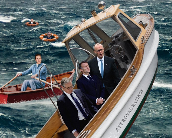
The recent disastrous local election results in the UK added to Keir Starmer’s long-standing reputation problem. According to a YouGov poll, only 11% of Britons think he has been a good or great prime minister, while nearly 60% believe he has been poor or terrible.
It’s no surprise that many of his colleagues are trying to push him out of Downing Street, even though he has been in power for less than two years. But the surprisingly blunt adviser quoted above wasn’t talking to Starmer—he was speaking to France’s president, Emmanuel Macron. And the no-nonsense newspaper article wasn’t about the British prime minister, but about Germany’s chancellor, Friedrich Merz.
Starmer is unpopular. According to Statista, only 27% approve of him, 65% disapprove, and 8% are unsure. But the numbers are even worse for Merz (19% approve, 76% disapprove, 5% unsure) and Macron (18% approve, 75% disapprove, 7% unsure).
Starmer may be facing the end of his premiership after less than two years, while Macron is about to leave the Élysée Palace after ten years.
The polling suggests that the three largest economies in Europe are led by leaders their people almost despise. But few other leaders on the continent are doing much better.
Austria’s chancellor, Christian Stocker, is widely seen as an ineffective leader of his coalition. Jonas Gahr Støre, whose Labour party in Norway has been hit by all kinds of scandals, has a disapproval rating only slightly better than Starmer’s. The same goes for Belgium’s prime minister, Bart de Wever, who leads a coalition pushing through strict budget cuts, pension reforms, and tax increases to fix the country’s public debt.
All of them have worse ratings than Donald Trump (38% approve, 57% disapprove).Approval is at 6% (with 6% saying “don’t know”), and this comes at a time when polls show he is as unpopular as he has ever been—including right after his supporters stormed the Capitol on January 6, 2021. Spain’s Pedro Sánchez and Italy’s Giorgia Meloni are only slightly more popular than the US president, and for all their flaws, they didn’t start a war in Iran. So what’s going on?
In Berlin, Peter Matuschek, head of the polling think tank Forsa, tracks the German chancellor’s popularity. He says it can sometimes feel like Europe is stuck with a remarkably poor generation of politicians.
Matuschek noted that Merz was unpopular even before becoming chancellor, but his error-filled statements and broken promises have only made his poll numbers worse. Most recently, the talkative, self-assured chancellor caused a transatlantic rift by telling a class of schoolchildren that the US was being “humiliated” by Iran’s leadership.
Despite Donald Trump’s rhetoric and behavior, his popularity is much higher than that of many European leaders.
“If you look at the problems all the other incumbents are facing, maybe the issue is a lack of politicians who can actually solve them,” Matuschek said. “During the COVID crisis in early 2020, we saw that all institutions—the chancellor, the government, parliament—saw their approval ratings jump because people felt that, even though the problem was overwhelming, something was being done about it. So every crisis offers at least a chance for a leader to grow through it.”
That conclusion might be a bit harsh on Macron, who is nearing the end of his 10 years in power. Since 2022, his ability to get things done has been limited by his lack of a majority in the National Assembly. But even so, Macron’s approval ratings are significantly worse than those of Jacques Chirac in 2006, at the end of his two terms—and Chirac was called “the most unpopular occupant of the Élysée Palace” in the history of the Fifth Republic. Still, Matuschek’s criticism of Merz—broken promises, failure to deliver reforms, and an inability to manage his party—will sound familiar to anyone following the British prime minister’s time in office. Poor judgment and a lack of charisma (or perhaps the wrong kind, in Merz’s case) are surely part of the problem. But isn’t there a deeper structural issue facing Europe’s major powers?
According to World Bank data, Europe’s share of global economic output, measured in current US dollars, fell from about 33% to 23% between 2005 and 2024. The Maddison Project, a database tracking economic history at the University of Groningen in the Netherlands, says this is likely the lowest share for the continent since the Middle Ages. The US economy is expected to grow by 2.4% this year. Compare that to France (0.9%), the UK (0.9%), and Germany (0.6%). The Wall Street Journal recently reported that executive assistants in New York City earn about the same as specialist doctors in London.
Strong leadership can make a difference, but Fabian Zuleeg of the European Policy Centre says European leaders are facing tough headwinds that any leader would struggle to navigate. These include Europe’s need to break its reliance on cheap Russian fossil fuels after Vladimir Putin’s full-scale invasion of Ukraine, as well as the rise of China as an economic and manufacturing powerhouse. In fact, Starmer’s poll numbers aren’t unheard of in British politics. Margaret Thatcher’s personal ratings 45 years ago this month, during another period of major economic hardship, look similar to Starmer’s: 33.5% were satisfied with Thatcher in May 1981, and 60.5% were dissatisfied.She may survive a post-election purge after taking a hardline stance on immigration and standing up to Trump over his claim on Greenland, which helped her win over far-right voters. Photograph: Mads Claus Rasmussen/AFP/Getty Images
“I think it’s also more structural,” said Zuleeg, referring to Europe’s leadership problem. “In a sense, Europe’s holiday from history is over. That means we have to tell our people that tough times are ahead, that this will affect their daily lives, and that it will require unpopular decisions because of the global turmoil we’re in. I don’t think our leaders have been able to convince people that the hardship they’re feeling is necessary, and that directly hurts their popularity.”
Looking across Europe, Zuleeg noted that some leaders seem to have defied the trend. After seven years in power, Mette Frederiksen still has a chance to remain Denmark’s prime minister following an election that left her Social Democrats party battered but not defeated. Coalition talks are ongoing. Frederiksen cut into the far-right vote by taking a tough line on immigration and navigating the clash with Donald Trump over his claims to Greenland, a Danish territory. “She’s a steady hand,” said Emil Sondaj Hansen from the Europa think tank in Copenhagen.
But while the cost of living crisis was a major issue in recent elections, Denmark has also benefited from long-term energy planning. Now, 80% of the country’s electricity comes from renewable sources, mainly wind power. Denmark’s economy is expected to grow by 2% to 3% this year. Ultimately, today’s leaders can only do so much to make their mark. They operate in an environment shaped by the failures and successes of those who came before them.
Frequently Asked Questions
Here is a list of FAQs about George Orwells Down and Out in Paris and London framed around the modern political comparison you provided
BeginnerLevel Questions
1 What is Down and Out in Paris and London about
Its George Orwells first book a memoir of his time living in extreme poverty He works as a dishwasher in Paris then becomes a homeless tramp in London Its a raw look at survival hunger and the humiliation of being poor
2 Why is this book still relevant today
Because the core problems havent changed low wages high rent and the stigma of poverty Politicians today like Keir Starmer struggle to connect with voters who feel invisible and trapped in the same cycle Orwell described 90 years ago
3 What does the book say about the system
Orwell argues that poverty is a trap You cant save money because youre too tired and hungry to think longterm He shows that the system is designed to keep poor people busy surviving not thriving This is why modern leaders often failvoters feel the system works against them
4 Is the book funny or depressing
Both Orwell has a dry witty voice But the overall tone is grim Its a powerful mix of humor and hopelessness
5 How does this relate to Keir Starmers popularity
Starmer like many centrist politicians promises to fix the system But voters who feel like Orwells charactersexhausted broke and ignoreddont trust promises Starmers problem is he seems too establishment to understand their daily grind
Intermediate Questions
6 What is the plongeur and why does it matter
A plongeur is a dishwasher in a Paris hotel Orwell shows its a brutal dehumanizing job with 16hour shifts The lesson for leaders when people are exhausted just to survive they dont have energy for politics Starmers challenge is to prove he understands this exhaustion
7 Why does Orwell choose to become a tramp
He didn