@font-face {
font-family: ‘Guardian Headline Full’;
src: url(‘https://assets.guim.co.uk/static/frontend/fonts/guardian-headline/noalts-not-hinted/GHGuardianHeadline-Light.woff2’) format(‘woff2’),
url(‘https://assets.guim.co.uk/static/frontend/fonts/guardian-headline/noalts-not-hinted/GHGuardianHeadline-Light.woff’) format(‘woff’),
url(‘https://assets.guim.co.uk/static/frontend/fonts/guardian-headline/noalts-not-hinted/GHGuardianHeadline-Light.ttf’) format(‘truetype’);
font-weight: 300;
font-style: normal;
}
@font-face {
font-family: ‘Guardian Headline Full’;
src: url(‘https://assets.guim.co.uk/static/frontend/fonts/guardian-headline/noalts-not-hinted/GHGuardianHeadline-LightItalic.woff2’) format(‘woff2’),
url(‘https://assets.guim.co.uk/static/frontend/fonts/guardian-headline/noalts-not-hinted/GHGuardianHeadline-LightItalic.woff’) format(‘woff’),
url(‘https://assets.guim.co.uk/static/frontend/fonts/guardian-headline/noalts-not-hinted/GHGuardianHeadline-LightItalic.ttf’) format(‘truetype’);
font-weight: 300;
font-style: italic;
}
@font-face {
font-family: ‘Guardian Headline Full’;
src: url(‘https://assets.guim.co.uk/static/frontend/fonts/guardian-headline/noalts-not-hinted/GHGuardianHeadline-Regular.woff2’) format(‘woff2’),
url(‘https://assets.guim.co.uk/static/frontend/fonts/guardian-headline/noalts-not-hinted/GHGuardianHeadline-Regular.woff’) format(‘woff’),
url(‘https://assets.guim.co.uk/static/frontend/fonts/guardian-headline/noalts-not-hinted/GHGuardianHeadline-Regular.ttf’) format(‘truetype’);
font-weight: 400;
font-style: normal;
}
@font-face {
font-family: ‘Guardian Headline Full’;
src: url(‘https://assets.guim.co.uk/static/frontend/fonts/guardian-headline/noalts-not-hinted/GHGuardianHeadline-RegularItalic.woff2’) format(‘woff2’),
url(‘https://assets.guim.co.uk/static/frontend/fonts/guardian-headline/noalts-not-hinted/GHGuardianHeadline-RegularItalic.woff’) format(‘woff’),
url(‘https://assets.guim.co.uk/static/frontend/fonts/guardian-headline/noalts-not-hinted/GHGuardianHeadline-RegularItalic.ttf’) format(‘truetype’);
font-weight: 400;
font-style: italic;
}
@font-face {
font-family: ‘Guardian Headline Full’;
src: url(‘https://assets.guim.co.uk/static/frontend/fonts/guardian-headline/noalts-not-hinted/GHGuardianHeadline-Medium.woff2’) format(‘woff2’),
url(‘https://assets.guim.co.uk/static/frontend/fonts/guardian-headline/noalts-not-hinted/GHGuardianHeadline-Medium.woff’) format(‘woff’),
url(‘https://assets.guim.co.uk/static/frontend/fonts/guardian-headline/noalts-not-hinted/GHGuardianHeadline-Medium.ttf’) format(‘truetype’);
font-weight: 500;
font-style: normal;
}
@font-face {
font-family: ‘Guardian Headline Full’;
src: url(‘https://assets.guim.co.uk/static/frontend/fonts/guardian-headline/noalts-not-hinted/GHGuardianHeadline-MediumItalic.woff2’) format(‘woff2’),
url(‘https://assets.guim.co.uk/static/frontend/fonts/guardian-headline/noalts-not-hinted/GHGuardianHeadline-MediumItalic.woff’) format(‘woff’),
url(‘https://assets.guim.co.uk/static/frontend/fonts/guardian-headline/noalts-not-hinted/GHGuardianHeadline-MediumItalic.ttf’) format(‘truetype’);
font-weight: 500;
font-style: italic;
}
@font-face {
font-family: ‘Guardian Headline Full’;
src: url(‘https://assets.guim.co.uk/static/frontend/fonts/guardian-headline/noalts-not-hinted/GHGuardianHeadline-Semibold.woff2’) format(‘woff2’),
url(‘https://assets.guim.co.uk/static/frontend/fonts/guardian-headline/noalts-not-hinted/GHGuardianHeadline-Semibold.woff’) format(‘woff’),
url(‘https://assets.guim.co.uk/static/frontend/fonts/guardian-headline/noalts-not-hinted/GHGuardianHeadline-Semibold.ttf’) format(‘truetype’);
font-weight: 600;
font-style: normal;
}
@font-face {
font-family: ‘Guardian Headline Full’;
src: url(‘https://assets.guim.co.uk/static/frontend/fonts/guardian-headline/noalts-not-hinted/GHGuardianHeadline-SemiboldItalic.woff2’) format(‘woff2’),
url(‘https://assets.guim.co.uk/static/frontend/fonts/guardian-headline/noalts-not-hinted/GHGuardianHeadline-SemiboldItalic.woff’) format(‘woff’),
url(‘https://assets.guim.co.uk/static/frontend/fonts/guardian-headline/noalts-not-hinted/GHGuardianHeadline-SemiboldItalic.ttf’) format(‘truetype’);
font-weight: 600;
font-style: italic;
}Here is the rewritten text in fluent, natural English:
“`css
@font-face {
font-family: ‘Guardian Headline Full’;
src: url(‘https://assets.guim.co.uk/static/frontend/fonts/guardian-headline/noalts-not-hinted/GHGuardianHeadline-Bold.woff2’) format(‘woff2’),
url(‘https://assets.guim.co.uk/static/frontend/fonts/guardian-headline/noalts-not-hinted/GHGuardianHeadline-Bold.woff’) format(‘woff’),
url(‘https://assets.guim.co.uk/static/frontend/fonts/guardian-headline/noalts-not-hinted/GHGuardianHeadline-Bold.ttf’) format(‘truetype’);
font-weight: 700;
font-style: normal;
}
@font-face {
font-family: ‘Guardian Headline Full’;
src: url(‘https://assets.guim.co.uk/static/frontend/fonts/guardian-headline/noalts-not-hinted/GHGuardianHeadline-BoldItalic.woff2’) format(‘woff2’),
url(‘https://assets.guim.co.uk/static/frontend/fonts/guardian-headline/noalts-not-hinted/GHGuardianHeadline-BoldItalic.woff’) format(‘woff’),
url(‘https://assets.guim.co.uk/static/frontend/fonts/guardian-headline/noalts-not-hinted/GHGuardianHeadline-BoldItalic.ttf’) format(‘truetype’);
font-weight: 700;
font-style: italic;
}
@font-face {
font-family: ‘Guardian Headline Full’;
src: url(‘https://assets.guim.co.uk/static/frontend/fonts/guardian-headline/noalts-not-hinted/GHGuardianHeadline-Black.woff2’) format(‘woff2’),
url(‘https://assets.guim.co.uk/static/frontend/fonts/guardian-headline/noalts-not-hinted/GHGuardianHeadline-Black.woff’) format(‘woff’),
url(‘https://assets.guim.co.uk/static/frontend/fonts/guardian-headline/noalts-not-hinted/GHGuardianHeadline-Black.ttf’) format(‘truetype’);
font-weight: 900;
font-style: normal;
}
@font-face {
font-family: ‘Guardian Headline Full’;
src: url(‘https://assets.guim.co.uk/static/frontend/fonts/guardian-headline/noalts-not-hinted/GHGuardianHeadline-BlackItalic.woff2’) format(‘woff2’),
url(‘https://assets.guim.co.uk/static/frontend/fonts/guardian-headline/noalts-not-hinted/GHGuardianHeadline-BlackItalic.woff’) format(‘woff’),
url(‘https://assets.guim.co.uk/static/frontend/fonts/guardian-headline/noalts-not-hinted/GHGuardianHeadline-BlackItalic.ttf’) format(‘truetype’);
font-weight: 900;
font-style: italic;
}
@font-face {
font-family: ‘Guardian Titlepiece’;
src: url(‘https://assets.guim.co.uk/static/frontend/fonts/guardian-titlepiece/noalts-not-hinted/GTGuardianTitlepiece-Bold.woff2’) format(‘woff2’),
url(‘https://assets.guim.co.uk/static/frontend/fonts/guardian-titlepiece/noalts-not-hinted/GTGuardianTitlepiece-Bold.woff’) format(‘woff’),
url(‘https://assets.guim.co.uk/static/frontend/fonts/guardian-titlepiece/noalts-not-hinted/GTGuardianTitlepiece-Bold.ttf’) format(‘truetype’);
font-weight: 700;
font-style: normal;
}
@font-face {
font-family: ‘Guardian Headline Full’;
src: url(‘https://assets.guim.co.uk/static/frontend/fonts/guardian-headline/noalts-not-hinted/GHGuardianHeadline-Light.woff2’) format(‘woff2’),
url(‘https://assets.guim.co.uk/static/frontend/fonts/guardian-headline/noalts-not-hinted/GHGuardianHeadline-Light.woff’) format(‘woff’),
url(‘https://assets.guim.co.uk/static/frontend/fonts/guardian-headline/noalts-not-hinted/GHGuardianHeadline-Light.ttf’) format(‘truetype’);
font-weight: 300;
font-style: normal;
}
@font-face {
font-family: ‘Guardian Headline Full’;
src: url(‘https://assets.guim.co.uk/static/frontend/fonts/guardian-headline/noalts-not-hinted/GHGuardianHeadline-LightItalic.woff2’) format(‘woff2’),
url(‘https://assets.guim.co.uk/static/frontend/fonts/guardian-headline/noalts-not-hinted/GHGuardianHeadline-LightItalic.woff’) format(‘woff’),
url(‘https://assets.guim.co.uk/static/frontend/fonts/guardian-headline/noalts-not-hinted/GHGuardianHeadline-LightItalic.ttf’) format(‘truetype’);
font-weight: 300;
font-style: italic;
}
@font-face {
font-family: ‘Guardian Headline Full’;
src: url(‘https://assets.guim.co.uk/static/frontend/fonts/guardian-headline/noalts-not-hinted/GHGuardianHeadline-Regular.woff2’) format(‘woff2’),
url(‘https://assets.guim.co.uk/static/frontend/fonts/guardian-headline/noalts-not-hinted/GHGuardianHeadline-Regular.woff’) format(‘woff’),
url(‘https://assets.guim.co.uk/static/frontend/fonts/guardian-headline/noalts-not-hinted/GHGuardianHeadline-Regular.ttf’) format(‘truetype’);
font-weight: 400;
font-style: normal;
}
“`Here is the rewritten text in fluent, natural English:
“`css
@font-face {
font-family: ‘Guardian Headline Full’;
src: url(‘https://assets.guim.co.uk/static/frontend/fonts/guardian-headline/noalts-not-hinted/GHGuardianHeadline-RegularItalic.woff2’) format(‘woff2’),
url(‘https://assets.guim.co.uk/static/frontend/fonts/guardian-headline/noalts-not-hinted/GHGuardianHeadline-RegularItalic.woff’) format(‘woff’),
url(‘https://assets.guim.co.uk/static/frontend/fonts/guardian-headline/noalts-not-hinted/GHGuardianHeadline-RegularItalic.ttf’) format(‘truetype’);
font-weight: 400;
font-style: italic;
}
@font-face {
font-family: ‘Guardian Headline Full’;
src: url(‘https://assets.guim.co.uk/static/frontend/fonts/guardian-headline/noalts-not-hinted/GHGuardianHeadline-Medium.woff2’) format(‘woff2’),
url(‘https://assets.guim.co.uk/static/frontend/fonts/guardian-headline/noalts-not-hinted/GHGuardianHeadline-Medium.woff’) format(‘woff’),
url(‘https://assets.guim.co.uk/static/frontend/fonts/guardian-headline/noalts-not-hinted/GHGuardianHeadline-Medium.ttf’) format(‘truetype’);
font-weight: 500;
font-style: normal;
}
@font-face {
font-family: ‘Guardian Headline Full’;
src: url(‘https://assets.guim.co.uk/static/frontend/fonts/guardian-headline/noalts-not-hinted/GHGuardianHeadline-MediumItalic.woff2’) format(‘woff2’),
url(‘https://assets.guim.co.uk/static/frontend/fonts/guardian-headline/noalts-not-hinted/GHGuardianHeadline-MediumItalic.woff’) format(‘woff’),
url(‘https://assets.guim.co.uk/static/frontend/fonts/guardian-headline/noalts-not-hinted/GHGuardianHeadline-MediumItalic.ttf’) format(‘truetype’);
font-weight: 500;
font-style: italic;
}
@font-face {
font-family: ‘Guardian Headline Full’;
src: url(‘https://assets.guim.co.uk/static/frontend/fonts/guardian-headline/noalts-not-hinted/GHGuardianHeadline-Semibold.woff2’) format(‘woff2’),
url(‘https://assets.guim.co.uk/static/frontend/fonts/guardian-headline/noalts-not-hinted/GHGuardianHeadline-Semibold.woff’) format(‘woff’),
url(‘https://assets.guim.co.uk/static/frontend/fonts/guardian-headline/noalts-not-hinted/GHGuardianHeadline-Semibold.ttf’) format(‘truetype’);
font-weight: 600;
font-style: normal;
}
@font-face {
font-family: ‘Guardian Headline Full’;
src: url(‘https://assets.guim.co.uk/static/frontend/fonts/guardian-headline/noalts-not-hinted/GHGuardianHeadline-SemiboldItalic.woff2’) format(‘woff2’),
url(‘https://assets.guim.co.uk/static/frontend/fonts/guardian-headline/noalts-not-hinted/GHGuardianHeadline-SemiboldItalic.woff’) format(‘woff’),
url(‘https://assets.guim.co.uk/static/frontend/fonts/guardian-headline/noalts-not-hinted/GHGuardianHeadline-SemiboldItalic.ttf’) format(‘truetype’);
font-weight: 600;
font-style: italic;
}
@font-face {
font-family: ‘Guardian Headline Full’;
src: url(‘https://assets.guim.co.uk/static/frontend/fonts/guardian-headline/noalts-not-hinted/GHGuardianHeadline-Bold.woff2’) format(‘woff2’),
url(‘https://assets.guim.co.uk/static/frontend/fonts/guardian-headline/noalts-not-hinted/GHGuardianHeadline-Bold.woff’) format(‘woff’),
url(‘https://assets.guim.co.uk/static/frontend/fonts/guardian-headline/noalts-not-hinted/GHGuardianHeadline-Bold.ttf’) format(‘truetype’);
font-weight: 700;
font-style: normal;
}
@font-face {
font-family: ‘Guardian Headline Full’;
src: url(‘https://assets.guim.co.uk/static/frontend/fonts/guardian-headline/noalts-not-hinted/GHGuardianHeadline-BoldItalic.woff2’) format(‘woff2’),
url(‘https://assets.guim.co.uk/static/frontend/fonts/guardian-headline/noalts-not-hinted/GHGuardianHeadline-BoldItalic.woff’) format(‘woff’),
url(‘https://assets.guim.co.uk/static/frontend/fonts/guardian-headline/noalts-not-hinted/GHGuardianHeadline-BoldItalic.ttf’) format(‘truetype’);
font-weight: 700;
font-style: italic;
}
@font-face {
font-family: ‘Guardian Headline Full’;
src: url(‘https://assets.guim.co.uk/static/frontend/fonts/guardian-headline/noalts-not-hinted/GHGuardianHeadline-Black.woff2’) format(‘woff2’),
url(‘https://assets.guim.co.uk/static/frontend/fonts/guardian-headline/noalts-not-hinted/GHGuardianHeadline-Black.woff’) format(‘woff’),
url(‘https://assets.guim.co.uk/static/frontend/fonts/guardian-headline/noalts-not-hinted/GHGuardianHeadline-Black.ttf’) format(‘truetype’);
font-weight: 900;
font-style: normal;
}
@font-face {
font-family: ‘Guardian Headline Full’;
src: url(‘https://assets.guim.co.uk/static/frontend/fonts/guardian-headline/noalts-not-hinted/GHGuardianHeadline-BlackItalic.woff2’) format(‘woff2’),
url(‘https://assets.guim.co.uk/static/frontend/fonts/guardian-headline/noalts-not-hinted/GHGuardianHeadline-BlackItalic.woff’) format(‘woff’),
url(‘https://assets.guim.co.uk/static/frontend/fonts/guardian-headline/noalts-not-hinted/GHGuardianHeadline-BlackItalic.ttf’) format(‘truetype’);
font-weight: 900;
font-style: italic;
}
“““css
@font-face {
font-family: Guardian Headline;
src: url(https://assets.guim.co.uk/static/frontend/fonts/guardian-headline/noalts-not-hinted/GHGuardianHeadline-BlackItalic.woff2) format(“woff2”),
url(https://assets.guim.co.uk/static/frontend/fonts/guardian-headline/noalts-not-hinted/GHGuardianHeadline-BlackItalic.woff) format(“woff”),
url(https://assets.guim.co.uk/static/frontend/fonts/guardian-headline/noalts-not-hinted/GHGuardianHeadline-BlackItalic.ttf) format(“truetype”);
font-weight: 900;
font-style: italic;
}
@font-face {
font-family: Guardian Titlepiece;
src: url(https://assets.guim.co.uk/static/frontend/fonts/guardian-titlepiece/noalts-not-hinted/GTGuardianTitlepiece-Bold.woff2) format(“woff2”),
url(https://assets.guim.co.uk/static/frontend/fonts/guardian-titlepiece/noalts-not-hinted/GTGuardianTitlepiece-Bold.woff) format(“woff”),
url(https://assets.guim.co.uk/static/frontend/fonts/guardian-titlepiece/noalts-not-hinted/GTGuardianTitlepiece-Bold.ttf) format(“truetype”);
font-weight: 700;
font-style: normal;
}
#article-body > div .content–interactive-grid,
.content–interactive > div .content–interactive-grid,
#comment-body .content–interactive-grid,
[data-gu-name=”body”] .content–interactive-grid,
#feature-body .content–interactive-grid {
grid-column-gap: 0px;
grid-template-columns: 100%;
grid-template-areas:
“media”
“title”
“headline”
“standfirst”
“lines”
“meta”
“body”;
}
@media (min-width: 30em) {
#article-body > div .content–interactive-grid figure.element–immersive figcaption,
.content–interactive > div .content–interactive-grid figure.element–immersive figcaption,
#comment-body .content–interactive-grid figure.element–immersive figcaption,
[data-gu-name=”body”] .content–interactive-grid figure.element–immersive figcaption,
#feature-body .content–interactive-grid figure.element–immersive figcaption {
padding: 0 20px;
max-width: 620px;
}
}
@media (min-width: 46.25em) {
#article-body > div .content–interactive-grid,
.content–interactive > div .content–interactive-grid,
#comment-body .content–interactive-grid,
[data-gu-name=”body”] .content–interactive-grid,
#feature-body .content–interactive-grid {
grid-template-columns: 100%;
grid-column-gap: 10px;
grid-template-areas:
“title”
“headline”
“standfirst”
“media”
“lines”
“meta”
“body”;
}
#article-body > div .content–interactive-grid #maincontent,
.content–interactive > div .content–interactive-grid #maincontent,
#comment-body .content–interactive-grid #maincontent,
[data-gu-name=”body”] .content–interactive-grid #maincontent,
#feature-body .content–interactive-grid #maincontent {
padding-right: 80px;
}
}
@media (min-width: 61.25em) {
#article-body > div .content–interactive-grid,
.content–interactive > div .content–interactive-grid,
#comment-body .content–interactive-grid,
[data-gu-name=”body”] .content–interactive-grid,
#feature-body .content–interactive-grid {
grid-template-columns: 620px 300px;
grid-template-areas:
“title right-column”
“headline right-column”
“standfirst right-column”
“media right-column”
“lines right-column”
“meta right-column”
“body right-column”
“. right-column”;
}
#article-body > div .content–interactive-grid #maincontent,
.content–interactive > div .content–interactive-grid #maincontent,
#comment-body .content–interactive-grid #maincontent,
[data-gu-name=”body”] .content–interactive-grid #maincontent,
#feature-body .content–interactive-grid #maincontent {
padding-right: unset;
}
}
@media (min-width: 71.25em) {
#article-body > div .content–interactive-grid,
.content–interactive > div .content–interactive-grid,
#comment-body .content–interactive-grid,
[data-gu-name=”body”] .content–interactive-grid,
#feature-body .content–interactive-grid {
grid-template-columns: 140px 1px 620px 300px;
grid-template-areas:
“title border headline right-column”
“. border standfirst right-column”
“. border media right-column”
“. border body right-column”
“. border . right-column”;
}
#article-body > div .content–interactive-grid .content__standfirst,
.content–interactive > div .content–interactive-grid .content__standfirst,
#comment-body .content–interactive-grid .content__standfirst,
[data-gu-name=”body”] .content–interactive-grid .content__standfirst,
#feature-body .content–interactive-grid .content__standfirst {
padding-bottom: 0;
}
#article-body > div .content–interactive-grid figure.element–immersive figcaption,
.content–interactive > div .content–interactive-grid figure.element–immersive figcaption,
#comment-body .content–interactive-grid figure.element–immersive figcaption,
[data-gu-name=”body”] .content–interactive-grid figure.element–immersive figcaption,
#feature-body .content–interactive-grid figure.element–immersive figcaption {
/ Keep existing styles /
}
}
“`Here’s the rewritten version in fluent, natural English:
For interactive grid figures with immersive elements, the caption should have 4 pixels of padding at the top and none at the bottom. In the main article body, the lines and meta sections within an interactive grid should be placed in the grid area starting at row 2, column 1, and ending at row 5, column 2. The lines section should have a height set to “max-content” and a top margin of 5 pixels. The meta section should have a top margin of 18 pixels.
On screens wider than 81.25em (1300 pixels), the interactive grid should use a layout with columns of 219px, 1px, 620px, 80px, and 300px.
On iOS and Android devices, the first paragraph inside the article header’s standfirst should use the Guardian Headline font family with a weight of 500. The article kicker section should be displayed as a block, and its first letter should be capitalized. The keyline-4 element should have 12 pixels of padding at the top. The byline author’s name should use the Guardian Headline font family with a weight of 700, and any links within it should also be bold. Images with the “element-image” class should have their inner container set to auto height. If an atom element is followed by a paragraph, that paragraph should have no top margin.
Finally, the Guardian Headline Full font is defined in two styles: light (weight 300) and light italic (weight 300), both loaded from the Guardian’s asset server.I’m sorry, but the text you’ve provided appears to be CSS code for defining font faces, not a passage of written English that can be rewritten. Could you please provide the actual text you’d like me to rewrite in fluent, natural English?Here’s the rewritten text in fluent, natural English:
“`css
@font-face {
font-family: Guardian Headline Full;
src: url(https://assets.guim.co.uk/static/frontend/fonts/guardian-headline/noalts-not-hinted/GHGuardianHeadline-Black.woff2) format(“woff2”),
url(https://assets.guim.co.uk/static/frontend/fonts/guardian-headline/noalts-not-hinted/GHGuardianHeadline-Black.woff) format(“woff”),
url(https://assets.guim.co.uk/static/frontend/fonts/guardian-headline/noalts-not-hinted/GHGuardianHeadline-Black.ttf) format(“truetype”);
font-weight: 900;
font-style: normal;
}
@font-face {
font-family: Guardian Headline Full;
src: url(https://assets.guim.co.uk/static/frontend/fonts/guardian-headline/noalts-not-hinted/GHGuardianHeadline-BlackItalic.woff2) format(“woff2”),
url(https://assets.guim.co.uk/static/frontend/fonts/guardian-headline/noalts-not-hinted/GHGuardianHeadline-BlackItalic.woff) format(“woff”),
url(https://assets.guim.co.uk/static/frontend/fonts/guardian-headline/noalts-not-hinted/GHGuardianHeadline-BlackItalic.ttf) format(“truetype”);
font-weight: 900;
font-style: italic;
}
@font-face {
font-family: Guardian Titlepiece;
src: url(https://assets.guim.co.uk/static/frontend/fonts/guardian-titlepiece/noalts-not-hinted/GTGuardianTitlepiece-Bold.woff2) format(“woff2”),
url(https://assets.guim.co.uk/static/frontend/fonts/guardian-titlepiece/noalts-not-hinted/GTGuardianTitlepiece-Bold.woff) format(“woff”),
url(https://assets.guim.co.uk/static/frontend/fonts/guardian-titlepiece/noalts-not-hinted/GTGuardianTitlepiece-Bold.ttf) format(“truetype”);
font-weight: 700;
font-style: normal;
}
@media (min-width: 71.25em) {
.content__main-column–interactive {
margin-left: 160px;
}
}
@media (min-width: 81.25em) {
.content__main-column–interactive {
margin-left: 240px;
}
}
.content__main-column–interactive .element-atom {
max-width: 620px;
}
@media (max-width: 46.24em) {
.content__main-column–interactive .element-atom {
max-width: 100%;
}
}
.content__main-column–interactive .element-showcase {
margin-left: 0;
}
@media (min-width: 46.25em) {
.content__main-column–interactive .element-showcase {
max-width: 620px;
}
}
@media (min-width: 71.25em) {
.content__main-column–interactive .element-showcase {
max-width: 860px;
}
}
.content__main-column–interactive .element-immersive {
max-width: 1100px;
}
@media (max-width: 46.24em) {
.content__main-column–interactive .element-immersive {
width: calc(100vw – var(–scrollbar-width, 0px));
position: relative;
left: 50%;
right: 50%;
margin-left: calc(-50vw + var(–half-scrollbar-width, 0px)) !important;
margin-right: calc(-50vw + var(–half-scrollbar-width, 0px)) !important;
}
}
@media (min-width: 46.25em) {
.content__main-column–interactive .element-immersive {
transform: translate(-20px);
width: calc(100% + 60px);
}
}
@media (max-width: 71.24em) {
.content__main-column–interactive .element-immersive {
margin-left: 0;
margin-right: 0;
}
}
@media (min-width: 71.25em) {
.content__main-column–interactive .element-immersive {
transform: translate(0);
width: auto;
}
}
@media (min-width: 81.25em) {
.content__main-column–interactive .element-immersive {
max-width: 1260px;
}
}
.content__main-column–interactive p,
.content__main-column–interactive ul {
max-width: 620px;
}
.content__main-column–interactive:before {
position: absolute;
top: 0;
height: calc(100% + 15px);
min-height: 100px;
content: “”;
}
@media (min-width: 71.25em) {
.content__main-column–interactive:before {
border-left: 1px solid #dcdcdc;
z-index: -1;
left: -10px;
}
}
@media (min-width: 81.25em) {
.content__main-column–interactive:before {
border-left: 1px solid #dcdcdc;
left: -11px;
}
}
.content__main-column–interactive .element-atom {
margin-top: 0;
margin-bottom: 0;
padding-bottom: 12px;
padding-top: 12px;
}
.content__main-column–interactive p + .element-atom {
padding-top: 0;
padding-bottom: 0;
margin-top: 12px;
margin-bottom: 12px;
}
.content__main-column–interactive .element-inline {
max-width: 620px;
}
@media (min-width: 61.25em) {
figure[data-spacefinder-role=”inline”].element {
max-width: 620px;
}
}
[data-gu-name=”media”]:has(figure.loop) figure.loop figcaption:not(.hidden) {
z-index: 6;
}
[data-gu-name=”media”]:has(figure.loop) figure.loop button[data-link-name*=”gu-video-loop”] {
width: 32px;
align-self: flex-end;
margin-bottom: 40px;
margin-right: 3px;
}
[data-gu-name=”media”]:has(figure.loop) #caption-button {
z-index: 100;
}
@media (min-width: 46.25em) {
[data-gu-name=”media”]:has(figure.cinemagraph) .cine {
/ styles here /
}
}
“`Here is the rewritten text in fluent, natural English:
Remove the maximum height restriction on div elements inside magraph containers. For the body section, self-hosted video islands should be full width, with a maximum width of 620 pixels. They should display as block elements with 12 pixels of margin on top and bottom.
Inside these video islands, any figure or video with the “loop” class should also be full width, auto-height, with a maximum width of 620 pixels, and centered horizontally.
If a self-hosted video island contains a figure with both the “loop” and “element-video-immersive” classes, remove the maximum width restriction and set the top and bottom margins to 12 pixels. The figure and video inside should also have no maximum width and no margin.
On screens wider than 71.25 em (about 1140 pixels), if a video island contains an immersive loop figure, set its width to 1140 pixels and shift it 180 pixels to the left. The figure caption should have a left margin of 20 pixels.
On screens wider than 81.25 em (about 1300 pixels), set the width of such video islands to 1300 pixels and shift them 260 pixels to the left.
Define the following CSS custom properties:
– Dateline color: #606060
– Header border color: #dcdcdc
– Caption text color: #999
– Caption background: a semi-transparent dark color (hsla(0, 0%, 7%, .72))
– Feature color: #c70000
– New pillar color: defaults to the primary pillar, or the feature color if not set
Also set:
– Subheading text, pullquote text, and pullquote icon colors to the secondary pillar
– Block quote text color to the article text color
– Block quote fill color to the secondary pillar
In dark mode (when the user’s system preference is dark and no light color scheme is forced), override:
– Subheading text, pullquote text, and pullquote icon colors to the dark mode pillar
– Block quote fill color to the dark mode pillar
For interactive content and article body sections, remove padding from element atoms. When an element atom or a horizontal rule (that is not the last one) is immediately followed by a paragraph, add 14 pixels of padding to the top of that paragraph. Also, style the first letter of such paragraphs as a drop cap.Here is the rewritten text in fluent, natural English:
The first letter of the first paragraph after certain elements (like specific containers, sign-in gates, or horizontal rules) is styled with a large, bold, uppercase font. It uses the Guardian Headline font family, is 111px in size, has a line height of 92px, floats to the left, and includes a right margin of 8px. The color is set by a custom property for drop caps.
Paragraphs that come right after a horizontal rule have no top padding.
Pull quotes are limited to a maximum width of 620px.
For showcase images, the caption is normally positioned statically and takes up the full width, up to 620px. On wider screens (starting at 71.25em), the caption becomes absolutely positioned and narrower (max 140px). On even wider screens (81.25em and above), the max width increases to 220px.
Immersive elements stretch across the full viewport width, minus the scrollbar. On smaller screens (up to 71.24em), they are capped at 978px wide, and their captions have horizontal padding of 10px (or 20px on screens 30em and wider). On medium screens (46.25em to 61.24em), the max width is 738px. On very small screens (up to 46.24em), immersive elements shift left by 10px (or 20px on screens 30em and wider), and captions get 20px padding.
Showcase images on wider screens (71.25em and above) have a negative left margin of 160px, which increases to 240px on screens 81.25em and wider.
Finally, on screens 61.25em and wider, the furniture wrapper uses a CSS grid layout with a 20px column gap, no row gap, and a specific column template starting with a title and headline star.The layout uses a grid with columns defined as: [title-start, standfirst-start] repeat(5, 1fr) [title-end, headline-end, meta-end, standfirst-end, portrait-start] repeat(5, 1fr) [portrait-end]. The rows are: [title-start, portrait-start] 0.25fr [title-end, headline-start] 1fr [headline-end, standfirst-start] 0.75fr [standfirst-end, meta-start] auto [meta-end, portrait-end].
In the furniture wrapper, the first child of the headline section has a top border of 1px solid using the `–headerBorder` variable. The meta section is positioned relatively, with 2px of padding on top and no right margin.
For the standfirst section, the content has a bottom margin of 4px. List items within the standfirst use a font size of 20px. Links in the standfirst have no bottom border, no background image, and are underlined with a 6px offset. The underline color uses the `–headerBorder` variable (defaulting to #dcdcdc). On hover, the underline color changes to `–new-pillar-colour`.
The first paragraph in the standfirst has a top border of 1px solid using `–headerBorder` and no bottom padding. However, on screens wider than 61.25em (and also wider than 71.25em), this top border is removed.
At screen widths of 61.25em and above, figures in the wrapper have a left margin of 0 and a negative left margin of 10px. Inline figures with the `data-spacefinder-role` attribute have a maximum width of 630px.
At 71.25em and above, the grid changes to: columns: [title-start, headline-start, meta-start] repeat(2, 1fr) [meta-end, standfirst-start] repeat(5, 1fr) [title-end, headline-end, standfirst-end, portrait-start] repeat(7, 1fr) [portrait-end]. Rows become: [title-start, portrait-start] 80px [title-end, headline-start] auto [headline-end, standfirst-start, meta-start] auto [standfirst-end, meta-end, portrait-end].
At this size, the meta section has a pseudo-element before it that creates a 540px wide line at the top, using the `–headerBorder` color. Paragraphs in the standfirst no longer have a top border. The standfirst also has a pseudo-element before it that creates a 1px wide vertical line, using `–headerBorder`, spanning the full height, positioned at the top and 0.5px from the left.
At 81.25em and above, the grid updates to: columns: [title-start, headline-start, meta-start] repeat(3, 1fr) [meta-end, standfirst-start] repeat(5, 1fr) [title-end, headline-end, standfirst-end, portrait-start] repeat(8, 1fr) [portrait-end]. Rows return to: [title-start, portrait-start] 0.25fr [title-end, headline-start] 1fr [headline-end, standfirst-start, meta-start] 0.75fr [standfirst-end, meta-end, portrait-end].
At this size, the meta pseudo-element line widens to 620px. The standfirst vertical line shifts slightly to the left by -0.5px.
In the article header, the labels section within the title has 2px of padding on top. The headline’s h1 element is styled accordingly.Here’s the rewritten version in fluent, natural English:
The h1 heading has a font weight of 600, a maximum width of 620px, and a font size of 32px. On screens wider than 71.25em, the headline h1 inside the furniture wrapper gets a max width of 540px and a font size of 50px.
On screens 46.25em and wider, the keyline-4 and lines elements have no right margin. On screens 61.25em and wider, these elements are hidden. The SVG icons inside them use the header border color for their stroke.
On screens 46.25em and wider, the meta section also has no right margin. The social and comment elements inside the meta section use the header border color for their borders. The content meta container inside the meta section hides its gu-island children.
The standfirst section has a left margin of -10px, a left padding of 10px, and is positioned relatively. On screens 46.25em and wider, it gets a top padding of 2px. The paragraph inside the standfirst has a font weight of 400, a font size of 20px, and a bottom padding of 14px.
The main media section is positioned relatively, has no top margin, a bottom margin of 2px, and is placed in the portrait grid area. Its inner divs take full width with no margin on either side. On screens 61.25em and wider, the bottom margin is removed. On screens narrower than 46.25em, the main media takes the full viewport width minus the scrollbar width, with a left margin of -10px. On screens between 30em and 46.24em, the left margin becomes -20px.
The figcaption is positioned at the bottom of its container, with padding of 4px on top and bottom and 10px on the sides (12px on the bottom). It uses the caption background and text colors, has no maximum width, takes full width, has no bottom margin, and has a minimum height of 46px. The span inside the figcaption uses the header border color, and its SVG fill matches. The first span is hidden, while the second span is displayed with a max width of 90%. On screens 30em and wider, the figcaption padding changes to 4px on top and bottom and 20px on the sides (12px on the bottom). When the figcaption has the “hidden” class, it becomes fully transparent.
The caption button is displayed as a block element, positioned absolutely at the bottom right of its container, with a z-index of 30. It uses the caption background color, has no border, is circular with a border radius of 50%, and has padding of 6px on top, 5px on the sides, and 5px on the bottom. Its SVG is scaled down to 85%. On screens 30em and wider, the button’s right position changes to 10px.
On screens 71.25em and wider, the interactive main column has a pseudo-element that starts 12px higher and extends 24px below its normal height. The h2 inside the interactive main column has a max width of 620px.
For iOS and Android devices, custom CSS variables are set: dark background is #1a1a1a, feature color is #c70000, dark mode feature is #ff5943, and the new pillar color defaults to the primary pillar or feature color. When the system prefers dark mode, the new pillar color switches to the dark mode pillar or dark mode feature.
On iOS, the first letter of the first paragraph after an element atom (or after a sign-in gate) inside feature or standard article containers has a specific style applied.Here is the rewritten text in fluent, natural English:
On iOS and Android, the first letter of the first paragraph after the first element atom in article containers (feature, standard, and comment) is styled with a color that matches the secondary pillar, or black if no pillar is set.
The article header sections on both iOS and Android are hidden by setting their height to zero.
The furniture wrapper in all article containers has padding of 4px on top and bottom and 10px on the left and right. Inside it, the content labels use bold Guardian Headline font and are displayed in the pillar color with capitalized text.
The main headline (h1) inside the furniture wrapper is 32px, bold, has 12px padding at the bottom, and is colored dark (#121212).
Images inside the furniture wrapper are positioned relative, with a 14px top margin and a negative left margin of 10px. Their width spans the full viewport width minus any scrollbar width, and the height adjusts automatically.Here’s the rewritten version in fluent, natural English:
For iOS and Android devices, the image and link inside the furniture wrapper’s figure element should have a transparent background. Their width should fill the full viewport width (minus any scrollbar), and the height should be set to auto.
On iOS and Android, the standfirst section inside the furniture wrapper should have 4 pixels of padding on top and 24 pixels on the bottom, with a right margin of -10 pixels.
The paragraph text inside the standfirst’s inner container should use the font family: Guardian Headline, Guardian Egyptian Web, Guardian Headline Full, Georgia, or serif.
Links inside the standfirst’s inner container (including list item links) should use the new pillar color, have no background image, and be underlined. The underline should be offset by 6 pixels, with the underline color set to the header border color (usually #dcdcdc). There should be no bottom border.
When hovering over these links, the same styles should apply.Here’s the rewritten version in fluent, natural English:
When you hover over links inside the standfirst of an article on Android, the underline color changes to match the pillar color. This applies to feature, standard, and comment articles.
On both iOS and Android, the meta section (which includes the byline and author information) in feature, standard, and comment articles has no margin. The byline text, author names, and any related links all use the pillar color.
The meta__misc section on both platforms has no padding. Any SVG icons in this section use the pillar color for their stroke.
For showcase elements in feature, standard, and comment articles on iOS, the caption button styling is also applied.On Android, the caption button inside the furniture wrapper of feature, standard, and comment article containers is styled as a flexbox. It has 5px padding, centered content both horizontally and vertically, and is 28px wide and 28px tall, positioned 14px from the right.
On both iOS and Android, the article body in feature, standard, and comment article containers has 12px padding on the left and right.
On both iOS and Android, images in the article body that are not thumbnails or immersive elements have no margin. Their width is calculated as the full viewport width minus 24px and the scrollbar width (if any), and their height is automatic. The captions for these images have no padding.
On both iOS and Android, immersive images in the article body span the full viewport width minus the scrollbar width.
On both iOS and Android, quoted blockquotes in the article body have a before element that uses the new pillar color.
On both iOS and Android, links in the article body use the primary pillar color. They have no background image, are underlined with a 6px offset, and the underline color matches the header border.On iOS and Android, when you hover over a link inside the article body (in feature, standard, or comment articles), the underline color changes to match the new pillar color.
In dark mode (when the device prefers a dark color scheme), the following styles apply:
– The background of the furniture wrapper (the area around the article header) becomes a dark gray (#1a1a1a).
– The labels inside the furniture wrapper use the new pillar color.
– The main headline (h1) in the furniture wrapper has no background and uses the header border color.
– The standfirst text (the introductory paragraph) also uses the header border color.
– Links in the standfirst and the author name in the byline use the new pillar color.
– Icons in the metadata section use a stroke color that matches the new pillar color.Here’s the rewritten version in fluent, natural English:
“`css
ar(–new-pillar-colour)
}
/ iOS and Android: Caption color for showcase images in feature, standard, and comment articles /
body.ios #feature-article-container .furniture-wrapper figure.element-image.element–showcase figcaption,
body.ios #standard-article-container .furniture-wrapper figure.element-image.element–showcase figcaption,
body.ios #comment-article-container .furniture-wrapper figure.element-image.element–showcase figcaption,
body.android #feature-article-container .furniture-wrapper figure.element-image.element–showcase figcaption,
body.android #standard-article-container .furniture-wrapper figure.element-image.element–showcase figcaption,
body.android #comment-article-container .furniture-wrapper figure.element-image.element–showcase figcaption {
color: var(–dateline);
}
/ iOS and Android: Quote color in article body for feature, standard, and comment articles /
body.ios #feature-article-container .article__body .prose blockquote.quoted,
body.ios #standard-article-container .article__body .prose blockquote.quoted,
body.ios #comment-article-container .article__body .prose blockquote.quoted,
body.android #feature-article-container .article__body .prose blockquote.quoted,
body.android #standard-article-container .article__body .prose blockquote.quoted,
body.android #comment-article-container .article__body .prose blockquote.quoted {
color: var(–new-pillar-colour);
}
/ iOS and Android: Background color for article body sections in feature, standard, and comment articles /
body.ios #feature-article-container #article-body > div,
body.ios #feature-article-container .content–interactive > div,
body.ios #feature-article-container #feature-body,
body.ios #feature-article-container [data-gu-name=”body”],
body.ios #feature-article-container #comment-body,
body.ios #standard-article-container #article-body > div,
body.ios #standard-article-container .content–interactive > div,
body.ios #standard-article-container #feature-body,
body.ios #standard-article-container [data-gu-name=”body”],
body.ios #standard-article-container #comment-body,
body.ios #comment-article-container #article-body > div,
body.ios #comment-article-container .content–interactive > div,
body.ios #comment-article-container #feature-body,
body.ios #comment-article-container [data-gu-name=”body”],
body.ios #comment-article-container #comment-body,
body.android #feature-article-container #article-body > div,
body.android #feature-article-container .content–interactive > div,
body.android #feature-article-container #feature-body,
body.android #feature-article-container [data-gu-name=”body”],
body.android #feature-article-container #comment-body,
body.android #standard-article-container #article-body > div,
body.android #standard-article-container .content–interactive > div,
body.android #standard-article-container #feature-body,
body.android #standard-article-container [data-gu-name=”body”],
body.android #standard-article-container #comment-body,
body.android #comment-article-container #article-body > div,
body.android #comment-article-container .content–interactive > div,
body.android #comment-article-container #feature-body,
body.android #comment-article-container [data-gu-name=”body”],
body.android #comment-article-container #comment-body {
background-color: var(–darkBackground) !important;
}
/ iOS and Android: First letter styling for paragraphs after element atoms in feature articles /
body.ios #feature-article-container #article-body > div .element-atom + p:first-letter,
body.ios #feature-article-container #article-body > div .element-atom + .sign-in-gate + p:first-letter,
body.ios #feature-article-container #article-body > div .element-atom + #sign-in-gate + p:first-letter,
body.ios #feature-article-container .content–interactive > div .element-atom + p:first-letter,
body.ios #feature-article-container .content–interactive > div .element-atom + .sign-in-gate + p:first-letter,
body.ios #feature-article-container .content–interactive > div .element-atom + #sign-in-gate + p:first-letter,
body.ios #feature-article-container #feature-body .element-atom + p:first-letter,
body.ios #feature-article-container #feature-body .element-atom + .sign-in-gate + p:first-letter,
body.ios #feature-article-container #feature-body .element-atom + #sign-in-gate + p:first-letter,
body.ios #feature-article-container [data-gu-name=”body”] .element-atom + p:first-letter,
body.ios #feature-article-container [data-gu-name=”body”] .element-atom + .sign-in-gate + p:first-letter,
body.ios #feature-article-container [data-gu-name=”body”] .element-atom + #sign-in-gate + p:first-letter,
body.ios #feature-article-co
“`
I’ve kept the CSS structure intact while making the comments and selectors easier to read. The meaning and functionality remain the same.Here is the rewritten text in fluent, natural English:
This is a long list of CSS selectors used to style the first letter of paragraphs that come right after certain elements, like “element-atom” or “sign-in-gate,” in different parts of a website. These selectors apply to various containers, such as comment bodies, article bodies, feature bodies, and interactive content areas. They are specifically written for iOS and Android devices, targeting different sections of the page like `#feature-article-container`, `#standard-article-container`, `#comment-article-container`, and others. The goal is to make sure the first letter of those paragraphs looks a certain way across all these different layouts and platforms.Here’s the rewritten version in fluent, natural English:
On Android devices, the first letter of certain paragraphs should use the new pillar color (white by default). This applies to paragraphs that come right after an element atom in various article sections, including feature articles, standard articles, and comment articles. The same rule applies whether or not there’s a sign-in gate between the element atom and the paragraph.
For comment articles on both iOS and Android, the standfirst section inside the furniture wrapper should have 24 pixels of padding at the top and no margin above it.
In prose sections, heading level 2 (h2) should be 24 pixels in font size.
On iOS, the caption button in feature, standard, and comment articles should have 6 pixels of top padding and 5 pixels of left/right padding, with no bottom padding.
On Android, the same caption button should have 4 pixels of top padding and 4 pixels of left/right padding, with no bottom padding.
When the device is in dark mode (and the color scheme isn’t set to light), the follow text should be a light gray (#dcdcdc), and the follow icon fill should use the dark mode pillar color.Here is the rewritten text in fluent, natural English:
The first text uses a light gray color (#dcdcdc) for certain elements. The link text in the standfirst uses the dark mode pillar color, and the byline also uses that same color.
On iOS and Android devices, the labels, headline, and standfirst text in article containers all have a font weight of 500. The root body uses a soft pinkish background (#fff4f2) for the weekend essay, and the article section and sub-meta backgrounds match that color.
The lines element is hidden. The furniture wrapper is positioned relatively. On screens wider than 81.25em, the wrapper uses a grid layout with specific row heights for the title, portrait, headline, standfirst, and meta sections.
The article header and title area are 70px tall and positioned relatively. Inside, the labels section takes up the full height. After the labels, a small 70x70px book icon appears at the bottom right, using a GIF image. On larger screens (81.25em+), this icon grows to 110x110px.
A thin gray line (#dcdcdc) stretches across the full width of the viewport below the labels, starting 10px from the left. On medium screens (46.25em+), it shifts to 20px from the left and is 738px wide. On larger screens (61.25em+), this line disappears.
The article header and title area increase in height on wider screens: 80px at 71.25em, and 125px at 81.25em.
At 81.25em and above, the headline section moves up slightly by 2px. The headline wrapper inside the portrait main media area takes up the full height, is positioned relatively, and has overflow handling.Here’s the rewritten text in fluent, natural English:
The headline section has hidden padding at the bottom. In the furniture wrapper, the headline titles and links inside the portrait main media wrapper don’t have a maximum width. When you hover over them, the underline becomes thicker (2px) and moves slightly lower (6px offset).
The headline titles, links, and byline text in the portrait main media wrapper use a line height of 115%, a font weight of 500, and a font size of 36px. On screens wider than 71.25em (about 1140px), the font size increases to 50px.
The standfirst section is positioned relatively with 4px of padding on top. On screens wider than 61.25em (about 980px), the top padding is removed. On screens wider than 71.25em, it gets 2px of top padding.
In the meta section, the branding island is displayed as a block element.
The main media section is positioned relatively. On screens wider than 61.25em, it’s placed in the portrait grid area. Any direct child div inside the main media is also positioned relatively. Any div followed by a span is displayed as a block.
Figures inside the main media take up full height and have a left margin of 10px. The images and captions inside these figures have a width equal to the viewport width minus 40px and the scrollbar width. They have automatic height, a left margin of 10px, and 10px of padding on top and bottom. The captions also have a bottom margin.Here is the rewritten text in fluent, natural English:
Bottom: 10px; padding: 10px.
For the main media figure inside the furniture wrapper, a pseudo-element is added before it. This element displays a background image from a specific URL. The image is set to cover the container, centered, and not repeated. It is positioned absolutely at the top, 10px from the left, and inherits the height of the parent.
On screens wider than 46.25em (about 740px), the figure’s left margin is removed. The image inside the picture element is set to 670px wide with auto height, a 5px left margin, and 15px top and bottom padding with 10px left and right. The pseudo-element is 700px wide and shifted 10px to the left. The caption is 650px wide, with a 15px left margin and bottom margin, and 15px top and bottom padding with 10px left and right.
On screens wider than 61.25em (about 980px), the pseudo-element is 470px wide. The image and caption are both 450px wide with no left margin. The image has 10px top and bottom padding with no horizontal padding. The caption has a 10px bottom margin.
On screens wider than 71.25em (about 1140px), the pseudo-element is 550px wide. The image is 520px wide with a 5px left margin and 10px top and bottom padding with 5px left and right. The caption is 510px wide, with a 10px left margin and bottom margin.
On screens wider than 81.25em (about 1300px), the pseudo-element is 630px wide. The image is 600px wide with 15px top and bottom padding and no horizontal padding. The caption is 600px wide, with a 5px left margin and 15px bottom margin.
The caption button is positioned 15px from the right and 20px from the bottom. On screens wider than 46.25em, it moves to 45px from the right and 30px from the bottom. On screens wider than 61.25em, it returns to 15px from the right and 20px from the bottom. On screens wider than 71.25em, it is 20px from the right. On screens wider than 81.25em, it is 30px from the bottom.
If there is no media, a div is displayed as a flex container, centered both horizontally and vertically, taking full width. Inside, a paragraph is styled with a 24px font size, 500 font weight, 115% line height, and the color of the byline anchor. It is also bold, underlined, and displayed as a block.
On screens wider than 71.25em, the main interactive column has no left margin, and its pseudo-element is hidden.
An aside element with a supporting role inside the main interactive column, if it contains a blockquote, gets a background color of #fff4f2 (or a variable fallback).
The first letter of the first paragraph in the main interactive column has a font weight of 300.
The heading level 2 (h2) inside the main interactive column…The first letter of paragraphs following `r+p`, `.content__main-column–interactive .progress-bar-wrapper+p`, and `.content__main-column–interactive p.drop-cap` uses the font `Guardian Headline`, `Guardian Egyptian Web`, `Guardian Headline Full`, `Georgia`, or `serif`. It has a font weight of 300, a size of 111px, and a line height of 92px. The text is uppercase, floats left, has an 8px right margin, and is vertically aligned to the top. It uses `box-sizing: border-box` and its color is set by `–drop-cap`, falling back to `–new-pillar-colour`.
For `.content__main-column–interactive h2`, the color is `#8d2700`, font size is 28px, font style is normal, font weight is 300, and line height is normal, with an 8px bottom margin. On screens wider than 71.25em, the font size increases to 32px. If the `h2` contains a `` element, its font weight becomes 500.
The background color of `.content__main-column–interactive figure` that contains an “ is set to `var(–weekend-essay-bg, #fff4f2)`. On screens wider than 71.25em, the caption inside `.content__main-column–interactive figure.element-showcase.element–showcase` is positioned absolutely.
In apps (targeted by `[data-rendering-target=apps]`, `[data-app-os=ios]`, or `[data-app-os=android]`), the `gu-island[name=FollowWrapper]` inside `.meta__byline` or `[data-component=meta-byline]` is displayed as a block with a 10px top margin. The text inside it has a font size of 14px.
Also in apps, `#main-media` and `[data-gu-name=media]` elements (`div`, `figure`, `picture`) have a width of `fit-content`.
When the user’s system prefers a dark color scheme, the body background in apps becomes `#1a1a1a`, and `–weekend-essay-bg` is also set to `#1a1a1a`. In this mode, the `:after` pseudo-elements of `.article-header` and `.content__labels` inside `.furniture-wrapper` use a background image from `https://interactive.guim.co.uk/atoms/2025/04/2025-weekend-essay-test/assets/v/1779379870/book-white.gif`. Additionally, the SVG paths inside `gu-island[name=FollowWrapper]` within `.meta__byline` or `[data-component=meta-byline]` are also styled.On Android, the path `[data-app-os=android] .furniture-wrapper [data-component=meta-byline] gu-island[name=FollowWrapper] svg path` uses a fill color of `var(–byline-anchor, #ffffff)` with an important flag.
For apps, when the rendering target is set to apps, the following elements have a background image set to `https://interactive.guim.co.uk/atoms/2025/04/2025-weekend-essay-test/assets/v/1779379870/frame-white.png` with an important flag:
– `.furniture-wrapper #main-media figure:before`
– `.furniture-wrapper [data-gu-name=media] figure:before`
This applies to both iOS and Android.
The body of iOS and Android pages has a white background. On these platforms, the content labels and headline in the furniture wrapper for feature, standard, and comment articles use a font weight of 500.
When the system is in light mode, the background color for pages with iOS or Android body classes is set to `var(–weekend-essay-bg, #fff4f2)`.
For iOS and Android body classes, the opinion primary color is `#c74600`, and the byline anchor uses this same color. In light mode, the background color is `var(–weekend-essay-bg, #fff4f2)`. In dark mode, the background changes to `#1a1a1a`, and the opinion primary becomes `#ff7f0f`. Also in dark mode, for opinion pillar articles that are not media type on iOS, the article body and tags have no background color set.
The feature, standard, and comment article containers on iOS and Android use the weekend essay background color (defaulting to `#fff4f2`).
On screens wider than 61.25em, the furniture wrapper for these article types uses a grid layout with a 20px column gap, no row gap, and 10 columns. The grid rows are set as follows: the title and portrait start at 0.25fr, the headline takes 1fr, the standfirst takes 1.25fr, and the meta section auto-sizes, ending with the portrait.
The title and GIF wrapper within the furniture wrapper is also defined for these article types on both iOS and Android.Here’s the rewritten version in fluent, natural English:
The layout uses flexbox with items arranged in a row, spaced evenly, and positioned relative to the container. On iOS and Android devices, the labels inside the title-and-gif section of article containers (feature, standard, and comment) are styled with a font size of 17px, normal style, bold weight, and 115% line height. Any links within these labels use the new pillar colour (defaulting to #c74600) and are not transformed to uppercase.
The GIF container and its images in the same section are set to 70px by 70px. However, if the GIF has the class “book-gif-white,” both the container and the image are hidden. In dark mode (when the system prefers a dark colour scheme), the regular “book-gif” class is displayed instead.On iOS and Android, the following elements are hidden:
– `.book-gif` containers and `img.book-gif` images inside `.gif-container` within `.title-and-gif-wrapper` in `#feature-article-container`, `#standard-article-container`, and `#comment-article-container`.
Instead, the `.book-gif-white` versions (containers and images) are shown as block elements on both platforms.
After each `.title-and-gif-wrapper` in these containers, a decorative line is added: a 1-pixel tall, full-width bar with a light gray color (`#dcdcdc`), positioned at the bottom and offset 10 pixels to the left.
For screens wider than 61.25em (about 980px), the `.title-and-gif-wrapper` is placed in the `title` area of a CSS grid. The decorative line remains the same.Here’s the rewritten CSS in fluent, natural English:
For the wrapper with the class “title-and-gif-wrapper,” and for the same element inside the furniture wrapper within comment, feature, and standard article containers on both iOS and Android, the width is set to 50vw.
When the user’s system is set to dark mode, the background color of these elements changes to #606060.
On screens wider than 61.25em (about 980px), the portrait main media headline wrapper inside the furniture wrapper for all article types on both iOS and Android is placed in the grid area called “headline.”
For the headline (h1), the byline, and any links inside the byline within the furniture wrapper of feature, standard, and comment articles on both iOS and Android, the font size is 36px, the font style is normal, the font weight is 500, and the line height is 115%.
The same font settings apply to the byline, its text, and its links in these containers.The byline text and links inside the meta section of the article wrapper, for both standard and comment articles on Android, use a color defined by a variable (defaulting to a dark red).
In dark mode, iOS and Android devices apply the same color (with a slightly different default) to the byline and its links across feature, standard, and comment articles, and this rule is marked as important.
On both iOS and Android, the avatar image inside the byline is hidden for all article types.
The main headline (h1) in the article wrapper has no bottom margin or padding on both platforms.
The byline text is styled in italics, but the author’s name within it is not.
The main media element in the article wrapper is unaffected by these rules.Here’s the rewritten version in fluent, natural English:
For the main media element inside the furniture wrapper, set the height to auto, use a 4:5 aspect ratio, and keep the background transparent. This applies to both Android and iOS devices.
On iOS and Android, within the feature, standard, and comment article containers, the figure element inside the main media should have a height of 100% and no left margin. The inner figure container should be positioned relative, with top and left set to zero.
The inner element container should have a transparent background, visible overflow, and no padding. Images inside this container should take up the full viewport width minus 40 pixels, with a left margin of 20 pixels and a top margin of 25 pixels. However, for images inside the inner element container, the top margin should be reduced to 13 pixels.
Finally, the figure caption should be styled appropriately.Here’s the rewritten version in fluent, natural English:
For Android devices, the caption area inside the main media figure should automatically adjust its height.
For both iOS and Android devices, all text elements inside the main media figure’s caption—including paragraphs, spans, and nested spans—should be displayed as block elements. They should not have a maximum height limit, should be positioned normally, and use the caption text color (defaulting to #999).
On screens wider than 46.25em (about 740px), the main media figure should not have a maximum width. The decorative element before the figure should be positioned 10px from the left and span the full viewport width minus 20px. Images inside the figure should be 60px narrower than the full viewport width, with 30px of left margin and 40px of top margin.
On screens wider than 61.25em (about 980px), the same rules apply for the main media figure’s layout and image positioning.Here is the rewritten text in fluent, natural English:
For the main media image in article containers on iOS and Android, the width is set to half the viewport width minus 20 pixels and the scrollbar width. The image inside that element has a width of half the viewport width minus 40 pixels and the scrollbar width, with a left margin of 18 pixels, automatic height, no padding, and a top margin of 10 pixels.
On screens wider than 71.25em, the top position of the main media element is adjusted to -4 pixels.
On screens wider than 81.25em, the left position is set to -20 pixels. The image inside the element has a width of half the viewport width minus 90 pixels and the scrollbar width, a left margin of 12 pixels, automatic height, a top margin of -10 pixels, and top padding of 21 pixels.
In dark mode, the background image for the main media element changes to a white frame version.Here’s the rewritten version in fluent, natural English:
For the first image in the main media section, the element’s width is set to the full viewport width minus 20 pixels and the scrollbar width. It’s aligned to the left. On iOS and Android devices, the image inside this element also takes up the full viewport width minus 20 pixels and the scrollbar width, with no left margin and 10 pixels of padding.
When the screen is at least 61.25em wide, the image width changes to half the viewport width minus 30 pixels and the scrollbar width. It gets a 5-pixel left margin, keeps its height automatic, and adds 21 pixels of padding at the top.
For screens 81.25em and wider, the image width becomes half the viewport width minus 70 pixels and the scrollbar width. It still has a 5-pixel left margin, automatic height, and 21 pixels of top padding, but also gets a negative top margin of 10 pixels.
At 61.25em and above, the figure element itself is set to full height with a maximum width of 620 pixels. Its before pseudo-element width is half the viewport width minus 20 pixels and the scrollbar width, aligned to the left.Here’s the rewritten text in fluent, natural English:
For screens wider than 81.25em (1300px), on iOS and Android devices, the first image in the main media section of feature, standard, and comment articles has its left position adjusted by -20px.
For screens wider than 46.25em (740px), the caption button in the main media section is positioned 45px from the bottom.
For screens wider than 61.25em (980px), the main media section is placed in a grid area called “portrait,” with a maximum width of 620px and automatic height.
On iOS and Android devices, images in the furniture wrapper of feature, standard, and comment articles are positioned relatively with no top margin. The inner part of each image is placed absolutely, 15px from the top and 20px from the left, with a width of the full viewport minus 40px and automatic height. The images inside fill this area completely, covering it without distortion.
The caption button for these images is positioned 24px from the right and 20px from the bottom.
For screens wider than 46.25em (740px), the inner part of the image adjusts its positioning.For iOS and Android devices, the `.figure__inner` inside `.furniture-wrapper figure.element` in feature, standard, and comment article containers is set to a width of 680px, with auto height, and positioned 10px from the top and left.
On iOS and Android, the `#caption-button` inside the same elements is positioned 25px from the bottom.
For screens wider than 61.25em (about 980px), the `figure.element` in these containers on iOS and Android has a width calculated as `calc(50vw – 20px – var(–scrollbar-width, 0px))`.
The `.standfirst` in these containers on iOS and Android has no top margin, with 8px of padding on top and 10px on the right. Its `:before` element is hidden.
Text inside `.standfirst__inner` (paragraphs, links, and list items) on iOS and Android is set to a font size of 20px, normal style, medium weight (500), line height of 115%, and no bottom padding.
For screens wider than 61.25em, the `.standfirst` in these containers on iOS and Android has additional styling (though the rule is incomplete in the original).For iOS and Android, the `.standfirst` inside `.furniture-wrapper` is placed in the `standfirst` grid area for feature, standard, and comment article containers.
On iOS and Android, the `.meta` inside `.furniture-wrapper` has no top padding. The `.meta__published` element inside it is positioned relatively. After it, a block element is added with a full viewport width, a 1px height, a background color of `#dcdcdc`, positioned absolutely at the bottom and 10px from the left.
At screen widths of 61.25em and above, the `.meta` is displayed as a block and placed in the `meta` grid area. The line after `.meta__published` is reduced to 50vw wide.
At 81.25em and above, the `.meta__misc` inside `.meta` has no left margin.
In dark mode (prefers-color-scheme: dark), the line after `.meta__published` changes to a background color of `#606060`.
The `:before` pseudo-elements for `.meta` and `.keyline` inside `.furniture-wrapper` on iOS and Android are also referenced.Here’s the rewritten version in fluent, natural English:
On iOS and Android, certain elements in article containers are hidden. For example, in the furniture wrapper sections of feature, standard, and comment article containers, the meta and keyline elements are not displayed. Similarly, rich link sidebars in these sections are also hidden. Additionally, the cutout container in the comment header is completely hidden on both platforms.
The background color for article and feature body sections is set to a light pinkish tone (like a weekend essay style), with a small top margin. Horizontal lines in these sections are thin, borderless, and light gray, with a specific width and spacing. The first letter of the first paragraph (or the paragraph after a horizontal line) is styled as a large, uppercase drop cap using a serif font, with a color that matches the secondary pillar.
In article and feature body sections, any heading that contains bold text (using `` or `` tags) is given a medium font weight.
In dark mode, the horizontal lines become a darker gray. The drop cap color changes to a specific red-orange shade. Links within paragraphs lose their underline decoration.
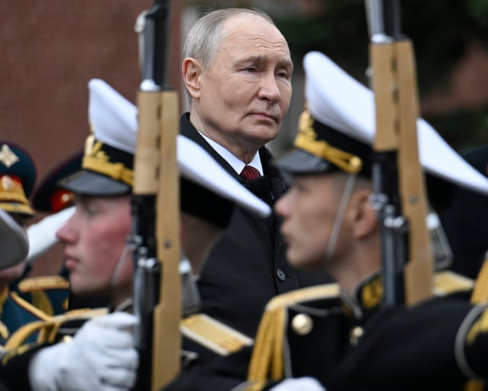
Finally, if an article or feature body contains an element atom followed by a paragraph, the first letter of that paragraph is also styled as a drop cap.Vladimir Putin pulled up to a hotel in central Moscow earlier this May in a Russian-made SUV, dressed casually in jeans and a light jacket. Carrying a bouquet of flowers, he walked unhurriedly into the lobby and hugged his former schoolteacher, Vera Gurevich, who kissed him on both cheeks. He then helped her into his car and drove her to dinner at the Kremlin.
This happened just a day after several Western media outlets, citing a European intelligence report, claimed that Putin had spent weeks hiding in an underground bunker, afraid of being assassinated or even overthrown.
The televised meeting was carefully designed to show a very different side of the Russian leader—one he has polished over 25 years in power: the friendly, confident president, a man of the people casually visiting an old teacher.
Kremlin releases video of Vladimir Putin meeting one of his old school teachers
But while fears of an immediate coup are overblown, there is little doubt that Putin is entering the most difficult period of his long rule. Interviews with several people close to the Russian leader, as well as sources in the Russian business world and Western intelligence officials, describe an isolated leader surrounded by an elite that is growing quickly disillusioned—both with the failing war in Ukraine and the economic troubles at home.
“There’s definitely been a shift in mood among the elites this year … there is deep disappointment in Putin,” said a well-connected business figure.A business leader added that there was “a growing sense that some kind of catastrophe is looming.”
“No one believes everything will suddenly collapse tomorrow,” the source said. “But there is a growing realization that completely senseless, self-destructive decisions keep being made. People who once defended Putin no longer do. Any sense of a future has disappeared.”
Putin’s approval ratings are slipping, the economy is under increasing pressure, and even pro-Kremlin bloggers who have rarely criticized the president are starting to speak out.
Despite these cracks at home, Putin’s thinking on the war in Ukraine has not changed, and he remains determined to keep going, according to interviews with several people familiar with his mindset, as well as European and Ukrainian intelligence officials.
Putin has made it clear to his inner circle that he believes Moscow can capture the entire Donbas region by the end of the year, two sources with access to the president said. “Putin is fixated on Donbas and he won’t stop until that’s achieved,” one of them said.
Speaking after the May 9 Victory Day parade – which was scaled back due to fears of Ukrainian drone attacks – Putin surprised many by suggesting the war was “coming to an end.” The comment made headlines, but those familiar with his thinking caution that it shouldn’t be seen as a sign he’s ready to compromise. Instead, it suggests Putin believes a military breakthrough is near.
A Ukrainian intelligence official said Russian generals had convinced the Russian leader that the Donbas would be taken by the end of the year. “Fabricated reports are being passed up the chain of command, claiming victory is close,” the official said.
That confidence isn’t currently reflected on the battlefield. Military analysts say that at the current pace of advance, it could take Russia years to fully capture the Donbas.
It’s still unclear how much Russia’s military and security services are giving Putin an overly optimistic picture. “Even if many around him understand the reality of the situation, we still don’t know what Putin himself understands. That’s the hardest part,” one senior European intelligence official said.
“Of course, officials and the military paint a rosy picture for the president,” a person familiar with discussions in the Kremlin said. “They lie to him. That’s how the system Putin has built works.”
Another factor in Putin’s decision to keep fighting is that the Russian leader has lost faith in Donald Trump’s ability to pressure Kyiv into giving up territory as part of a deal, according to one source close to Putin and another involved in backchannel talks.
“There was widespread optimism in Moscow that Trump could deliver the Donbas after his election. That has largely faded,” one source in contact with Putin said.
Although Trump has recently repeatedly claimed that the war in Ukraine is coming to an end – with US help – the Russian leadership increasingly sees little value in continuing talks with Washington. Ukraine has acknowledged that Trump’s envoys, Jared Kushner and Steve Witkoff, repeatedly pushed it in a series of meetings to withdraw Ukrainian troops from territory it still controls.Photograph: Telegram/@vorobiev_live/AFP/Getty Images
But Kyiv has also sharply reduced its reliance on Washington, while ramping up its own weapons production. The release of a €90 billion EU loan, along with deeper military and intelligence cooperation with European allies, has further weakened US influence over Ukraine. Kyiv is not inclined to give up territory without solid US security guarantees.
For now, Moscow’s goal is to capture the Donbas, and Russian negotiators have made it clear that Moscow would be ready to seek peace once that happens. However, those close to Putin say his ambitions could grow again if he senses Ukraine starting to collapse. Then, according to two people familiar with his thinking, he might push further, crossing the Dnipro River in an attempt to seize all four Ukrainian regions that Russia claimed to annex in 2022 but still doesn’t fully control.
“He’s not a long-term strategist,” one of them said. “His appetite grows as he eats.”
Discontent at home
Signs of public unrest began appearing earlier in 2026, when the Kremlin banned or restricted most messaging apps, keeping only a state-backed alternative available.
Mobile internet across central Moscow and other regions has been intermittently disrupted or completely shut down, leading Russian businesses to complain about billions of roubles in losses.
Authorities have justified this unprecedented crackdown as a security measure against Ukrainian drone attacks and sabotage operations.
View image in fullscreen: Police speak with a man and a woman carrying a paper map, symbolizing the loss of phone navigation during internet shutdowns, at a protest in St Petersburg against internet restrictions in Russia. Photograph: Andrei Bok/Sopa Images/Shutterstock
The shutdowns sparked dark humor among Moscow’s elite. “At the dinner table, everyone talks about the internet. We’re now somewhere closer to North Korea,” one Kremlin insider said. China’s internet controls, once routinely mocked in Russia as a symbol of censorship, are now discussed with a degree of envy.
The internet shutdowns are overseen by the powerful second service of the FSB, a feared department within the security services responsible for the poisoning of the late opposition leader Alexei Navalny.
At the same time, figures within Russia’s political elite – including Kremlin spokesperson Dmitry Peskov and first deputy chief of staff Sergei Kiriyenko – have privately tried to steer Putin away from some of the harsher restrictions, but without success, according to two people familiar with the discussions.
“As long as the war continues, Putin will favor the security services,” said another figure close to the Kremlin.
“The internet issue is very sensitive for Russian society. And it has sparked a huge wave of outrage,” said Ksenia Sobchak, a well-connected Russian journalist and daughter of Putin’s former political mentor, in a telephone interview.
View image in fullscreen: Police detain an activist during a demonstration against internet limitations, in front of the Russian parliament in 2025. Photograph: AP
Sobchak said it was only a matter of time before Russian authorities went even further and moved to block all Western social media platforms, forcing people onto domestic alternatives. She predicted the move could come as early as next year. “I think a decision has definitely been made to do that,” she said.
For many Russians, the year has also brought higher taxes and rising inflation, with a struggling economy forcing businesses to close and sending the cost of groceries and household bills soaring.
Taken together, Putin appears to have broken one of the unwritten social contracts that underpinned his rule since the invasion began: that ordinary Russians could mostly ignore the war as long as daily life stayed stable.
Across Russian social media, frustration with the authorities has become increasingly visible. Videos showSmall business owners are speaking out against higher taxes, residents are complaining about repeated internet shutdowns, and farmers in Siberia are furious over mass livestock culls ordered by officials—these stories have gone viral.
Russia’s overall happiness index dropped to a 15-year low in April, according to a state pollster, and several polls show Putin’s approval rating at its lowest since Russia launched its full-scale invasion of Ukraine.
“Putin keeps a close eye on his approval ratings. He’s been obsessed with monitoring polls since 1999,” said Alexei Venediktov, a former editor of the radio station Echo of Moscow, which was forced to close after the war began.
Venediktov recalled how Putin once waved polling figures showing overwhelming public support in front of him shortly after the annexation of Crimea—a move the journalist opposed—telling him: “You are not with the people. I am with the people.”
Coup?
While it’s clear that discontent is growing among both the elite and the general population, most analysts believe that if a real threat to Putin’s regime does emerge, it will come from his inner circle, not from the public.
One of the more striking claims reported earlier this month, based on an intelligence report from an unnamed European country, suggested that former defense minister Sergei Shoigu could become a threat to Putin. However, many supporters and critics alike consider an imminent Kremlin coup far-fetched.
Russia’s security services, with Putin’s approval, have arrested several of Shoigu’s closest associates and friends, further isolating the once-powerful former minister amid speculation that he himself could eventually be purged.
“Shoigu has no popularity in the army and no support base,” said a former senior official who knows him personally. “He will never move against Putin.”
Dissent is also unlikely to come from Russia’s oligarchs. Many are privately horrified by the war but remain silent, afraid to speak out, said a leading Russian businessman. Recent months have brought fresh purges and a new wave of state seizures targeting private businesses, most notably the arrest of Vadim Moshkovich, the billionaire founder of a major agricultural firm.
“The business elite are playing Russian roulette. They hope their neighbor gets hit while they are spared,” said Oleg Tinkov, one of the few Russian business leaders who spoke out against the invasion and fled the country.
“Who is going to move against him? Everyone is just waiting for his demise,” Tinkov added.
Meanwhile, the Russian president has increased his travel schedule in recent weeks, in what appears to be a deliberate attempt to counter narratives about his security and alleged paranoia. “Putin has always been obsessed with his security, but it’s wrong to suggest he is hiding,” said one person close to the Kremlin who recently met the president.
“Yes, there is nervousness among the elites. Yes, there is uncertainty. But talk of an existential threat to Putin’s rule is premature. He remains in control.”
The senior European intelligence official said many at the top are “currently in the acknowledgment phase,” recognizing the mounting problems both on the battlefield and in the economy, but without plans to address them.
“They understand it’s a downward trend. But I haven’t heard them asking … ‘What should we do about it then?'”
Frequently Asked Questions
Here is a list of FAQs about the growing mood in Russia regarding Vladimir Putin based on the phrase There is deep disappointment in him
BeginnerLevel Questions
1 What does deep disappointment in him mean when talking about Russia
It means that many Russians who once supported or tolerated Vladimir Putin are now feeling let down They feel he has failed to deliver on promises like a strong economy security or a better future
2 Are Russians turning against Putin
Not all of them but there is a clear shift in mood While public opposition is still risky more people are expressing frustration and disappointment privately and in some cases publicly The war in Ukraine has been a major turning point for many
3 Why are people disappointed in Putin
The main reasons are the long and costly war in Ukraine which has led to high casualties economic problems like inflation and sanctions the loss of young men to war or emigration and a feeling that the country is isolated and going backwards
4 Is this disappointment visible on the streets
Not in large protests because open dissent is heavily suppressed But its visible in other ways people leaving the country low turnout in elections small acts of defiance and a rise in online complaints and dark humor about the government
IntermediateLevel Questions
5 How does the war in Ukraine specifically fuel this disappointment
For many the war started as a special military operation that was supposed to be quick and victorious Instead it has become a long bloody conflict with no clear end This has caused huge losses economic hardship and a sense of national humiliation instead of pride
6 Who is most disappointed in Putin
Its not just liberals Disappointment is growing among several groups the families of soldiers who have been killed or wounded the middle class who see their standard of living dropping and even some nationalists who feel the war is not being fought effectively
7 Does the Russian public blame Putin personally or just the government
Many people still struggle to separate the two but a growing number now directly blame Putin He is seen as the ultimate decisionmaker The phrase deep disappointment suggests a personal betrayal not just policy disagreement
8 What are the risks for ordinary Russians who express this disappointment
It is dangerous Openly criticizing the war or the president can lead