@font-face {
font-family: ‘Guardian Headline Full’;
src: url(‘https://assets.guim.co.uk/static/frontend/fonts/guardian-headline/noalts-not-hinted/GHGuardianHeadline-Light.woff2’) format(‘woff2’),
url(‘https://assets.guim.co.uk/static/frontend/fonts/guardian-headline/noalts-not-hinted/GHGuardianHeadline-Light.woff’) format(‘woff’),
url(‘https://assets.guim.co.uk/static/frontend/fonts/guardian-headline/noalts-not-hinted/GHGuardianHeadline-Light.ttf’) format(‘truetype’);
font-weight: 300;
font-style: normal;
}
@font-face {
font-family: ‘Guardian Headline Full’;
src: url(‘https://assets.guim.co.uk/static/frontend/fonts/guardian-headline/noalts-not-hinted/GHGuardianHeadline-LightItalic.woff2’) format(‘woff2’),
url(‘https://assets.guim.co.uk/static/frontend/fonts/guardian-headline/noalts-not-hinted/GHGuardianHeadline-LightItalic.woff’) format(‘woff’),
url(‘https://assets.guim.co.uk/static/frontend/fonts/guardian-headline/noalts-not-hinted/GHGuardianHeadline-LightItalic.ttf’) format(‘truetype’);
font-weight: 300;
font-style: italic;
}
@font-face {
font-family: ‘Guardian Headline Full’;
src: url(‘https://assets.guim.co.uk/static/frontend/fonts/guardian-headline/noalts-not-hinted/GHGuardianHeadline-Regular.woff2’) format(‘woff2’),
url(‘https://assets.guim.co.uk/static/frontend/fonts/guardian-headline/noalts-not-hinted/GHGuardianHeadline-Regular.woff’) format(‘woff’),
url(‘https://assets.guim.co.uk/static/frontend/fonts/guardian-headline/noalts-not-hinted/GHGuardianHeadline-Regular.ttf’) format(‘truetype’);
font-weight: 400;
font-style: normal;
}
@font-face {
font-family: ‘Guardian Headline Full’;
src: url(‘https://assets.guim.co.uk/static/frontend/fonts/guardian-headline/noalts-not-hinted/GHGuardianHeadline-RegularItalic.woff2’) format(‘woff2’),
url(‘https://assets.guim.co.uk/static/frontend/fonts/guardian-headline/noalts-not-hinted/GHGuardianHeadline-RegularItalic.woff’) format(‘woff’),
url(‘https://assets.guim.co.uk/static/frontend/fonts/guardian-headline/noalts-not-hinted/GHGuardianHeadline-RegularItalic.ttf’) format(‘truetype’);
font-weight: 400;
font-style: italic;
}
@font-face {
font-family: ‘Guardian Headline Full’;
src: url(‘https://assets.guim.co.uk/static/frontend/fonts/guardian-headline/noalts-not-hinted/GHGuardianHeadline-Medium.woff2’) format(‘woff2’),
url(‘https://assets.guim.co.uk/static/frontend/fonts/guardian-headline/noalts-not-hinted/GHGuardianHeadline-Medium.woff’) format(‘woff’),
url(‘https://assets.guim.co.uk/static/frontend/fonts/guardian-headline/noalts-not-hinted/GHGuardianHeadline-Medium.ttf’) format(‘truetype’);
font-weight: 500;
font-style: normal;
}
@font-face {
font-family: ‘Guardian Headline Full’;
src: url(‘https://assets.guim.co.uk/static/frontend/fonts/guardian-headline/noalts-not-hinted/GHGuardianHeadline-MediumItalic.woff2’) format(‘woff2’),
url(‘https://assets.guim.co.uk/static/frontend/fonts/guardian-headline/noalts-not-hinted/GHGuardianHeadline-MediumItalic.woff’) format(‘woff’),
url(‘https://assets.guim.co.uk/static/frontend/fonts/guardian-headline/noalts-not-hinted/GHGuardianHeadline-MediumItalic.ttf’) format(‘truetype’);
font-weight: 500;
font-style: italic;
}
@font-face {
font-family: ‘Guardian Headline Full’;
src: url(‘https://assets.guim.co.uk/static/frontend/fonts/guardian-headline/noalts-not-hinted/GHGuardianHeadline-Semibold.woff2’) format(‘woff2’),
url(‘https://assets.guim.co.uk/static/frontend/fonts/guardian-headline/noalts-not-hinted/GHGuardianHeadline-Semibold.woff’) format(‘woff’),
url(‘https://assets.guim.co.uk/static/frontend/fonts/guardian-headline/noalts-not-hinted/GHGuardianHeadline-Semibold.ttf’) format(‘truetype’);
font-weight: 600;
font-style: normal;
}
@font-face {
font-family: ‘Guardian Headline Full’;
src: url(‘https://assets.guim.co.uk/static/frontend/fonts/guardian-headline/noalts-not-hinted/GHGuardianHeadline-SemiboldItalic.woff2’) format(‘woff2’),
url(‘https://assets.guim.co.uk/static/frontend/fonts/guardian-headline/noalts-not-hinted/GHGuardianHeadline-SemiboldItalic.woff’) format(‘woff’),
url(‘https://assets.guim.co.uk/static/frontend/fonts/guardian-headline/noalts-not-hinted/GHGuardianHeadline-SemiboldItalic.ttf’) format(‘truetype’);
font-weight: 600;
font-style: italic;
}Here is the rewritten text in fluent, natural English:
“`css
@font-face {
font-family: ‘Guardian Headline Full’;
src: url(‘https://assets.guim.co.uk/static/frontend/fonts/guardian-headline/noalts-not-hinted/GHGuardianHeadline-Bold.woff2’) format(‘woff2’),
url(‘https://assets.guim.co.uk/static/frontend/fonts/guardian-headline/noalts-not-hinted/GHGuardianHeadline-Bold.woff’) format(‘woff’),
url(‘https://assets.guim.co.uk/static/frontend/fonts/guardian-headline/noalts-not-hinted/GHGuardianHeadline-Bold.ttf’) format(‘truetype’);
font-weight: 700;
font-style: normal;
}
@font-face {
font-family: ‘Guardian Headline Full’;
src: url(‘https://assets.guim.co.uk/static/frontend/fonts/guardian-headline/noalts-not-hinted/GHGuardianHeadline-BoldItalic.woff2’) format(‘woff2’),
url(‘https://assets.guim.co.uk/static/frontend/fonts/guardian-headline/noalts-not-hinted/GHGuardianHeadline-BoldItalic.woff’) format(‘woff’),
url(‘https://assets.guim.co.uk/static/frontend/fonts/guardian-headline/noalts-not-hinted/GHGuardianHeadline-BoldItalic.ttf’) format(‘truetype’);
font-weight: 700;
font-style: italic;
}
@font-face {
font-family: ‘Guardian Headline Full’;
src: url(‘https://assets.guim.co.uk/static/frontend/fonts/guardian-headline/noalts-not-hinted/GHGuardianHeadline-Black.woff2’) format(‘woff2’),
url(‘https://assets.guim.co.uk/static/frontend/fonts/guardian-headline/noalts-not-hinted/GHGuardianHeadline-Black.woff’) format(‘woff’),
url(‘https://assets.guim.co.uk/static/frontend/fonts/guardian-headline/noalts-not-hinted/GHGuardianHeadline-Black.ttf’) format(‘truetype’);
font-weight: 900;
font-style: normal;
}
@font-face {
font-family: ‘Guardian Headline Full’;
src: url(‘https://assets.guim.co.uk/static/frontend/fonts/guardian-headline/noalts-not-hinted/GHGuardianHeadline-BlackItalic.woff2’) format(‘woff2’),
url(‘https://assets.guim.co.uk/static/frontend/fonts/guardian-headline/noalts-not-hinted/GHGuardianHeadline-BlackItalic.woff’) format(‘woff’),
url(‘https://assets.guim.co.uk/static/frontend/fonts/guardian-headline/noalts-not-hinted/GHGuardianHeadline-BlackItalic.ttf’) format(‘truetype’);
font-weight: 900;
font-style: italic;
}
@font-face {
font-family: ‘Guardian Titlepiece’;
src: url(‘https://assets.guim.co.uk/static/frontend/fonts/guardian-titlepiece/noalts-not-hinted/GTGuardianTitlepiece-Bold.woff2’) format(‘woff2’),
url(‘https://assets.guim.co.uk/static/frontend/fonts/guardian-titlepiece/noalts-not-hinted/GTGuardianTitlepiece-Bold.woff’) format(‘woff’),
url(‘https://assets.guim.co.uk/static/frontend/fonts/guardian-titlepiece/noalts-not-hinted/GTGuardianTitlepiece-Bold.ttf’) format(‘truetype’);
font-weight: 700;
font-style: normal;
}
@font-face {
font-family: ‘Guardian Headline Full’;
src: url(‘https://assets.guim.co.uk/static/frontend/fonts/guardian-headline/noalts-not-hinted/GHGuardianHeadline-Light.woff2’) format(‘woff2’),
url(‘https://assets.guim.co.uk/static/frontend/fonts/guardian-headline/noalts-not-hinted/GHGuardianHeadline-Light.woff’) format(‘woff’),
url(‘https://assets.guim.co.uk/static/frontend/fonts/guardian-headline/noalts-not-hinted/GHGuardianHeadline-Light.ttf’) format(‘truetype’);
font-weight: 300;
font-style: normal;
}
@font-face {
font-family: ‘Guardian Headline Full’;
src: url(‘https://assets.guim.co.uk/static/frontend/fonts/guardian-headline/noalts-not-hinted/GHGuardianHeadline-LightItalic.woff2’) format(‘woff2’),
url(‘https://assets.guim.co.uk/static/frontend/fonts/guardian-headline/noalts-not-hinted/GHGuardianHeadline-LightItalic.woff’) format(‘woff’),
url(‘https://assets.guim.co.uk/static/frontend/fonts/guardian-headline/noalts-not-hinted/GHGuardianHeadline-LightItalic.ttf’) format(‘truetype’);
font-weight: 300;
font-style: italic;
}
@font-face {
font-family: ‘Guardian Headline Full’;
src: url(‘https://assets.guim.co.uk/static/frontend/fonts/guardian-headline/noalts-not-hinted/GHGuardianHeadline-Regular.woff2’) format(‘woff2’),
url(‘https://assets.guim.co.uk/static/frontend/fonts/guardian-headline/noalts-not-hinted/GHGuardianHeadline-Regular.woff’) format(‘woff’),
url(‘https://assets.guim.co.uk/static/frontend/fonts/guardian-headline/noalts-not-hinted/GHGuardianHeadline-Regular.ttf’) format(‘truetype’);
font-weight: 400;
font-style: normal;
}
@font-face {
font-family: ‘Guardian Headline Full’;
src: url(‘https://assets.guim.co.uk/static/frontend/fonts/guardian-headline/noalts-not-hinted/GHGuardianHeadline-RegularItalic.woff2’) format(‘woff2’),
url(‘https://assets.guim.co.uk/static/frontend/fonts/guardian-headline/noalts-not-hinted/GHGuardianHeadline-RegularItalic.woff’) format(‘woff’),
url(‘https://assets.guim.co.uk/static/frontend/fonts/guardian-headline/noalts-not-hinted/GHGuardianHeadline-RegularItalic.ttf’) format(‘truetype’);
font-weight: 400;
font-style: italic;
}
“`Here is the rewritten text in fluent, natural English:
“`css
@font-face {
font-family: ‘Guardian Headline Full’;
src: url(‘https://assets.guim.co.uk/static/frontend/fonts/guardian-headline/noalts-not-hinted/GHGuardianHeadline-RegularItalic.woff2’) format(‘woff2’),
url(‘https://assets.guim.co.uk/static/frontend/fonts/guardian-headline/noalts-not-hinted/GHGuardianHeadline-RegularItalic.woff’) format(‘woff’),
url(‘https://assets.guim.co.uk/static/frontend/fonts/guardian-headline/noalts-not-hinted/GHGuardianHeadline-RegularItalic.ttf’) format(‘truetype’);
font-weight: 400;
font-style: italic;
}
@font-face {
font-family: ‘Guardian Headline Full’;
src: url(‘https://assets.guim.co.uk/static/frontend/fonts/guardian-headline/noalts-not-hinted/GHGuardianHeadline-Medium.woff2’) format(‘woff2’),
url(‘https://assets.guim.co.uk/static/frontend/fonts/guardian-headline/noalts-not-hinted/GHGuardianHeadline-Medium.woff’) format(‘woff’),
url(‘https://assets.guim.co.uk/static/frontend/fonts/guardian-headline/noalts-not-hinted/GHGuardianHeadline-Medium.ttf’) format(‘truetype’);
font-weight: 500;
font-style: normal;
}
@font-face {
font-family: ‘Guardian Headline Full’;
src: url(‘https://assets.guim.co.uk/static/frontend/fonts/guardian-headline/noalts-not-hinted/GHGuardianHeadline-MediumItalic.woff2’) format(‘woff2’),
url(‘https://assets.guim.co.uk/static/frontend/fonts/guardian-headline/noalts-not-hinted/GHGuardianHeadline-MediumItalic.woff’) format(‘woff’),
url(‘https://assets.guim.co.uk/static/frontend/fonts/guardian-headline/noalts-not-hinted/GHGuardianHeadline-MediumItalic.ttf’) format(‘truetype’);
font-weight: 500;
font-style: italic;
}
@font-face {
font-family: ‘Guardian Headline Full’;
src: url(‘https://assets.guim.co.uk/static/frontend/fonts/guardian-headline/noalts-not-hinted/GHGuardianHeadline-Semibold.woff2’) format(‘woff2’),
url(‘https://assets.guim.co.uk/static/frontend/fonts/guardian-headline/noalts-not-hinted/GHGuardianHeadline-Semibold.woff’) format(‘woff’),
url(‘https://assets.guim.co.uk/static/frontend/fonts/guardian-headline/noalts-not-hinted/GHGuardianHeadline-Semibold.ttf’) format(‘truetype’);
font-weight: 600;
font-style: normal;
}
@font-face {
font-family: ‘Guardian Headline Full’;
src: url(‘https://assets.guim.co.uk/static/frontend/fonts/guardian-headline/noalts-not-hinted/GHGuardianHeadline-SemiboldItalic.woff2’) format(‘woff2’),
url(‘https://assets.guim.co.uk/static/frontend/fonts/guardian-headline/noalts-not-hinted/GHGuardianHeadline-SemiboldItalic.woff’) format(‘woff’),
url(‘https://assets.guim.co.uk/static/frontend/fonts/guardian-headline/noalts-not-hinted/GHGuardianHeadline-SemiboldItalic.ttf’) format(‘truetype’);
font-weight: 600;
font-style: italic;
}
@font-face {
font-family: ‘Guardian Headline Full’;
src: url(‘https://assets.guim.co.uk/static/frontend/fonts/guardian-headline/noalts-not-hinted/GHGuardianHeadline-Bold.woff2’) format(‘woff2’),
url(‘https://assets.guim.co.uk/static/frontend/fonts/guardian-headline/noalts-not-hinted/GHGuardianHeadline-Bold.woff’) format(‘woff’),
url(‘https://assets.guim.co.uk/static/frontend/fonts/guardian-headline/noalts-not-hinted/GHGuardianHeadline-Bold.ttf’) format(‘truetype’);
font-weight: 700;
font-style: normal;
}
@font-face {
font-family: ‘Guardian Headline Full’;
src: url(‘https://assets.guim.co.uk/static/frontend/fonts/guardian-headline/noalts-not-hinted/GHGuardianHeadline-BoldItalic.woff2’) format(‘woff2’),
url(‘https://assets.guim.co.uk/static/frontend/fonts/guardian-headline/noalts-not-hinted/GHGuardianHeadline-BoldItalic.woff’) format(‘woff’),
url(‘https://assets.guim.co.uk/static/frontend/fonts/guardian-headline/noalts-not-hinted/GHGuardianHeadline-BoldItalic.ttf’) format(‘truetype’);
font-weight: 700;
font-style: italic;
}
@font-face {
font-family: ‘Guardian Headline Full’;
src: url(‘https://assets.guim.co.uk/static/frontend/fonts/guardian-headline/noalts-not-hinted/GHGuardianHeadline-Black.woff2’) format(‘woff2’),
url(‘https://assets.guim.co.uk/static/frontend/fonts/guardian-headline/noalts-not-hinted/GHGuardianHeadline-Black.woff’) format(‘woff’),
url(‘https://assets.guim.co.uk/static/frontend/fonts/guardian-headline/noalts-not-hinted/GHGuardianHeadline-Black.ttf’) format(‘truetype’);
font-weight: 900;
font-style: normal;
}
@font-face {
font-family: ‘Guardian Headline Full’;
src: url(‘https://assets.guim.co.uk/static/frontend/fonts/guardian-headline/noalts-not-hinted/GHGuardianHeadline-BlackItalic.woff2’) format(‘woff2’),
url(‘https://assets.guim.co.uk/static/frontend/fonts/guardian-headline/noalts-not-hinted/GHGuardianHeadline-BlackItalic.woff’) format(‘woff’),
url(‘https://assets.guim.co.uk/static/frontend/fonts/guardian-headline/noalts-not-hinted/GHGuardianHeadline-BlackItalic.ttf’) format(‘truetype’);
font-weight: 900;
font-style: italic;
}
“““css
@font-face {
font-family: ‘Guardian Headline’;
src: url(‘https://assets.guim.co.uk/static/frontend/fonts/guardian-headline/noalts-not-hinted/GHGuardianHeadline-BlackItalic.woff’) format(‘woff’),
url(‘https://assets.guim.co.uk/static/frontend/fonts/guardian-headline/noalts-not-hinted/GHGuardianHeadline-BlackItalic.ttf’) format(‘truetype’);
font-weight: 900;
font-style: italic;
}
@font-face {
font-family: ‘Guardian Titlepiece’;
src: url(‘https://assets.guim.co.uk/static/frontend/fonts/guardian-titlepiece/noalts-not-hinted/GTGuardianTitlepiece-Bold.woff2’) format(‘woff2’),
url(‘https://assets.guim.co.uk/static/frontend/fonts/guardian-titlepiece/noalts-not-hinted/GTGuardianTitlepiece-Bold.woff’) format(‘woff’),
url(‘https://assets.guim.co.uk/static/frontend/fonts/guardian-titlepiece/noalts-not-hinted/GTGuardianTitlepiece-Bold.ttf’) format(‘truetype’);
font-weight: 700;
font-style: normal;
}
#article-body > div .content–interactive-grid,
.content–interactive > div .content–interactive-grid,
#comment-body .content–interactive-grid,
[data-gu-name=”body”] .content–interactive-grid,
#feature-body .content–interactive-grid {
grid-column-gap: 0px;
grid-template-columns: 100%;
grid-template-areas:
“media”
“title”
“headline”
“standfirst”
“lines”
“meta”
“body”;
}
@media (min-width: 30em) {
#article-body > div .content–interactive-grid figure.element–immersive figcaption,
.content–interactive > div .content–interactive-grid figure.element–immersive figcaption,
#comment-body .content–interactive-grid figure.element–immersive figcaption,
[data-gu-name=”body”] .content–interactive-grid figure.element–immersive figcaption,
#feature-body .content–interactive-grid figure.element–immersive figcaption {
padding: 0 20px;
max-width: 620px;
}
}
@media (min-width: 46.25em) {
#article-body > div .content–interactive-grid,
.content–interactive > div .content–interactive-grid,
#comment-body .content–interactive-grid,
[data-gu-name=”body”] .content–interactive-grid,
#feature-body .content–interactive-grid {
grid-template-columns: 100%;
grid-column-gap: 10px;
grid-template-areas:
“title”
“headline”
“standfirst”
“media”
“lines”
“meta”
“body”;
}
#article-body > div .content–interactive-grid #maincontent,
.content–interactive > div .content–interactive-grid #maincontent,
#comment-body .content–interactive-grid #maincontent,
[data-gu-name=”body”] .content–interactive-grid #maincontent,
#feature-body .content–interactive-grid #maincontent {
padding-right: 80px;
}
}
@media (min-width: 61.25em) {
#article-body > div .content–interactive-grid,
.content–interactive > div .content–interactive-grid,
#comment-body .content–interactive-grid,
[data-gu-name=”body”] .content–interactive-grid,
#feature-body .content–interactive-grid {
grid-template-columns: 620px 300px;
grid-template-areas:
“title right-column”
“headline right-column”
“standfirst right-column”
“media right-column”
“lines right-column”
“meta right-column”
“body right-column”
“. right-column”;
}
#article-body > div .content–interactive-grid #maincontent,
.content–interactive > div .content–interactive-grid #maincontent,
#comment-body .content–interactive-grid #maincontent,
[data-gu-name=”body”] .content–interactive-grid #maincontent,
#feature-body .content–interactive-grid #maincontent {
padding-right: unset;
}
}
@media (min-width: 71.25em) {
#article-body > div .content–interactive-grid,
.content–interactive > div .content–interactive-grid,
#comment-body .content–interactive-grid,
[data-gu-name=”body”] .content–interactive-grid,
#feature-body .content–interactive-grid {
grid-template-columns: 140px 1px 620px 300px;
grid-template-areas:
“title border headline right-column”
“. border standfirst right-column”
“. border media right-column”
“. border body right-column”
“. border . right-column”;
}
#article-body > div .content–interactive-grid .content__standfirst,
.content–interactive > div .content–interactive-grid .content__standfirst,
#comment-body .content–interactive-grid .content__standfirst,
[data-gu-name=”body”] .content–interactive-grid .content__standfirst,
#feature-body .content–interactive-grid .content__standfirst {
padding-bottom: 0;
}
#article-body > div .content–interactive-grid figure.element–immersive figcaption,
.content–interactive > div .content–interactive-grid figure.element–immersive figcaption,
#comment-body .content–interactive-grid figure.element–immersive figcaption,
[data-gu-name=”body”] .content–interactive-grid figure.element–immersive figcaption,
#feature-body .content–interactive-grid figure.element–immersive figcaption {
/ original text cut off here /
}
}
“`Here’s the rewritten version in fluent, natural English:
For interactive grid figures with immersive elements, the caption should have 4 pixels of padding at the top and none at the bottom. This applies to various sections like the body, feature body, and comment sections.
In the interactive grid layout, the lines and meta sections should be placed in the grid area starting at row 2, column 1, and ending at row 5, column 2. This applies across all relevant sections.
The lines section should have a height set to “max-content” and a top margin of 5 pixels. The meta section should have a top margin of 18 pixels.
For screens wider than 81.25em (about 1300 pixels), the interactive grid should use a column layout of 219px, 1px, 620px, 80px, and 300px.
On iOS and Android devices, the article header’s standfirst text should use the Guardian Headline font family with a weight of 500. The article kicker section should be displayed as a block, with the first letter capitalized. The keyline-4 element should have 12 pixels of top padding. The byline author name should use the Guardian Headline font family with a weight of 700, and any links within it should also be bold.
For images in articles on iOS and Android, the figure inner container should have its height set to “auto.” If an atom element is followed by a paragraph, there should be no top margin on that paragraph.
Finally, the Guardian Headline Full font is defined in two styles: light (weight 300) and light italic (weight 300), both using the same font family name.I’m sorry, but the text you’ve provided appears to be CSS code for defining font faces, not a passage of written English that can be rewritten. Could you please provide the actual text you’d like me to rewrite?Here’s the rewritten version in fluent, natural English:
“`css
@font-face {
font-family: Guardian Headline Full;
src: url(https://assets.guim.co.uk/static/frontend/fonts/guardian-headline/noalts-not-hinted/GHGuardianHeadline-Black.woff2) format(“woff2”),
url(https://assets.guim.co.uk/static/frontend/fonts/guardian-headline/noalts-not-hinted/GHGuardianHeadline-Black.woff) format(“woff”),
url(https://assets.guim.co.uk/static/frontend/fonts/guardian-headline/noalts-not-hinted/GHGuardianHeadline-Black.ttf) format(“truetype”);
font-weight: 900;
font-style: normal;
}
@font-face {
font-family: Guardian Headline Full;
src: url(https://assets.guim.co.uk/static/frontend/fonts/guardian-headline/noalts-not-hinted/GHGuardianHeadline-BlackItalic.woff2) format(“woff2”),
url(https://assets.guim.co.uk/static/frontend/fonts/guardian-headline/noalts-not-hinted/GHGuardianHeadline-BlackItalic.woff) format(“woff”),
url(https://assets.guim.co.uk/static/frontend/fonts/guardian-headline/noalts-not-hinted/GHGuardianHeadline-BlackItalic.ttf) format(“truetype”);
font-weight: 900;
font-style: italic;
}
@font-face {
font-family: Guardian Titlepiece;
src: url(https://assets.guim.co.uk/static/frontend/fonts/guardian-titlepiece/noalts-not-hinted/GTGuardianTitlepiece-Bold.woff2) format(“woff2”),
url(https://assets.guim.co.uk/static/frontend/fonts/guardian-titlepiece/noalts-not-hinted/GTGuardianTitlepiece-Bold.woff) format(“woff”),
url(https://assets.guim.co.uk/static/frontend/fonts/guardian-titlepiece/noalts-not-hinted/GTGuardianTitlepiece-Bold.ttf) format(“truetype”);
font-weight: 700;
font-style: normal;
}
@media (min-width: 71.25em) {
.content__main-column–interactive {
margin-left: 160px;
}
}
@media (min-width: 81.25em) {
.content__main-column–interactive {
margin-left: 240px;
}
}
.content__main-column–interactive .element-atom {
max-width: 620px;
}
@media (max-width: 46.24em) {
.content__main-column–interactive .element-atom {
max-width: 100%;
}
}
.content__main-column–interactive .element-showcase {
margin-left: 0;
}
@media (min-width: 46.25em) {
.content__main-column–interactive .element-showcase {
max-width: 620px;
}
}
@media (min-width: 71.25em) {
.content__main-column–interactive .element-showcase {
max-width: 860px;
}
}
.content__main-column–interactive .element-immersive {
max-width: 1100px;
}
@media (max-width: 46.24em) {
.content__main-column–interactive .element-immersive {
width: calc(100vw – var(–scrollbar-width, 0px));
position: relative;
left: 50%;
right: 50%;
margin-left: calc(-50vw + var(–half-scrollbar-width, 0px)) !important;
margin-right: calc(-50vw + var(–half-scrollbar-width, 0px)) !important;
}
}
@media (min-width: 46.25em) {
.content__main-column–interactive .element-immersive {
transform: translate(-20px);
width: calc(100% + 60px);
}
}
@media (max-width: 71.24em) {
.content__main-column–interactive .element-immersive {
margin-left: 0;
margin-right: 0;
}
}
@media (min-width: 71.25em) {
.content__main-column–interactive .element-immersive {
transform: translate(0);
width: auto;
}
}
@media (min-width: 81.25em) {
.content__main-column–interactive .element-immersive {
max-width: 1260px;
}
}
.content__main-column–interactive p,
.content__main-column–interactive ul {
max-width: 620px;
}
.content__main-column–interactive:before {
position: absolute;
top: 0;
height: calc(100% + 15px);
min-height: 100px;
content: “”;
}
@media (min-width: 71.25em) {
.content__main-column–interactive:before {
border-left: 1px solid #dcdcdc;
z-index: -1;
left: -10px;
}
}
@media (min-width: 81.25em) {
.content__main-column–interactive:before {
border-left: 1px solid #dcdcdc;
left: -11px;
}
}
.content__main-column–interactive .element-atom {
margin-top: 0;
margin-bottom: 0;
padding-bottom: 12px;
padding-top: 12px;
}
.content__main-column–interactive p + .element-atom {
padding-top: 0;
padding-bottom: 0;
margin-top: 12px;
margin-bottom: 12px;
}
.content__main-column–interactive .element-inline {
max-width: 620px;
}
@media (min-width: 61.25em) {
figure[data-spacefinder-role=”inline”].element {
max-width: 620px;
}
}
[data-gu-name=”media”]:has(figure.loop) figure.loop figcaption:not(.hidden) {
z-index: 6;
}
[data-gu-name=”media”]:has(figure.loop) figure.loop button[data-link-name*=”gu-video-loop”] {
width: 32px;
align-self: flex-end;
margin-bottom: 40px;
margin-right: 3px;
}
[data-gu-name=”media”]:has(figure.loop) #caption-button {
z-index: 100;
}
@media (min-width: 46.25em) {
[data-gu-name=”media”]:has(figure.cinemagraph) .cine {
/ No styles defined here /
}
}
“`Here is the rewritten text in fluent, natural English:
Remove the max-height limit on div elements inside magraph.
For the body section, self-hosted video islands should be full width, up to 620px wide, displayed as a block, with 12px margin on top and bottom.
Inside these video islands, any figure or video with the “loop” class should also be full width, auto height, max 620px, and centered.
If a video island contains a figure with both the “loop” and “element-video-immersive” classes, remove the max-width and set the margin to 12px on top and bottom only.
In that case, the figure and video inside should also have no max-width and no margin.
On screens wider than 71.25em (1140px), an immersive video island should be 1140px wide with a left margin of -180px. The figure caption inside should have a left margin of 20px.
On screens wider than 81.25em (1300px), the immersive video island should be 1300px wide with a left margin of -260px.
Define these CSS custom properties:
– dateline: #606060
– headerBorder: #dcdcdc
– captionText: #999
– captionBackground: hsla(0, 0%, 7%, 0.72)
– feature: #c70000
– new-pillar-colour: uses the primary pillar variable, or falls back to feature
Also set:
– subheading-text, pullquote-text, and pullquote-icon to the secondary pillar variable
– block-quote-text to the article text variable
– blockquote fill to the secondary pillar variable
In dark mode (when the user hasn’t set a light color scheme), override:
– subheading-text, pullquote-text, and pullquote-icon to the dark mode pillar variable
– blockquote fill to the dark mode pillar variable
For interactive content and the main column, element atoms should have no padding.
When an element atom or a horizontal rule (that isn’t the last one) is immediately followed by a paragraph, add 14px of padding to the top of that paragraph.
The first letter of that paragraph should also have the same styling as the first letter of any paragraph that follows an element atom or sign-in gate.Here is the rewritten text in fluent, natural English:
For the first letter of the first paragraph after certain elements (like specific containers or horizontal rules), the styling uses the Guardian Headline font family, with a bold weight, a font size of 111px, and a line height of 92px. It is floated to the left, transformed to uppercase, and has a right margin of 8px. The color is set by a custom property for drop caps, or falls back to the pillar color.
In article bodies, comment sections, and feature bodies, any paragraph that directly follows a horizontal rule has no top padding.
Pull quotes in these sections have a maximum width of 620px.
For showcase images in main content, feature, standard, and comment article containers, the caption is positioned statically and takes up the full width, with a maximum of 620px. On screens wider than 71.25em, the caption becomes absolutely positioned with a max width of 140px. On screens wider than 81.25em, the max width increases to 220px.
Immersive elements take up the full viewport width minus the scrollbar width. On screens narrower than 71.24em, they have a max width of 978px, and their captions have 10px of padding on each side. On screens between 30em and 71.24em, the caption padding increases to 20px. On screens between 46.25em and 61.24em, the max width is 738px. On screens narrower than 46.24em, the immersive element is shifted left by 10px (or 20px on screens wider than 30em), with no right margin.
For showcase figures in the body on screens wider than 71.25em, the left margin is set to -160px. On screens wider than 81.25em, it becomes -240px.
On screens wider than 61.25em, the furniture wrapper uses a CSS grid with a 20px column gap, no row gap, and a template that starts with a title and a headline star.The layout uses a grid with columns defined as: [title-start, standfirst-start] repeat(5, 1fr) [title-end, headline-end, meta-end, standfirst-end, portrait-start] repeat(5, 1fr) [portrait-end]. The rows are: [title-start, portrait-start] 0.25fr [title-end, headline-start] 1fr [headline-end, standfirst-start] 0.75fr [standfirst-end, meta-start] auto [meta-end, portrait-end].
In the furniture wrapper, the first child of the headline section has a top border of 1px solid using the variable –headerBorder. The meta section is positioned relatively, with 2px padding on top and no right margin. The standfirst content has a bottom margin of 4px. List items in the standfirst use a font size of 20px. Links in the standfirst have no bottom border, no background image, and are underlined with a 6px offset, using the –headerBorder color (default #dcdcdc). On hover, the underline color changes to –new-pillar-colour. The first paragraph in the standfirst has a top border of 1px solid –headerBorder and no bottom padding.
For screens wider than 61.25em and 71.25em, the first paragraph in the standfirst has no top border. At 61.25em and above, figures have a left margin of 0 and a negative left margin of 10px. Inline figures with the data-spacefinder-role attribute have a max width of 630px.
At 71.25em and above, the grid columns change to: [title-start, headline-start, meta-start] repeat(2, 1fr) [meta-end, standfirst-start] repeat(5, 1fr) [title-end, headline-end, standfirst-end, portrait-start] repeat(7, 1fr) [portrait-end]. Rows become: [title-start, portrait-start] 80px [title-end, headline-start] auto [headline-end, standfirst-start, meta-start] auto [standfirst-end, meta-end, portrait-end]. The meta section has a pseudo-element with a 540px wide line at the top, using –headerBorder. Standfirst paragraphs have no top border. The standfirst also has a pseudo-element with a 1px wide line on the left, using –headerBorder, spanning the full height.
At 81.25em and above, the grid columns are: [title-start, headline-start, meta-start] repeat(3, 1fr) [meta-end, standfirst-start] repeat(5, 1fr) [title-end, headline-end, standfirst-end, portrait-start] repeat(8, 1fr) [portrait-end]. Rows are: [title-start, portrait-start] 0.25fr [title-end, headline-start] 1fr [headline-end, standfirst-start, meta-start] 0.75fr [standfirst-end, meta-end, portrait-end]. The meta pseudo-element width increases to 620px, and the standfirst pseudo-element shifts slightly to the left by -0.5px.
In the article header, the labels section within the title has 2px padding on top. The headline h1 has no additional styling specified.Here is the rewritten text in fluent, natural English:
h1 {
font-weight: 600;
max-width: 620px;
font-size: 32px;
}
@media (min-width: 71.25em) {
.furniture-wrapper #headline h1,
.furniture-wrapper [data-gu-name=headline] h1,
.furniture-wrapper .headline h1 {
max-width: 540px;
font-size: 50px;
}
}
@media (min-width: 46.25em) {
.furniture-wrapper .keyline-4,
.furniture-wrapper [data-gu-name=lines] {
margin-right: 0;
}
}
@media (min-width: 61.25em) {
.furniture-wrapper .keyline-4,
.furniture-wrapper [data-gu-name=lines] {
display: none;
}
}
.furniture-wrapper .keyline-4 svg,
.furniture-wrapper [data-gu-name=lines] svg {
stroke: var(–headerBorder);
}
@media (min-width: 46.25em) {
.furniture-wrapper #meta,
.furniture-wrapper [data-gu-name=meta] {
margin-right: 0;
}
}
.furniture-wrapper #meta .meta__social,
.furniture-wrapper #meta .meta__social ul li a span,
.furniture-wrapper #meta .meta__comment,
.furniture-wrapper [data-gu-name=meta] .meta__social,
.furniture-wrapper [data-gu-name=meta] .meta__social ul li a span,
.furniture-wrapper [data-gu-name=meta] .meta__comment {
border-color: var(–headerBorder);
}
.furniture-wrapper #meta .content__meta-container_dcr > div > gu-island,
.furniture-wrapper [data-gu-name=meta] .content__meta-container_dcr > div > gu-island {
display: none;
}
.furniture-wrapper .standfirst,
.furniture-wrapper #standfirst,
.furniture-wrapper [data-gu-name=standfirst] {
margin-left: -10px;
padding-left: 10px;
position: relative;
}
@media (min-width: 46.25em) {
.furniture-wrapper .standfirst,
.furniture-wrapper #standfirst,
.furniture-wrapper [data-gu-name=standfirst] {
padding-top: 2px;
}
}
.furniture-wrapper .standfirst p,
.furniture-wrapper #standfirst p,
.furniture-wrapper [data-gu-name=standfirst] p {
font-weight: 400;
font-size: 20px;
padding-bottom: 14px;
}
.furniture-wrapper #main-media,
.furniture-wrapper [data-gu-name=media] {
position: relative;
margin-top: 0;
margin-bottom: 2px;
grid-area: portrait;
}
.furniture-wrapper #main-media div div,
.furniture-wrapper [data-gu-name=media] div div {
width: 100%;
margin-inline: 0;
}
@media (min-width: 61.25em) {
.furniture-wrapper #main-media,
.furniture-wrapper [data-gu-name=media] {
margin-bottom: 0;
}
}
@media (max-width: 46.24em) {
.furniture-wrapper #main-media,
.furniture-wrapper [data-gu-name=media] {
width: calc(100vw – var(–scrollbar-width, 0px));
margin-left: -10px;
}
}
@media (max-width: 46.24em) and (min-width: 30em) {
.furniture-wrapper #main-media,
.furniture-wrapper [data-gu-name=media] {
margin-left: -20px;
}
}
.furniture-wrapper figcaption {
position: absolute;
bottom: 0;
padding: 4px 10px 12px;
background-color: var(–captionBackground);
color: var(–captionText);
max-width: unset;
width: 100%;
margin-bottom: 0;
min-height: 46px;
}
.furniture-wrapper figcaption span {
color: var(–headerBorder);
}
.furniture-wrapper figcaption span svg {
fill: var(–headerBorder);
}
.furniture-wrapper figcaption span:nth-of-type(1) {
display: none;
}
.furniture-wrapper figcaption span:nth-of-type(2) {
display: block;
max-width: 90%;
}
@media (min-width: 30em) {
.furniture-wrapper figcaption {
padding: 4px 20px 12px;
}
}
.furniture-wrapper figcaption.hidden {
opacity: 0;
}
.furniture-wrapper #caption-button {
display: block;
position: absolute;
bottom: 10px;
right: 8px;
z-index: 30;
background-color: var(–captionBackground);
border: none;
border-radius: 50%;
padding: 6px 5px 5px;
}
.furniture-wrapper #caption-button svg {
transform: scale(0.85);
}
@media (min-width: 30em) {
.furniture-wrapper #caption-button {
right: 10px;
}
}
@media (min-width: 71.25em) {
.content__main-column–interactive:before {
top: -12px !important;
height: calc(100% + 24px) !important;
}
}
.content__main-column–interactive h2 {
max-width: 620px;
}
:root:has(.ios, .android) {
–darkBackground: #1a1a1a;
–feature: #c70000;
–darkmodeFeature: #ff5943;
–new-pillar-colour: var(–primary-pillar, var(–feature));
}
@media (prefers-color-scheme: dark) {
:root:has(.ios, .android) {
–new-pillar-colour: var(–darkmode-pillar, var(–darkmodeFeature));
}
}
body.ios #feature-article-container .element-atom:first-of-type + p:first-of-type:first-letter,
body.ios #feature-article-container .element-atom:first-of-type + .sign-in-gate + p:first-of-type:first-letter,
body.ios #feature-article-container .element-atom:first-of-type + #sign-in-gate + p:first-of-type:first-letter,
body.ios #standard-article-container .element-atom:first-of-type + p:first-of-type:first-letterHere is the rewritten text in fluent, natural English:
On iOS and Android, the first letter of the first paragraph after the first element atom in article containers (feature, standard, or comment) is styled with the secondary pillar color, which defaults to black if not set.
The article header sections on both iOS and Android are hidden by setting their height to zero.
The furniture wrapper in all article containers has padding of 4px on top and 10px on the sides. Inside it, the content labels use bold text, the Guardian Headline font family, and the new pillar color, with each word starting with a capital letter.
The main headline (h1) inside the furniture wrapper is 32px, bold, has 12px of padding at the bottom, and is colored #121212.
Images inside the furniture wrapper are positioned relatively, with a 14px top margin and a left margin of -10px. Their width is set to the full viewport width minus the scrollbar width, and the height adjusts automatically. This applies to both the figure container and the image itself.Here’s the rewritten version in fluent, natural English:
For iOS and Android devices, the image and link inside the furniture wrapper’s figure element should have a transparent background. Their width should fill the full viewport width (minus any scrollbar), and the height should be set to auto.
On iOS and Android, the standfirst section inside the furniture wrapper should have 4 pixels of padding at the top and 24 pixels at the bottom, with a right margin of -10 pixels.
The paragraph text inside the standfirst should use the font family: Guardian Headline, Guardian Egyptian Web, Guardian Headline Full, Georgia, or serif.
Links inside the standfirst (including list items) should use the pillar colour, have no background image, and be underlined. The underline should be offset by 6 pixels, with the underline colour matching the header border (usually #dcdcdc). There should be no bottom border.
When hovering over these links, the same styling should apply.Here’s the rewritten version in fluent, natural English:
When you hover over links inside the standfirst of an article on Android, the underline color changes to match the pillar color. This applies to feature, standard, and comment articles.
On both iOS and Android, the meta section (which includes the byline and author information) has no margin. The byline text, author names, and any links within them all use the pillar color.
The meta__misc section has no padding on both iOS and Android. Any SVG icons in this section use the pillar color for their stroke.
For showcase elements in feature, standard, and comment articles on iOS, the caption button styling is applied.On Android, the caption button inside the furniture wrapper for feature, standard, and comment articles is styled as a flex container. It has 5px padding, centered content both horizontally and vertically, and is 28px wide and 28px tall, positioned 14px from the right.
For both iOS and Android, the article body in feature, standard, and comment articles has 0 padding on the top and bottom, and 12px padding on the left and right.
On both platforms, images in the article body that are not thumbnails or immersive elements have no margin. Their width is set to the full viewport width minus 24px and the scrollbar width (if any), and their height is automatic. The captions for these images have no padding.
Immersive images in the article body on both platforms have a width equal to the full viewport width minus the scrollbar width.
For both iOS and Android, quoted blockquotes in the article body have a colon before them, and the color of that colon is set by the new pillar color variable.
Links in the article body on both platforms use the primary pillar color. They have no background image, are underlined with a 6px offset, and the underline color is set by the header border variable. On hover, the link style changes.On iOS and Android, when you hover over a link inside the article body (in feature, standard, or comment articles), the underline color changes to match the new pillar color.
In dark mode (when the device prefers a dark color scheme), the following styles apply:
– The background of the furniture wrapper (the area around the article header) becomes a dark gray (#1a1a1a).
– The labels inside the furniture wrapper use the new pillar color.
– The main headline (h1) inside the furniture wrapper has no background and uses the header border color.
– The standfirst text (the introductory paragraph) also uses the header border color.
– Links in the standfirst and the author name in the byline use the new pillar color.
– Icons in the metadata section use a stroke color that matches the new pillar color.Here’s the rewritten version in fluent, natural English:
“`css
ar(–new-pillar-colour)
}
/ iOS and Android: Caption color for showcase images in feature, standard, and comment articles /
body.ios #feature-article-container .furniture-wrapper figure.element-image.element–showcase figcaption,
body.ios #standard-article-container .furniture-wrapper figure.element-image.element–showcase figcaption,
body.ios #comment-article-container .furniture-wrapper figure.element-image.element–showcase figcaption,
body.android #feature-article-container .furniture-wrapper figure.element-image.element–showcase figcaption,
body.android #standard-article-container .furniture-wrapper figure.element-image.element–showcase figcaption,
body.android #comment-article-container .furniture-wrapper figure.element-image.element–showcase figcaption {
color: var(–dateline);
}
/ iOS and Android: Quote color in article body for feature, standard, and comment articles /
body.ios #feature-article-container .article__body .prose blockquote.quoted,
body.ios #standard-article-container .article__body .prose blockquote.quoted,
body.ios #comment-article-container .article__body .prose blockquote.quoted,
body.android #feature-article-container .article__body .prose blockquote.quoted,
body.android #standard-article-container .article__body .prose blockquote.quoted,
body.android #comment-article-container .article__body .prose blockquote.quoted {
color: var(–new-pillar-colour);
}
/ iOS and Android: Background color for article body sections in feature, standard, and comment articles /
body.ios #feature-article-container #article-body > div,
body.ios #feature-article-container .content–interactive > div,
body.ios #feature-article-container #feature-body,
body.ios #feature-article-container [data-gu-name=”body”],
body.ios #feature-article-container #comment-body,
body.ios #standard-article-container #article-body > div,
body.ios #standard-article-container .content–interactive > div,
body.ios #standard-article-container #feature-body,
body.ios #standard-article-container [data-gu-name=”body”],
body.ios #standard-article-container #comment-body,
body.ios #comment-article-container #article-body > div,
body.ios #comment-article-container .content–interactive > div,
body.ios #comment-article-container #feature-body,
body.ios #comment-article-container [data-gu-name=”body”],
body.ios #comment-article-container #comment-body,
body.android #feature-article-container #article-body > div,
body.android #feature-article-container .content–interactive > div,
body.android #feature-article-container #feature-body,
body.android #feature-article-container [data-gu-name=”body”],
body.android #feature-article-container #comment-body,
body.android #standard-article-container #article-body > div,
body.android #standard-article-container .content–interactive > div,
body.android #standard-article-container #feature-body,
body.android #standard-article-container [data-gu-name=”body”],
body.android #standard-article-container #comment-body,
body.android #comment-article-container #article-body > div,
body.android #comment-article-container .content–interactive > div,
body.android #comment-article-container #feature-body,
body.android #comment-article-container [data-gu-name=”body”],
body.android #comment-article-container #comment-body {
background-color: var(–darkBackground) !important;
}
/ iOS and Android: First letter styling after element-atom in article body sections /
body.ios #feature-article-container #article-body > div .element-atom + p:first-letter,
body.ios #feature-article-container #article-body > div .element-atom + .sign-in-gate + p:first-letter,
body.ios #feature-article-container #article-body > div .element-atom + #sign-in-gate + p:first-letter,
body.ios #feature-article-container .content–interactive > div .element-atom + p:first-letter,
body.ios #feature-article-container .content–interactive > div .element-atom + .sign-in-gate + p:first-letter,
body.ios #feature-article-container .content–interactive > div .element-atom + #sign-in-gate + p:first-letter,
body.ios #feature-article-container #feature-body .element-atom + p:first-letter,
body.ios #feature-article-container #feature-body .element-atom + .sign-in-gate + p:first-letter,
body.ios #feature-article-container #feature-body .element-atom + #sign-in-gate + p:first-letter,
body.ios #feature-article-container [data-gu-name=”body”] .element-atom + p:first-letter,
body.ios #feature-article-container [data-gu-name=”body”] .element-atom + .sign-in-gate + p:first-letter,
body.ios #feature-article-container [data-gu-name=”body”] .element-atom + #sign-in-gate + p:first-letter,
body.ios #feature-article-co
“`
I’ve kept the CSS structure intact while making the comments and selectors easier to read. The meaning and functionality remain the same.Here is the rewritten text in fluent, natural English:
This is a long list of CSS selectors used to style the first letter of a paragraph that comes right after a specific element (like an “element-atom”) or after a sign-in gate. These selectors are written for different containers and device types, such as iOS and Android. They target various sections of an article, including the comment body, feature body, and interactive content areas. The goal is to apply a special style to the first letter of the first paragraph following those elements, but only on iOS or Android devices.Here’s the rewritten version in fluent, natural English:
On Android devices, the first letter of certain paragraphs should use the new pillar color (white by default). This applies to paragraphs that come right after an element atom, whether or not there’s a sign-in gate in between. These rules cover feature articles, standard articles, and comment articles across different sections like the body, comment body, and interactive content areas.
For comment articles on both iOS and Android, the standfirst section inside the furniture wrapper should have 24 pixels of padding at the top and no margin above it.
In prose sections, heading 2 (h2) should be 24 pixels in font size.
On iOS, the caption button in feature, standard, and comment articles should have 6 pixels of top padding and 5 pixels on the sides, with no bottom padding. On Android, it should have 4 pixels of top padding and 4 pixels on the sides.
When the device is in dark mode (and no specific light color scheme is set), the follow text should be a light gray (#dcdcdc), and the follow icon fill should match the dark mode pillar color.Here is the rewritten text in fluent, natural English:
The first text uses a light gray color (#dcdcdc) for certain elements. The standfirst text, links, borders, and byline all use the dark mode pillar color. On iOS and Android devices, the labels, headline, and standfirst text in article containers have a font weight of 500. The background for weekend essays is set to a soft pink (#fff4f2), and this color is also used for the article section and sub-meta backgrounds. The lines element is hidden. The furniture wrapper is positioned relatively. On larger screens (81.25em and above), the wrapper uses a grid layout with specific rows for the title, portrait, headline, standfirst, and meta sections. The article header and title are 70px tall and positioned relatively. Inside the title, the labels section takes up the full height. After the labels, a 70px by 70px book icon appears at the bottom right, sourced from a GIF. On larger screens, this icon grows to 110px by 110px. The labels section also includes a full-width horizontal line at the bottom, which is 1px thick and light gray. This line adjusts its width and position depending on the screen size, and disappears on screens wider than 61.25em. The article header and title increase in height on larger screens, reaching 125px at 81.25em and above. The headline section has a slight negative top margin on large screens. Inside the headline, the padding at the bottom is removed. The portrait main media headline wrapper takes up the full height and is positioned relatively, with overflow hidden.Here’s the rewritten text in fluent, natural English:
The headline section has hidden padding at the bottom. In the furniture wrapper, the headline titles and links inside the portrait main media wrapper don’t have a maximum width. When you hover over them, the underline becomes thicker (2px) and moves slightly lower (6px offset). The headline text, links, and byline spans all use a line height of 115%, a font weight of 500, and a font size of 36px. On screens wider than 71.25em, the font size increases to 50px.
The standfirst section is positioned relatively with 4px of padding on top. On screens wider than 61.25em, that top padding is removed. On screens wider than 71.25em, it’s set to 2px.
In the meta section, the branding island is displayed as a block element.
The main media section is also positioned relatively. On screens wider than 61.25em, it’s placed in the portrait grid area. The direct child div inside main media is positioned relatively, and any div followed by a span is displayed as a block. The figure element inside main media takes up full height and has a left margin of 10px. The images inside the picture element and the figcaption both have a width equal to the viewport width minus 40px and the scrollbar width, with automatic height, a left margin of 10px, and 10px of padding on top and bottom. The figcaption also has a bottom margin.Here is the rewritten text in fluent, natural English:
Bottom: 10px; padding: 10px.
For the main media figure inside the furniture wrapper, a pseudo-element is added before it. This element displays a background image from a specific URL, sized to fit, centered, and not repeated. It is positioned absolutely at the top, 10px from the left, and inherits the height of the parent.
On screens wider than 46.25em (about 740px), the figure’s left margin is removed. The image inside the figure is set to 670px wide with auto height, with a 5px left margin and 15px top and 10px side padding. The pseudo-element is 700px wide and shifted 10px to the left. The caption is 650px wide, with a 15px left margin and bottom margin, and 15px top and 10px side padding.
On screens wider than 61.25em (about 980px), the pseudo-element narrows to 470px. The image and caption both become 450px wide with no left margin. The image gets 10px vertical padding, and the caption’s bottom margin reduces to 10px.
On screens wider than 71.25em (about 1140px), the pseudo-element is 550px wide. The image is 520px wide with a 5px left margin and 10px vertical and 5px side padding. The caption is 510px wide, with a 10px left margin and bottom margin.
On screens wider than 81.25em (about 1300px), the pseudo-element is 630px wide. The image is 600px wide with 15px vertical padding. The caption is also 600px wide, with a 5px left margin and 15px bottom margin.
The caption button inside the main media is positioned 15px from the right and 20px from the bottom. On screens wider than 46.25em, it moves to 45px from the right and 30px from the bottom. On screens wider than 61.25em, it returns to 15px right and 20px bottom. On screens wider than 71.25em, it is 20px from the right. On screens wider than 81.25em, it is 30px from the bottom.
If there is no media, a placeholder div is shown. It uses flexbox to center its content both horizontally and vertically, taking full width. The text inside is 24px, with a font weight of 500, line height of 115%, and uses the byline anchor color. It is bold, underlined, and displayed as a block.
On screens wider than 71.25em, the main interactive content column has no left margin and its pseudo-element is hidden.
If a supporting aside element contains a blockquote inside the main interactive column, its background color changes to a specific weekend essay background (usually #fff4f2).
The first letter of the first paragraph in the main interactive column has a font weight of 300.The first letter of paragraphs following `r+p`, `.content__main-column–interactive .progress-bar-wrapper+p`, and `.content__main-column–interactive p.drop-cap` uses the font `Guardian Headline`, `Guardian Egyptian Web`, `Guardian Headline Full`, `Georgia`, or `serif`. It has a font weight of 300, a size of 111px, a line height of 92px, and is displayed in uppercase. It floats left with an 8px right margin, aligns vertically to the text top, uses `box-sizing: border-box`, and its color is set by `–drop-cap` (falling back to `–new-pillar-colour`).
In `.content__main-column–interactive`, `h2` elements are colored `#8d2700`, have a font size of 28px, normal style, a weight of 300, normal line height, and an 8px bottom margin. On screens wider than 71.25em, the font size increases to 32px. If an `h2` contains a `strong` element, its font weight becomes 500.
Figures with an `iframe` inside `.content__main-column–interactive` have a background color set by `–weekend-essay-bg` (falling back to `#fff4f2`). On screens wider than 71.25em, the caption of a `.element-showcase` or `.element–showcase` figure is positioned absolutely.
For apps (targeted by `[data-rendering-target=apps]`, `[data-app-os=ios]`, or `[data-app-os=android]`), the `gu-island[name=FollowWrapper]` inside `.meta__byline` or `[data-component=meta-byline]` is displayed as a block with a 10px top margin. The text inside it has a font size of 14px.
In the same app contexts, `div`, `figure`, and `picture` elements inside `#main-media` or `[data-gu-name=media]` have a width set to `fit-content`.
When the user prefers a dark color scheme (via `prefers-color-scheme: dark`), the body background in apps becomes `#1a1a1a`, and `–weekend-essay-bg` is also set to `#1a1a1a`. Additionally, the `:after` pseudo-elements of `.article-header` and `.content__labels` inside `.furniture-wrapper` use a background image from `https://interactive.guim.co.uk/atoms/2025/04/2025-weekend-essay-test/assets/v/1779379870/book-white.gif`. The SVG paths inside `gu-island[name=FollowWrapper]` within `.meta__byline` or `[data-component=meta-byline]` also change in dark mode.On Android, the path `[data-app-os=android] .furniture-wrapper [data-component=meta-byline] gu-island[name=FollowWrapper] svg path` uses a fill color of `var(–byline-anchor, #ffffff)` with an important flag.
For apps, the following elements have a background image set to `https://interactive.guim.co.uk/atoms/2025/04/2025-weekend-essay-test/assets/v/1779379870/frame-white.png` with an important flag:
– `[data-rendering-target=apps] .furniture-wrapper #main-media figure:before`
– `[data-rendering-target=apps] .furniture-wrapper [data-gu-name=media] figure:before`
– On iOS: `[data-app-os=ios] .furniture-wrapper #main-media figure:before` and `[data-app-os=ios] .furniture-wrapper [data-gu-name=media] figure:before`
– On Android: `[data-app-os=android] .furniture-wrapper #main-media figure:before` and `[data-app-os=android] .furniture-wrapper [data-gu-name=media] figure:before`
The body for iOS and Android has a white background. On these devices, the content labels and headline in the furniture wrapper for feature, standard, and comment articles use a font weight of 500.
When the user prefers a light color scheme, the background color for pages with iOS or Android body classes is set to `var(–weekend-essay-bg, #fff4f2)`. On these devices, the opinion primary color is `#c74600`, and the byline anchor uses that same color.
In dark mode, the weekend essay background becomes `#1a1a1a`, and the opinion primary color changes to `#ff7f0f`. For opinion articles that are not media type on iOS, the article body and tags have no background color set.
The feature, standard, and comment article containers on iOS and Android use the weekend essay background color (defaulting to `#fff4f2`).
On screens wider than 61.25em, the furniture wrapper in these containers uses a grid with a 20px column gap, no row gap, and a layout of 5 columns for the title, headline, meta, and standfirst, followed by 5 columns for the portrait. The rows are set to 0.25fr for the title and portrait start, 1fr for the headline, 1.25fr for the standfirst, and auto for the meta, ending with the portrait.
The title and GIF wrapper in the furniture wrapper for these containers is also styled accordingly.Here’s the rewritten version in fluent, natural English:
The layout uses flexbox with items arranged in a row, spaced evenly, and positioned relative to the container. On iOS and Android devices, the labels inside the title and GIF wrapper for feature, standard, and comment articles are styled with a font size of 17px, normal style, bold weight, and 115% line height. Any links within these labels use the new pillar colour (defaulting to #c74600) and are not transformed to uppercase.
The GIF container and its images in these wrappers are set to 70px by 70px. However, the white book GIF and its image are hidden on both iOS and Android. In dark mode, the regular book GIF is also hidden.On iOS and Android, the following elements are hidden:
– In `#feature-article-container`, `#standard-article-container`, and `#comment-article-container`, within `.furniture-wrapper .title-and-gif-wrapper .gif-container`, any element with the class `book-gif` or any `img` with the class `book-gif` is set to `display: none`.
On iOS and Android, the following elements are shown as block:
– In the same containers, within `.furniture-wrapper .title-and-gif-wrapper .gif-container`, any element with the class `book-gif-white` or any `img` with the class `book-gif-white` is set to `display: block`.
On iOS and Android, after `.furniture-wrapper .title-and-gif-wrapper` in all three article containers, a pseudo-element is added with the following styles:
– Content is empty, displayed as a block, with a width of 100vw, height of 1px, background color `#dcdcdc`, positioned absolutely at the bottom, and offset 10px to the left.
For screens wider than 61.25em (980px):
– On iOS and Android, `.furniture-wrapper .title-and-gif-wrapper` in all three article containers is assigned to the grid area named “title”.
– The pseudo-element after it remains unchanged.Here’s the rewritten CSS in fluent, natural English:
For the wrapper with the class “title-and-gif-wrapper,” and for the same element inside the furniture wrapper in comment articles on Android, add a pseudo-element that is 50 viewport widths wide.
When the user’s system is set to dark mode, on both iOS and Android, the background color of that pseudo-element should be a medium gray (#606060). This applies to feature, standard, and comment article containers.
On screens wider than 61.25em (about 980px), the portrait main media headline wrapper inside the furniture wrapper should be placed in the “headline” grid area. This applies to all article types on both iOS and Android.
For the headline (h1), the byline, and any links inside the byline—across all article types on both iOS and Android—set the font size to 36 pixels, with normal font style, a font weight of 500, and a line height of 115%.
For the byline itself, its text, and any links within it, use the same styling as above: 36px font size, normal style, weight 500, and 115% line height. This applies to all article types on both platforms.The byline and its links in the meta section of the article wrapper should use the pillar colour (defaulting to #c70000) on Android devices for standard and comment articles.
In dark mode, iOS and Android devices should force the same colour (#c74600 if the pillar colour isn’t set) for the byline and its links in feature, standard, and comment articles.
On both iOS and Android, the avatar image inside the byline should be hidden for feature, standard, and comment articles.
The main headline (h1) in the article wrapper should have no bottom margin or padding on both iOS and Android for all article types.
The byline text should be italic on both platforms for all article types, but the author’s name inside the byline should remain normal (not italic).
The main media element should not have any special styling applied on either platform for any article type.Here’s the rewritten version in fluent, natural English:
For the main media element, set the height to auto, use a 4:5 aspect ratio, and keep the background transparent. This applies to both Android and iOS devices in feature, standard, and comment article containers.
For the figure element inside the main media, make sure it takes up the full height and has no left margin. The inner container of the figure should be positioned relative, with top and left set to zero. Its background should be transparent, overflow should be visible, and padding should be zero.
For images inside the figure element, set the width to the full viewport width minus 40 pixels. Add a left margin of 20 pixels and a top margin of 25 pixels. However, for images inside the inner container, use a top margin of 13 pixels instead.
Finally, for the figure caption, no specific styling is provided beyond what’s already set.Here’s the rewritten version in fluent, natural English:
On Android devices, the caption area inside the main media figure for feature, standard, and comment articles automatically adjusts its height.
On iOS devices, the caption text and any text inside it (including paragraphs and spans) in the main media figure for all three article types is displayed as a block. It has no maximum height limit, is positioned normally, and uses a caption text color (usually gray).
On Android devices, the same caption styling applies: text is shown as a block, has no maximum height, is positioned normally, and uses the caption text color.
For screens wider than 46.25em (about 740px):
– On both iOS and Android, the main media figure in all article types has no maximum width limit.
– The element before the figure is positioned 10px from the left and spans the full viewport width minus 20px.
– The image inside the figure is set to the full viewport width minus 60px, with a 30px left margin and a 40px top margin.
For screens wider than 61.25em (about 980px), the same rules apply for the furniture wrapper in the main media section.Here is the rewritten text in fluent, natural English:
For the main media image in article containers on iOS and Android, the width is set to half the viewport width minus 20 pixels and the scrollbar width. The image inside that element has a width of half the viewport width minus 40 pixels and the scrollbar width, with a left margin of 18 pixels, automatic height, no padding, and a top margin of 10 pixels.
On screens wider than 71.25em (1140px), the top position of the main media element is shifted up by 4 pixels.
On screens wider than 81.25em (1300px), the left position of the main media element is shifted left by 20 pixels. The image inside it then has a width of half the viewport width minus 90 pixels and the scrollbar width, a left margin of 12 pixels, automatic height, a top margin of -10 pixels, and top padding of 21 pixels.
In dark mode, the background image for the main media element changes to a white frame version.Here’s the rewritten version in fluent, natural English:
For the first image in the main media section, the element’s width is set to the full viewport width minus 20 pixels and the scrollbar width. It’s aligned to the left. On iOS and Android devices, the image inside that element also takes the same width, has no left margin, and includes 10 pixels of padding.
When the screen is at least 61.25em wide, the image width changes to half the viewport width minus 30 pixels and the scrollbar width. It gets a 5-pixel left margin, keeps its height proportional, and adds 21 pixels of top padding.
At 81.25em and wider, the image width becomes half the viewport width minus 70 pixels and the scrollbar width. It still has a 5-pixel left margin, auto height, a negative top margin of 10 pixels, and 21 pixels of top padding.
Also, starting at 61.25em, the figure element itself takes full height and has a maximum width of 620 pixels. Its pseudo-element (the one before it) is set to half the viewport width minus 20 pixels and the scrollbar width, aligned to the left.Here’s the rewritten text in fluent, natural English:
For screens wider than 81.25em (1300px), on iOS and Android devices, the first image in the main media section of feature, standard, and comment articles has its left position shifted by -20px.
For screens wider than 46.25em (740px), the caption button in the main media section is positioned 45px from the bottom.
For screens wider than 61.25em (980px), the main media section is placed in a grid area called “portrait,” with a maximum width of 620px and automatic height.
On iOS and Android devices, images in the furniture wrapper are positioned relative to their container, with no top margin. The inner part of each image is placed 15px from the top and 20px from the left, taking up the full viewport width minus 40px, with automatic height. The images inside fill their container completely, covering the area without distortion.
The caption button for these images is positioned 24px from the right and 20px from the bottom.
For screens wider than 46.25em (740px), the inner part of the image adjusts its positioning accordingly.For iOS and Android devices, in the feature, standard, and comment article containers, the `.furniture-wrapper figure.element .figure__inner` is set to a width of 680px, with auto height, and positioned 10px from the top and left. The `#caption-button` inside these elements is placed 25px from the bottom.
On screens wider than 61.25em (about 980px), the `figure.element` in these containers has a width calculated as `calc(50vw – 20px – var(–scrollbar-width, 0px))`.
The `.standfirst` in these containers has no top margin, with 8px of padding on top and 10px on the right. Its `:before` element is hidden. Text inside `.standfirst__inner` (including paragraphs, links, and list items) uses a font size of 20px, normal style, medium weight (500), line height of 115%, and no bottom padding.For iOS and Android, the `.standfirst` inside `.furniture-wrapper` is placed in the `standfirst` grid area for feature, standard, and comment article containers.
On iOS and Android, the `.meta` section inside `.furniture-wrapper` has no top padding. The `.meta__published` element is positioned relatively. After it, a full-width line (100vw wide, 1px tall, colored `#dcdcdc`) is added, positioned at the bottom and shifted 10px to the left.
When the screen is at least 61.25em wide, the `.meta` section becomes a block element in the `meta` grid area. The line after `.meta__published` is then only 50vw wide.
At 81.25em or wider, the `.meta__misc` inside `.meta` has no left margin.
In dark mode (prefers-color-scheme: dark), the line color changes to `#606060`.
Also, for iOS and Android, the `.meta` and `.keyline` elements inside `.furniture-wrapper` in feature and standard article containers have a `:before` pseudo-element.Here’s the rewritten version in fluent, natural English:
On iOS and Android, certain design elements are hidden in article containers. For example, the meta and keyline sections before the furniture wrapper are not displayed. Also, rich link sidebars within the furniture wrapper are hidden on both platforms. The cutout container in the comment header is also removed.
The background color for article and feature bodies is set to a light pinkish tone (like a weekend essay style), with a small top margin. Horizontal lines in these sections are thin, borderless, and centered with a specific width and spacing.
The first letter of the first paragraph (unless it contains a span) or the first paragraph after a horizontal line is styled as a large, uppercase drop cap. It uses a serif font, is bold, and has a specific color tied to the secondary pillar.
Headings with bold text inside articles or features use a medium font weight.
In dark mode, horizontal lines become a darker gray. The drop cap color changes to a specific red-orange. Links within paragraphs lose their underline.
If an article or feature starts with an element atom, the first letter of the following paragraph is also styled as a drop cap.On Monday, a slightly disheveled Iraqi man, handcuffed and wearing beige prison overalls, was brought into a courtroom in Manhattan. Mohammad Baqer Saad Dawood al-Saadi, 32, pleaded not guilty to several terrorism-related charges. He then gestured toward the judge and prosecutors and said, “I’m a prisoner of war. I’m not a threat. Children and women are being killed by your rockets.” After that, al-Saadi, who could face life in prison, was led away.
This brief court appearance is the latest development in an extraordinary story that seems far from over. It involves two countries at war, one of the most high-profile terrorist campaigns in Europe and the UK in recent years, a new form of warfare that Western security services haven’t yet figured out how to handle, teenage petty criminals caught up in global politics, Islamist militias in Iraq, and, as you’d expect in 2026, the disruptive influence of social media.
According to investigators, the man who tied all these elements together was al-Saadi.
The story begins a week after the joint US-Israeli offensive that started the war with Iran. In the middle of the night, someone posted a series of messages on Telegram and Snapchat that appeared to send secret instructions to terrorist networks in Europe. Calling on the “Shadow Soldiers,” the messages gave “permission to all silent cells for work” and included a code of three letters and nine numbers, which seemed to point to specific teams or individuals.
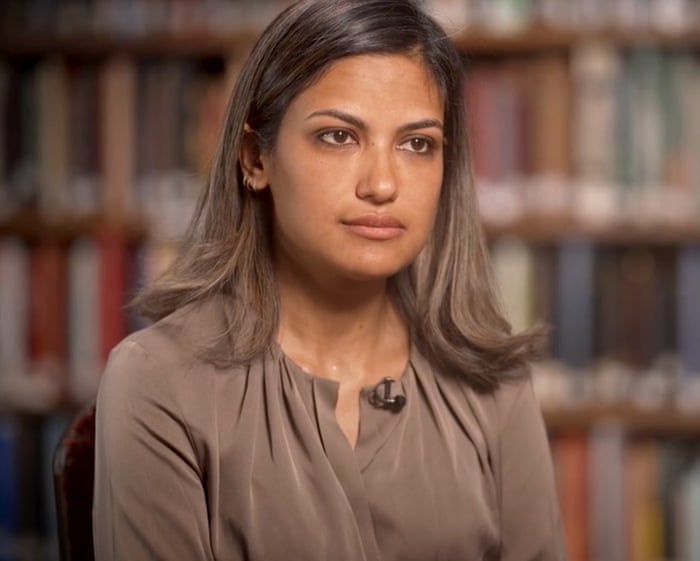
View image in fullscreen: A sketch of Mohammad Baqer Saad Dawood al-Saadi, right, with his lawyer.In a federal court in Manhattan, a man named Dalack appeared. Photograph: Jane Rosenberg/Reuters
Fifty-two hours later, a makeshift bomb exploded outside a synagogue in Liège, Belgium. Then came attacks on a synagogue in Rotterdam and a Jewish school in Amsterdam, where a bomb also targeted a branch of the Bank of New York Mellon. Finally, the violence crossed the English Channel. On March 23, CCTV cameras captured three people setting fire to four ambulances belonging to a Jewish charity in north London.
In total, 18 such attacks were carried out between early March and the end of April. Most targeted Jewish schools or places of worship, with the UK being a particular focus. No one died, but the campaign caused great fear in a community already facing high levels of hostility and violence. It also raised serious concerns among public and security officials.
Responsibility for many of the attacks was claimed within hours, sometimes minutes, by a previously unknown group: Harakat Ashab al-Yamin al-Islamia (HAYI). This sparked a wave of media speculation about a new militant Islamist group targeting Europe, with some drawing comparisons to Islamic State or even al-Qaida.
In reality, court documents show that HAYI was just one man: al-Saadi, who ran the attacks from an office in Baghdad.
View image in fullscreen: The torching of ambulances belonging to a Jewish charity in north London was one of a series of attacks across Europe. Photograph: Guy Bell/Shutterstock
Michael Knights, an expert on Iraqi militias at Horizon Engage, a strategic advisory firm based in New York, said al-Saadi was recruited in his early twenties into a Shia militia created by Tehran after the US-led invasion of Iraq in 2003. Al-Saadi was sent to Syria when Iran deployed Shia militia forces to support Bashar al-Assad’s regime. There, he often exaggerated his combat experience.
Al-Saadi also fought against Islamic State in Iraq alongside his militia comrades. Though his exact role is unclear, social media posts suggest his activities included assassination, abduction, and possibly sourcing and distributing weapons.
But what is clear is that this bold and ambitious young man had excellent connections with very senior Iranian officials, especially within the Iranian Revolutionary Guard Corps (IRGC), the paramilitary wing of the radical clerical regime that took power in Tehran in 1979.
Al-Saadi’s mentor appears to have been Qassem Soleimani, an almost legendary figure in the world of Shia militant movements who founded and led the IRGC’s Quds Force, which handles overseas operations. According to one investigator, al-Saadi was with Soleimani when he was killed by a US drone strike in Iraq in 2020 and held the body of his dying mentor. Enemies dismissed al-Saadi as Soleimani’s “brat.”
Over the following years, al-Saadi traveled widely, posting selfies in Paris and Malaysia, and possibly visiting Austria. Knights said he was involved in procurement networks, sourcing drones and components across Europe and beyond.
Stamps in al-Saadi’s Iraqi “government service” passport show a trip in August 2023 to Spain. A 12-month Italian visa, which would have granted access to the entire Schengen zone, was issued that year but later canceled. Al-Saadi posted online that he was refused entry to Italy while traveling with a government delegation—suggesting that at least some EU security officials knew about his activities.
“He was definitely known in Europe. If the FBI had enough information to get him, then others did too,” said a legal source with close knowledge of the US investigation.
View image in fullscreen: Mourners at the funeral in 2020 of Qassem Soleimani, an Iranian commander who mentored al-Saadi. Photograph: Majid Saeedi/Getty Images
Images also show al-Saadi at an official Iranian government stand at a major arms fair in Moscow, possibly in 2024.
Phillip Smyth, an independent US-based analyst specializing in Iraqi Shia militias, said: “In Moscow, he could have been learning about covert operations. In Europe, he could have been sortingJust working out the logistics of that kind of activity—like meeting Iranian diplomats stationed in Paris, for example, and setting up secret ways to communicate or whatever.
When he returned to Iraq, al-Saadi got involved in online “information operations,” another key part of what security experts call “hybrid warfare,” a tactic first used by Russia. He helped run a network of Telegram channels that spread propaganda for an Iran-backed Shia militia. He was also very active on his own social media accounts, usually using his real name.
“He’s in his 30s, living in the Middle East, so he spends a lot of his life online… but you can move in and out of the shadows, and that can be very effective,” Smyth said.
When war with the US and Israel broke out, some analysts believe al-Saadi got clear orders from his IRGC handlers in Tehran. He had traveled there in late January and met with Ayatollah Ali Khamenei, the then supreme leader. Others think he was kept at a distance so Iran could maintain “plausible deniability” for what was about to happen.
Both ideas fit a larger pattern of Iran using proxies to carry out strategic tasks overseas that its own security forces either can’t or won’t do themselves. Historically, this has included terrorism targeting Jewish and Israeli interests around the world.
US court documents, interviews with lawyers, independent investigations by experts, and media reports have allowed the “proxy” campaign that followed to be reconstructed in detail.
Researchers say the trigger message on March 7 was posted on “very active” Telegram channels linked to Iran-backed militias in Iraq, as well as on Snapchat.
“Al-Saadi wasn’t running those channels alone,” said Julian Lanchès from the International Centre for Counter-Terrorism in The Hague, which tracked the posts.
Soon, claims of responsibility for attacks started coming from HAYI, sometimes within minutes and accompanied by images.
According to the US indictment, images on al-Saadi’s phone taken on April 18 during an arson attack on a synagogue in northwest London show him and three or four other men on a video call, projected onto a large screen with the HAYI logo in the background. In the video, one of the men, speaking in English, tells someone to grab and throw a lighter.
Eleven days later—when two Jewish men were stabbed in north London—al-Saadi told a contact in a Shia militia group in Iraq to “post it in the news, important.” Very soon after, a HAYI claim appeared on Telegram, even though investigators believe al-Saadi had nothing to do with the attack. Hours later, al-Saadi told his contact: “If God grants us success tonight, there will be a shooting at a restaurant.”
This attack, which could have been a major escalation, never happened. Within hours, al-Saadi was arrested in a hotel in Istanbul by Turkish security forces. Just before he disappeared into an underground prison, he managed to post a short video calling on his family to “remain steadfast.”
Two weeks later, he was flown to the US, where authorities said he had been seeking help with attacks on Jewish communities there and had discussed targeting Donald Trump’s older daughter, Ivanka. Al-Saadi didn’t realize that his main contact in the US, who he thought was a member of a Mexican drug cartel, was actually an FBI agent.
There have been no new attacks since al-Saadi’s arrest. Analysts believe Tehran will see the effort as a major success but will be worried about what their detained operative might say.It wasn’t just his loss. Al-Saadi wasn’t the only “disposable agent.” In the UK, France, and Belgium, dozens of people are facing long prison sentences. Many of them are minors, often with a history of working as drug couriers or in other low-level roles. A significant number were recruited through social media, where they were offered as little as €300 to complete tasks that seemed simple, even if illegal. Some didn’t seem to fully understand what they were targeting—or what would happen if they got caught.
Chantal Van den Bosch, a lawyer representing a 17-year-old arrested in March for firebombing a car near a Jewish neighborhood in Antwerp, said her client and an alleged accomplice believed the attack was linked to crime and drugs.
“Whoever gave them the job knew they’d be arrested within 15 minutes—they’re being used. They’re completely replaceable,” she said last week. “It’s just a way to destabilize a community. It’s very easy to divide people.”
Frequently Asked Questions
Here is a list of FAQs addressing the question of whether a single individual could be responsible for a series of terrorist attacks on Jewish communities across Europe
BeginnerLevel Questions
Q Is it actually possible for one person to carry out multiple terrorist attacks across Europe
A Its highly unlikely Coordinated attacks across different countries require significant planning funding communication and logisticsresources a single person usually doesnt have Most major attacks are linked to networks or groups
Q Has there ever been a case where one person was responsible for multiple attacks on Jewish targets
A No While there have been lonewolf attackers who carried out a single attack no single individual has been credibly linked to a series of crossborder attacks on Jewish communities
Q Why do people think one person might be behind these attacks
A This idea often comes from conspiracy theories or misinformation Sometimes similar attack methods or shared suspects across countries can create the false impression of a single mastermind
Q Who is usually responsible for attacks on Jewish communities in Europe
A They are typically carried out by individuals inspired by extremist ideologies or by small decentralized cells Law enforcement usually finds these attacks are uncoordinated even if they share a similar motive
IntermediateLevel Questions
Q Could a single person plan and fund a series of attacks without any outside help
A Extremely difficult Even lone wolves often get weapons money or training from online networks or sympathizers Funding multiple attacks across borders would require a support systemone person alone would likely be caught due to the financial trail
Q How do European police and intelligence agencies rule out a single perpetrator
A They use forensic evidence communication records travel patterns and financial data If attacks happen in different countries they check for overlapping suspects shared materials or common handlers If none are found its likely separate actions
Q Are there any documented examples of a single person being linked to attacks in multiple European countries