@font-face {
font-family: ‘Guardian Headline Full’;
src: url(‘https://assets.guim.co.uk/static/frontend/fonts/guardian-headline/full-not-hinted/GHGuardianHeadline-Light.woff2’) format(‘woff2’),
url(‘https://assets.guim.co.uk/static/frontend/fonts/guardian-headline/full-not-hinted/GHGuardianHeadline-Light.woff’) format(‘woff’),
url(‘https://assets.guim.co.uk/static/frontend/fonts/guardian-headline/full-not-hinted/GHGuardianHeadline-Light.ttf’) format(‘truetype’);
font-weight: 300;
font-style: normal;
}
@font-face {
font-family: ‘Guardian Headline Full’;
src: url(‘https://assets.guim.co.uk/static/frontend/fonts/guardian-headline/full-not-hinted/GHGuardianHeadline-LightItalic.woff2’) format(‘woff2’),
url(‘https://assets.guim.co.uk/static/frontend/fonts/guardian-headline/full-not-hinted/GHGuardianHeadline-LightItalic.woff’) format(‘woff’),
url(‘https://assets.guim.co.uk/static/frontend/fonts/guardian-headline/full-not-hinted/GHGuardianHeadline-LightItalic.ttf’) format(‘truetype’);
font-weight: 300;
font-style: italic;
}
@font-face {
font-family: ‘Guardian Headline Full’;
src: url(‘https://assets.guim.co.uk/static/frontend/fonts/guardian-headline/full-not-hinted/GHGuardianHeadline-Regular.woff2’) format(‘woff2’),
url(‘https://assets.guim.co.uk/static/frontend/fonts/guardian-headline/full-not-hinted/GHGuardianHeadline-Regular.woff’) format(‘woff’),
url(‘https://assets.guim.co.uk/static/frontend/fonts/guardian-headline/full-not-hinted/GHGuardianHeadline-Regular.ttf’) format(‘truetype’);
font-weight: 400;
font-style: normal;
}
@font-face {
font-family: ‘Guardian Headline Full’;
src: url(‘https://assets.guim.co.uk/static/frontend/fonts/guardian-headline/full-not-hinted/GHGuardianHeadline-RegularItalic.woff2’) format(‘woff2’),
url(‘https://assets.guim.co.uk/static/frontend/fonts/guardian-headline/full-not-hinted/GHGuardianHeadline-RegularItalic.woff’) format(‘woff’),
url(‘https://assets.guim.co.uk/static/frontend/fonts/guardian-headline/full-not-hinted/GHGuardianHeadline-RegularItalic.ttf’) format(‘truetype’);
font-weight: 400;
font-style: italic;
}
@font-face {
font-family: ‘Guardian Headline Full’;
src: url(‘https://assets.guim.co.uk/static/frontend/fonts/guardian-headline/full-not-hinted/GHGuardianHeadline-Medium.woff2’) format(‘woff2’),
url(‘https://assets.guim.co.uk/static/frontend/fonts/guardian-headline/full-not-hinted/GHGuardianHeadline-Medium.woff’) format(‘woff’),
url(‘https://assets.guim.co.uk/static/frontend/fonts/guardian-headline/full-not-hinted/GHGuardianHeadline-Medium.ttf’) format(‘truetype’);
font-weight: 500;
font-style: normal;
}
@font-face {
font-family: ‘Guardian Headline Full’;
src: url(‘https://assets.guim.co.uk/static/frontend/fonts/guardian-headline/full-not-hinted/GHGuardianHeadline-MediumItalic.woff2’) format(‘woff2’),
url(‘https://assets.guim.co.uk/static/frontend/fonts/guardian-headline/full-not-hinted/GHGuardianHeadline-MediumItalic.woff’) format(‘woff’),
url(‘https://assets.guim.co.uk/static/frontend/fonts/guardian-headline/full-not-hinted/GHGuardianHeadline-MediumItalic.ttf’) format(‘truetype’);
font-weight: 500;
font-style: italic;
}
@font-face {
font-family: ‘Guardian Headline Full’;
src: url(‘https://assets.guim.co.uk/static/frontend/fonts/guardian-headline/full-not-hinted/GHGuardianHeadline-Semibold.woff2’) format(‘woff2’),
url(‘https://assets.guim.co.uk/static/frontend/fonts/guardian-headline/full-not-hinted/GHGuardianHeadline-Semibold.woff’) format(‘woff’),
url(‘https://assets.guim.co.uk/static/frontend/fonts/guardian-headline/full-not-hinted/GHGuardianHeadline-Semibold.ttf’) format(‘truetype’);
font-weight: 600;
font-style: normal;
}
@font-face {
font-family: ‘Guardian Headline Full’;
src: url(‘https://assets.guim.co.uk/static/frontend/fonts/guardian-headline/full-not-hinted/GHGuardianHeadline-SemiboldItalic.woff2’) format(‘woff2’),
url(‘https://assets.guim.co.uk/static/frontend/fonts/guardian-headline/full-not-hinted/GHGuardianHeadline-SemiboldItalic.woff’) format(‘woff’),
url(‘https://assets.guim.co.uk/static/frontend/fonts/guardian-headline/full-not-hinted/GHGuardianHeadline-SemiboldItalic.ttf’) format(‘truetype’);
font-weight: 600;
font-style: italic;
}@font-face {
font-family: ‘Guardian Headline Full’;
src: url(‘https://assets.guim.co.uk/static/frontend/fonts/guardian-headline/full-not-hinted/GHGuardianHeadline-Bold.woff2’) format(‘woff2’),
url(‘https://assets.guim.co.uk/static/frontend/fonts/guardian-headline/full-not-hinted/GHGuardianHeadline-Bold.woff’) format(‘woff’),
url(‘https://assets.guim.co.uk/static/frontend/fonts/guardian-headline/full-not-hinted/GHGuardianHeadline-Bold.ttf’) format(‘truetype’);
font-weight: 700;
font-style: normal;
}
@font-face {
font-family: ‘Guardian Headline Full’;
src: url(‘https://assets.guim.co.uk/static/frontend/fonts/guardian-headline/full-not-hinted/GHGuardianHeadline-BoldItalic.woff2’) format(‘woff2’),
url(‘https://assets.guim.co.uk/static/frontend/fonts/guardian-headline/full-not-hinted/GHGuardianHeadline-BoldItalic.woff’) format(‘woff’),
url(‘https://assets.guim.co.uk/static/frontend/fonts/guardian-headline/full-not-hinted/GHGuardianHeadline-BoldItalic.ttf’) format(‘truetype’);
font-weight: 700;
font-style: italic;
}
@font-face {
font-family: ‘Guardian Headline Full’;
src: url(‘https://assets.guim.co.uk/static/frontend/fonts/guardian-headline/full-not-hinted/GHGuardianHeadline-Black.woff2’) format(‘woff2’),
url(‘https://assets.guim.co.uk/static/frontend/fonts/guardian-headline/full-not-hinted/GHGuardianHeadline-Black.woff’) format(‘woff’),
url(‘https://assets.guim.co.uk/static/frontend/fonts/guardian-headline/full-not-hinted/GHGuardianHeadline-Black.ttf’) format(‘truetype’);
font-weight: 900;
font-style: normal;
}
@font-face {
font-family: ‘Guardian Headline Full’;
src: url(‘https://assets.guim.co.uk/static/frontend/fonts/guardian-headline/full-not-hinted/GHGuardianHeadline-BlackItalic.woff2’) format(‘woff2’),
url(‘https://assets.guim.co.uk/static/frontend/fonts/guardian-headline/full-not-hinted/GHGuardianHeadline-BlackItalic.woff’) format(‘woff’),
url(‘https://assets.guim.co.uk/static/frontend/fonts/guardian-headline/full-not-hinted/GHGuardianHeadline-BlackItalic.ttf’) format(‘truetype’);
font-weight: 900;
font-style: italic;
}
@font-face {
font-family: ‘Guardian Titlepiece’;
src: url(‘https://interactive.guim.co.uk/fonts/garnett/GTGuardianTitlepiece-Bold.woff2’) format(‘woff2’),
url(‘https://interactive.guim.co.uk/fonts/garnett/GTGuardianTitlepiece-Bold.woff’) format(‘woff’),
url(‘https://interactive.guim.co.uk/fonts/garnett/GTGuardianTitlepiece-Bold.ttf’) format(‘truetype’);
font-weight: 700;
font-style: normal;
}
@font-face {
font-family: ‘Guardian Headline Full’;
src: url(‘https://assets.guim.co.uk/static/frontend/fonts/guardian-headline/noalts-not-hinted/GHGuardianHeadline-Light.woff2’) format(‘woff2’),
url(‘https://assets.guim.co.uk/static/frontend/fonts/guardian-headline/noalts-not-hinted/GHGuardianHeadline-Light.woff’) format(‘woff’),
url(‘https://assets.guim.co.uk/static/frontend/fonts/guardian-headline/noalts-not-hinted/GHGuardianHeadline-Light.ttf’) format(‘truetype’);
font-weight: 300;
font-style: normal;
}
@font-face {
font-family: ‘Guardian Headline Full’;
src: url(‘https://assets.guim.co.uk/static/frontend/fonts/guardian-headline/noalts-not-hinted/GHGuardianHeadline-LightItalic.woff2’) format(‘woff2’),
url(‘https://assets.guim.co.uk/static/frontend/fonts/guardian-headline/noalts-not-hinted/GHGuardianHeadline-LightItalic.woff’) format(‘woff’),
url(‘https://assets.guim.co.uk/static/frontend/fonts/guardian-headline/noalts-not-hinted/GHGuardianHeadline-LightItalic.ttf’) format(‘truetype’);
font-weight: 300;
font-style: italic;
}
@font-face {
font-family: ‘Guardian Headline Full’;
src: url(‘https://assets.guim.co.uk/static/frontend/fonts/guardian-headline/noalts-not-hinted/GHGuardianHeadline-Regular.woff2’) format(‘woff2’),
url(‘https://assets.guim.co.uk/static/frontend/fonts/guardian-headline/noalts-not-hinted/GHGuardianHeadline-Regular.woff’) format(‘woff’),
url(‘https://assets.guim.co.uk/static/frontend/fonts/guardian-headline/noalts-not-hinted/GHGuardianHeadline-Regular.ttf’) format(‘truetype’);
font-weight: 400;
font-style: normal;
}
@font-face {
font-family: ‘Guardian Headline Full’;
src: url(‘https://assets.guim.co.uk/static/frontend/fonts/guardian-headline/noalts-not-hinted/GHGuardianHeadline-RegularItalic.woff2’) format(‘woff2’),
url(‘https://assets.guim.co.uk/static/frontend/fonts/guardian-headline/noalts-not-hinted/GHGuardianHeadline-RegularItalic.woff’) format(‘woff’),
url(‘https://assets.guim.co.uk/static/frontend/fonts/guardian-headline/noalts-not-hinted/GHGuardianHeadline-RegularItalic.ttf’) format(‘truetype’);
font-weight: 400;
font-style: italic;
}Here is the rewritten text in fluent, natural English:
“`
@font-face {
font-family: ‘Guardian Headline Full’;
src: url(‘https://assets.guim.co.uk/static/frontend/fonts/guardian-headline/noalts-not-hinted/GHGuardianHeadline-RegularItalic.ttf’) format(‘truetype’);
font-weight: 400;
font-style: italic;
}
@font-face {
font-family: ‘Guardian Headline Full’;
src: url(‘https://assets.guim.co.uk/static/frontend/fonts/guardian-headline/noalts-not-hinted/GHGuardianHeadline-Medium.woff2’) format(‘woff2’),
url(‘https://assets.guim.co.uk/static/frontend/fonts/guardian-headline/noalts-not-hinted/GHGuardianHeadline-Medium.woff’) format(‘woff’),
url(‘https://assets.guim.co.uk/static/frontend/fonts/guardian-headline/noalts-not-hinted/GHGuardianHeadline-Medium.ttf’) format(‘truetype’);
font-weight: 500;
font-style: normal;
}
@font-face {
font-family: ‘Guardian Headline Full’;
src: url(‘https://assets.guim.co.uk/static/frontend/fonts/guardian-headline/noalts-not-hinted/GHGuardianHeadline-MediumItalic.woff2’) format(‘woff2’),
url(‘https://assets.guim.co.uk/static/frontend/fonts/guardian-headline/noalts-not-hinted/GHGuardianHeadline-MediumItalic.woff’) format(‘woff’),
url(‘https://assets.guim.co.uk/static/frontend/fonts/guardian-headline/noalts-not-hinted/GHGuardianHeadline-MediumItalic.ttf’) format(‘truetype’);
font-weight: 500;
font-style: italic;
}
@font-face {
font-family: ‘Guardian Headline Full’;
src: url(‘https://assets.guim.co.uk/static/frontend/fonts/guardian-headline/noalts-not-hinted/GHGuardianHeadline-Semibold.woff2’) format(‘woff2’),
url(‘https://assets.guim.co.uk/static/frontend/fonts/guardian-headline/noalts-not-hinted/GHGuardianHeadline-Semibold.woff’) format(‘woff’),
url(‘https://assets.guim.co.uk/static/frontend/fonts/guardian-headline/noalts-not-hinted/GHGuardianHeadline-Semibold.ttf’) format(‘truetype’);
font-weight: 600;
font-style: normal;
}
@font-face {
font-family: ‘Guardian Headline Full’;
src: url(‘https://assets.guim.co.uk/static/frontend/fonts/guardian-headline/noalts-not-hinted/GHGuardianHeadline-SemiboldItalic.woff2’) format(‘woff2’),
url(‘https://assets.guim.co.uk/static/frontend/fonts/guardian-headline/noalts-not-hinted/GHGuardianHeadline-SemiboldItalic.woff’) format(‘woff’),
url(‘https://assets.guim.co.uk/static/frontend/fonts/guardian-headline/noalts-not-hinted/GHGuardianHeadline-SemiboldItalic.ttf’) format(‘truetype’);
font-weight: 600;
font-style: italic;
}
@font-face {
font-family: ‘Guardian Headline Full’;
src: url(‘https://assets.guim.co.uk/static/frontend/fonts/guardian-headline/noalts-not-hinted/GHGuardianHeadline-Bold.woff2’) format(‘woff2’),
url(‘https://assets.guim.co.uk/static/frontend/fonts/guardian-headline/noalts-not-hinted/GHGuardianHeadline-Bold.woff’) format(‘woff’),
url(‘https://assets.guim.co.uk/static/frontend/fonts/guardian-headline/noalts-not-hinted/GHGuardianHeadline-Bold.ttf’) format(‘truetype’);
font-weight: 700;
font-style: normal;
}
@font-face {
font-family: ‘Guardian Headline Full’;
src: url(‘https://assets.guim.co.uk/static/frontend/fonts/guardian-headline/noalts-not-hinted/GHGuardianHeadline-BoldItalic.woff2’) format(‘woff2’),
url(‘https://assets.guim.co.uk/static/frontend/fonts/guardian-headline/noalts-not-hinted/GHGuardianHeadline-BoldItalic.woff’) format(‘woff’),
url(‘https://assets.guim.co.uk/static/frontend/fonts/guardian-headline/noalts-not-hinted/GHGuardianHeadline-BoldItalic.ttf’) format(‘truetype’);
font-weight: 700;
font-style: italic;
}
@font-face {
font-family: ‘Guardian Headline Full’;
src: url(‘https://assets.guim.co.uk/static/frontend/fonts/guardian-headline/noalts-not-hinted/GHGuardianHeadline-Black.woff2’) format(‘woff2’),
url(‘https://assets.guim.co.uk/static/frontend/fonts/guardian-headline/noalts-not-hinted/GHGuardianHeadline-Black.woff’) format(‘woff’),
url(‘https://assets.guim.co.uk/static/frontend/fonts/guardian-headline/noalts-not-hinted/GHGuardianHeadline-Black.ttf’) format(‘truetype’);
font-weight: 900;
font-style: normal;
}
@font-face {
font-family: ‘Guardian Headline Full’;
src: url(‘https://assets.guim.co.uk/static/frontend/fonts/guardian-headline/noalts-not-hinted/GHGuardianHeadline-BlackItalic.woff2’) format(‘woff2’),
url(‘https://assets.guim.co.uk/static/frontend/fonts/guardian-headline/noalts-not-hinted/GHGuardianHeadline-BlackItalic.woff’) format(‘woff’),
url(‘https://assets.guim.co.uk/static/frontend/fonts/guardian-headline/noalts-not-hinted/GHGuardianHeadline-BlackItalic.ttf’) format(‘truetype’);
font-weight: 900;
font-style: italic;
}
“`ine-BlackItalic.ttf) format(“truetype”);
font-weight: 900;
font-style: italic;
}
@font-face {
font-family: Guardian Titlepiece;
src: url(https://assets.guim.co.uk/static/frontend/fonts/guardian-titlepiece/noalts-not-hinted/GTGuardianTitlepiece-Bold.woff2) format(“woff2”),
url(https://assets.guim.co.uk/static/frontend/fonts/guardian-titlepiece/noalts-not-hinted/GTGuardianTitlepiece-Bold.woff) format(“woff”),
url(https://assets.guim.co.uk/static/frontend/fonts/guardian-titlepiece/noalts-not-hinted/GTGuardianTitlepiece-Bold.ttf) format(“truetype”);
font-weight: 700;
font-style: normal;
}
#article-body > div .content–interactive-grid,
.content–interactive > div .content–interactive-grid,
#comment-body .content–interactive-grid,
[data-gu-name=”body”] .content–interactive-grid,
#feature-body .content–interactive-grid {
grid-column-gap: 0px;
grid-template-columns: 100%;
grid-template-areas:
“media”
“title”
“headline”
“standfirst”
“lines”
“meta”
“body”;
}
@media (min-width: 30em) {
#article-body > div .content–interactive-grid figure.element–immersive figcaption,
.content–interactive > div .content–interactive-grid figure.element–immersive figcaption,
#comment-body .content–interactive-grid figure.element–immersive figcaption,
[data-gu-name=”body”] .content–interactive-grid figure.element–immersive figcaption,
#feature-body .content–interactive-grid figure.element–immersive figcaption {
padding: 0 20px;
max-width: 620px;
}
}
@media (min-width: 46.25em) {
#article-body > div .content–interactive-grid,
.content–interactive > div .content–interactive-grid,
#comment-body .content–interactive-grid,
[data-gu-name=”body”] .content–interactive-grid,
#feature-body .content–interactive-grid {
grid-template-columns: 100%;
grid-column-gap: 10px;
grid-template-areas:
“title”
“headline”
“standfirst”
“media”
“lines”
“meta”
“body”;
}
#article-body > div .content–interactive-grid #maincontent,
.content–interactive > div .content–interactive-grid #maincontent,
#comment-body .content–interactive-grid #maincontent,
[data-gu-name=”body”] .content–interactive-grid #maincontent,
#feature-body .content–interactive-grid #maincontent {
padding-right: 80px;
}
}
@media (min-width: 61.25em) {
#article-body > div .content–interactive-grid,
.content–interactive > div .content–interactive-grid,
#comment-body .content–interactive-grid,
[data-gu-name=”body”] .content–interactive-grid,
#feature-body .content–interactive-grid {
grid-template-columns: 620px 300px;
grid-template-areas:
“title right-column”
“headline right-column”
“standfirst right-column”
“media right-column”
“lines right-column”
“meta right-column”
“body right-column”
“. right-column”;
}
#article-body > div .content–interactive-grid #maincontent,
.content–interactive > div .content–interactive-grid #maincontent,
#comment-body .content–interactive-grid #maincontent,
[data-gu-name=”body”] .content–interactive-grid #maincontent,
#feature-body .content–interactive-grid #maincontent {
padding-right: unset;
}
}
@media (min-width: 71.25em) {
#article-body > div .content–interactive-grid,
.content–interactive > div .content–interactive-grid,
#comment-body .content–interactive-grid,
[data-gu-name=”body”] .content–interactive-grid,
#feature-body .content–interactive-grid {
grid-template-columns: 140px 1px 620px 300px;
grid-template-areas:
“title border headline right-column”
“. border standfirst right-column”
“. border media right-column”
“. border body right-column”
“. border . right-column”;
}
#article-body > div .content–interactive-grid .content__standfirst,
.content–interactive > div .content–interactive-grid .content__standfirst,
#comment-body .content–interactive-grid .content__standfirst,
[data-gu-name=”body”] .content–interactive-grid .content__standfirst,
#feature-body .content–interactive-grid .content__standfirst {
padding-bottom: 0;
}
#article-body > div .content–interactive-grid figure.element–immersive figcaption,
.content–interactive > div .content–interactive-grid figure.element–immersive figcaption,
#comment-body .content–interactive-grid figure.element–immersive figcaption,
[data-gu-name=”body”] .content–interactive-grid figure.element–immersive figcaption,
#feature-body .content–interactive-grid figure.element–immersive figcaption {
/ The original text cuts off here, so I’ve kept it as is /
}
}figcaption {
padding: 4px 0 0;
}
#article-body > div .content–interactive-grid [data-gu-name=”lines”],
#article-body > div .content–interactive-grid [data-gu-name=”meta”],
.content–interactive > div .content–interactive-grid [data-gu-name=”lines”],
.content–interactive > div .content–interactive-grid [data-gu-name=”meta”],
#comment-body .content–interactive-grid [data-gu-name=”lines”],
#comment-body .content–interactive-grid [data-gu-name=”meta”],
[data-gu-name=”body”] .content–interactive-grid [data-gu-name=”lines”],
[data-gu-name=”body”] .content–interactive-grid [data-gu-name=”meta”],
#feature-body .content–interactive-grid [data-gu-name=”lines”],
#feature-body .content–interactive-grid [data-gu-name=”meta”] {
grid-area: 2 / 1 / 5 / 2;
}
#article-body > div .content–interactive-grid [data-gu-name=”lines”],
.content–interactive > div .content–interactive-grid [data-gu-name=”lines”],
#comment-body .content–interactive-grid [data-gu-name=”lines”],
[data-gu-name=”body”] .content–interactive-grid [data-gu-name=”lines”],
#feature-body .content–interactive-grid [data-gu-name=”lines”] {
height: max-content;
margin-top: 5px;
}
#article-body > div .content–interactive-grid [data-gu-name=”meta”],
.content–interactive > div .content–interactive-grid [data-gu-name=”meta”],
#comment-body .content–interactive-grid [data-gu-name=”meta”],
[data-gu-name=”body”] .content–interactive-grid [data-gu-name=”meta”],
#feature-body .content–interactive-grid [data-gu-name=”meta”] {
margin-top: 18px;
}
@media (min-width: 81.25em) {
#article-body > div .content–interactive-grid,
.content–interactive > div .content–interactive-grid,
#comment-body .content–interactive-grid,
[data-gu-name=”body”] .content–interactive-grid,
#feature-body .content–interactive-grid {
grid-template-columns: 219px 1px 620px 80px 300px;
}
}
body.ios .article__header .standfirst__inner p,
body.android .article__header .standfirst__inner p {
font-family: Guardian Headline, Guardian Egyptian Web, Guardian Headline Full, Georgia, serif;
font-weight: 500;
}
body.ios .article__header .article-kicker__section,
body.android .article__header .article-kicker__section {
display: block;
}
body.ios .article__header .article-kicker__section:first-letter,
body.android .article__header .article-kicker__section:first-letter {
text-transform: uppercase;
}
body.ios .article__header .keyline-4,
body.android .article__header .keyline-4 {
padding-top: 12px !important;
}
body.ios .article__header .meta__misc .byline__author,
body.android .article__header .meta__misc .byline__author {
font-family: Guardian Headline, Guardian Egyptian Web, Guardian Headline Full, Georgia, serif;
font-weight: 700;
}
body.ios .article__header .meta__misc .byline__author a,
body.android .article__header .meta__misc .byline__author a {
font-weight: 700;
}
body.ios .article figure.element-image .figure__inner,
body.android .article figure.element-image .figure__inner {
height: auto !important;
}
body.ios .article figure.element-atom + p,
body.android .article figure.element-atom + p {
margin-top: 0;
}
@media (scripting: enabled) {
:root article.content–interactive > div,
:root .article {
opacity: 0;
overflow: hidden;
}
:root.interactive-loaded article.content–interactive > div,
:root.interactive-loaded .article {
opacity: 1;
transition: opacity 1s ease;
overflow: unset;
}
}
[data-article-theme=”News”] {
–active-pillar-100: #660505;
–active-pillar-200: #8b0000;
–active-pillar-300: #ab0613;
–active-pillar-400: #c70000;
–active-pillar-500: #ff5943;
–active-pillar-600: #ffbac8;
–furniture-card-gradient-color: rgba(139, 0, 0, 0.6);
}
[data-article-theme=”Lifestyle”] {
–active-pillar-100: #510043;
–active-pillar-200: #650054;
–active-pillar-300: #7d0068;
–active-pillar-400: #bb3b80;
–active-pillar-500: #ffabdb;
–active-pillar-600: #fec8d3;
–furniture-card-gradient-color: rgba(101, 0, 84, 0.6);
}
[data-article-theme=”Culture”] {
–active-pillar-100: #3e3323;
–active-pillar-200: #574835;
–active-pillar-300: #6b5840;
–active-pillar-400: #866d50;
–active-pillar-500: #eacca0;
–active-pillar-600: #e7d4b9;
–furniture-card-gradient-color: rgba(87, 72, 53, 0.6);
}
[data-article-theme=”Sport”] {
–active-pillar-100: #003c60;
–active-pillar-200: #004e7c;
–active-pillar-300: #005689;
–active-pillar-400: #0077b6;
}Here’s the rewritten version in fluent, natural English:
– Pillar-500: #00b2ff
– Active pillar-600: #90dcff
– Furniture card gradient color: rgba(0, 78, 124, 0.6)
On Android devices, the top toolbar is 58px tall, the bottom toolbar is 56px, and the visible height is calculated as 100vh minus the top toolbar.
On iOS devices, the top toolbar is 44px and the bottom toolbar is 50px. The top toolbar is also set to 20px, and the visible height is 100vh minus the bottom toolbar.
If the screen height is at least 670px on iOS, the bottom toolbar becomes 84px and the top toolbar becomes 44px.
If the screen height is at least 800px on iOS, the top toolbar becomes 94px.
The top banner ad container is hidden by default.
For interactive articles, the inner div has no padding.
On screens wider than 61.25em, the interactive grid inside the article uses a single column layout with no gaps. The grid areas are arranged as: title, headline, standfirst, media, lines, meta, body, and an empty space.
On screens wider than 71.25em, the grid changes to four columns: 79px, 1px, auto, and 79px, with a 10px gap. The layout becomes: title, border, headline, and right column in the first row; then border, standfirst, and right column; then border, media, and right column; then border, body, and right column; and finally border and an empty space in the right column.
On screens wider than 81.25em, the first and last columns expand to 159px each.
The title section has zero height and is hidden with overflow.
The main content area has no top margin. On screens wider than 46.25em, it has no right padding.
The interactive main column is positioned relatively. Inside it, the element-atom has zero height and no margin or padding.
The media section is positioned sticky at the top left of the viewport, taking up the full width and height of the screen. It has a z-index of 0. After the media, there’s a pseudo-element that covers the entire area with a semi-transparent black background. This overlay starts invisible and fades in over 0.3 seconds. When the text is expanded, the overlay becomes fully visible.
On screens wider than 46.25em, the media section has a fixed width of 740px and no left margin. On screens wider than 61.25em, it’s aligned to the right with a width of 630px.
Inside the media section, the caption is positioned at the top with 40px of padding above it.
Images and the AppsLightboxImage component inside the media section are positioned absolutely and start invisible, fading in over 0.5 seconds. Their inner spans are hidden, and their inner divs take up the full height. The checkbox label is also hidden.
On screens wider than 46.25em, buttons inside links in the media section are fully visible and have a high z-index.
Images are aligned to the top of their container.
When an image or the lightbox has the class “show-me,” it becomes fully visible.
For users who prefer reduced motion, the fade-in transition is disabled entirely.Here’s the rewritten version in fluent, natural English:
For media elements inside `.content__main-column–interactive [data-gu-name=media]`, the following styles apply:
– Images, `gu-island[name=AppsLightboxImage]`, and `img` elements should be full width and height, with no margin.
– The first `figure` in this section should hide its label.
On screens wider than 46.25em:
– The first figure’s lightbox link should be hidden.
– The `picture` followed by a `span` should be displayed as a block.
On screens wider than 61.25em:
– The label inside the `span` after the `picture` should be visible.
– The caption inside `#the-caption figcaption` should have 8px of padding at the top.
If the first figure has the class `card-figure video-container loop`, a warning message will appear:
“Video Loops are not supported as main media in SnapSlides. Remove the loop and choose a cinemagraph or a static picture instead.”
This message is positioned at the top left, in red uppercase bold text, with a white background and a max width of 500px.
If the first figure has the class `cinemagraph`, it should take up the full viewport height and width. Any video inside it should also fill the viewport height and cover the area without distortion.
On screens wider than 46.25em, the cinemagraph should be limited to 740px wide. On screens wider than 61.25em, it should be limited to 630px wide.
The `.media-placeholder` element is a full-width, full-height placeholder with a light gray background. It starts invisible and fades in over half a second. When it has the class `show-me`, it becomes fully visible. On screens wider than 61.25em, its background changes to white. If the user prefers reduced motion, the fade transition is removed.
Inside `.card-figure figure > div`, the content is centered both horizontally and vertically, with 10px of padding on the sides. The inner `div` has rounded corners (8px), auto height, a max height of 95%, and auto width, with overflow hidden.
When `.card-figure` has the class `show-me`, its `figure` becomes fully visible.
For `.card-figure.video-portrait`, the inner `div` has auto width, no max height limit, and rounded corners. On screens wider than 61.25em, its height is set to 95%. The inner `div`’s child `div` has a height that fits its content and is positioned relatively.
If a `.card-figure.video-portrait` contains a `.cinemagraph`, the cinemagraph and its video should fill the full viewport height and width, with no margin or padding, and no border radius. The video should cover the area without distortion.
Finally, if a `.card-figure` contains a YouTube embed (via `[data-component=youtube-embed]`), it should be displayed as a flex item.Here’s the rewritten version in fluent, natural English:
“`css
/ Center content using flexbox /
ex {
justify-content: center;
align-items: center;
}
/ Style for YouTube embeds inside media cards /
.content__main-column–interactive [data-gu-name=”media”] .card-figure:has(>[data-component=”youtube-embed”]) > div {
height: fit-content;
border-radius: 8px;
overflow: hidden;
}
/ Make iframes fill their container in interactive blocks /
.content__main-column–interactive [data-gu-name=”media”] .card-figure[name=”InteractiveBlockComponent”] iframe {
height: 100% !important;
}
/ Position the cards wrapper /
.content__main-column–interactive .cards-wrapper {
position: relative;
top: -100vh;
}
/ Adjust card wrapper for medium screens /
@media (min-width: 61.25em) {
.content__main-column–interactive .cards-wrapper {
max-width: 460px;
margin-left: 10px;
}
}
/ Adjust card wrapper for large screens /
@media (min-width: 71.25em) {
.content__main-column–interactive .cards-wrapper {
margin-left: 0;
}
}
/ Dark theme for feature articles /
article.feature-dark {
–article-border: #545454;
}
@media (min-width: 46.25em) {
article.feature-dark {
background-color: #1a1a1a !important;
}
}
article.feature-dark [data-gu-name=”media”] .media-placeholder {
background-color: #121212;
}
@media (min-width: 46.25em) {
article.feature-dark [data-gu-name=”media”] .media-placeholder {
background-color: #1a1a1a;
}
}
article.feature-dark [data-gu-name=”media”] gu-island.card-figure figure > div {
background-color: #121212;
}
@media (min-width: 46.25em) {
article.feature-dark [data-gu-name=”media”] gu-island.card-figure figure > div {
background-color: #1a1a1a;
}
}
/ iOS app-specific styles /
[data-rendering-target=”apps”][data-app-os=”ios”] [data-gu-name=”media”] {
height: 100dvh;
}
[data-rendering-target=”apps”][data-app-os=”ios”] .cards-wrapper {
top: -100dvh;
}
[data-rendering-target=”apps”] [data-gu-name=”meta”] .content__meta-container_dcr:has(>gu-island[name=”ListenToArticle”]) > div {
height: 0;
}
/ Dark mode preference /
@media (prefers-color-scheme: dark) {
:root:root:not([data-color-scheme=”light”]) article {
–article-border: #545454;
}
}
@media (prefers-color-scheme: dark) and (min-width: 46.25em) {
:root:root:not([data-color-scheme=”light”]) article {
background-color: #1a1a1a !important;
}
}
@media (prefers-color-scheme: dark) {
:root:root:not([data-color-scheme=”light”]) article [data-gu-name=”media”] .media-placeholder {
background-color: #121212;
}
}
@media (prefers-color-scheme: dark) and (min-width: 46.25em) {
:root:root:not([data-color-scheme=”light”]) article [data-gu-name=”media”] .media-placeholder {
background-color: #1a1a1a;
}
}
@media (prefers-color-scheme: dark) {
:root:root:not([data-color-scheme=”light”]) article [data-gu-name=”media”] gu-island.card-figure figure > div {
background-color: #121212;
}
}
@media (prefers-color-scheme: dark) and (min-width: 46.25em) {
:root:root:not([data-color-scheme=”light”]) article [data-gu-name=”media”] gu-island.card-figure figure > div {
background-color: #1a1a1a;
}
}
/ Global variables /
:root:root {
–share-button: var(–active-pillar-400);
–opacity: 0.4;
}
/ Furniture card styles /
.article-card.furniture-card {
justify-content: space-between;
padding: 10px;
}
.article-card.furniture-card .info-button {
display: block;
position: absolute;
right: 5px;
width: 32px;
height: 32px;
z-index: 100;
background-color: rgba(18, 18, 18, 0.6);
border-radius: 50%;
border: none;
cursor: pointer;
}
@media (min-width: 61.25em) {
.article-card.furniture-card .info-button {
left: 930px;
}
}
@media (min-width: 71.25em) {
.article-card.furniture-card .info-button {
left: 910px;
}
}
.article-card.furniture-card .article-card–lightbox-btn {
display: none;
}
@media (min-width: 46.25em) {
.article-card.furniture-card .article-card–lightbox-btn {
display: block;
pointer-events: none;
}
}
@media (min-width: 61.25em) {
.article-card.furniture-card .article-card–lightbox-btn {
display: none;
}
}
.article-card.furniture-card [data-component=”series”] {
display: block;
font-family: “Guardian Headline Full”, “Guardian Egyptian Web”, Georgia, serif;
font-size: 17px;
font-weight: 700;
line-height: 115%;
color: #fff;
background-color: var(–active-pillar-400);
width: max-content;
padding: 3px 6px 4px;
}
.article-card.furniture-card [data-gu-name=”headline”] {
margin-bottom: 24px;
}
.article-card.furniture-card [data-gu-name=”headline”] h1 {
color: var(–active-pillar-200);
font-weight: 700;
font-size: 34px;
}
@media (min-width: 61.25em) {
.article-card.furniture-card [data-gu-name=”headline”] h1 {
font-size: 50px;
}
}
.article-card.furniture-card [data-gu-name=”headline”] div {
padding-bottom: 0;
}
.article-card.furniture-card [data-gu-name=”headline”] h2 {
color: var(–active-pillar-200);
font-family: “Guardian Headline Full”, “Guardian Egyptian Web”, Georgia, serif;
font-variant-numeric: lining-nums;
}
“`Here’s the rewritten version in fluent, natural English:
– For the headline section in e-cards, style the `h2` that contains a `strong` element with a font size of 24px and no top padding.
– In article cards with the “furniture-card” class, if the `h2` in the headline section does not contain a `strong` element, set its font size to 42px and font weight to 200.
– For the standfirst section in furniture cards, set the paragraph font size to 17px.
– In the meta section of furniture cards, use a CSS grid layout with three areas: “byline”, “byline”, and “share”. The grid should have three columns: the first two take up one fraction each, and the third is auto-sized.
– On screens wider than 61.25em, change the grid to a single column, with the areas stacked as “byline” on top and “share” below.
– The `address` element in the meta section should be placed in the “byline” grid area. Remove the bottom border from any links inside it.
– For the byline class inside the `address`, style both links and spans with the color `var(–active-pillar-400)`.
– For any `div` that follows the `address` element, set `–article-link-text` to `var(–active-pillar-400)`. When hovering over a link inside this `div`, change the text color to white.
– Both the `address` and the following `div` should have 4px of top padding and a 1px solid top border using `var(–article-border)`.
– The `div` after `address` should be placed in the “share” grid area.
– On screens wider than 61.25em, remove the top border and top padding from this `div`.
– For the social and comment meta elements inside the meta section, remove top padding and borders.
– Style the slides counter with a border radius of 18px, padding of 0 4px 2px 6px, and a background color of `#121212b3`. Its width should fit its content.
– The slides counter wrapper should have 4px of padding on top and right, 3px on the bottom, and no left padding. Text color should be white, font family should be “Guardian Text Sans Web” (with fallbacks), font size 12px, normal style, bold weight, and 130% line height. Remove the bottom border and set margin to 0. Any SVG inside should have a bottom margin of -3px.
– On screens wider than 46.25em, position the slides counter absolutely.
– On screens wider than 61.25em, set the slides counter to static positioning, with padding of 0 5px 2px 8px. The wrapper font size should be 15px, and the SVG bottom margin should be -1px.
– On screens wider than 61.25em, add 10px of top and bottom padding to the furniture card itself.
– For articles with the “feature-dark” class, style the furniture card content with a gradient background from `#12121266` at 0% to 100%, using `var(–furniture-card-gradient-color)`.
– In the headline section of this content, set the `h1` color to `var(–active-pillar-500)`.
– In the meta section, set `–byline` to `var(–active-pillar-500)`. For links, SVGs, and buttons, set `–article-link-text` and `–share-button` to `var(–active-pillar-500)`.
– For the byline class and its links and spans, use the color `var(–active-pillar-500)`.
– For social meta links and buttons, set the border color to `var(–article-border)` (using `!important`).
– For the series component in feature-dark articles, set the background color to `var(–active-pillar-500)` and text color to `#121212`.
– For articles with the “explainer” class, add the word “Explainer” before the `h1` in the headline section. Display it as a block, using the font family “Guardian Headline Full” (with fallbacks).Here’s the rewritten text in fluent, natural English:
If the font size is 17px, font weight is 700, line height is 115%, text color is white, and the background color uses the active pillar-400 variable, the element should have a width set to max-content, with padding of 3px on top and bottom and 6px on the left and right, plus 4px on the bottom.
For article explainers with the feature-dark class, the headline h1 should have a background color using the active pillar-500 variable and a text color of #121212.
For articles that are not feature-light or feature-dark, but are news articles with the furniture-card class, the headline h1 should have a font weight of 500.
In apps with the feature-dark class, all paragraph text inside article cards should be #dcdcdc.
In apps, the furniture-card article’s meta section should be displayed as a block. The byline’s span > div should be hidden. On screens wider than 46.25em, the byline span containing gu-island should be displayed as a block. The address and address+div in the meta section should have no border. On screens wider than 61.25em, address+div should be hidden. The content__meta-container_dcr SVG should be hidden. The follow section should have a top margin of 8px.
For dark mode (when the color scheme is not set to light), the article card content with the furniture-card class should have a background gradient from #12121266 to 100%, using the furniture-card gradient color. The headline h1 should use the active pillar-500 color. The meta section’s byline, links, and SVG icons should also use the active pillar-500 color. The byline, byline links, and byline spans should all be colored with active pillar-500. The meta social links and buttons should have a border color matching the article border. Paragraph text should be #dcdcdc. The series component should have a background of active pillar-500 and text color of #121212. For explainer articles, the headline h1:before should use active pillar-500 background and #121212 text. For news explainer articles, the headline h1:before should have white text. For news articles with the furniture-card class, the background should be #1a1a1ae6.
The article card should be 100% wide and 100vh tall, displayed as a flex column aligned to the bottom, with 10px padding on the sides and bottom, and positioned relatively with overflow hidden. On screens wider than 61.25em, the padding should be 0 on the sides and 28px on the bottom.
The lightbox button should be displayed as a block, take up the full available height, have a transparent background, and no bottom border. On screens wider than 71.25em, it should be hidden.
If the article card has no media, it should have 10px padding on all sides.Here’s the rewritten text in fluent, natural English:
The article card uses centered content with a flex layout. Cards that only contain media are initially hidden. Headings and paragraphs inside the card are dark gray. The content area has padding, rounded corners, and a semi-transparent white background with a blur effect. It has a bottom margin and a maximum height that adjusts to the viewport.
On wider screens (over 61.25em), the background becomes a slightly different light gray. If a caption is not the only child element, it gets a top border. If it is the only child, it has no margin or padding.
Headings are styled with a line height of 115% and use the active pillar color. Headings without bold text are large and light in weight—42px on smaller screens and 50px on larger ones. Headings with bold text are smaller (24px or 28px) and bold, with extra bottom padding.
Paragraphs are 15px. Links within them use the active pillar color and have no border, except on hover when a bottom border appears. The last paragraph has a bottom margin of 10px.
The “show more” button has no border or padding and is transparent. On wider screens, it is hidden. Its text uses a specific font family, is 14px, and matches the active pillar color. The chevron icon rotates smoothly on click and uses the same color.
Video elements inside the card have a bottom margin of 8px, and their captions are hidden. Portrait videos have a 9:16 aspect ratio, and cinemagraphs use the same ratio with object-fit cover.
In dark or light feature articles, the card has no border. Bold headings remain bold. In dark mode, the background is a dark semi-transparent color, headings use the active pillar color, paragraphs are light gray, and links and captions follow the dark theme. The “show more” button and chevron also use the active pillar color.
For news articles that are not feature-light or feature-dark, bold headings have a medium font weight.
On iOS apps, the card takes the full viewport height with a top margin of 50px. On Android, it also takes full height, and the content has extra bottom margin to account for the toolbar. When scrolling down on Android, that bottom margin disappears.
In dark mode (when the system preference is dark and no light scheme is set), the card content uses the dark theme styling with no border, a dark background, and the active pillar color for headings and links.Harry Styles is playing a record-breaking 12 nights at Wembley Stadium, following 10 shows in Amsterdam. He’ll then perform four nights in São Paulo, six in Mexico City, and a massive 30 nights in New York, finishing with four in Melbourne and two in Sydney, Australia.
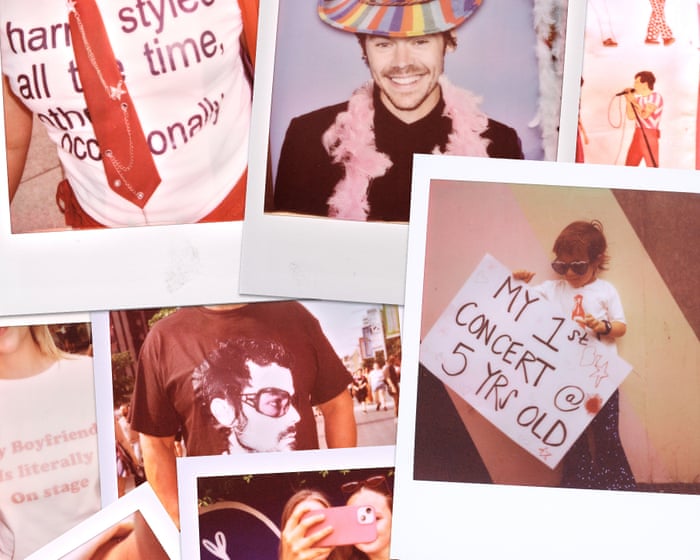
“I chose to photograph fans arriving at Harry Styles’s concert at Wembley because I was interested in the sense of community and self-expression that surrounds live music events,” said photographer Gareth Cattermole.
“Instead of focusing on the performance itself, I wanted to capture the excitement and anticipation before the show, when fans were arriving, socializing, and showing off their personalities through what they wore.
“Using Polaroid film encouraged me to slow down and be selective with each photograph, giving the images a candid, personal feel.
“I focused on small details, especially the handmade outfits, accessories, and funny slogans on T-shirts. This reflects the creativity and shared culture of Harry Styles’s fan community, documenting not just the event but also the people who helped create its unique atmosphere.”
A fan shows off her handiwork in a hand-sewn tie dress she put together the night before.
A handcrafted top features lyrics from Harry Styles’s album, Kiss All the Time. Disco, Occasionally.
An excited young fan gets ready for his first concert at just five years old.
Frequently Asked Questions
Here is a list of FAQs for Alongside Harry The Wit Style and Fun of His Fans Captured in Polaroids
Beginner Questions
Q What exactly is Alongside Harry
A Its a photo collection or project that uses Polaroidstyle pictures to show the humor fashion and playful moments of Harry Styles fans
Q Is this an official Harry Styles product
A No its typically a fanmade or independent project celebrating the community around Harry not something from his official team
Q Why Polaroids Why not regular photos
A Polaroids give a nostalgic candid and personal feel They capture the raw unfiltered fun and style of fans in the moment like a reallife memory
Q Who are the fans in the photos
A They are real people who attend Harrys concerts wait outside venues or participate in fan meetups The focus is on their outfits signs jokes and shared excitement
Intermediate Questions
Q What kind of content is featured Wit style and funcan you give examples
A
Wit Fans holding clever signs or funny interactions
Style Bold outfits inspired by Harrys fashion
Fun Dancing laughing crying happy tears or making silly faces together
Q Where can I see or buy this Alongside Harry collection
A Its often shared on social media or sold as a zinebook on independent platforms like Etsy or Big Cartel Search the exact name online
Q How are the photos chosen Is it just random fans
A Usually the photographer approaches fans who stand out with unique style a funny sign or a joyful vibe Its about capturing the energy of the fandom not just anyone
Q Do the fans have to pay to be included
A No participation is voluntary and free The goal is to celebrate the community not sell spots
Advanced Practical Questions