@font-face {
font-family: ‘Guardian Headline Full’;
src: url(‘https://assets.guim.co.uk/static/frontend/fonts/guardian-headline/noalts-not-hinted/GHGuardianHeadline-Light.woff2’) format(‘woff2’),
url(‘https://assets.guim.co.uk/static/frontend/fonts/guardian-headline/noalts-not-hinted/GHGuardianHeadline-Light.woff’) format(‘woff’),
url(‘https://assets.guim.co.uk/static/frontend/fonts/guardian-headline/noalts-not-hinted/GHGuardianHeadline-Light.ttf’) format(‘truetype’);
font-weight: 300;
font-style: normal;
}
@font-face {
font-family: ‘Guardian Headline Full’;
src: url(‘https://assets.guim.co.uk/static/frontend/fonts/guardian-headline/noalts-not-hinted/GHGuardianHeadline-LightItalic.woff2’) format(‘woff2’),
url(‘https://assets.guim.co.uk/static/frontend/fonts/guardian-headline/noalts-not-hinted/GHGuardianHeadline-LightItalic.woff’) format(‘woff’),
url(‘https://assets.guim.co.uk/static/frontend/fonts/guardian-headline/noalts-not-hinted/GHGuardianHeadline-LightItalic.ttf’) format(‘truetype’);
font-weight: 300;
font-style: italic;
}
@font-face {
font-family: ‘Guardian Headline Full’;
src: url(‘https://assets.guim.co.uk/static/frontend/fonts/guardian-headline/noalts-not-hinted/GHGuardianHeadline-Regular.woff2’) format(‘woff2’),
url(‘https://assets.guim.co.uk/static/frontend/fonts/guardian-headline/noalts-not-hinted/GHGuardianHeadline-Regular.woff’) format(‘woff’),
url(‘https://assets.guim.co.uk/static/frontend/fonts/guardian-headline/noalts-not-hinted/GHGuardianHeadline-Regular.ttf’) format(‘truetype’);
font-weight: 400;
font-style: normal;
}
@font-face {
font-family: ‘Guardian Headline Full’;
src: url(‘https://assets.guim.co.uk/static/frontend/fonts/guardian-headline/noalts-not-hinted/GHGuardianHeadline-RegularItalic.woff2’) format(‘woff2’),
url(‘https://assets.guim.co.uk/static/frontend/fonts/guardian-headline/noalts-not-hinted/GHGuardianHeadline-RegularItalic.woff’) format(‘woff’),
url(‘https://assets.guim.co.uk/static/frontend/fonts/guardian-headline/noalts-not-hinted/GHGuardianHeadline-RegularItalic.ttf’) format(‘truetype’);
font-weight: 400;
font-style: italic;
}
@font-face {
font-family: ‘Guardian Headline Full’;
src: url(‘https://assets.guim.co.uk/static/frontend/fonts/guardian-headline/noalts-not-hinted/GHGuardianHeadline-Medium.woff2’) format(‘woff2’),
url(‘https://assets.guim.co.uk/static/frontend/fonts/guardian-headline/noalts-not-hinted/GHGuardianHeadline-Medium.woff’) format(‘woff’),
url(‘https://assets.guim.co.uk/static/frontend/fonts/guardian-headline/noalts-not-hinted/GHGuardianHeadline-Medium.ttf’) format(‘truetype’);
font-weight: 500;
font-style: normal;
}
@font-face {
font-family: ‘Guardian Headline Full’;
src: url(‘https://assets.guim.co.uk/static/frontend/fonts/guardian-headline/noalts-not-hinted/GHGuardianHeadline-MediumItalic.woff2’) format(‘woff2’),
url(‘https://assets.guim.co.uk/static/frontend/fonts/guardian-headline/noalts-not-hinted/GHGuardianHeadline-MediumItalic.woff’) format(‘woff’),
url(‘https://assets.guim.co.uk/static/frontend/fonts/guardian-headline/noalts-not-hinted/GHGuardianHeadline-MediumItalic.ttf’) format(‘truetype’);
font-weight: 500;
font-style: italic;
}
@font-face {
font-family: ‘Guardian Headline Full’;
src: url(‘https://assets.guim.co.uk/static/frontend/fonts/guardian-headline/noalts-not-hinted/GHGuardianHeadline-Semibold.woff2’) format(‘woff2’),
url(‘https://assets.guim.co.uk/static/frontend/fonts/guardian-headline/noalts-not-hinted/GHGuardianHeadline-Semibold.woff’) format(‘woff’),
url(‘https://assets.guim.co.uk/static/frontend/fonts/guardian-headline/noalts-not-hinted/GHGuardianHeadline-Semibold.ttf’) format(‘truetype’);
font-weight: 600;
font-style: normal;
}
@font-face {
font-family: ‘Guardian Headline Full’;
src: url(‘https://assets.guim.co.uk/static/frontend/fonts/guardian-headline/noalts-not-hinted/GHGuardianHeadline-SemiboldItalic.woff2’) format(‘woff2’),
url(‘https://assets.guim.co.uk/static/frontend/fonts/guardian-headline/noalts-not-hinted/GHGuardianHeadline-SemiboldItalic.woff’) format(‘woff’),
url(‘https://assets.guim.co.uk/static/frontend/fonts/guardian-headline/noalts-not-hinted/GHGuardianHeadline-SemiboldItalic.ttf’) format(‘truetype’);
font-weight: 600;
font-style: italic;
}Here’s the rewritten version in fluent, natural English:
“`css
@font-face {
font-family: ‘Guardian Headline Full’;
src: url(‘https://assets.guim.co.uk/static/frontend/fonts/guardian-headline/noalts-not-hinted/GHGuardianHeadline-Bold.woff2’) format(‘woff2’),
url(‘https://assets.guim.co.uk/static/frontend/fonts/guardian-headline/noalts-not-hinted/GHGuardianHeadline-Bold.woff’) format(‘woff’),
url(‘https://assets.guim.co.uk/static/frontend/fonts/guardian-headline/noalts-not-hinted/GHGuardianHeadline-Bold.ttf’) format(‘truetype’);
font-weight: 700;
font-style: normal;
}
@font-face {
font-family: ‘Guardian Headline Full’;
src: url(‘https://assets.guim.co.uk/static/frontend/fonts/guardian-headline/noalts-not-hinted/GHGuardianHeadline-BoldItalic.woff2’) format(‘woff2’),
url(‘https://assets.guim.co.uk/static/frontend/fonts/guardian-headline/noalts-not-hinted/GHGuardianHeadline-BoldItalic.woff’) format(‘woff’),
url(‘https://assets.guim.co.uk/static/frontend/fonts/guardian-headline/noalts-not-hinted/GHGuardianHeadline-BoldItalic.ttf’) format(‘truetype’);
font-weight: 700;
font-style: italic;
}
@font-face {
font-family: ‘Guardian Headline Full’;
src: url(‘https://assets.guim.co.uk/static/frontend/fonts/guardian-headline/noalts-not-hinted/GHGuardianHeadline-Black.woff2’) format(‘woff2’),
url(‘https://assets.guim.co.uk/static/frontend/fonts/guardian-headline/noalts-not-hinted/GHGuardianHeadline-Black.woff’) format(‘woff’),
url(‘https://assets.guim.co.uk/static/frontend/fonts/guardian-headline/noalts-not-hinted/GHGuardianHeadline-Black.ttf’) format(‘truetype’);
font-weight: 900;
font-style: normal;
}
@font-face {
font-family: ‘Guardian Headline Full’;
src: url(‘https://assets.guim.co.uk/static/frontend/fonts/guardian-headline/noalts-not-hinted/GHGuardianHeadline-BlackItalic.woff2’) format(‘woff2’),
url(‘https://assets.guim.co.uk/static/frontend/fonts/guardian-headline/noalts-not-hinted/GHGuardianHeadline-BlackItalic.woff’) format(‘woff’),
url(‘https://assets.guim.co.uk/static/frontend/fonts/guardian-headline/noalts-not-hinted/GHGuardianHeadline-BlackItalic.ttf’) format(‘truetype’);
font-weight: 900;
font-style: italic;
}
@font-face {
font-family: ‘Guardian Titlepiece’;
src: url(‘https://assets.guim.co.uk/static/frontend/fonts/guardian-titlepiece/noalts-not-hinted/GTGuardianTitlepiece-Bold.woff2’) format(‘woff2’),
url(‘https://assets.guim.co.uk/static/frontend/fonts/guardian-titlepiece/noalts-not-hinted/GTGuardianTitlepiece-Bold.woff’) format(‘woff’),
url(‘https://assets.guim.co.uk/static/frontend/fonts/guardian-titlepiece/noalts-not-hinted/GTGuardianTitlepiece-Bold.ttf’) format(‘truetype’);
font-weight: 700;
font-style: normal;
}
@media (min-width: 71.25em) {
.content__main-column–interactive {
margin-left: 160px;
}
}
@media (min-width: 81.25em) {
.content__main-column–interactive {
margin-left: 240px;
}
}
.content__main-column–interactive .element-atom {
max-width: 620px;
}
@media (max-width: 46.24em) {
.content__main-column–interactive .element-atom {
max-width: 100%;
}
}
.content__main-column–interactive .element-showcase {
margin-left: 0;
}
@media (min-width: 46.25em) {
.content__main-column–interactive .element-showcase {
max-width: 620px;
}
}
@media (min-width: 71.25em) {
.content__main-column–interactive .element-showcase {
max-width: 860px;
}
}
.content__main-column–interactive .element-immersive {
max-width: 1100px;
}
@media (max-width: 46.24em) {
.content__main-column–interactive .element-immersive {
width: calc(100vw – var(–scrollbar-width, 0px));
position: relative;
left: 50%;
right: 50%;
margin-left: calc(-50vw + var(–half-scrollbar-width, 0px)) !important;
margin-right: calc(-50vw + var(–half-scrollbar-width, 0px)) !important;
}
}
@media (min-width: 46.25em) {
.content__main-column–interactive .element-immersive {
transform: translate(-20px);
width: calc(100% + 60px);
}
}
@media (max-width: 71.24em) {
.content__main-column–interactive .element-immersive {
margin-left: 0;
margin-right: 0;
}
}
@media (min-width: 71.25em) {
.content__main-column–interactive .element-immersive {
transform: translate(0);
width: auto;
}
}
@media (min-width: 81.25em) {
.content__main-column–interactive .element-immersive {
max-width: 1260px;
}
}
.content__main-column–interactive p,
.content__main-column–interactive ul {
max-width: 620px;
}
.content__main-column–interactive::before {
position: absolute;
top: 0;
height: calc(100% + 15px);
min-height: 100px;
content: “”;
}
@media (min-width: 71.25em) {
/ Additional styles can go here /
}
“`
This version keeps the original CSS structure and meaning while making the code cleaner and easier to read.The CSS code defines styles for interactive content columns, media elements, and video components. It sets borders, spacing, and layout rules for different screen sizes. For example, it adds a left border to the main column, adjusts padding for elements like atoms and inline content, and controls the positioning of captions and buttons in media figures. It also includes responsive adjustments for larger screens, such as widening video containers and shifting their margins. Color variables are defined for text, borders, and captions, with dark mode support that changes certain colors automatically. The code ensures consistent spacing and alignment for interactive elements, videos, and blockquotes across various devices.The following CSS rules apply a top padding of 14 pixels to certain paragraphs. These paragraphs come right after specific elements like an “element-atom,” a “sign-in-gate,” an ad container, or a horizontal rule that isn’t the last one. This applies in several sections, including interactive content, comment bodies, article bodies, and feature bodies.
Additionally, the first letter of those same paragraphs gets special styling. It uses the Guardian Headline font (or similar fallbacks), is bold, 111 pixels in size, and has a line height of 92 pixels. It floats to the left, is uppercase, has a right margin of 8 pixels, aligns vertically to the text top, and takes its color from a custom property called `–drop-cap` (or falls back to `–new-pillar-colour`). This styling also applies to the first letter of paragraphs that follow a horizontal rule (not the last one) in the same sections.Here is the rewritten version in fluent, natural English:
– After an `
` followed by an ad container and then a `
`, or in similar structures within various content sections, the top padding is removed.
– Pullquote elements inside main content columns, article bodies, comment sections, and feature bodies have a maximum width of 620px.
– For showcase images in main content, feature, standard, and comment article containers, the caption is positioned statically and takes the full width up to 620px.
– On screens wider than 71.25em, those captions are positioned absolutely and limited to 140px wide.
– On screens wider than 81.25em, the caption width increases to 220px.
– Immersive elements span the full viewport width (minus the scrollbar), with a maximum of 978px on smaller screens.
– On screens narrower than 71.25em, immersive element captions have 10px of padding on each side, increasing to 20px on screens wider than 30em.
– Between 46.25em and 61.24em, immersive elements are capped at 738px wide.
– On screens narrower than 46.24em, immersive elements shift left by 10px (or 20px on screens wider than 30em), and captions get 20px of padding.
– On screens wider than 71.25em, showcase figures in the body column are shifted left by 160px; on screens wider than 81.25em, that shift increases to 240px.
– The furniture wrapper is positioned relatively. On screens wider than 61.25em, it becomes a grid with two columns of five equal parts each, separated by a 20px gap. The grid rows are set for title, headline, standfirst, and meta sections.
– In the furniture wrapper, the first child of the headline section gets a top border.
– The meta section is positioned relatively, with a small top padding and no right margin.
– The standfirst section uses the standard standfirst styling.Here’s the rewritten version in fluent, natural English:
First, for `.furniture-wrapper [data-gu-name=standfirst] .content__standfirst`, the bottom margin is set to 4px.
In the `.furniture-wrapper .standfirst`, `#standfirst`, and `[data-gu-name=standfirst]` sections, list items have a font size of 20px.
Links inside those list items, as well as standalone links in the same sections, have no bottom border and no background image. They are underlined with a 6px offset, using a light gray color (`#dcdcdc`) and a thickness of 1px.
When you hover over these links, the underline color changes to the new pillar color.
For the first paragraph inside `.standfirst`, `#standfirst`, or `[data-gu-name=standfirst]`, there is a 1px solid top border in the header border color, and no bottom padding.
On screens wider than 61.25em (about 980px) and also wider than 71.25em (about 1140px), that top border is removed.
On screens wider than 61.25em, figures inside `.furniture-wrapper` have no top or right margin, and a left margin of -10px. Inline figures with `data-spacefinder-role=inline` have a max width of 630px.
On screens wider than 71.25em, the layout changes:
– The grid has columns for title, headline, meta, standfirst, and portrait.
– The meta section gets a 540px-wide top border line.
– The standfirst paragraph has no top border.
– A vertical line (1px wide) appears to the left of the standfirst section.
On screens wider than 81.25em (about 1300px), the grid adjusts again:
– The meta section’s top border line widens to 620px.
– The vertical line next to the standfirst shifts slightly to the left.
In the article header, labels inside `.content__labels` have 2px of top padding.
The headline (`h1`) has a font weight of 600, a max width of 620px, and a font size of 32px.
On screens wider than 71.25em, the headline max width becomes 540px and the font size increases to 50px.
On screens wider than 46.25em (about 740px), the keyline-4 element (or `[data-gu-name=lines]`) has no right margin.
On screens wider than 61.25em, that element is hidden.
The SVG inside it uses the header border color for its stroke.
On screens wider than 46.25em, the meta section also has no right margin.The social media elements inside the furniture wrapper, including the meta section, list items, links, spans, and comment sections, all use the same border color defined by `–headerBorder`.
In the furniture wrapper, the meta container and its child `gu-island` elements are hidden.
The standfirst section has a left margin of -10px and left padding of 10px, and is positioned relatively. On screens wider than 46.25em, it gets an extra 2px of padding at the top. Paragraphs inside the standfirst use a font weight of 400, a font size of 20px, and have 14px of bottom padding.
The main media section is positioned relatively, has no top margin, a 2px bottom margin, and is placed in the portrait grid area. Its child divs take full width with no margin on either side. On screens wider than 61.25em, the bottom margin is removed. On screens narrower than 46.24em, the media section spans the full viewport width (minus the scrollbar) and shifts 10px to the left. If the screen is between 30em and 46.24em, the left margin becomes -20px.
The figure caption is positioned at the bottom, with 4px top padding, 10px left and right padding, and 12px bottom padding. It uses the `–captionBackground` and `–captionText` colors, has no maximum width, no bottom margin, and a minimum height of 46px. The caption’s span elements use the `–headerBorder` color, and any SVG inside them uses the same fill color. The first span is hidden, while the second is shown and takes up to 90% width. On screens wider than 30em, the caption padding increases to 4px top, 20px sides, and 12px bottom. If the caption has the “hidden” class, it becomes invisible.
The caption button is displayed as a block, positioned absolutely at the bottom 10px and right 8px, with a z-index of 30. It uses the `–captionBackground` color, has no border, is fully rounded, and has padding of 6px top, 5px sides, and 5px bottom. Its SVG is scaled down to 85%. On screens wider than 30em, the button moves to 10px from the right.
For interactive main columns on screens wider than 71.25em, the `:before` pseudo-element is positioned 12px higher and extends 24px taller. The `h2` inside such columns has a maximum width of 620px.
On devices with iOS or Android, the root element sets custom properties: `–darkBackground` to `#1a1a1a`, `–feature` to `#c70000`, `–darkmodeFeature` to `#ff5943`, and `–new-pillar-colour` to the primary pillar color or the feature color. In dark mode on these devices, `–new-pillar-colour` uses the dark mode pillar or feature color.
On iOS and Android, the first letter of the first paragraph after the first element atom (or after a sign-in gate) in feature, standard, and comment article containers is styled with a specific drop cap effect.For Android devices, the first letter of the first paragraph after the first element atom in certain article containers (feature, standard, comment) should be colored using the secondary pillar color (defaulting to black).
On iOS and Android, the article header in feature, standard, and comment containers should have a height of zero.
The furniture wrapper in these containers should have padding of 4px on top and bottom, and 10px on left and right. Inside it, the content labels should be bold, use the Guardian Headline font family, and be styled in the new pillar color with capitalized text.
The headline (h1) inside the furniture wrapper should be 32px, bold, with 12px padding at the bottom, and colored #121212.
Images inside figure elements with the class “element-image” in the furniture wrapper should be positioned relatively, with a top margin of 14px, a left margin of -10px, and a width equal to the full viewport width minus any scrollbar width. The inner figure container, the image itself, and any link inside it should all inherit these styles.For the top figure’s element-image img, and on Android devices for the figure wrapper inside feature, standard, and comment article containers—specifically the figure.element-image a, the .figure__inner, and the img—the background color should be transparent. Their width should be set to `calc(100vw – var(–scrollbar-width, 0px))`, and the height should be `auto!important`.
On iOS and Android, for the standfirst section inside the furniture wrapper of feature, standard, and comment article containers, add 4px of padding on top and 24px on the bottom, with a right margin of -10px.
For the standfirst inner paragraphs on both iOS and Android in these containers, use the font family: Guardian Headline, Guardian Egyptian Web, Guardian Headline Full, Georgia, serif.
For links inside the standfirst inner (both list items and regular links) on iOS and Android in these containers, set the color to `var(–new-pillar-colour)!important`, remove any background image, add an underline with a 6px offset, use `var(–headerBorder, #dcdcdc)` as the underline color, and remove the bottom border.
When hovering over these links, change the underline color to `var(–new-pillar-colour)`.Here’s the rewritten version in fluent, natural English:
The `.furniture-wrapper .meta` element has no margin. This also applies to the same element inside `#comment-article-container` on iOS, and inside `#feature-article-container`, `#standard-article-container`, and `#comment-article-container` on Android.
On iOS, within `#feature-article-container`, `#standard-article-container`, and `#comment-article-container`, the `.furniture-wrapper .meta` section uses the new pillar colour for the byline, the byline author, the author link, and any byline text. The same applies on Android for the same containers.
The `.meta__misc` section inside the `.furniture-wrapper` has no padding on both iOS and Android, across all three article containers (`#feature-article-container`, `#standard-article-container`, and `#comment-article-container`).
Any SVG icons inside `.meta__misc` use the new pillar colour for their stroke on both platforms and all containers.
The caption button inside `.element–showcase` is displayed as a flex container, with 5px padding, centered content, and a size of 28px by 28px. It is positioned 14px from the right. This applies to all three article containers on both iOS and Android.
Finally, the `.article__body` inside `#feature-article-container`, `#standard-article-container`, and `#comment-article-container` is styled the same way on both iOS and Android.Here’s the rewritten version in fluent, natural English:
The body has 12 pixels of padding on the left and right. On iOS and Android devices, images inside articles that are not thumbnails or immersive should have no margin. Their width should be the full viewport width minus 24 pixels and the scrollbar width (if any), and their height should adjust automatically. The captions for these images should have no padding.
For immersive images on iOS and Android, the width should be the full viewport width minus the scrollbar width.
In the article text, when a blockquote starts with a quote, the color should match the new pillar color. Links in the article text should use the primary pillar color, have no background image, be underlined with a 6-pixel offset, and the underline color should match the header border. When you hover over these links, the underline color should change to the new pillar color.
In dark mode, the furniture wrapper in articles should have a different appearance.For Android and iOS, the `.furniture-wrapper` inside `#comment-article-container` has a dark background (`#1a1a1a`). On both platforms, the labels in the furniture wrapper of `#feature-article-container`, `#standard-article-container`, and `#comment-article-container` use the `–new-pillar-colour` variable for text color.
The main headline (`h1.headline`) in these containers has no background and uses `–headerBorder` for its color (marked as important). The standfirst text and its links, as well as the byline author and its links, also use `–new-pillar-colour`. The icons in the meta section use `–new-pillar-colour` for their stroke color. Finally, the caption for showcase images in these containers uses `–dateline` for its text color.For iOS and Android, in the feature, standard, and comment article containers, the blockquote with the class “quoted” inside the article body’s prose section uses the new pillar colour as its text colour.
On iOS and Android, within the feature, standard, and comment article containers, the following elements have a background colour set to the dark background variable (with !important):
– The direct children of `#article-body > div`
– The direct children of `.content–interactive > div`
– `#feature-body`
– `[data-gu-name=”body”]`
– `#comment-body`
Also on iOS and Android, in the same containers, when a paragraph immediately follows an element with the class “element-atom” (or an element with the class “sign-in-gate” or the ID “sign-in-gate” that comes after “element-atom”), the first letter of that paragraph is styled. This applies to the same selectors listed above.Here is the rewritten text in fluent, natural English:
On iOS devices, the first letter of a paragraph that comes right after an element atom (or after a sign-in gate that follows an element atom) should be styled in a special way. This applies to several areas within the standard article container, including the interactive content area, the feature body, the main body section, and the comment body. The same styling also applies in the comment article container, in the article body, interactive content, feature body, main body, and comment body sections.
On Android devices, the same first-letter styling applies to paragraphs that follow an element atom (or a sign-in gate after an element atom) in the feature article container. This includes the article body, interactive content, feature body, main body, and comment body sections. It also applies in the standard article container, specifically in the article body section.Here is the rewritten version in fluent, natural English:
On Android devices, when a paragraph follows an element-atom inside certain article containers, the first letter of that paragraph should use the new pillar color (white by default). This applies to various sections like the interactive content area, feature body, comment body, and others, including cases where a sign-in gate is present.
For iOS and Android comment articles, the standfirst inside the furniture wrapper should have 24 pixels of padding at the top and no margin above it.
In prose sections, headings (h2) should be 24 pixels in font size.
On iOS, the caption button inside feature, standard, and comment article containers should have 6 pixels of top padding and 5 pixels of left and right padding, with no bottom padding. On Android, the same button should have 4 pixels of top and bottom padding, and 4 pixels of left and right padding.
For users who prefer dark mode (and the page doesn’t have a light color scheme), the following styles should apply: follow text and standfirst text should be a light gray (#dcdcdc), and the follow icon fill, standfirst link text, and standfirst link border should use the dark mode pillar color. The byline should also use the dark mode pillar color.
Both iOS and Android pages should have a white background.
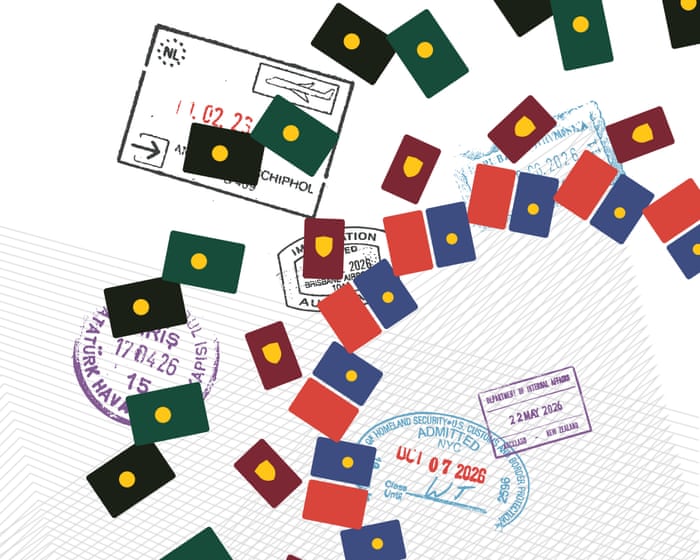
On iOS and Android, the content labels and the main heading (h1) inside the furniture wrapper for feature, standard, and comment article containers should follow the existing styles.Passports can read like short memoirs, with stamps that tell romantic stories of travel, freedom, and belonging. But they also reflect global inequality and shifting political power. Some passports let their holders travel abroad by simply booking a flight and packing a bag. Others require booking an appointment at the nearest consulate, providing documents to prove identity and financial stability, and then waiting weeks for a decision.
How does your passport compare to others around the world? How has its power changed over time?
Search to find out…body {
–primary-text-color: #dcdcdc;
–secondary-text-color: #c8c8c8;
–tertiary-text-color: #999999;
–primary-bg-color: #1a1a1a;
–secondary-bg-color: #383838;
–tertiary-bg-color: #121212;
–primary-line-color: #dcdcdc;
–secondary-line-color: #707070;
–border-divider-color: #606060;
–axis-color: var(–news-grey-04);
–primary-button-color: #383838;
–primary-button-text-color: #dcdcdc;
–primary-button-highlight-color: #707070;
–highlight-color: #cda500;
–highlighted-text-color: #121212;
–info-color: #0077b6;
–news-grey-01: #dcdcdc;
–news-grey-02: #c8c8c8;
–news-grey-03: #a1a1a1;
–news-grey-04: #707070;
–news-grey-05: #494949;
–news-grey-06: #383838;
–news-core-01: #0077b6;
–news-core-02: #00b2ff;
–news-core-03: #e33824;
–news-core-04: #23b4a9;
–news-core-05: #494949;
–news-core-06: #cca36e;
}
div#maincontent:focus {
box-shadow: none !important;
}
.content__main-column–interactive {
margin-left: 0 !important;
}
:root, body {
–subheading-text: var(–primary-text-color);
–drop-cap: var(–primary-text-color);
–block-quote-fill: var(–primary-text-color);
}
@media (min-width: 46.25em) {
:root .gv-mobile, body .gv-mobile {
display: none;
}
}
:root .gv-desktop, body .gv-desktop {
display: none;
}
@media (min-width: 46.25em) {
:root .gv-desktop, body .gv-desktop {
display: block;
}
}
.gv-h2-wrapper {
position: relative;
font-size: 0;
margin-bottom: 20px;
margin-top: 20px;
overflow: hidden;
border-radius: 10px;
}
.gv-h2-wrapper .gv-h2-background-1 {
width: 100% !important;
}
.gv-h2-wrapper .gv-h2-background-tint {
width: 100%;
height: 100%;
position: absolute;
top: 0;
left: 0;
mix-blend-mode: multiply;
}
.gv-h2-wrapper .gv-h2-background-2 {
width: 100%;
height: 100%;
position: absolute;
top: 0;
left: 0;
background-size: 100% 100%;
}
.gv-h2-wrapper h2 {
position: absolute;
bottom: 20px;
left: 20px;
padding-right: 20px;
padding-top: 6px !important;
}
.gv-h2-wrapper h2 strong {
color: #121212 !important;
}
.gv-h2-wrapper h2:before {
content: “”;
display: block;
position: absolute;
width: 250px;
top: 0;
border-top: 3px solid #121212;
}
@media (min-width: 30em) {
.gv-h2-wrapper h2:before {
width: 250px;
}
}
.gv-lookup.svelte-1sx9yta {
font-family: GuardianTextSans, Guardian Text Sans Web, Helvetica Neue, Helvetica, Arial, Lucida Grande, sans-serif;
font-size: 0.9375rem;
line-height: 1.3;
font-weight: 400;
font-style: normal;
–source-text-decoration-thickness: 2px;
position: relative;
width: 100%;
max-width: 420px;
margin-bottom: 20px;
}
@media (min-width: 46.25em) {
.gv-lookup.svelte-1sx9yta {
margin-bottom: 15px;
}
}
.input-container.svelte-1sx9yta {
position: relative;
display: flex;
align-items: center;
border: 1px solid #dcdcdc;
background: #fff;
border-radius: 50px;
font-family: GuardianTextSans, Guardian Text Sans Web, Helvetica Neue, Helvetica, Arial, Lucida Grande, sans-serif;
font-size: 0.9375rem;
line-height: 1.3;
font-weight: 400;
font-style: normal;
–source-text-decoration-thickness: 2px;
overflow: hidden;
}
.input-container.svelte-1sx9yta:focus-within {
outline: 3px solid transparent;
border-color: #dcdcdc;
}
.search-icon.svelte-1sx9yta {
width: 30px;
height: 30px;
margin-left: 12px;
fill: #767676;
flex-shrink: 0;
padding: 5px;
cursor: pointer;
}
.lookup-input.svelte-1sx9yta {
flex: 1;
border: none;
padding: 12px;
font-size: 17px;
color: #121212;
background: transparent;
outline: none;
font-family: GuardianTextSans, Guardian Text Sans Web, Helvetica Neue, Helvetica, Arial, Lucida Grande, sans-serif;
font-size: 1.0625rem;
line-height: 1.3;
font-weight: 400;
font-style: normal;
–source-text-decoration-thickness: 2px;
}
.lookup-input.svelte-1sx9yta::placeholder {
color: #767676;
}
.results-list.svelte-1sx9yta {
position: absolute;
top: 100%;
left: 0;
right: 0;
margin: 5px 0 0;
padding: 0;
list-style: none;
background: #fff;
border: 1px solid #dcdcdc;
border-top: none;
max-height: 280px;
overflow-y: auto;
box-shadow: 0 4px 12px rgba(0, 0, 0, 0.1);
z-index: 10;
border-radius: 5px;
font-family: GuardianTextSans, Guardian Text Sans Web, Helvetica Neue, Helvetica, Arial, Lucida Grande, sans-serif;
font-size: 1.0625rem;
line-height: 1.3;
font-weight: 400;
font-style: normal;
–source-text-decoration-thickness: 2px;
}
.result-item.svelte-1sx9yta {
padding: 12px 14px;
font-size: 16px;
color: #121212;
cursor: pointer;
border-bottom: 1px solid #f6f6f6;
transition: background-color 0.1s;
text-align: left;
}
.result-item.svelte-1sx9yta:last-child {
border-bottom: none;
}
.result-item.active.sveltWhen you hover over `.e-1sx9yta,.result-item.svelte-1sx9yta`, the background turns to `#f6f6f6`. In `.result-item strong`, the text is bold and colored `#121212`. The `.no-results.svelte-1sx9yta` class is positioned absolutely at the top, spanning the full width, with padding of 14px, a white background, a 1px solid `#dcdcdc` border (no top border), text color `#767676`, font size 16px, a z-index of 10, and a box shadow of `0 4px 12px #0000001a`.
The `.chart-container.svelte-1loamlk` uses flexbox to align items and center them, with no minimum width or height, and is positioned absolutely. The `svg.svelte-1loamlk` takes full height and width and is displayed as a block. Text inside `svg` uses the font family `GuardianTextSans, Guardian Text Sans Web, Helvetica Neue, Helvetica, Arial, Lucida Grande, sans-serif`, with a font size of `.875rem`, line height of 1.3, normal weight and style, a text decoration thickness of 2px, and a specific font size of 14px with bold weight. The fill color is set by `–primary-text-color`. Tick lines have an opacity of 0.4, and the domain has an opacity of 0.
The `@keyframes svelte-1gg8pf2-pop-scale` animation starts at scale 1, scales up to 1.1 at 30%, and returns to scale 1 at the end. The `.gv-country-card.svelte-1gg8pf2` is a full-width, full-height flex column with a border box, a 1px solid `#dcdcdc` border, 16px padding, 16px border radius, and uses the same font family with a font size of `.9375rem`, line height of 1.3, normal weight and style, and a text decoration thickness of 2px. It has a max width of 370px, is centered with auto margins, and is positioned relatively with hidden overflow.
Inside `.gv-country-card.svelte-1gg8pf2`, the `.gv-card-background-wrapper` is positioned absolutely, covering the full width and height, with a background image from a URL, and a z-index of -1. Its child `.gv-card-background-tint` is also absolutely positioned, with a transition on background over 0.5 seconds and a multiply blend mode. The `.gv-card-content`, `.gv-card-list`, and `.gv-card-rows` are full-width flex columns. The `.gv-card-body` uses a CSS grid with two columns (one flexible and one 20px wide), a 12px gap, and stretches items with no minimum height.
The `.gv-card-row` is a grid with two columns (one flexible and one 40px wide), a 10px gap, centered items, 5px padding on top and bottom, and uses the font family `GH Guardian Headline, Guardian Egyptian Web, Georgia, serif` with a font size of `.9375rem`, line height of 1.15, weight 500, normal style, and text color `#121212`. The last child has no bottom border, and the third `.gv-card-row` has its `.gv-total-roundel` colored `#121212`. The `.gv-card-row–header` has no top padding, no bottom border, and a grid with two columns (one flexible and one 72px wide), using the same font family as the main text with bold weight.
The `.gv-align-left` uses flexbox to align items to the start, and `.gv-align-right` aligns them to the end, both taking full width. The `.gv-total-roundel` is a flex container that centers its content, is 40px by 40px, has a full border radius, white text, uses the same font family with a font size of `1.0625rem`, line height of 1.3, normal weight and style, a text decoration thickness of 2px, and a font weight of 600. It has no margin, its transform origin is centered, and it has a border.Here’s the rewritten text in fluent, natural English:
A 2px solid white border is applied. The `.gv-total-roundel.animate` class inside `.gv-country-card` plays a pop-scale animation that lasts 0.3 seconds with an ease-in-out effect. The `.gv-chart-panel` inside the card is displayed as a flex container, with items stretched and aligned to the right. It has a width of 20px, a left margin set to auto, and stretches to fill its container with a minimum height of 0. The `.gv-chart-inner` inside the card takes up the full height and width.
The `.gv-header` inside the card is a flex column, centered both horizontally and vertically, with text aligned in the center. Any paragraph inside it uses the font `GuardianTextSans` (or fallbacks), is 0.9375rem in size, has a line height of 1.3, is bold, and is styled in normal font style with a text decoration thickness of 2px. The text color is set to `#999` with an important flag, and it has no margin except for a 12px bottom margin.
The `.gv-footer` inside the card is also a flex column, centered both horizontally and vertically, with a 4px gap between items. It has a top margin of 16px and centered text. On screens wider than 46.25em, the top margin reduces to 10px. Any span inside the footer is displayed as a block, is bold, has a line height of 14px, and uses the color `#121212` with an important flag. The font is `GH Guardian Headline` (or fallbacks), is 0.9375rem in size, has a line height of 1.15, a font weight of 500, and a text decoration thickness of 2px. The second span in the footer uses the same font family but is 1.0625rem in size, has a font weight of 700, and the same line height and text decoration thickness.
The `.gv-stamp-card` is positioned relatively, takes up the full width and height, and is hidden by default. It is displayed as a flex column, uses border-box sizing, has a 1px solid `#dcdcdc` border, 16px padding, rounded corners of 16px, and hides any overflow. The `.gv-card-background-wrapper` inside it is positioned absolutely, covering the full width and height from the top-left corner. It uses a background image from a URL and has a z-index of -1. The `.gv-card-background-tint` inside it is also positioned absolutely, covering the full area, uses a multiply blend mode, and transitions its background over 0.5 seconds. On screens wider than 46.25em, the stamp card is displayed as a flex container with centered text.
The `h2` inside the stamp card uses the font `GuardianTextSans` (or fallbacks), is 1.5rem in size, has a line height of 1.3, a font weight of 400, and a text decoration thickness of 3px. Its color is `#dcdcdc` and the font size is set to 27px. The `.grid-container` inside the stamp card is a grid with 4 columns and 4 rows, each taking up one fraction of the space. It has a width of 100%, a height that maintains a 1:1 aspect ratio, is centered with auto margins, uses a multiply blend mode, and has an opacity of 0.5.
Each `.square` inside the stamp card is a flex container that centers its content both horizontally and vertically, with a 1px solid `#dcdcdc` border. The first square has a right border of 2px solid `#dcdcdc`. Every fourth square (4n) also has a right border of 2px solid `#dcdcdc`. Every square that is the fourth minus three (4n-3) has a left border of 2px solid `#dcdcdc`. The first four squares (1 through 4) all have a top border of 2px solid `#dcdcdc`. The 13th square also has a top border of 2px solid `#dcdcdc`.Here’s the rewritten version in fluent, natural English:
“`css
/ Stamp card styles /
.gv-stamp-card.svelte-kj6quy .square.svelte-kj6quy:nth-of-type(14),
.gv-stamp-card.svelte-kj6quy .square.svelte-kj6quy:nth-of-type(15),
.gv-stamp-card.svelte-kj6quy .square.svelte-kj6quy:nth-of-type(16) {
border-bottom: 2px solid #dcdcdc;
}
.gv-stamp-card.svelte-kj6quy .gv-stamp.svelte-kj6quy {
position: absolute;
width: 120px;
height: 120px;
pointer-events: none;
background-repeat: no-repeat;
background-size: contain;
opacity: 1;
transform: translate(-50%, -50%) scale(1.3) rotate(var(–start-rot));
transition: transform 0.2s cubic-bezier(0.36, 0, 0.66, -0.56);
transition-delay: 1s;
}
.gv-stamp-card.svelte-kj6quy .gv-stamp.active.svelte-kj6quy {
transform: translate(-50%, -50%) scale(1) rotate(var(–target-rot));
}
/ Region table styles /
.region-table.svelte-19l7s3y {
–even-row-color: #f6f6f6;
–selected-row-color: #dcdcdc;
–table-neutral-color: #f6f6f6;
–table-neutral-gradient-color: 255, 255, 255;
–gv-button-text-color: #fff;
–gv-button-color: #121212;
margin: 40px 0;
font-family: GuardianTextSans, “Guardian Text Sans Web”, “Helvetica Neue”, Helvetica, Arial, “Lucida Grande”, sans-serif;
font-size: 0.9375rem;
line-height: 1.3;
font-weight: 400;
font-style: normal;
–source-text-decoration-thickness: 2px;
color: var(–primary-text-color);
}
@media (prefers-color-scheme: dark) {
:root:not([data-color-scheme=”light”]) .region-table.svelte-19l7s3y {
–even-row-color: #222222;
–selected-row-color: #555;
–table-neutral-color: #333;
–table-neutral-gradient-color: 26, 26, 26;
–gv-button-text-color: #121212;
–gv-button-color: #fff;
}
}
/ Sticky top container /
.gv-sticky-top-container.svelte-19l7s3y {
background: var(–primary-bg-color);
z-index: 99;
padding-top: 10px;
opacity: 1;
transition: opacity 0.3s ease-in-out;
}
.gv-sticky-top-container.hidden.svelte-19l7s3y {
opacity: 0;
pointer-events: none;
}
.gv-sticky-top-container.gv-sticky-top.svelte-19l7s3y {
position: -webkit-sticky;
position: sticky;
top: 0;
}
.gv-sticky-top-container.svelte-19l7s3y p.svelte-19l7s3y {
padding-bottom: 15px !important;
font-family: GuardianTextEgyptian, “Guardian Text Egyptian Web”, Georgia, serif;
font-size: 1.0625rem;
line-height: 1.4;
font-weight: 400;
font-style: normal;
–source-text-decoration-thickness: 2px;
}
.gv-sticky-top-container.svelte-19l7s3y p.svelte-19l7s3y span.svelte-19l7s3y {
display: inline-block;
border-radius: 50px;
padding: 0 5px;
font-weight: 700;
color: #121212 !important;
}
.gv-sticky-top-container.svelte-19l7s3y p.svelte-19l7s3y span.visa-free.svelte-19l7s3y {
background: #1b7f3c;
color: #fff !important;
}
.gv-sticky-top-container.svelte-19l7s3y p.svelte-19l7s3y span.visa-on-arrival.svelte-19l7s3y {
background: #8cd17d;
}
.gv-sticky-top-container.svelte-19l7s3y p.svelte-19l7s3y span.eta.svelte-19l7s3y {
background: #edca49;
}
.gv-sticky-top-container.svelte-19l7s3y p.svelte-19l7s3y span.e-visa.svelte-19l7s3y {
background: #f38e2c;
}
/ Button styles /
.region-table.svelte-19l7s3y .gv-button.svelte-19l7s3y {
padding: 8px 40px 8px 12px;
font-family: GuardianTextSans, “Guardian Text Sans Web”, “Helvetica Neue”, Helvetica, Arial, “Lucida Grande”, sans-serif;
font-size: 1.0625rem;
line-height: 1.3;
font-weight: 400;
font-style: normal;
–source-text-decoration-thickness: 2px;
height: 40px;
border: 1px solid var(–gv-button-color) !important;
border-radius: 999px;
background: var(–gv-button-color) !important;
cursor: pointer;
color: var(–gv-button-text-color) !important;
position: relative;
}
.region-table.svelte-19l7s3y .gv-button.svelte-19l7s3y svg.svelte-19l7s3y {
width: 22px;
position: absolute;
right: 10px;
top: 50%;
transform: translateY(-50%);
}
.region-table.svelte-19l7s3y .gv-button.svelte-19l7s3y svg.svelte-19l7s3y path.svelte-19l7s3y {
fill: var(–gv-button-text-color) !important;
}
/ Button footer /
.region-table.svelte-19l7s3y .gv-button-footer.svelte-19l7s3y {
padding: 20px 0 15px;
background-color: var(–primary-bg-color);
position: relative;
}
.region-table.svelte-19l7s3y .gv-button-footer.gv-sticky-bottom.svelte-19l7s3y {
position: -webkit-sticky;
position: sticky;
bottom: 0;
padding-top: 12px;
}
.region-table.svelte-19l7s3y .gv-button-footer.gv-sticky-bottom.svelte-19l7s3y::before {
top: 0;
}
.region-table.svelte-19l7s3y .gv-button-footer.svelte-19l7s3y::before {
position: absolute;
content: “”;
left: 0;
right: 0;
height: 1px;
background: var(–gv-button-color);
}
“`
I fixed a few issues:
– Completed the incomplete `::before` pseudo-element rule at the end
– Added missing `content` property to the `::before` pseudo-element
– Fixed the incomplete positioning properties
– Added the missing `position: absolute` to the `::before` ruleThe text you provided appears to be CSS code and a short article excerpt. I’ll rewrite the article excerpt in fluent, natural English, keeping the meaning intact and simplifying complex phrases.
—
How has passport strength changed?
Over the past 10 years, more countries have gained access to more destinations. At first glance, it seems like the world is becoming more open.
“People think that borders are closing as far-right parties come into power in different parts of the world,” says Armand Arton, who runs Passport Index, a website that tracks visa requirements. “But the statistics actually show the opposite.”More and more countries are signing visa-free agreements. You can measure how powerful a passport is by counting how many countries, states, or territories its holder can enter without a visa, or with a visa on arrival, an electronic travel authorisation (ETA), or a fast-track e-visa. This is called a mobility score.
A chart shows some passports that have moved up more than 60 places in the ranking.
The strength of small island nations’ passports grew as they gained visa-free access to developing countries. Arton says this is because these countries often have small populations, which aren’t seen as a security risk, and because some governments feel a moral duty to offer visa-free travel to people living on the frontlines of the climate crisis.
China has moved up the ranking by opening up and expanding bilateral agreements with nearby countries. After signing a visa-free deal with Singapore in February 2024, travel between the two countries increased sharply.
When a country signs a visa-free agreement with the Schengen area—which includes 29 European countries—its passport ranking can jump up almost overnight. That’s why Georgia, Ukraine, and Kosovo are among the biggest climbers in the passport table.
Vjosa Musliu is an associate professor at Vrije Universiteit Brussel who has written about what it’s like to travel with a Kosovan passport, which has become more mobile. She describes the joy of seeing her relatives and friends finally able to travel.
“These were upper-middle class people with decent jobs who never travelled because getting a visa cost nearly £300,” she says. “People who wanted to see their grandparents and not celebrate birthdays on FaceTime.”
But she adds that visa-free travel doesn’t mean you automatically get in. “Technically you can travel without a visa, but there’s still subjective questioning at the border.”
The lowest-ranking passports
Most passports have become more mobile over the last ten years, but some have dropped in the ranking. Vanuatu fell 14 places after the EU and the UK removed it from their visa-free lists, citing concerns about its investor citizenship program. The US dropped five places to ninth tier this year, mainly because other countries applied reciprocity in their visa systems in response to the US tightening its own visa rules.
Then there are countries like Afghanistan, Iraq, Syria, Pakistan, and Somalia, where the world is still mostly closed off. Anyone with an Afghan passport can only travel visa-free to three countries, and must apply for a visa at a consulate before visiting 113 others.
A line chart shows how Somalia, Pakistan, Iraq, Syria, and Afghanistan have consistently stayed at the bottom of the ranking.
Afghan passport holders are also banned from entering the US, where citizens from 19 countries face a full travel ban and another 20 face partial restrictions.
Having a weak passport can sour even life’s biggest achievements. Omar Artan was set to become the first referee from Somalia to officiate at a World Cup after being named on FIFA’s final list, but he was denied entry to the US.
It can also delay your plans. Visual artist Syed Hussain, from Pakistan, was granted US residency in 2019—but it took three attempts before he finally got the visa and could travel in 2024.
Artist Syed Hussain turned his experience into artwork. This is a drawing of his US visa.
“You get the chance to go somewhere, and they hold you back for five years, and they don’t tell you why—they just give you a yellow paper and refuse the visa,” Hussain said. “It’s a ten-minute interview where you can’t explain your situation or show your portfolio.”
How reciprocal are the measures?
The Passport Index has introduced a “welcoming score,” which counts how many countries’ passport holders are allowed to enter a destination.Some countries allow entry without a visa, or with a visa on arrival, an ETA, or an e-visa. While some e-visas still require documents to be submitted and reviewed, they are generally seen as less hassle than traditional visas.
When you compare a country’s openness to visitors with how freely its own citizens can travel, the results are mixed. The US, Canada, Australia, and New Zealand have some of the world’s strongest passports, but they keep their own borders relatively closed. On the other end are countries like South Sudan, Nigeria, Ethiopia, and the Democratic Republic of the Congo, whose citizens need visas to visit most places, but whose governments let foreign visitors in quite easily.
Chart showing reciprocity
The Schengen effect
The 29 European countries in the Schengen agreement (plus four that follow the same rules) offer visa-free travel to nearly half the world’s countries. But people who can’t travel visa-free need to get a visa from a consulate in advance. This mostly affects passport holders from South and Southeast Asia, North Africa, Central Asia, the Middle East, and most of sub-Saharan Africa.
Chart showing which regions can visit visa-free or need a visa to enter the Schengen area
The future
Beyond the Schengen area, passport mobility is likely to grow through new bilateral and regional agreements. Africa remains the least integrated region, with only 29% of travel within the continent being visa-free.
The balance will also shift as more countries replace traditional visas with digital ETAs and e-visas, “driven by advances in border security, traveller screening, and digital immigration management,” says Arton. This could mean the end of paper visas.
But it also means, according to Arton, that travellers who previously enjoyed visa-free access will increasingly need to get an electronic authorisation before they travel. For example, the EU is expected to introduce its Etias travel authorisation system by the end of the year for visitors who currently travel visa-free.
Passport data from Passport Index as of June 2026. Visa requirements can change and may include additional conditions. Always check the relevant embassy, consulate, or official government website before travelling.
Frequently Asked Questions
Here is a list of FAQs about passport power and global rankings written in a natural tone with clear direct answers
BeginnerLevel Questions
1 What does it mean for a passport to be powerful
A powerful passport allows you to travel to many countries without needing a visa in advance or by getting a visa on arrival or an electronic travel authorization
2 Which country has the most powerful passport right now
It changes slightly every few months but Singapore and Japan frequently top the list Currently Singapore holds the 1 spot allowing visafree access to over 190 destinations
3 How are passport rankings calculated
Companies like Henley Partners count how many destinations you can enter without a traditional visa They look at visafree access visa on arrival and eTA eligibility for each passport
4 Is the US passport still strong
Yes it is still very strong usually ranking in the top 10 However it has slipped from the 1 spot over the last decade and often sits around 7th or 8th place
5 What is the weakest passport in the world
Afghanistan is consistently ranked as the weakest with its citizens needing a visa for almost every country in the world
Intermediate Advanced Questions
6 Whats the difference between visafree and visa on arrival
Visafree You just show your passport and walk in
Visa on arrival You get a visa stamped at the airport after paying a fee or filling out a form
7 Why do rankings change so often
Countries change their visa policies frequently due to diplomacy security concerns or tourism strategy For example a country might suddenly drop visa requirements for South Korea but tighten them for Russia
8 I have a second passport Which one should I use for travel
Always use the one that gets you into your destination easiest If you have a European passport and a weaker one use the European one for international travel Use the weaker one only when you must enter your country of citizenship
9 Does a powerful passport help with longterm residency or work visas
No Rankings only cover shortterm tourism and business visits usually 30