@font-face {
font-family: ‘Guardian Headline Full’;
src: url(‘https://assets.guim.co.uk/static/frontend/fonts/guardian-headline/noalts-not-hinted/GHGuardianHeadline-Light.woff2’) format(‘woff2’),
url(‘https://assets.guim.co.uk/static/frontend/fonts/guardian-headline/noalts-not-hinted/GHGuardianHeadline-Light.woff’) format(‘woff’),
url(‘https://assets.guim.co.uk/static/frontend/fonts/guardian-headline/noalts-not-hinted/GHGuardianHeadline-Light.ttf’) format(‘truetype’);
font-weight: 300;
font-style: normal;
}
@font-face {
font-family: ‘Guardian Headline Full’;
src: url(‘https://assets.guim.co.uk/static/frontend/fonts/guardian-headline/noalts-not-hinted/GHGuardianHeadline-LightItalic.woff2’) format(‘woff2’),
url(‘https://assets.guim.co.uk/static/frontend/fonts/guardian-headline/noalts-not-hinted/GHGuardianHeadline-LightItalic.woff’) format(‘woff’),
url(‘https://assets.guim.co.uk/static/frontend/fonts/guardian-headline/noalts-not-hinted/GHGuardianHeadline-LightItalic.ttf’) format(‘truetype’);
font-weight: 300;
font-style: italic;
}
@font-face {
font-family: ‘Guardian Headline Full’;
src: url(‘https://assets.guim.co.uk/static/frontend/fonts/guardian-headline/noalts-not-hinted/GHGuardianHeadline-Regular.woff2’) format(‘woff2’),
url(‘https://assets.guim.co.uk/static/frontend/fonts/guardian-headline/noalts-not-hinted/GHGuardianHeadline-Regular.woff’) format(‘woff’),
url(‘https://assets.guim.co.uk/static/frontend/fonts/guardian-headline/noalts-not-hinted/GHGuardianHeadline-Regular.ttf’) format(‘truetype’);
font-weight: 400;
font-style: normal;
}
@font-face {
font-family: ‘Guardian Headline Full’;
src: url(‘https://assets.guim.co.uk/static/frontend/fonts/guardian-headline/noalts-not-hinted/GHGuardianHeadline-RegularItalic.woff2’) format(‘woff2’),
url(‘https://assets.guim.co.uk/static/frontend/fonts/guardian-headline/noalts-not-hinted/GHGuardianHeadline-RegularItalic.woff’) format(‘woff’),
url(‘https://assets.guim.co.uk/static/frontend/fonts/guardian-headline/noalts-not-hinted/GHGuardianHeadline-RegularItalic.ttf’) format(‘truetype’);
font-weight: 400;
font-style: italic;
}
@font-face {
font-family: ‘Guardian Headline Full’;
src: url(‘https://assets.guim.co.uk/static/frontend/fonts/guardian-headline/noalts-not-hinted/GHGuardianHeadline-Medium.woff2’) format(‘woff2’),
url(‘https://assets.guim.co.uk/static/frontend/fonts/guardian-headline/noalts-not-hinted/GHGuardianHeadline-Medium.woff’) format(‘woff’),
url(‘https://assets.guim.co.uk/static/frontend/fonts/guardian-headline/noalts-not-hinted/GHGuardianHeadline-Medium.ttf’) format(‘truetype’);
font-weight: 500;
font-style: normal;
}
@font-face {
font-family: ‘Guardian Headline Full’;
src: url(‘https://assets.guim.co.uk/static/frontend/fonts/guardian-headline/noalts-not-hinted/GHGuardianHeadline-MediumItalic.woff2’) format(‘woff2’),
url(‘https://assets.guim.co.uk/static/frontend/fonts/guardian-headline/noalts-not-hinted/GHGuardianHeadline-MediumItalic.woff’) format(‘woff’),
url(‘https://assets.guim.co.uk/static/frontend/fonts/guardian-headline/noalts-not-hinted/GHGuardianHeadline-MediumItalic.ttf’) format(‘truetype’);
font-weight: 500;
font-style: italic;
}
@font-face {
font-family: ‘Guardian Headline Full’;
src: url(‘https://assets.guim.co.uk/static/frontend/fonts/guardian-headline/noalts-not-hinted/GHGuardianHeadline-Semibold.woff2’) format(‘woff2’),
url(‘https://assets.guim.co.uk/static/frontend/fonts/guardian-headline/noalts-not-hinted/GHGuardianHeadline-Semibold.woff’) format(‘woff’),
url(‘https://assets.guim.co.uk/static/frontend/fonts/guardian-headline/noalts-not-hinted/GHGuardianHeadline-Semibold.ttf’) format(‘truetype’);
font-weight: 600;
font-style: normal;
}
@font-face {
font-family: ‘Guardian Headline Full’;
src: url(‘https://assets.guim.co.uk/static/frontend/fonts/guardian-headline/noalts-not-hinted/GHGuardianHeadline-SemiboldItalic.woff2’) format(‘woff2’),
url(‘https://assets.guim.co.uk/static/frontend/fonts/guardian-headline/noalts-not-hinted/GHGuardianHeadline-SemiboldItalic.woff’) format(‘woff’),
url(‘https://assets.guim.co.uk/static/frontend/fonts/guardian-headline/noalts-not-hinted/GHGuardianHeadline-SemiboldItalic.ttf’) format(‘truetype’);
font-weight: 600;
font-style: italic;
}Here is the rewritten text in fluent, natural English:
“`css
@font-face {
font-family: ‘Guardian Headline Full’;
src: url(‘https://assets.guim.co.uk/static/frontend/fonts/guardian-headline/noalts-not-hinted/GHGuardianHeadline-Bold.woff2’) format(‘woff2’),
url(‘https://assets.guim.co.uk/static/frontend/fonts/guardian-headline/noalts-not-hinted/GHGuardianHeadline-Bold.woff’) format(‘woff’),
url(‘https://assets.guim.co.uk/static/frontend/fonts/guardian-headline/noalts-not-hinted/GHGuardianHeadline-Bold.ttf’) format(‘truetype’);
font-weight: 700;
font-style: normal;
}
@font-face {
font-family: ‘Guardian Headline Full’;
src: url(‘https://assets.guim.co.uk/static/frontend/fonts/guardian-headline/noalts-not-hinted/GHGuardianHeadline-BoldItalic.woff2’) format(‘woff2’),
url(‘https://assets.guim.co.uk/static/frontend/fonts/guardian-headline/noalts-not-hinted/GHGuardianHeadline-BoldItalic.woff’) format(‘woff’),
url(‘https://assets.guim.co.uk/static/frontend/fonts/guardian-headline/noalts-not-hinted/GHGuardianHeadline-BoldItalic.ttf’) format(‘truetype’);
font-weight: 700;
font-style: italic;
}
@font-face {
font-family: ‘Guardian Headline Full’;
src: url(‘https://assets.guim.co.uk/static/frontend/fonts/guardian-headline/noalts-not-hinted/GHGuardianHeadline-Black.woff2’) format(‘woff2’),
url(‘https://assets.guim.co.uk/static/frontend/fonts/guardian-headline/noalts-not-hinted/GHGuardianHeadline-Black.woff’) format(‘woff’),
url(‘https://assets.guim.co.uk/static/frontend/fonts/guardian-headline/noalts-not-hinted/GHGuardianHeadline-Black.ttf’) format(‘truetype’);
font-weight: 900;
font-style: normal;
}
@font-face {
font-family: ‘Guardian Headline Full’;
src: url(‘https://assets.guim.co.uk/static/frontend/fonts/guardian-headline/noalts-not-hinted/GHGuardianHeadline-BlackItalic.woff2’) format(‘woff2’),
url(‘https://assets.guim.co.uk/static/frontend/fonts/guardian-headline/noalts-not-hinted/GHGuardianHeadline-BlackItalic.woff’) format(‘woff’),
url(‘https://assets.guim.co.uk/static/frontend/fonts/guardian-headline/noalts-not-hinted/GHGuardianHeadline-BlackItalic.ttf’) format(‘truetype’);
font-weight: 900;
font-style: italic;
}
@font-face {
font-family: ‘Guardian Titlepiece’;
src: url(‘https://assets.guim.co.uk/static/frontend/fonts/guardian-titlepiece/noalts-not-hinted/GTGuardianTitlepiece-Bold.woff2’) format(‘woff2’),
url(‘https://assets.guim.co.uk/static/frontend/fonts/guardian-titlepiece/noalts-not-hinted/GTGuardianTitlepiece-Bold.woff’) format(‘woff’),
url(‘https://assets.guim.co.uk/static/frontend/fonts/guardian-titlepiece/noalts-not-hinted/GTGuardianTitlepiece-Bold.ttf’) format(‘truetype’);
font-weight: 700;
font-style: normal;
}
@font-face {
font-family: ‘Guardian Headline Full’;
src: url(‘https://assets.guim.co.uk/static/frontend/fonts/guardian-headline/noalts-not-hinted/GHGuardianHeadline-Light.woff2’) format(‘woff2’),
url(‘https://assets.guim.co.uk/static/frontend/fonts/guardian-headline/noalts-not-hinted/GHGuardianHeadline-Light.woff’) format(‘woff’),
url(‘https://assets.guim.co.uk/static/frontend/fonts/guardian-headline/noalts-not-hinted/GHGuardianHeadline-Light.ttf’) format(‘truetype’);
font-weight: 300;
font-style: normal;
}
@font-face {
font-family: ‘Guardian Headline Full’;
src: url(‘https://assets.guim.co.uk/static/frontend/fonts/guardian-headline/noalts-not-hinted/GHGuardianHeadline-LightItalic.woff2’) format(‘woff2’),
url(‘https://assets.guim.co.uk/static/frontend/fonts/guardian-headline/noalts-not-hinted/GHGuardianHeadline-LightItalic.woff’) format(‘woff’),
url(‘https://assets.guim.co.uk/static/frontend/fonts/guardian-headline/noalts-not-hinted/GHGuardianHeadline-LightItalic.ttf’) format(‘truetype’);
font-weight: 300;
font-style: italic;
}
@font-face {
font-family: ‘Guardian Headline Full’;
src: url(‘https://assets.guim.co.uk/static/frontend/fonts/guardian-headline/noalts-not-hinted/GHGuardianHeadline-Regular.woff2’) format(‘woff2’),
url(‘https://assets.guim.co.uk/static/frontend/fonts/guardian-headline/noalts-not-hinted/GHGuardianHeadline-Regular.woff’) format(‘woff’),
url(‘https://assets.guim.co.uk/static/frontend/fonts/guardian-headline/noalts-not-hinted/GHGuardianHeadline-Regular.ttf’) format(‘truetype’);
font-weight: 400;
font-style: normal;
}
@font-face {
font-family: ‘Guardian Headline Full’;
src: url(‘https://assets.guim.co.uk/static/frontend/fonts/guardian-headline/noalts-not-hinted/GHGuardianHeadline-RegularItalic.woff2’) format(‘woff2’),
url(‘https://assets.guim.co.uk/static/frontend/fonts/guardian-headline/noalts-not-hinted/GHGuardianHeadline-RegularItalic.woff’) format(‘woff’),
url(‘https://assets.guim.co.uk/static/frontend/fonts/guardian-headline/noalts-not-hinted/GHGuardianHeadline-RegularItalic.ttf’) format(‘truetype’);
font-weight: 400;
font-style: italic;
}
“`Here is the rewritten text in fluent, natural English:
“`css
@font-face {
font-family: ‘Guardian Headline Full’;
src: url(‘https://assets.guim.co.uk/static/frontend/fonts/guardian-headline/noalts-not-hinted/GHGuardianHeadline-RegularItalic.woff2’) format(‘woff2’),
url(‘https://assets.guim.co.uk/static/frontend/fonts/guardian-headline/noalts-not-hinted/GHGuardianHeadline-RegularItalic.woff’) format(‘woff’),
url(‘https://assets.guim.co.uk/static/frontend/fonts/guardian-headline/noalts-not-hinted/GHGuardianHeadline-RegularItalic.ttf’) format(‘truetype’);
font-weight: 400;
font-style: italic;
}
@font-face {
font-family: ‘Guardian Headline Full’;
src: url(‘https://assets.guim.co.uk/static/frontend/fonts/guardian-headline/noalts-not-hinted/GHGuardianHeadline-Medium.woff2’) format(‘woff2’),
url(‘https://assets.guim.co.uk/static/frontend/fonts/guardian-headline/noalts-not-hinted/GHGuardianHeadline-Medium.woff’) format(‘woff’),
url(‘https://assets.guim.co.uk/static/frontend/fonts/guardian-headline/noalts-not-hinted/GHGuardianHeadline-Medium.ttf’) format(‘truetype’);
font-weight: 500;
font-style: normal;
}
@font-face {
font-family: ‘Guardian Headline Full’;
src: url(‘https://assets.guim.co.uk/static/frontend/fonts/guardian-headline/noalts-not-hinted/GHGuardianHeadline-MediumItalic.woff2’) format(‘woff2’),
url(‘https://assets.guim.co.uk/static/frontend/fonts/guardian-headline/noalts-not-hinted/GHGuardianHeadline-MediumItalic.woff’) format(‘woff’),
url(‘https://assets.guim.co.uk/static/frontend/fonts/guardian-headline/noalts-not-hinted/GHGuardianHeadline-MediumItalic.ttf’) format(‘truetype’);
font-weight: 500;
font-style: italic;
}
@font-face {
font-family: ‘Guardian Headline Full’;
src: url(‘https://assets.guim.co.uk/static/frontend/fonts/guardian-headline/noalts-not-hinted/GHGuardianHeadline-Semibold.woff2’) format(‘woff2’),
url(‘https://assets.guim.co.uk/static/frontend/fonts/guardian-headline/noalts-not-hinted/GHGuardianHeadline-Semibold.woff’) format(‘woff’),
url(‘https://assets.guim.co.uk/static/frontend/fonts/guardian-headline/noalts-not-hinted/GHGuardianHeadline-Semibold.ttf’) format(‘truetype’);
font-weight: 600;
font-style: normal;
}
@font-face {
font-family: ‘Guardian Headline Full’;
src: url(‘https://assets.guim.co.uk/static/frontend/fonts/guardian-headline/noalts-not-hinted/GHGuardianHeadline-SemiboldItalic.woff2’) format(‘woff2’),
url(‘https://assets.guim.co.uk/static/frontend/fonts/guardian-headline/noalts-not-hinted/GHGuardianHeadline-SemiboldItalic.woff’) format(‘woff’),
url(‘https://assets.guim.co.uk/static/frontend/fonts/guardian-headline/noalts-not-hinted/GHGuardianHeadline-SemiboldItalic.ttf’) format(‘truetype’);
font-weight: 600;
font-style: italic;
}
@font-face {
font-family: ‘Guardian Headline Full’;
src: url(‘https://assets.guim.co.uk/static/frontend/fonts/guardian-headline/noalts-not-hinted/GHGuardianHeadline-Bold.woff2’) format(‘woff2’),
url(‘https://assets.guim.co.uk/static/frontend/fonts/guardian-headline/noalts-not-hinted/GHGuardianHeadline-Bold.woff’) format(‘woff’),
url(‘https://assets.guim.co.uk/static/frontend/fonts/guardian-headline/noalts-not-hinted/GHGuardianHeadline-Bold.ttf’) format(‘truetype’);
font-weight: 700;
font-style: normal;
}
@font-face {
font-family: ‘Guardian Headline Full’;
src: url(‘https://assets.guim.co.uk/static/frontend/fonts/guardian-headline/noalts-not-hinted/GHGuardianHeadline-BoldItalic.woff2’) format(‘woff2’),
url(‘https://assets.guim.co.uk/static/frontend/fonts/guardian-headline/noalts-not-hinted/GHGuardianHeadline-BoldItalic.woff’) format(‘woff’),
url(‘https://assets.guim.co.uk/static/frontend/fonts/guardian-headline/noalts-not-hinted/GHGuardianHeadline-BoldItalic.ttf’) format(‘truetype’);
font-weight: 700;
font-style: italic;
}
@font-face {
font-family: ‘Guardian Headline Full’;
src: url(‘https://assets.guim.co.uk/static/frontend/fonts/guardian-headline/noalts-not-hinted/GHGuardianHeadline-Black.woff2’) format(‘woff2’),
url(‘https://assets.guim.co.uk/static/frontend/fonts/guardian-headline/noalts-not-hinted/GHGuardianHeadline-Black.woff’) format(‘woff’),
url(‘https://assets.guim.co.uk/static/frontend/fonts/guardian-headline/noalts-not-hinted/GHGuardianHeadline-Black.ttf’) format(‘truetype’);
font-weight: 900;
font-style: normal;
}
@font-face {
font-family: ‘Guardian Headline Full’;
src: url(‘https://assets.guim.co.uk/static/frontend/fonts/guardian-headline/noalts-not-hinted/GHGuardianHeadline-BlackItalic.woff2’) format(‘woff2’),
url(‘https://assets.guim.co.uk/static/frontend/fonts/guardian-headline/noalts-not-hinted/GHGuardianHeadline-BlackItalic.woff’) format(‘woff’),
url(‘https://assets.guim.co.uk/static/frontend/fonts/guardian-headline/noalts-not-hinted/GHGuardianHeadline-BlackItalic.ttf’) format(‘truetype’);
font-weight: 900;
font-style: italic;
}
“““css
@font-face {
font-family: Guardian Headline;
src: url(https://assets.guim.co.uk/static/frontend/fonts/guardian-headline/noalts-not-hinted/GHGuardianHeadline-BlackItalic.woff2) format(“woff2”),
url(https://assets.guim.co.uk/static/frontend/fonts/guardian-headline/noalts-not-hinted/GHGuardianHeadline-BlackItalic.woff) format(“woff”),
url(https://assets.guim.co.uk/static/frontend/fonts/guardian-headline/noalts-not-hinted/GHGuardianHeadline-BlackItalic.ttf) format(“truetype”);
font-weight: 900;
font-style: italic;
}
@font-face {
font-family: Guardian Titlepiece;
src: url(https://assets.guim.co.uk/static/frontend/fonts/guardian-titlepiece/noalts-not-hinted/GTGuardianTitlepiece-Bold.woff2) format(“woff2”),
url(https://assets.guim.co.uk/static/frontend/fonts/guardian-titlepiece/noalts-not-hinted/GTGuardianTitlepiece-Bold.woff) format(“woff”),
url(https://assets.guim.co.uk/static/frontend/fonts/guardian-titlepiece/noalts-not-hinted/GTGuardianTitlepiece-Bold.ttf) format(“truetype”);
font-weight: 700;
font-style: normal;
}
#article-body > div .content–interactive-grid,
.content–interactive > div .content–interactive-grid,
#comment-body .content–interactive-grid,
[data-gu-name=”body”] .content–interactive-grid,
#feature-body .content–interactive-grid {
grid-column-gap: 0px;
grid-template-columns: 100%;
grid-template-areas:
“media”
“title”
“headline”
“standfirst”
“lines”
“meta”
“body”;
}
@media (min-width: 30em) {
#article-body > div .content–interactive-grid figure.element–immersive figcaption,
.content–interactive > div .content–interactive-grid figure.element–immersive figcaption,
#comment-body .content–interactive-grid figure.element–immersive figcaption,
[data-gu-name=”body”] .content–interactive-grid figure.element–immersive figcaption,
#feature-body .content–interactive-grid figure.element–immersive figcaption {
padding: 0 20px;
max-width: 620px;
}
}
@media (min-width: 46.25em) {
#article-body > div .content–interactive-grid,
.content–interactive > div .content–interactive-grid,
#comment-body .content–interactive-grid,
[data-gu-name=”body”] .content–interactive-grid,
#feature-body .content–interactive-grid {
grid-template-columns: 100%;
grid-column-gap: 10px;
grid-template-areas:
“title”
“headline”
“standfirst”
“media”
“lines”
“meta”
“body”;
}
#article-body > div .content–interactive-grid #maincontent,
.content–interactive > div .content–interactive-grid #maincontent,
#comment-body .content–interactive-grid #maincontent,
[data-gu-name=”body”] .content–interactive-grid #maincontent,
#feature-body .content–interactive-grid #maincontent {
padding-right: 80px;
}
}
@media (min-width: 61.25em) {
#article-body > div .content–interactive-grid,
.content–interactive > div .content–interactive-grid,
#comment-body .content–interactive-grid,
[data-gu-name=”body”] .content–interactive-grid,
#feature-body .content–interactive-grid {
grid-template-columns: 620px 300px;
grid-template-areas:
“title right-column”
“headline right-column”
“standfirst right-column”
“media right-column”
“lines right-column”
“meta right-column”
“body right-column”
“. right-column”;
}
#article-body > div .content–interactive-grid #maincontent,
.content–interactive > div .content–interactive-grid #maincontent,
#comment-body .content–interactive-grid #maincontent,
[data-gu-name=”body”] .content–interactive-grid #maincontent,
#feature-body .content–interactive-grid #maincontent {
padding-right: unset;
}
}
@media (min-width: 71.25em) {
#article-body > div .content–interactive-grid,
.content–interactive > div .content–interactive-grid,
#comment-body .content–interactive-grid,
[data-gu-name=”body”] .content–interactive-grid,
#feature-body .content–interactive-grid {
grid-template-columns: 140px 1px 620px 300px;
grid-template-areas:
“title border headline right-column”
“. border standfirst right-column”
“. border media right-column”
“. border body right-column”
“. border . right-column”;
}
#article-body > div .content–interactive-grid .content__standfirst,
.content–interactive > div .content–interactive-grid .content__standfirst,
#comment-body .content–interactive-grid .content__standfirst,
[data-gu-name=”body”] .content–interactive-grid .content__standfirst,
#feature-body .content–interactive-grid .content__standfirst {
padding-bottom: 0;
}
#article-body > div .content–interactive-grid figure.element–immersive figcaption,
.content–interactive > div .content–interactive-grid figure.element–immersive figcaption,
#comment-body .cont
“`Here’s the rewritten version in fluent, natural English:
For interactive grid figures with immersive elements, the caption should have 4 pixels of padding at the top and none on the sides. In the main article body, interactive grid sections for lines and metadata should be placed in the grid area starting at row 2, column 1, and ending at row 5, column 2. The lines section should have a height set to fit its content, with a 5-pixel top margin. The metadata section should have an 18-pixel top margin.
On screens wider than 81.25em (about 1300px), the interactive grid layout should use columns of 219px, 1px, 620px, 80px, and 300px.
For iOS and Android devices, the article header’s standfirst text should use the Guardian Headline font family with a medium weight (500). The article kicker section should be displayed as a block, with the first letter capitalized. The keyline-4 element should have 12 pixels of top padding. The byline author name should use the Guardian Headline font family with a bold weight (700), and any links within it should also be bold. Article images with the element-image class should have their inner figure height set to auto. If an element-atom figure is followed by a paragraph, that paragraph should have no top margin.
The custom font “Guardian Headline Full” is defined in three weights: light (300) with normal and italic styles, using WOFF2, WOFF, and TTF formats from the Guardian’s asset server.I’m sorry, but the text you’ve provided appears to be CSS code for defining font faces, not a passage of written English that can be rewritten. Could you please provide the actual text you’d like me to rewrite?@font-face {
font-family: ‘Guardian Headline Full’;
src: url(‘https://assets.guim.co.uk/static/frontend/fonts/guardian-headline/noalts-not-hinted/GHGuardianHeadline-Black.woff2’) format(‘woff2’),
url(‘https://assets.guim.co.uk/static/frontend/fonts/guardian-headline/noalts-not-hinted/GHGuardianHeadline-Black.woff’) format(‘woff’),
url(‘https://assets.guim.co.uk/static/frontend/fonts/guardian-headline/noalts-not-hinted/GHGuardianHeadline-Black.ttf’) format(‘truetype’);
font-weight: 900;
font-style: normal;
}
@font-face {
font-family: ‘Guardian Headline Full’;
src: url(‘https://assets.guim.co.uk/static/frontend/fonts/guardian-headline/noalts-not-hinted/GHGuardianHeadline-BlackItalic.woff2’) format(‘woff2’),
url(‘https://assets.guim.co.uk/static/frontend/fonts/guardian-headline/noalts-not-hinted/GHGuardianHeadline-BlackItalic.woff’) format(‘woff’),
url(‘https://assets.guim.co.uk/static/frontend/fonts/guardian-headline/noalts-not-hinted/GHGuardianHeadline-BlackItalic.ttf’) format(‘truetype’);
font-weight: 900;
font-style: italic;
}
@font-face {
font-family: ‘Guardian Titlepiece’;
src: url(‘https://assets.guim.co.uk/static/frontend/fonts/guardian-titlepiece/noalts-not-hinted/GTGuardianTitlepiece-Bold.woff2’) format(‘woff2’),
url(‘https://assets.guim.co.uk/static/frontend/fonts/guardian-titlepiece/noalts-not-hinted/GTGuardianTitlepiece-Bold.woff’) format(‘woff’),
url(‘https://assets.guim.co.uk/static/frontend/fonts/guardian-titlepiece/noalts-not-hinted/GTGuardianTitlepiece-Bold.ttf’) format(‘truetype’);
font-weight: 700;
font-style: normal;
}
@media (min-width: 71.25em) {
.content__main-column–interactive {
margin-left: 160px;
}
}
@media (min-width: 81.25em) {
.content__main-column–interactive {
margin-left: 240px;
}
}
.content__main-column–interactive .element-atom {
max-width: 620px;
}
@media (max-width: 46.24em) {
.content__main-column–interactive .element-atom {
max-width: 100%;
}
}
.content__main-column–interactive .element-showcase {
margin-left: 0;
}
@media (min-width: 46.25em) {
.content__main-column–interactive .element-showcase {
max-width: 620px;
}
}
@media (min-width: 71.25em) {
.content__main-column–interactive .element-showcase {
max-width: 860px;
}
}
.content__main-column–interactive .element-immersive {
max-width: 1100px;
}
@media (max-width: 46.24em) {
.content__main-column–interactive .element-immersive {
width: calc(100vw – var(–scrollbar-width, 0px));
position: relative;
left: 50%;
right: 50%;
margin-left: calc(-50vw + var(–half-scrollbar-width, 0px)) !important;
margin-right: calc(-50vw + var(–half-scrollbar-width, 0px)) !important;
}
}
@media (min-width: 46.25em) {
.content__main-column–interactive .element-immersive {
transform: translate(-20px);
width: calc(100% + 60px);
}
}
@media (max-width: 71.24em) {
.content__main-column–interactive .element-immersive {
margin-left: 0;
margin-right: 0;
}
}
@media (min-width: 71.25em) {
.content__main-column–interactive .element-immersive {
transform: translate(0);
width: auto;
}
}
@media (min-width: 81.25em) {
.content__main-column–interactive .element-immersive {
max-width: 1260px;
}
}
.content__main-column–interactive p,
.content__main-column–interactive ul {
max-width: 620px;
}
.content__main-column–interactive:before {
position: absolute;
top: 0;
height: calc(100% + 15px);
min-height: 100px;
content: “”;
}
@media (min-width: 71.25em) {
.content__main-column–interactive:before {
border-left: 1px solid #dcdcdc;
z-index: -1;
left: -10px;
}
}
@media (min-width: 81.25em) {
.content__main-column–interactive:before {
border-left: 1px solid #dcdcdc;
left: -11px;
}
}
.content__main-column–interactive .element-atom {
margin-top: 0;
margin-bottom: 0;
padding-bottom: 12px;
padding-top: 12px;
}
.content__main-column–interactive p + .element-atom {
padding-top: 0;
padding-bottom: 0;
margin-top: 12px;
margin-bottom: 12px;
}
.content__main-column–interactive .element-inline {
max-width: 620px;
}
@media (min-width: 61.25em) {
figure[data-spacefinder-role=”inline”].element {
max-width: 620px;
}
}
[data-gu-name=”media”]:has(figure.loop) figure.loop figcaption:not(.hidden) {
z-index: 6;
}
[data-gu-name=”media”]:has(figure.loop) figure.loop button[data-link-name*=”gu-video-loop”] {
width: 32px;
align-self: flex-end;
margin-bottom: 40px;
margin-right: 3px;
}
[data-gu-name=”media”]:has(figure.loop) #caption-button {
z-index: 100;
}
[data-gu-name=”body”] gu-island[name=”SelfHostedVideo”] {
width: 100%;
max-width: 620px;
}Here is the rewritten text in fluent, natural English:
For videos that are self-hosted, the video and its container should be full width, with a maximum width of 620px, and centered. If the video is set to be immersive, it should expand to full width without any max-width limit, and have no margin.
On screens wider than 71.25em (1140px), an immersive video can stretch beyond its normal container by shifting left 180px. On screens wider than 81.25em (1300px), it shifts left 260px.
The design uses these color variables:
– Dateline: #606060
– Header border: #dcdcdc
– Caption text: #999
– Caption background: a dark, semi-transparent color
– Feature color: #c70000
– New pillar color: uses the primary pillar or feature color as fallback
Subheadings, pull quotes, and block quotes all use the secondary pillar color. Block quotes also use the secondary pillar color as their fill.
In dark mode (unless the user has chosen light mode), subheadings, pull quotes, and block quotes switch to the dark mode pillar color.
Interactive content and article body sections have no padding around element atoms. The first paragraph after an element atom or a horizontal rule gets 14px of top padding. The first letter of that paragraph is styled with a drop cap.Here’s the rewritten text in fluent, natural English:
For the first letter of certain paragraphs, the styling uses the Guardian Headline font family, with a bold weight, a font size of 111 pixels, and a line height of 92 pixels. It floats to the left, is uppercase, and has a box-sizing of border-box. There’s an 8-pixel right margin, and the text aligns vertically to the top. The color is set by a custom property called `–drop-cap`, which falls back to `–new-pillar-colour`.
For paragraphs that follow a horizontal rule in specific sections like `#article-body>div`, `.content–interactive>div`, `#comment-body`, `[data-gu-name=body]`, and `#feature-body`, the top padding is removed.
Pull quotes in those same sections have a maximum width of 620 pixels.
For figure captions inside showcase elements in `#maincontent`, `#feature-article-container`, `#standard-article-container`, and `#comment-article-container`, the position is set to static, the width is 100%, and the maximum width is 620 pixels.
At screen widths of 71.25 em and above, those showcase figure captions have a maximum width of 140 pixels. At 81.25 em and above, that increases to 220 pixels.
Immersive elements have a width equal to the full viewport width minus the scrollbar width. On screens up to 71.24 em wide, their maximum width is 978 pixels, and their captions have 10 pixels of padding on each side. On screens between 30 em and 71.24 em, that padding increases to 20 pixels. Between 46.25 em and 61.24 em, immersive elements have a maximum width of 738 pixels. On screens up to 46.24 em, they have a left margin of -10 pixels and no right margin, with a left offset of 0. On screens between 30 em and 46.24 em, the left margin is -20 pixels, and captions have 20 pixels of padding on each side.
For showcase elements, at 71.25 em and above, the left margin is -160 pixels. At 81.25 em and above, it’s -240 pixels.
At screen widths of 61.25 em and above, the furniture wrapper uses a CSS grid layout. It has a column gap of 20 pixels and no row gap. The grid template columns are divided into two groups: the first five columns are for the title, headline, meta, and standfirst, and the next five columns are for the portrait. The grid template rows are set up so that the title and portrait start together at 0.25 fraction, the headline takes up 1 fraction, the standfirst takes 0.75 fraction, and the meta area auto-sizes, ending with the portrait. In this layout, the first child of the headline section has a border property that is not fully specified.Here’s the rewritten version in fluent, natural English:
– The top border is set to 1px solid using the header border color.
– The meta section is positioned relatively, with 2px of padding on top and no right margin.
– In the standfirst section, the content’s standfirst has a 4px bottom margin.
– List items in the standfirst use a font size of 20px.
– Links inside the standfirst have no bottom border, no background image, and are underlined with a 6px offset. The underline color matches the header border.
– When hovering over these links, the underline color changes to the new pillar color.
– The first paragraph in the standfirst has a top border of 1px solid using the header border color, and no bottom padding.
– For screens wider than 61.25em and 71.25em, the first paragraph’s top border is removed.
– On screens wider than 61.25em, figures have a left margin of -10px, and inline figures are limited to a max width of 630px.
– On screens wider than 71.25em, the layout uses a grid with specific column and row definitions. The meta section gets a 540px-wide top border line. Standfirst paragraphs lose their top border, and a vertical line appears on the left.
– On screens wider than 81.25em, the grid adjusts with different column and row sizes. The meta top border line widens to 620px, and the vertical line shifts slightly to the left.
– In the article header or title section, labels have 2px of top padding.
– The headline (h1) is bold (600 weight), with a max width of 620px and a font size of 32px. On screens wider than 71.25em, the max width becomes 540px and the font size increases to 50px.
– On screens wider than 46.25em, the keyline-4 or lines section has no right margin. On screens wider than 61.25em, it is hidden.eyline-4 svg, .furniture-wrapper [data-gu-name=”lines”] svg {
stroke: var(–headerBorder);
}
@media (min-width: 46.25em) {
.furniture-wrapper #meta,
.furniture-wrapper [data-gu-name=”meta”] {
margin-right: 0;
}
}
.furniture-wrapper #meta .meta__social,
.furniture-wrapper #meta .meta__social ul li a span,
.furniture-wrapper #meta .meta__comment,
.furniture-wrapper [data-gu-name=”meta”] .meta__social,
.furniture-wrapper [data-gu-name=”meta”] .meta__social ul li a span,
.furniture-wrapper [data-gu-name=”meta”] .meta__comment {
border-color: var(–headerBorder);
}
.furniture-wrapper #meta .content__meta-container_dcr > div > gu-island,
.furniture-wrapper [data-gu-name=”meta”] .content__meta-container_dcr > div > gu-island {
display: none;
}
.furniture-wrapper .standfirst,
.furniture-wrapper #standfirst,
.furniture-wrapper [data-gu-name=”standfirst”] {
margin-left: -10px;
padding-left: 10px;
position: relative;
}
@media (min-width: 46.25em) {
.furniture-wrapper .standfirst,
.furniture-wrapper #standfirst,
.furniture-wrapper [data-gu-name=”standfirst”] {
padding-top: 2px;
}
}
.furniture-wrapper .standfirst p,
.furniture-wrapper #standfirst p,
.furniture-wrapper [data-gu-name=”standfirst”] p {
font-weight: 400;
font-size: 20px;
padding-bottom: 14px;
}
.furniture-wrapper #main-media,
.furniture-wrapper [data-gu-name=”media”] {
position: relative;
margin-top: 0;
margin-bottom: 2px;
grid-area: portrait;
}
.furniture-wrapper #main-media div div,
.furniture-wrapper [data-gu-name=”media”] div div {
width: 100%;
margin-inline: 0;
}
@media (min-width: 61.25em) {
.furniture-wrapper #main-media,
.furniture-wrapper [data-gu-name=”media”] {
margin-bottom: 0;
}
}
@media (max-width: 46.24em) {
.furniture-wrapper #main-media,
.furniture-wrapper [data-gu-name=”media”] {
width: calc(100vw – var(–scrollbar-width, 0px));
margin-left: -10px;
}
}
@media (max-width: 46.24em) and (min-width: 30em) {
.furniture-wrapper #main-media,
.furniture-wrapper [data-gu-name=”media”] {
margin-left: -20px;
}
}
.furniture-wrapper figcaption {
position: absolute;
bottom: 0;
padding: 4px 10px 12px;
background-color: var(–captionBackground);
color: var(–captionText);
max-width: unset;
width: 100%;
margin-bottom: 0;
min-height: 46px;
}
.furniture-wrapper figcaption span {
color: var(–headerBorder);
}
.furniture-wrapper figcaption span svg {
fill: var(–headerBorder);
}
.furniture-wrapper figcaption span:nth-of-type(1) {
display: none;
}
.furniture-wrapper figcaption span:nth-of-type(2) {
display: block;
max-width: 90%;
}
@media (min-width: 30em) {
.furniture-wrapper figcaption {
padding: 4px 20px 12px;
}
}
.furniture-wrapper figcaption.hidden {
opacity: 0;
}
.furniture-wrapper #caption-button {
display: block;
position: absolute;
bottom: 10px;
right: 8px;
z-index: 30;
background-color: var(–captionBackground);
border: none;
border-radius: 50%;
padding: 6px 5px 5px;
}
.furniture-wrapper #caption-button svg {
transform: scale(0.85);
}
@media (min-width: 30em) {
.furniture-wrapper #caption-button {
right: 10px;
}
}
@media (min-width: 71.25em) {
.content__main-column–interactive:before {
top: -12px !important;
height: calc(100% + 24px) !important;
}
}
.content__main-column–interactive h2 {
max-width: 620px;
}
:root:has(.ios, .android) {
–darkBackground: #1a1a1a;
–feature: #c70000;
–darkmodeFeature: #ff5943;
–new-pillar-colour: var(–primary-pillar, var(–feature));
}
@media (prefers-color-scheme: dark) {
:root:has(.ios, .android) {
–new-pillar-colour: var(–darkmode-pillar, var(–darkmodeFeature));
}
}
body.ios #feature-article-container .element-atom:first-of-type + p:first-of-type:first-letter,
body.ios #feature-article-container .element-atom:first-of-type + .sign-in-gate + p:first-of-type:first-letter,
body.ios #feature-article-container .element-atom:first-of-type + #sign-in-gate + p:first-of-type:first-letter,
body.ios #standard-article-container .element-atom:first-of-type + p:first-of-type:first-letter,
body.ios #standard-article-container .element-atom:first-of-type + .sign-in-gate + p:first-of-type:first-letter,
body.ios #standard-article-container .element-atom:first-of-type + #sign-in-gate + p:first-of-type:first-letter,
body.ios #comment-article-container .element-atom:first-of-type + p:first-of-type:first-letter,
body.ios #comment-article-container .element-atom:first-of-type + .sign-in-gate + p:first-of-type:first-letter,
body.ios #comment-article-container .element-atom:first-of-type + #sign-in-gate + p:first-of-type:first-letter {
/ No styles defined here /
}On Android devices, the first letter of the first paragraph after certain elements (like `.element-atom:first-of-type`, with or without a sign-in gate) in feature, standard, and comment article containers should be styled with the secondary pillar color (defaulting to black).
On iOS and Android devices, the article header in feature, standard, and comment article containers should have a height of zero.
On both iOS and Android, the furniture wrapper in these containers should have padding of 4px on top and 10px on the sides. Within the furniture wrapper, the content labels should use bold font weight, the font family `Guardian Headline`, `Guardian Egyptian Web`, `Guardian Headline Full`, `Georgia`, or `serif`, be colored with the new pillar color, and have capitalized text.
Also on both platforms, the headline (h1) inside the furniture wrapper should have a font size of 32px, bold weight, 12px of padding at the bottom, and a color of `#121212` (important).
For images inside the furniture wrapper (using `figure.element-image`), they should be positioned relatively, have a top margin of 14px, a left margin of -10px, and a width equal to the full viewport width minus any scrollbar width. The inner elements of the figure (`.figure__inner`, `img`, and `a`) should also be styled appropriately.For iOS and Android, in the article containers (feature, standard, and comment), the furniture wrapper’s figure element with the class “element-image” and its inner elements (links, images, and figure inner divs) have a transparent background. Their width is set to the full viewport width minus the scrollbar width, and the height is automatically adjusted (with !important).
For the standfirst sections in these containers on both iOS and Android, there is 4px of padding on top and 24px on the bottom, with a right margin of -10px.
The paragraph text inside the standfirst inner div uses the font family: Guardian Headline, Guardian Egyptian Web, Guardian Headline Full, Georgia, or serif.
Links inside the standfirst inner div (including list item links) are styled with the new pillar colour (using !important), no background image, an underline with a 6px offset, a decoration color set to the header border (defaulting to #dcdcdc), and no bottom border.
When hovering over these links, the styling remains the same.For Android: When you hover over a link inside `.standfirst__inner a` within `#comment-article-container .furniture-wrapper`, the text underline color changes to the new pillar color.
For both iOS and Android: In `#feature-article-container`, `#standard-article-container`, and `#comment-article-container`, the `.furniture-wrapper .meta` section has no margin. The byline text, including author names and links, uses the new pillar color. The `.meta__misc` section has no padding, and any SVG icons inside it use the new pillar color as their stroke color.
Also for both iOS and Android: In the same containers, the caption button inside `.element–showcase` is displayed as a flexbox, with 5px padding, centered content, and a width and height of 28px. It is positioned 14px from the right.Here is the rewritten version in fluent, natural English:
For article bodies on iOS and Android, the padding is set to 0 on the left and right sides (12px each).
On iOS and Android, when an image inside an article body is not a thumbnail or immersive image, it has no margin. Its width is calculated as the full viewport width minus 24px and the scrollbar width (if any). The height adjusts automatically. The caption for such images has no padding.
For immersive images on iOS and Android, the width is set to the full viewport width minus the scrollbar width.
In the prose section of article bodies on iOS and Android, a quoted blockquote has a colored line before it, using the new pillar color.
Links in the prose section on iOS and Android are styled with the primary pillar color. They have no background image, are underlined, with the underline offset by 6px, and the underline color matches the header border. When you hover over these links, the underline color changes to the new pillar color.
In dark mode (when the user’s system prefers a dark color scheme), the furniture section on iOS adjusts accordingly.On iOS and Android, the `.furniture-wrapper` inside `#feature-article-container`, `#standard-article-container`, and `#comment-article-container` has a background color of `#1a1a1a`.
In those same containers, the `.content__labels` text color is set to `var(–new-pillar-colour)`.
The `h1.headline` inside these wrappers has no background color and uses `var(–headerBorder)` for its text color.
Paragraphs inside `.standfirst` also use `var(–headerBorder)` for their text color.
Links inside `.standfirst`, as well as `.byline__author` and any `span.byline__author a` within `.meta`, are colored with `var(–new-pillar-colour)`.
SVG icons inside `.meta__misc` use `var(–new-pillar-colour)` for their stroke color.
For `figure.element-image.element–showcase figcaption` inside these wrappers, the styling applies to both iOS and Android versions of the feature, standard, and comment article containers.For iOS and Android devices, the caption inside the figure element with the class `element-image element–showcase` within the `furniture-wrapper` of article containers now uses the `–dateline` color variable.
On both iOS and Android, quoted blockquotes inside the article body’s prose section now use the `–new-pillar-colour` color variable.
For iOS and Android, the main content areas of feature, standard, and comment article containers—including `#article-body > div`, `.content–interactive > div`, `#feature-body`, `[data-gu-name=body]`, and `#comment-body`—now have a background color set to `–darkBackground` with the `!important` flag.
On iOS, the first letter of paragraphs that follow an `element-atom` (with or without a sign-in gate) inside these content areas also uses the `–darkBackground` color.Here’s the rewritten text in fluent, natural English:
On iOS devices, the first letter of a paragraph that comes right after an element-atom (or after a sign-in gate that follows an element-atom) should be styled in a specific way. This applies to paragraphs inside various sections of the standard article container, such as the interactive content area, feature body, data-gu-name body, and comment body. The same styling also applies to paragraphs in the comment article container, including the article body, interactive content, feature body, data-gu-name body, and comment body.
On Android devices, the same first-letter styling applies to paragraphs that follow an element-atom (or a sign-in gate after an element-atom) in the feature article container. This includes sections like the article body, interactive content, feature body, data-gu-name body, and comment body. It also applies to the standard article container’s article body section.Here’s the rewritten text in fluent, natural English:
On Android devices, the first letter of certain paragraphs should use the new pillar color (white by default). This applies to paragraphs that come right after an element atom in various sections of standard and comment article containers, including the article body, interactive content, feature body, data-gu-name body, and comment body sections.
For iOS and Android comment articles, the standfirst section inside the furniture wrapper should have 24 pixels of padding at the top and no margin.
In prose sections, heading 2 (h2) should be 24 pixels in size.
On iOS, the caption button in feature, standard, and comment article containers should have 6 pixels of top padding and 5 pixels of left/right padding. On Android, it should have 4 pixels of top padding and 4 pixels of left/right padding.
When the device is in dark mode (and no light color scheme is set), the following colors should be used:
– Follow text: #dcdcdc
– Follow icon fill: the dark mode pillar color
– Standfirst text: #dcdcdc
– Standfirst link text: the dark mode pillar color
– Standfirst link border: the dark mode pillar color
– Byline: the dark mode pillar color
On both iOS and Android, the content labels inside the furniture wrapper for feature, standard, and comment article containers should follow the same styling rules.The following CSS rules apply font-weight 500 to various headline and standfirst elements inside `.furniture-wrapper` and related containers. On the root body, a custom property `–weekend-essay-bg` is set to `#fff4f2`, and the background uses this value. The article section and sub-meta backgrounds also use this variable. The `[data-gu-name=lines]` element is hidden. The `.furniture-wrapper` is positioned relatively. At screen widths of 81.25em and above, it uses a grid layout with specific row heights for title, portrait, headline, standfirst, and meta sections.
The `.article-header` and `[data-gu-name=title]` elements are positioned relatively and have a fixed height of 70px. Their child `.content__labels` inherits this height. A pseudo-element `:after` on `.content__labels` displays a 70px by 70px background image (a book GIF) at the bottom right. At 81.25em and above, this image becomes 110px by 110px. The inner `div` of `.content__labels` takes full height, and its `:after` pseudo-element creates a full-width horizontal line (1px, color `#dcdcdc`) at the bottom, offset by -10px from the left. At 46.25em, the offset changes to -20px and width to 738px. At 61.25em, this line is hidden. At 71.25em, the header height becomes 80px, and at 81.25em, it becomes 125px.
At 81.25em and above, the headline elements (`#headline`, `[data-gu-name=headline]`, `.headline`) have a top margin of -2px. Their inner `div > div` has no bottom padding. The `.portrait-mainmedia__headline-wrapper` inside these elements takes full height, is positioned relatively, hides overflow, and has 24px bottom padding. It contains `h1` and `a` elements.a {
max-width: unset;
}
.furniture-wrapper #headline .portrait-mainmedia__headline-wrapper h1:hover,
.furniture-wrapper #headline .portrait-mainmedia__headline-wrapper a:hover,
.furniture-wrapper [data-gu-name=”headline”] .portrait-mainmedia__headline-wrapper h1:hover,
.furniture-wrapper [data-gu-name=”headline”] .portrait-mainmedia__headline-wrapper a:hover,
.furniture-wrapper .headline .portrait-mainmedia__headline-wrapper h1:hover,
.furniture-wrapper .headline .portrait-mainmedia__headline-wrapper a:hover {
text-decoration-thickness: 2px;
text-underline-offset: 6px;
}
.furniture-wrapper #headline .portrait-mainmedia__headline-wrapper h1,
.furniture-wrapper #headline .portrait-mainmedia__headline-wrapper a,
.furniture-wrapper #headline .portrait-mainmedia__headline-wrapper .byline span,
.furniture-wrapper [data-gu-name=”headline”] .portrait-mainmedia__headline-wrapper h1,
.furniture-wrapper [data-gu-name=”headline”] .portrait-mainmedia__headline-wrapper a,
.furniture-wrapper [data-gu-name=”headline”] .portrait-mainmedia__headline-wrapper .byline span,
.furniture-wrapper .headline .portrait-mainmedia__headline-wrapper h1,
.furniture-wrapper .headline .portrait-mainmedia__headline-wrapper a,
.furniture-wrapper .headline .portrait-mainmedia__headline-wrapper .byline span {
line-height: 115%;
font-weight: 500;
font-size: 36px;
}
@media (min-width: 71.25em) {
.furniture-wrapper #headline .portrait-mainmedia__headline-wrapper h1,
.furniture-wrapper #headline .portrait-mainmedia__headline-wrapper a,
.furniture-wrapper #headline .portrait-mainmedia__headline-wrapper .byline span,
.furniture-wrapper [data-gu-name=”headline”] .portrait-mainmedia__headline-wrapper h1,
.furniture-wrapper [data-gu-name=”headline”] .portrait-mainmedia__headline-wrapper a,
.furniture-wrapper [data-gu-name=”headline”] .portrait-mainmedia__headline-wrapper .byline span,
.furniture-wrapper .headline .portrait-mainmedia__headline-wrapper h1,
.furniture-wrapper .headline .portrait-mainmedia__headline-wrapper a,
.furniture-wrapper .headline .portrait-mainmedia__headline-wrapper .byline span {
font-size: 50px;
}
}
.furniture-wrapper .standfirst,
.furniture-wrapper #standfirst,
.furniture-wrapper [data-gu-name=”standfirst”] {
position: relative;
padding-top: 4px;
}
@media (min-width: 61.25em) {
.furniture-wrapper .standfirst,
.furniture-wrapper #standfirst,
.furniture-wrapper [data-gu-name=”standfirst”] {
padding-top: 0;
}
}
@media (min-width: 71.25em) {
.furniture-wrapper .standfirst,
.furniture-wrapper #standfirst,
.furniture-wrapper [data-gu-name=”standfirst”] {
padding-top: 2px;
}
}
.furniture-wrapper #meta .content__meta-container_dcr gu-island[name=”Branding”],
.furniture-wrapper [data-gu-name=”meta”] .content__meta-container_dcr gu-island[name=”Branding”] {
display: block;
}
.furniture-wrapper #main-media,
.furniture-wrapper [data-gu-name=”media”] {
position: relative;
}
@media (min-width: 61.25em) {
.furniture-wrapper #main-media,
.furniture-wrapper [data-gu-name=”media”] {
grid-area: portrait;
}
}
.furniture-wrapper #main-media > div,
.furniture-wrapper [data-gu-name=”media”] > div {
position: relative;
}
.furniture-wrapper #main-media div + span,
.furniture-wrapper [data-gu-name=”media”] div + span {
display: block;
}
.furniture-wrapper #main-media figure,
.furniture-wrapper [data-gu-name=”media”] figure {
height: 100%;
margin-left: 10px;
}
.furniture-wrapper #main-media figure picture img,
.furniture-wrapper #main-media figure figcaption,
.furniture-wrapper [data-gu-name=”media”] figure picture img,
.furniture-wrapper [data-gu-name=”media”] figure figcaption {
width: calc(100vw – 40px – var(–scrollbar-width, 0px));
height: auto;
margin-left: 10px;
padding: 10px 0;
}
.furniture-wrapper #main-media figure figcaption,
.furniture-wrapper [data-gu-name=”media”] figure figcaption {
margin-bottom: 10px;
padding: 10px;
}
.furniture-wrapper #main-media figure:before,
.furniture-wrapper [data-gu-name=”media”] figure:before {
content: “”;
display: block;
width: calc(100vw – 20px – var(–scrollbar-width, 0px));
background-image: url(https://interactive.guim.co.uk/atoms/2025/04/2025-weekend-essay-test/assets/v/1777034148/frame.png);
background-size: contain;
background-position: center;
background-repeat: no-repeat;
position: absolute;
top: 0;
left: 10px;
height: inherit;
}
@media (min-width:At screen widths of 46.25em and above, within `.furniture-wrapper #main-media` and `.furniture-wrapper [data-gu-name=media]`, the `figure` element has no left margin. The `picture img` inside these figures is set to 670px wide, auto height, with a 5px left margin and 15px top/bottom padding plus 10px side padding. The `figure:before` pseudo-element is 700px wide and positioned 10px to the left. The `figcaption` is 650px wide, with a 15px left margin and bottom margin, and 15px top/bottom padding plus 10px side padding.
At 61.25em and above, the `figure:before` width reduces to 470px. The `picture img` and `figcaption` are both 450px wide with no left margin. The `picture img` has 10px top and bottom padding only. The `figcaption` has a 10px bottom margin.
At 71.25em and above, the `figure:before` width is 550px. The `picture img` is 520px wide, with a 5px left margin and 10px top/bottom padding plus 5px side padding. The `figcaption` is 510px wide, with a 10px left margin and bottom margin.
At 81.25em and above, the `figure:before` width is 630px. The `picture img` is 600px wide with 15px top and bottom padding. The `figcaption` is 600px wide, with a 5px left margin and 15px bottom margin.
For the caption button (`#caption-button`) inside these media elements, its position is set to 15px from the right and 20px from the bottom. At 46.25em and above, it moves to 45px from the right and 30px from the bottom. At 61.25em and above, it returns to 15px from the right and 20px from the bottom. At 71.25em and above, it is 20px from the right. At 81.25em and above, it is 30px from the bottom.
The `.no-media-div` class inside these media elements uses flexbox to center its content both horizontally and vertically, taking full width. The paragraph inside it is 24px font size, 500 font weight, 115% line height, uses the `–byline-anchor` color, is bold and underlined, and displayed as a block.
At 71.25em and above, the `.content__main-column–interactive` class has no left margin and its `:before` pseudo-element is hidden.
The `aside[data-spacefinder-role=supporting]` that contains a `blockquote` inside `.content__main-column–interactive` has a background color set to `var(–weekend-essay-bg, #fff4f2)`.
The first paragraph’s first letter inside `.content__main-column–interactive` has a font weight of 300. For the first letter after an `hr`, a `.progress-bar-wrapper`, or in a paragraph with the `.drop-cap` class, it uses the font family `Guardian Headline, Guardian Egyptian Web, Guardian Headline Full, Georgia, serif`, with a font weight of 300, font size of 111px, line height of 92px, uppercase text, floated left, with an 8px right margin, vertical alignment at text top, box-sizing set to border-box, and color set to `var(–drop-cap, var(–new-pillar-colour))`.
For `h2` elements inside `.content__main-column–interactive`, no additional styles are specified beyond the default.Here is the rewritten text in fluent, natural English:
– For headings: color is dark red (#8d2700), font size is 28px, style is normal, weight is 300, line height is normal, with a bottom margin of 8px.
– On wider screens (at least 71.25em), the main column heading font size increases to 32px.
– If a heading inside the main column contains a strong tag, its font weight becomes 500.
– For figures containing an iframe inside the main column, the background color is set to a light pinkish white (#fff4f2), or a variable called –weekend-essay-bg.
– On app platforms (iOS, Android, or apps rendering target), the byline section with the FollowWrapper component is displayed as a block with a top margin of 10px.
– In that same byline section, any span inside FollowWrapper has a font size of 14px.
– For main media or media sections on app platforms, divs, figures, and pictures should have a width that fits their content.
– In dark mode (when the user’s system prefers a dark color scheme), the body background for apps uses a dark gray (#1a1a1a) for both the article section and the weekend essay background.
– Also in dark mode, the decorative line after the article header or title labels uses a white book animation image.
– In dark mode, the byline FollowWrapper SVG paths use white for the fill color.
– And in dark mode, the media figure’s decorative element uses a specific background image.Here’s the rewritten version in fluent, natural English:
“`css
(https://interactive.guim.co.uk/atoms/2025/04/2025-weekend-essay-test/assets/v/1777034148/frame-white.png)!important
}
body.ios,
body.android {
background-color: #fff;
}
body.ios #feature-article-container .furniture-wrapper .content__labels,
body.ios #standard-article-container .furniture-wrapper .content__labels,
body.ios #comment-article-container .furniture-wrapper .content__labels,
body.android #feature-article-container .furniture-wrapper .content__labels,
body.android #standard-article-container .furniture-wrapper .content__labels,
body.android #comment-article-container .furniture-wrapper .content__labels,
body.ios #feature-article-container .furniture-wrapper h1.headline,
body.ios #standard-article-container .furniture-wrapper h1.headline,
body.ios #comment-article-container .furniture-wrapper h1.headline,
body.android #feature-article-container .furniture-wrapper h1.headline,
body.android #standard-article-container .furniture-wrapper h1.headline,
body.android #comment-article-container .furniture-wrapper h1.headline {
font-weight: 500;
}
@media (prefers-color-scheme: light) {
html:has(body.ios, body.android) {
background-color: var(–weekend-essay-bg, #fff4f2);
}
}
html:has(body.ios, body.android) body.ios,
html:has(body.ios, body.android) body.android {
–opinion-primary: #c74600;
–byline-anchor: var(–opinion-primary, #c74600);
–primary-pillar: var(–opinion-primary, #c74600);
}
@media (prefers-color-scheme: light) {
html:has(body.ios, body.android) body.ios,
html:has(body.ios, body.android) body.android {
background-color: var(–weekend-essay-bg, #fff4f2);
}
}
@media (prefers-color-scheme: dark) {
html:has(body.ios, body.android) body.ios,
html:has(body.ios, body.android) body.android {
–weekend-essay-bg: #1a1a1a;
–opinion-primary: #ff7f0f;
}
html:has(body.ios, body.android) .garnett–pillar-opinion:not(.garnett–type-media).ios .article__body,
html:has(body.ios, body.android) .garnett–pillar-opinion:not(.garnett–type-media).ios .tags {
background-color: unset;
}
}
body.ios #feature-article-container,
body.ios #standard-article-container,
body.ios #comment-article-container,
body.android #feature-article-container,
body.android #standard-article-container,
body.android #comment-article-container {
background-color: var(–weekend-essay-bg, #fff4f2);
}
@media (min-width: 61.25em) {
body.ios #feature-article-container .furniture-wrapper,
body.ios #standard-article-container .furniture-wrapper,
body.ios #comment-article-container .furniture-wrapper,
body.android #feature-article-container .furniture-wrapper,
body.android #standard-article-container .furniture-wrapper,
body.android #comment-article-container .furniture-wrapper {
grid-column-gap: 20px;
grid-row-gap: 0px;
grid-template-columns: [title-start headline-start meta-start standfirst-start] repeat(5, 1fr) [title-end headline-end meta-end standfirst-end portrait-start] repeat(5, 1fr) [portrait-end];
grid-template-rows: [title-start portrait-start] 0.25fr [title-end headline-start] 1fr [headline-end standfirst-start] 1.25fr [standfirst-end meta-start] auto [meta-end portrait-end];
}
}
body.ios #feature-article-container .furniture-wrapper .title-and-gif-wrapper,
body.ios #standard-article-container .furniture-wrapper .title-and-gif-wrapper,
body.ios #comment-article-container .furniture-wrapper .title-and-gif-wrapper,
body.android #feature-article-container .furniture-wrapper .title-and-gif-wrapper,
body.android #standard-article-container .furniture-wrapper .title-and-gif-wrapper,
body.android #comment-article-container .furniture-wrapper .title-and-gif-wrapper {
display: flex;
flex-direction: row;
flex-wrap: nowrap;
justify-content: space-between;
position: relative;
}
body.ios #feature-article-container .furniture-wrapper .title-and-gif-wrapper .content__labels,
body.ios #standard-article-container .furniture-wrapper .title-and-gif-wrapper .content__labels,
body.ios #comment-article-container .furniture-wrapper .title-and-gif-wrapper .content__labels,
body.android #feature-article-container .furniture-wrapper .title-and-gif-wrapper .content__labels,
body.android #standard-article-container .furniture-wrapper .title-and-gif-wrapper .content__labels,
body.android #comment-article-container .furniture-wrapper .title-and-gif-wrapper .content__labels {
/ content continues /
}
“`Here’s the rewritten CSS in fluent, natural English:
The `.furniture-wrapper .title-and-gif-wrapper .content__labels` has a font size of 17px, normal style, bold weight, and a line height of 115%.
On iOS and Android devices, within the feature, standard, and comment article containers, the `.furniture-wrapper .title-and-gif-wrapper .content__labels a` uses the new pillar colour (or a fallback of #c74600) and has no text transformation.
Also on iOS and Android, in the same article containers, the `.gif-container` and its images are set to 70px by 70px.
For the `.book-gif-white` class inside the `.gif-container` (and its images), it is hidden (display: none) on both iOS and Android across all article containers.
When the user’s system is in dark mode (prefers-color-scheme: dark), the `.book-gif` class inside the `.gif-container` (and its images) is displayed on iOS and Android in all article containers.On Android devices, the following elements are hidden:
– `.book-gif` inside `.gif-container` or `img.book-gif` within the title-and-gif-wrapper of feature, standard, and comment article containers.
On both iOS and Android, these elements are shown instead:
– `.book-gif-white` inside `.gif-container` or `img.book-gif-white` within the same containers.
For both iOS and Android, after the title-and-gif-wrapper in feature, standard, and comment article containers, a 1-pixel-wide, full-viewport-width line is added at the bottom, positioned 10 pixels from the left, with a light gray color (#dcdcdc).
On screens wider than 61.25em (about 980px), the title-and-gif-wrapper is placed in the “title” grid area, and the line below it is reduced to half the viewport width.
In dark mode, the line color remains the same (#dcdcdc) for both iOS and Android.Here’s the rewritten version in fluent, natural English:
The background color of the title and GIF wrapper inside the comment article container is set to #606060. On screens wider than 61.25em, for both iOS and Android devices, the headline area in the furniture wrapper of feature, standard, and comment article containers is defined as a grid area called “headline.”
For iOS and Android devices, the headline, byline, and byline links in the furniture wrapper of feature, standard, and comment article containers all have a font size of 36px, normal font style, a font weight of 500, and a line height of 115%.
The byline, byline text, and byline links in the same containers and devices use a color that matches the new pillar color, which defaults to #c70000.
In dark mode, the byline styling for iOS and Android devices in these article containers follows the same rules.On iOS and Android, for feature, standard, and comment article containers, the byline links and text inside the furniture wrapper should use the new pillar colour (defaulting to #c74600) with the `!important` rule. The avatar inside the byline should be hidden with `display: none !important`. The headline (`h1.headline`) should have no bottom margin or padding. The byline text should be italic, but the author name inside the byline should remain normal (not italic). The main media element should have a height set to auto, an aspect ratio of 4:5, and a transparent background.Here’s the rewritten text in fluent, natural English:
The main media figure inside the wrapper should take up the full height, with no left margin. On iOS and Android devices, the inner part of the figure in article containers should be positioned relative to the top-left corner. The background of the element’s inner section should be transparent, with visible overflow and no padding.
Images inside the element’s inner section, as well as images directly inside the figure, should have a width equal to the viewport width minus 40 pixels. They should have a left margin of 20 pixels and a top margin of 25 pixels. However, for images inside the element’s inner section, the top margin should be reduced to 13 pixels.
The caption for the figure should have automatic height. Any text inside the caption, including paragraphs and spans, should also adjust automatically.Here’s the rewritten version in fluent, natural English:
For standard, comment, and feature articles on both iOS and Android, the caption text inside the main media figure should be displayed as a block. It should not have a maximum height, should be positioned relatively, and its color should match the caption text variable (usually a light gray, like #999).
On screens wider than 46.25em (about 740px), the main media figure should not have a maximum width. A pseudo-element before the figure should be placed 10px from the left, with a width equal to the full viewport width minus 20px. Images inside the figure should be 60px narrower than the viewport, with a 30px left margin and a 40px top margin.
On screens wider than 61.25em (about 980px), the pseudo-element before the figure should be half the viewport width minus 20px, also accounting for any scrollbar width.Here’s the rewritten version in fluent, natural English:
For images inside the main media section on iOS and Android devices, the width is set to half the viewport width minus 40 pixels and the scrollbar width. The image has a left margin of 18 pixels, auto height, no padding, and a top margin of 10 pixels.
When the screen is at least 71.25em wide, the top position of the element’s decorative element is moved up by 4 pixels.
When the screen is at least 81.25em wide, the left position of that decorative element is moved 20 pixels to the left. The image width is then half the viewport width minus 90 pixels and the scrollbar width, with a left margin of 12 pixels, auto height, a top margin of negative 10 pixels, and top padding of 21 pixels.
In dark mode, the decorative element uses a white frame image instead of the default.
For the first image in the main media section, the decorative element spans the full viewport width minus 20 pixels and the scrollbar width, and is aligned to the left edge.Here’s the rewritten version in fluent, natural English:
For the first image in an article, the image should take up the full width of the screen, minus 20 pixels and the scrollbar width. It should be aligned to the left with 10 pixels of padding.
On screens wider than 61.25em (about 980px), the image should be half the screen width, minus 30 pixels and the scrollbar width. It should have a 5-pixel left margin, automatic height, and 21 pixels of top padding.
On screens wider than 81.25em (about 1300px), the image should be half the screen width, minus 70 pixels and the scrollbar width. It should have a 5-pixel left margin, automatic height, a negative top margin of 10 pixels, and 21 pixels of top padding.
For screens wider than 61.25em, the container for the first image should take up the full height and have a maximum width of 620 pixels. A pseudo-element before the image should be half the screen width, minus 20 pixels and the scrollbar width, aligned to the left, and full height.
For screens wider than 81.25em, the pseudo-element before the image should be half the screen width, minus 20 pixels and the scrollbar width, aligned to the left, and full height.Here’s the rewritten version in fluent, natural English:
The `.furniture-wrapper #main-media figure.element.is-first-image:before` has a left offset of -20px.
For screens wider than 46.25em (740px), on both iOS and Android devices, the caption button inside the main media area of feature, standard, and comment article containers is positioned 45px from the bottom.
For screens wider than 61.25em (980px), on both iOS and Android devices, the main media area in these article containers is set to a grid area called “portrait,” with a maximum width of 620px and automatic height.
On both iOS and Android, the figure elements inside the furniture wrapper of feature, standard, and comment article containers are positioned relatively, with no top margin. The inner part of these figures (`.figure__inner`) is positioned absolutely, 15px from the top and 20px from the left, with a width that fills the viewport minus 40px and automatic height. Images inside this inner container fill the full width and height, using `object-fit: cover`.
The caption button inside these figure elements is positioned 24px from the right and 20px from the bottom.
For screens wider than 46.25em (740px), on both iOS and Android, the inner part of these figures is 680px wide with automatic height, positioned 10px from the top and 10px from the left.For iOS and Android, in the feature, standard, and comment article containers, the caption button inside a figure element within the furniture wrapper is positioned 25px from the bottom. On screens wider than 61.25em, the figure element in these containers takes up half the viewport width minus 20px and the scrollbar width. The standfirst text in these containers has no top margin, with 8px of padding on top and 10px on the right, and its preceding element is hidden. The text inside the standfirst—paragraphs, links, and list items—is 20px, normal style, medium weight, with 115% line height and no bottom padding. On wider screens, the standfirst is placed in the grid area named “standfirst.” The meta section in these containers is also adjusted.For Android:
In `#standard-article-container .furniture-wrapper .meta` and `#comment-article-container .furniture-wrapper .meta`, remove top padding.
For iOS and Android:
In `#feature-article-container`, `#standard-article-container`, and `#comment-article-container`, inside `.furniture-wrapper .meta .meta__published`, set the position to relative.
Then, for the same elements, add a pseudo-element `:after` with:
– No content
– A block display
– Full viewport width (`100vw`)
– 1px height
– Background color `#dcdcdc`
– Absolute positioning at the bottom, offset 10px to the left
At screen widths of 61.25em and above:
For iOS and Android, in the same containers, set `.furniture-wrapper .meta` to use grid area `meta` and display as block.
Also, change the `:after` pseudo-element width to `50vw`.
At screen widths of 81.25em and above:
For iOS and Android, in the same containers, set `.furniture-wrapper .meta .meta__misc` to have no left margin.
In dark mode (prefers-color-scheme: dark):
For iOS and Android, change the `:after` background color to `#606060`.
For iOS and Android:
In `#feature-article-container`, `#standard-article-container`, and `#comment-article-container`, inside `.furniture-wrapper .meta:before` and `.furniture-wrapper .keyline:before`, apply the same styling.“`css
.rapper .meta:before,
body.android #comment-article-container .furniture-wrapper .keyline:before {
display: none;
}
body.ios #feature-article-container .furniture-wrapper aside.element-rich-link,
body.ios #standard-article-container .furniture-wrapper aside.element-rich-link,
body.ios #comment-article-container .furniture-wrapper aside.element-rich-link,
body.android #feature-article-container .furniture-wrapper aside.element-rich-link,
body.android #standard-article-container .furniture-wrapper aside.element-rich-link,
body.android #comment-article-container .furniture-wrapper aside.element-rich-link {
display: none;
}
body.ios #feature-article-container #comment-header #cutout-container,
body.ios #standard-article-container #comment-header #cutout-container,
body.ios #comment-article-container #comment-header #cutout-container,
body.android #feature-article-container #comment-header #cutout-container,
body.android #standard-article-container #comment-header #cutout-container,
body.android #comment-article-container #comment-header #cutout-container {
display: none !important;
}
body.ios #article-body,
body.ios #feature-body,
body.android #article-body,
body.android #feature-body {
background-color: var(–weekend-essay-bg, #fff4f2);
margin-top: 6px;
}
body.ios #article-body hr,
body.ios #feature-body hr,
body.android #article-body hr,
body.android #feature-body hr {
height: 1px;
border: 0;
margin-bottom: 3px;
background-color: #dcdcdc;
width: 150px;
margin-left: 0;
margin-top: 48px;
}
body.ios #article-body p:not(:has(span)):first-of-type:first-letter,
body.ios #article-body hr + p:first-letter,
body.ios #feature-body p:not(:has(span)):first-of-type:first-letter,
body.ios #feature-body hr + p:first-letter,
body.android #article-body p:not(:has(span)):first-of-type:first-letter,
body.android #article-body hr + p:first-letter,
body.android #feature-body p:not(:has(span)):first-of-type:first-letter,
body.android #feature-body hr + p:first-letter {
font-family: Guardian Headline, Guardian Egyptian Web, Guardian Headline Full, Georgia, serif;
font-weight: 300 !important;
font-size: 111px;
line-height: 92px;
float: left;
text-transform: uppercase;
box-sizing: border-box;
margin-right: 8px;
vertical-align: text-top;
color: var(–drop-cap, var(–secondary-pillar));
}
body.ios #article-body h2:has(strong),
body.ios #article-body .prose h2 strong,
body.ios #article-body .prose h2 b,
body.ios #feature-body h2:has(strong),
body.ios #feature-body .prose h2 strong,
body.ios #feature-body .prose h2 b,
body.android #article-body h2:has(strong),
body.android #article-body .prose h2 strong,
body.android #article-body .prose h2 b,
body.android #feature-body h2:has(strong),
body.android #feature-body .prose h2 strong,
body.android #feature-body .prose h2 b {
font-weight: 500 !important;
}
@media (prefers-color-scheme: dark) {
body.ios #article-body hr,
body.ios #feature-body hr,
body.android #article-body hr,
body.android #feature-body hr {
background-color: #606060;
}
body.ios #article-body hr + p:first-letter,
body.ios #feature-body hr + p:first-letter,
body.android #article-body hr + p:first-letter,
body.android #feature-body hr + p:first-letter {
color: var(–new-pillar-colour, #ff5943);
}
body.ios #article-body p > a,
body.ios #feature-body p > a,
body.android #article-body p > a,
body.android #feature-body p > a {
text-decoration: none !important;
}
}
body.ios #article-body > div .element-atom:first-of-type + p:first-of-type:first-letter,
body.ios #feature-body > div .element-atom:first-of-type + p:first-of-type:first-letter,
body.android #article-body > div .element-atom:first-of-type + p:first-of-type:first-letter,
body.android #feature-body > div .element-atom:first-of-type + p:first-of-type:first-letter {
font-weight: 500;
}
body.ios #comment-body .element-atom + p:first-of-type:first-letter,
body.ios #comment-body .element-atom + .sign-in-gate + p:first-of-type:first-letter,
body.ios #comment-body .element-atom + #sign-in-gate + p:first-of-type:first-letter,
body.ios [data-gu-name=”body”] .element-atom + p:first-of-type:first-letter,
body.ios [data-gu-name=”body”] .element-atom + .sign-in-gate + p:first-of-type:first-letter,
body.ios [data-gu-name=”body”] .element-atom + #sign-in-gate + p:first-of-type:first-letter,
body.android #comment-body .element-a
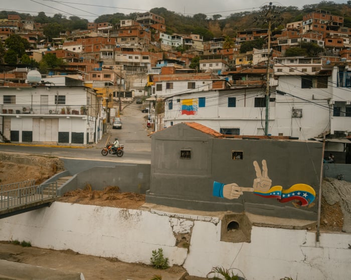
“`When Ángel Linares heard a strange buzzing sound followed by an explosion, his first thought was that his neighbors were setting off fireworks to celebrate the new year. Then his windows shattered, the building’s walls shook, and its front was torn off, throwing him to the ground of an apartment that had suddenly turned into rubble. His 85-year-old mother, Jesucita, feared that Venezuela’s northern coast had been hit by an earthquake, like the one she remembers from 1967.
Next door, Elizabeth Herrera jumped out of bed in her pajamas and realized something more sinister was happening when the silence after the explosion was filled with gunfire: “Tah-tah-tah-tah-tah-po-po-tah-tah-tah.” “Is it a coup? … I don’t believe ‘Papa Trump’ would have dared to invade,” Herrera remembers her husband guessing, as panicked residents of their housing estate struggled to understand the chaos just before 2 a.m. on January 3.
All four residents of the Urbanización Rómulo Gallegos project in Catia La Mar, a seaside town 20 miles north of Caracas, were wrong. Donald Trump had indeed ordered an invasion of Venezuela, though it was a lightning-fast one to kidnap the country’s then-president, Nicolás Maduro.
Their community found itself at the center of the storm as air-to-surface missiles rained down on defense and radar systems along the country’s Caribbean coast, and helicopter-borne Delta Force fighters swept south toward the capital. “They were 10 minutes that felt like an endless hour,” said Herrera, who lost two elderly neighbors during the attack, which was apparently targeting military installations on a nearby hill. She recalled her autistic son’s distress as they rushed out into the darkness and took shelter in a nearby school. “Mummy, are we the ba”Baddies? Are Venezuelans the baddies? Are they going to kill us?” he asked.
“I told him, ‘No, it’s probably just a problem between the White House and Miraflores,'” she replied, referring to Venezuela’s presidential palace.
Elizabeth Herrera stood outside her home in Catia La Mar. “So why are they shooting at us?” her son insisted. “In his autistic mind… it made no sense. If this was a disagreement between governments, why were the missiles falling here?”
More than four months after Operation Absolute Resolve, Herrera and her neighbors are far from the only ones still trying to understand Trump’s intervention and what it means for a country already struggling with years of poverty, hunger, and repression.
Across Venezuela, ordinary citizens, opposition activists, diplomats, businesspeople, and members of Maduro’s movement are trying to make sense of the confusing new era that began with the autocrat’s capture and Trump’s unexpected decision to recognize his vice president, Delcy Rodríguez, who has been in power since.
“Everything is so confusing… Sometimes it feels like an illusion,” said Jesús Armas, a former political prisoner and ally of the exiled opposition leader and Nobel laureate, María Corina Machado. Machado had hoped to take power but has been sidelined from Venezuela’s post-Maduro transformation.
Changes have certainly happened since Maduro’s 13-year rule ended during a two-and-a-half-hour blitz that left dozens of Cuban and Venezuelan troops and at least three civilians dead.
After years of increasingly harsh rule, which worsened after Maduro was accused of stealing the 2024 presidential election, a slow political thaw has begun.
Murals of Maduro have been painted over, his portraits quietly removed from some government offices, and foreign journalists are being allowed into the country for the first time since the 2024 vote.
Hundreds of political prisoners have been freed, and dissidents have come out of hiding or returned from exile to continue pushing for a return to democracy.
One recent evening, hundreds of people gathered outside Venezuela’s most notorious political prison—a shopping mall turned into a torture center called El Helicoide—for a protest that would have been unthinkable before. They demanded new elections and the release of the estimated 500 detainees still behind bars.
“People have lost their fear,” said Jeisi Blanco, a human rights campaigner, as colleagues wrote the names of those still imprisoned on the pavement with chalk, under the watch of police who filmed the participants but did not intervene.
“They aren’t just statistics. They are people with stories and families who have spent more than three years in jail,” she said.
Armas, who was released from El Helicoide in February as a gesture from Maduro’s successors, said: “I feel great… I feel hope right now. I know we are going to change this country.”
“We’re going to bring back freedom… and I know Venezuela will be a democracy in the next few months,” he said, insisting that Machado would return in the coming weeks to tour Venezuela, rally supporters, and complete its political transformation.
US officials also celebrate what many here call the “new political moment” made possible by Trump’s bold—though, to many, illegal—raid. “The president likes action. He also likes deals, and he likes progress.””We’re seeing all of that in a very short period of time,” said Jarrod Agen, the director of Trump’s National Energy Dominance Council, after arriving in Caracas on the first U.S. commercial flight to the oil-rich country in more than seven years.
Jarrod Agen speaking to reporters in Caracas. Photograph: Andrea Hernández Briceño/The Guardian
“We’re moving at Trump speed … I’m super excited,” he said, surrounded by smiling Venezuelan officials who have spent years at odds with their U.S. counterparts.
But alongside the excitement and optimism, there is confusion and concern. Maduro’s removal didn’t lead to full regime change or democratization. Instead, it led to a strange reconciliation between the fallen dictator’s authoritarian allies and their longtime enemies in Washington.
Trump has repeatedly praised Rodríguez as a “terrific” partner, while Venezuela’s new leader has given no sign that new elections are coming. “I don’t know, some time,” she said vaguely when asked recently when a vote might be held.
Diplomats in Caracas are stunned by the sudden political shift made by Maduro’s supposed anti-imperialist successors. They have rolled out the red carpet for Trump officials and allowed Venezuela to become what some call a U.S. protectorate—with almost no explanation.
“It’s the theater of the absurd, it’s Beckett,” said one foreign envoy, recalling how, after Japan’s 1945 surrender to allied forces, Emperor Hirohito urged citizens to “bear the unbearable and endure the unendurable” to save their nation’s future.
Supporters gather to hear Delcy Rodríguez speak at a rally in Caracas in April. Photograph: Andrea Hernández Briceño/The Guardian
Rodríguez’s team offered no such justification for embracing Trump, the diplomat said: “They just went from A to B without explaining why.”
Experts say this once unlikely partnership between Washington and Caracas is driven by Trump’s desire to secure access to Venezuela’s vast oil reserves and to score a foreign policy “win” amid the disaster in Iran. Meanwhile, Rodríguez is determined to hold onto power and save the political movement Hugo Chávez founded more than 25 years ago.
“The goal is not to be the cat’s paw of the United States, or to be a partner of the United States,” said Tom Shannon, a U.S. diplomat who has worked with Venezuela since the 1990s.
“The goal is to maintain and preserve the Bolivarian revolution, as much as possible, and to do whatever is necessary to keep that revolution alive and to allow the political leadership that defined it to survive.”
A man walks past posters celebrating Delcy Rodríguez in Caracas. Photograph: Andrea Hernández Briceño/The Guardian
“I’m sure she finds it humiliating,” he said of Rodríguez, whom he has met many times. “She’s in a position that I’m sure she sees as politically complicated and difficult, but historic in terms of the path of the Bolivarian revolution.”
For opponents of the movement, who blame it for an economic and humanitarian disaster that has forced about a quarter of the country’s population to flee abroad, the détente and incomplete transition have left a bitter taste.
Sitting outside her home, next to a government memorial to the victims of Trump’s attack, Herrera recalled her initial excitement at what seemed like imminent change, even as parts of her housing estate lay in ruins.
“I thought it was all over … I thought, thank goodness we’re going to escape this situation that’s strangling us,” she said, with a freshly painted government mural behind her bearing the message: “We will prevail.”
Elizabeth HerRera stood in front of a government mural that read, “We will prevail.” (Photo: Andrea Hernández Briceño/The Guardian)
But as the days went by, the excitement turned into disappointment. “On the news, they talk about how much oil and gold they’ve taken… yet we’re still stuck in the same place. [If Trump came here] I’d ask him to think about Venezuelans, not just the natural resources Venezuela has,” she said.
“I feel hope, but I also feel fear… Our fear is that we hope the situation will change, but then it doesn’t happen.”
Sitting on a sofa next to a portrait of Venezuela’s liberation hero Simón Bolívar, which was scarred by shrapnel, Jesucita Linares said her biggest worry was another attack.
To prepare, she has turned her shopping cart into an emergency bag filled with clothes and medicine. “I’ve been praying to God that this never happens again,” said Linares. “But you never really know.”
Frequently Asked Questions
Here is a list of FAQs about the article It feels like an illusion inside Venezuelas confusing new era after Maduro written in a natural tone with clear direct answers
BeginnerLevel Questions
1 What does It feels like an illusion mean in this context
It means that while President Maduro is still in power there are small signs of changelike more imported goods in stores or a slight economic opening But for many Venezuelans these changes feel temporary and unreal like a dream they might wake up from
2 Is Maduro still in charge of Venezuela
Yes Despite international pressure and a contested election Nicolás Maduro remains the president and controls the military police and most state institutions
3 What is the confusing new era theyre talking about
Its a period where the old strict socialist controls have loosened a bit The US has lifted some oil sanctions the economy has partially dollarized and you can find products that were missing for years But the political crisis poverty and repression havent gone away
4 Why would people say the changes are an illusion
Because the improvements are fragile For example you might see a supermarket full of food but most people cant afford to buy it The political situation is still unstable and theres a fear that the government could crack down again at any moment
5 Is life better in Venezuela now than it was a year ago
For some people yesespecially those with access to US dollars They can buy imported goods and eat better But for the majority earning in the local currency life is still extremely hard due to hyperinflation and low wages
AdvancedLevel Questions
6 What specific economic changes have happened since the US eased sanctions
The government has allowed more private imports relaxed some price controls and encouraged the use of the US dollar alongside the bolivar This has brought back basic goods like cooking oil flour and medicine that were scarce before
7 Why does the article call the situation confusing
Because the government is sending mixed signals On one hand they talk about dialogue and economic opening On the other they arrest opposition leaders restrict protests and keep tight control over the media Its