@font-face {
font-family: ‘Guardian Headline Full’;
src: url(‘https://assets.guim.co.uk/static/frontend/fonts/guardian-headline/noalts-not-hinted/GHGuardianHeadline-Light.woff2’) format(‘woff2’),
url(‘https://assets.guim.co.uk/static/frontend/fonts/guardian-headline/noalts-not-hinted/GHGuardianHeadline-Light.woff’) format(‘woff’),
url(‘https://assets.guim.co.uk/static/frontend/fonts/guardian-headline/noalts-not-hinted/GHGuardianHeadline-Light.ttf’) format(‘truetype’);
font-weight: 300;
font-style: normal;
}
@font-face {
font-family: ‘Guardian Headline Full’;
src: url(‘https://assets.guim.co.uk/static/frontend/fonts/guardian-headline/noalts-not-hinted/GHGuardianHeadline-LightItalic.woff2’) format(‘woff2’),
url(‘https://assets.guim.co.uk/static/frontend/fonts/guardian-headline/noalts-not-hinted/GHGuardianHeadline-LightItalic.woff’) format(‘woff’),
url(‘https://assets.guim.co.uk/static/frontend/fonts/guardian-headline/noalts-not-hinted/GHGuardianHeadline-LightItalic.ttf’) format(‘truetype’);
font-weight: 300;
font-style: italic;
}
@font-face {
font-family: ‘Guardian Headline Full’;
src: url(‘https://assets.guim.co.uk/static/frontend/fonts/guardian-headline/noalts-not-hinted/GHGuardianHeadline-Regular.woff2’) format(‘woff2’),
url(‘https://assets.guim.co.uk/static/frontend/fonts/guardian-headline/noalts-not-hinted/GHGuardianHeadline-Regular.woff’) format(‘woff’),
url(‘https://assets.guim.co.uk/static/frontend/fonts/guardian-headline/noalts-not-hinted/GHGuardianHeadline-Regular.ttf’) format(‘truetype’);
font-weight: 400;
font-style: normal;
}
@font-face {
font-family: ‘Guardian Headline Full’;
src: url(‘https://assets.guim.co.uk/static/frontend/fonts/guardian-headline/noalts-not-hinted/GHGuardianHeadline-RegularItalic.woff2’) format(‘woff2’),
url(‘https://assets.guim.co.uk/static/frontend/fonts/guardian-headline/noalts-not-hinted/GHGuardianHeadline-RegularItalic.woff’) format(‘woff’),
url(‘https://assets.guim.co.uk/static/frontend/fonts/guardian-headline/noalts-not-hinted/GHGuardianHeadline-RegularItalic.ttf’) format(‘truetype’);
font-weight: 400;
font-style: italic;
}
@font-face {
font-family: ‘Guardian Headline Full’;
src: url(‘https://assets.guim.co.uk/static/frontend/fonts/guardian-headline/noalts-not-hinted/GHGuardianHeadline-Medium.woff2’) format(‘woff2’),
url(‘https://assets.guim.co.uk/static/frontend/fonts/guardian-headline/noalts-not-hinted/GHGuardianHeadline-Medium.woff’) format(‘woff’),
url(‘https://assets.guim.co.uk/static/frontend/fonts/guardian-headline/noalts-not-hinted/GHGuardianHeadline-Medium.ttf’) format(‘truetype’);
font-weight: 500;
font-style: normal;
}
@font-face {
font-family: ‘Guardian Headline Full’;
src: url(‘https://assets.guim.co.uk/static/frontend/fonts/guardian-headline/noalts-not-hinted/GHGuardianHeadline-MediumItalic.woff2’) format(‘woff2’),
url(‘https://assets.guim.co.uk/static/frontend/fonts/guardian-headline/noalts-not-hinted/GHGuardianHeadline-MediumItalic.woff’) format(‘woff’),
url(‘https://assets.guim.co.uk/static/frontend/fonts/guardian-headline/noalts-not-hinted/GHGuardianHeadline-MediumItalic.ttf’) format(‘truetype’);
font-weight: 500;
font-style: italic;
}
@font-face {
font-family: ‘Guardian Headline Full’;
src: url(‘https://assets.guim.co.uk/static/frontend/fonts/guardian-headline/noalts-not-hinted/GHGuardianHeadline-Semibold.woff2’) format(‘woff2’),
url(‘https://assets.guim.co.uk/static/frontend/fonts/guardian-headline/noalts-not-hinted/GHGuardianHeadline-Semibold.woff’) format(‘woff’),
url(‘https://assets.guim.co.uk/static/frontend/fonts/guardian-headline/noalts-not-hinted/GHGuardianHeadline-Semibold.ttf’) format(‘truetype’);
font-weight: 600;
font-style: normal;
}
@font-face {
font-family: ‘Guardian Headline Full’;
src: url(‘https://assets.guim.co.uk/static/frontend/fonts/guardian-headline/noalts-not-hinted/GHGuardianHeadline-SemiboldItalic.woff2’) format(‘woff2’),
url(‘https://assets.guim.co.uk/static/frontend/fonts/guardian-headline/noalts-not-hinted/GHGuardianHeadline-SemiboldItalic.woff’) format(‘woff’),
url(‘https://assets.guim.co.uk/static/frontend/fonts/guardian-headline/noalts-not-hinted/GHGuardianHeadline-SemiboldItalic.ttf’) format(‘truetype’);
font-weight: 600;
font-style: italic;
}Here’s the rewritten version in fluent, natural English:
“`css
@font-face {
font-family: ‘Guardian Headline Full’;
src: url(‘https://assets.guim.co.uk/static/frontend/fonts/guardian-headline/noalts-not-hinted/GHGuardianHeadline-Bold.woff2’) format(‘woff2’),
url(‘https://assets.guim.co.uk/static/frontend/fonts/guardian-headline/noalts-not-hinted/GHGuardianHeadline-Bold.woff’) format(‘woff’),
url(‘https://assets.guim.co.uk/static/frontend/fonts/guardian-headline/noalts-not-hinted/GHGuardianHeadline-Bold.ttf’) format(‘truetype’);
font-weight: 700;
font-style: normal;
}
@font-face {
font-family: ‘Guardian Headline Full’;
src: url(‘https://assets.guim.co.uk/static/frontend/fonts/guardian-headline/noalts-not-hinted/GHGuardianHeadline-BoldItalic.woff2’) format(‘woff2’),
url(‘https://assets.guim.co.uk/static/frontend/fonts/guardian-headline/noalts-not-hinted/GHGuardianHeadline-BoldItalic.woff’) format(‘woff’),
url(‘https://assets.guim.co.uk/static/frontend/fonts/guardian-headline/noalts-not-hinted/GHGuardianHeadline-BoldItalic.ttf’) format(‘truetype’);
font-weight: 700;
font-style: italic;
}
@font-face {
font-family: ‘Guardian Headline Full’;
src: url(‘https://assets.guim.co.uk/static/frontend/fonts/guardian-headline/noalts-not-hinted/GHGuardianHeadline-Black.woff2’) format(‘woff2’),
url(‘https://assets.guim.co.uk/static/frontend/fonts/guardian-headline/noalts-not-hinted/GHGuardianHeadline-Black.woff’) format(‘woff’),
url(‘https://assets.guim.co.uk/static/frontend/fonts/guardian-headline/noalts-not-hinted/GHGuardianHeadline-Black.ttf’) format(‘truetype’);
font-weight: 900;
font-style: normal;
}
@font-face {
font-family: ‘Guardian Headline Full’;
src: url(‘https://assets.guim.co.uk/static/frontend/fonts/guardian-headline/noalts-not-hinted/GHGuardianHeadline-BlackItalic.woff2’) format(‘woff2’),
url(‘https://assets.guim.co.uk/static/frontend/fonts/guardian-headline/noalts-not-hinted/GHGuardianHeadline-BlackItalic.woff’) format(‘woff’),
url(‘https://assets.guim.co.uk/static/frontend/fonts/guardian-headline/noalts-not-hinted/GHGuardianHeadline-BlackItalic.ttf’) format(‘truetype’);
font-weight: 900;
font-style: italic;
}
@font-face {
font-family: ‘Guardian Titlepiece’;
src: url(‘https://assets.guim.co.uk/static/frontend/fonts/guardian-titlepiece/noalts-not-hinted/GTGuardianTitlepiece-Bold.woff2’) format(‘woff2’),
url(‘https://assets.guim.co.uk/static/frontend/fonts/guardian-titlepiece/noalts-not-hinted/GTGuardianTitlepiece-Bold.woff’) format(‘woff’),
url(‘https://assets.guim.co.uk/static/frontend/fonts/guardian-titlepiece/noalts-not-hinted/GTGuardianTitlepiece-Bold.ttf’) format(‘truetype’);
font-weight: 700;
font-style: normal;
}
@media (min-width: 71.25em) {
.content__main-column–interactive {
margin-left: 160px;
}
}
@media (min-width: 81.25em) {
.content__main-column–interactive {
margin-left: 240px;
}
}
.content__main-column–interactive .element-atom {
max-width: 620px;
}
@media (max-width: 46.24em) {
.content__main-column–interactive .element-atom {
max-width: 100%;
}
}
.content__main-column–interactive .element-showcase {
margin-left: 0;
}
@media (min-width: 46.25em) {
.content__main-column–interactive .element-showcase {
max-width: 620px;
}
}
@media (min-width: 71.25em) {
.content__main-column–interactive .element-showcase {
max-width: 860px;
}
}
.content__main-column–interactive .element-immersive {
max-width: 1100px;
}
@media (max-width: 46.24em) {
.content__main-column–interactive .element-immersive {
width: calc(100vw – var(–scrollbar-width, 0px));
position: relative;
left: 50%;
right: 50%;
margin-left: calc(-50vw + var(–half-scrollbar-width, 0px)) !important;
margin-right: calc(-50vw + var(–half-scrollbar-width, 0px)) !important;
}
}
@media (min-width: 46.25em) {
.content__main-column–interactive .element-immersive {
transform: translate(-20px);
width: calc(100% + 60px);
}
}
@media (max-width: 71.24em) {
.content__main-column–interactive .element-immersive {
margin-left: 0;
margin-right: 0;
}
}
@media (min-width: 71.25em) {
.content__main-column–interactive .element-immersive {
transform: translate(0);
width: auto;
}
}
@media (min-width: 81.25em) {
.content__main-column–interactive .element-immersive {
max-width: 1260px;
}
}
.content__main-column–interactive p,
.content__main-column–interactive ul {
max-width: 620px;
}
.content__main-column–interactive:before {
position: absolute;
top: 0;
height: calc(100% + 15px);
min-height: 100px;
content: “”;
}
@media (min-width: 71.25em) {
/ Additional styles can go here /
}
“`Here’s the rewritten text in fluent, natural English:
The main interactive column has a left border that is 1 pixel wide and light gray. On larger screens (81.25em and above), this border shifts slightly to the left. Inside this column, elements like atoms have no top or bottom margin but include padding. When a paragraph is followed by an atom, the padding is removed and replaced with a 12-pixel margin on both sides. Inline elements are limited to a maximum width of 620 pixels.
For media sections that contain looping figures, the caption sits above other content. The loop button is 32 pixels wide, aligned to the bottom right, with a small right margin. The caption button is also given a high stacking order. On medium screens (46.25em and above), cinemagraph figures can expand beyond their usual height limits.
In the body section, self-hosted videos are displayed as block elements, up to 620 pixels wide, with 12-pixel margins above and below. When these videos are in a loop, both the figure and the video fill the full width, with auto height and centered alignment. If the video is immersive (full-width), it stretches across the entire container without margins. On larger screens (71.25em and above), immersive videos expand to 1140 pixels wide and shift left. On even larger screens (81.25em and above), they grow to 1300 pixels wide and shift further left.
The design uses several color variables: dateline is dark gray, header borders are light gray, caption text is a medium gray, and caption backgrounds are nearly black with some transparency. The feature color is a deep red. Subheadings, pull quotes, and block quotes all use the secondary pillar color. In dark mode, these switch to a dark-mode pillar color.
Interactive elements like atoms have no padding. In the article body, when an atom or a horizontal rule appears right before a paragraph, the paragraph is treated as the first one in that section. This applies to various parts of the page, including the comment body and feature body.Here’s the rewritten text in fluent, natural English:
The first paragraph after an element atom, sign-in gate, or horizontal rule (except the last one) gets a 14-pixel top padding. The first letter of that paragraph is styled with a large, bold, uppercase drop cap using the Guardian Headline font family. It’s 111 pixels tall, with a line height of 92 pixels, floats to the left, has an 8-pixel right margin, and uses the drop cap color (or the pillar color as a fallback).
Paragraphs that come right after a horizontal rule have no top padding. Pull quotes are limited to a maximum width of 620 pixels.
For showcase elements, the caption is positioned statically and takes up the full width, up to 620 pixels. On screens wider than 71.25em, the caption becomes absolutely positioned with a max width of 140 pixels. On screens wider than 81.25em, the max width increases to 220 pixels.
Immersive elements take up the full viewport width, minus the scrollbar width. On screens narrower than 71.24em, they are capped at 978 pixels wide. Their captions have 10 pixels of horizontal padding on small screens, and 20 pixels on screens between 30em and 71.24em.Here’s the rewritten version in fluent, natural English:
The immersive element has a maximum width of 738px. On smaller screens (under 46.24em), the immersive element shifts 10px to the left with no right margin. On screens between 30em and 46.24em, it shifts 20px to the left, and the caption gets 20px of padding on each side.
For larger screens (71.25em and above), showcase images in the main content area move 160px to the left. On even larger screens (81.25em and above), they shift 240px to the left.
The furniture wrapper is positioned relatively. On screens 61.25em and wider, it becomes a grid with a 20px gap between columns and no gap between rows. The grid has two main sections: the left side (title, headline, meta, standfirst) takes up 5 columns, and the right side (portrait) takes up another 5 columns. The rows are arranged with the title and portrait starting together, followed by the headline, then the standfirst, and finally the meta.
In this layout, the first child of the headline section gets a top border. The meta section has some top padding and no right margin. The standfirst text has a small bottom margin, and its list items are 20px in size. Links in the standfirst are underlined with a 6px offset, using a light gray color. When hovered, the underline color changes to the pillar color. The first paragraph of the standfirst has a top border and no bottom padding.
On screens 71.25em and wider, the first paragraph of the standfirst loses its top border. The figure elements in the furniture wrapper have no margin on the left, and inline figures have a maximum width of 630px.
At 71.25em and above, the grid changes: the left side (title, headline, meta) takes up 2 columns, the standfirst takes up 5 columns, and the portrait takes up 7 columns. The rows are arranged with the title and portrait starting at 80px, followed by the headline, then the standfirst and meta together. The meta section gets a 540px-wide top border line. The standfirst paragraphs have no top border, and the standfirst section itself has no top border either.The `e=standfirst]:before` rule adds a 1px-wide vertical line using the header border color. It’s positioned at the top left, with a height of 100%.
For screens wider than 81.25em, the `.furniture-wrapper` uses a grid layout with 16 columns and three rows. The `#meta` and `[data-gu-name=meta]` elements have a `:before` pseudo-element that’s 620px wide. The `.standfirst`, `#standfirst`, and `[data-gu-name=standfirst]` elements have their `:before` pseudo-element shifted slightly to the left.
Inside the article header, the labels within `.content__labels > div` for `.article-header`, `[data-gu-name=title]`, and similar have 2px of padding at the top.
For `#headline h1`, `[data-gu-name=headline] h1`, and `.headline h1`, the font weight is 600, max width is 620px, and font size is 32px. On screens wider than 71.25em, the max width becomes 540px and font size increases to 50px.
On screens wider than 46.25em, `.keyline-4` and `[data-gu-name=lines]` have no right margin. On screens wider than 61.25em, they are hidden. Their SVG elements use the header border color for strokes.
For `#meta` and `[data-gu-name=meta]`, the right margin is removed on screens wider than 46.25em. The social and comment sections within these elements use the header border color for their borders.
Inside `#meta` and `[data-gu-name=meta]`, the `gu-island` elements inside `.content__meta-container_dcr > div` are hidden.
The `.standfirst`, `#standfirst`, and `[data-gu-name=standfirst]` elements have a left margin of -10px, left padding of 10px, and are positioned relatively. On screens wider than 46.25em, they get 2px of top padding. Paragraphs inside them have a font weight of 400, font size of 20px, and 14px of bottom padding.
`#main-media` and `[data-gu-name=media]` are positioned relatively, have no top margin, a 2px bottom margin, and are placed in the portrait grid area. Their inner `div div` elements are full width with no inline margin. On screens wider than 61.25em, the bottom margin is removed. On screens narrower than 46.24em, they take up the full viewport width (minus scrollbar) and have a left margin of -10px. If the screen is between 30em and 46.24em, the left margin becomes -20px.
The `figcaption` is positioned at the bottom, with 4px top padding, 10px left and right padding, and 12px bottom padding. It uses the caption background and text colors, has no max width, is full width, no bottom margin, and a minimum height of 46px. The `span` inside uses the header border color for text and SVG fills. The first `span` is hidden, while the second is displayed with a max width of 90%. On screens wider than 30em, the left and right padding increases to 20px. When the `hidden` class is applied, the caption becomes invisible.
The `#caption-button` is displayed as a block, positioned at the bottom right (10px from bottom, 8px from right), with a z-index of 30. It uses the caption background color, has no border, and is fully rounded.Here is the rewritten text in fluent, natural English:
The padding is set to 6px on the top and bottom, and 5px on the left and right. In the furniture wrapper, the caption button’s SVG is scaled down to 85% of its original size. On screens wider than 30em, the caption button is positioned 10px from the right. On screens wider than 71.25em, the main interactive column’s top margin is adjusted to -12px, and its height is increased by 24px. The main interactive column’s h2 headings have a maximum width of 620px.
For devices running iOS or Android, the following color variables are defined: the dark background is #1a1a1a, the feature color is #c70000, the dark mode feature color is #ff5943, and the new pillar color defaults to the primary pillar or the feature color. In dark mode on these devices, the new pillar color switches to the dark mode pillar or the dark mode feature color.
On iOS and Android devices, the first letter of the first paragraph after the first element atom in feature, standard, and comment article containers is colored using the secondary pillar variable, which defaults to black. Also on these devices, the article header in feature, standard, and comment containers has a height of 0. The furniture wrapper in these containers has padding of 4px on top and bottom, and 10px on the left and right, with no padding on the bottom. The content labels inside the furniture wrapper use bold font weight, the Guardian Headline font family, the new pillar color, and are capitalized. The headline h1 inside the furniture wrapper is also styled accordingly.Here’s the rewritten CSS in fluent, natural English:
For the headline inside the furniture wrapper on Android devices, set the font size to 32 pixels, make it bold, add 12 pixels of padding at the bottom, and use a dark color (#121212).
On both iOS and Android, when an image appears inside the furniture wrapper, position it relatively. Add 14 pixels of margin on top and none on the left. Set its width to fill the full viewport width, accounting for any scrollbar, and let the height adjust automatically.
For the image itself, along with its inner container and any links inside it, remove the background color. Make the width span the full viewport width (minus the scrollbar), and let the height stay automatic.
For the standfirst section on both iOS and Android, add 4 pixels of padding on top and 24 pixels on the bottom. Also, add a negative right margin of 10 pixels.
Inside the standfirst, style the paragraph text using the font family: Guardian Headline, Guardian Egyptian Web, Guardian Headline Full, or Georgia (in that order).
For any links inside the standfirst, including those within list items, apply the same styling.Here’s the rewritten version in fluent, natural English:
On Android devices, links inside the standfirst section of feature, standard, and comment articles use the pillar color, have no background image, are underlined with a 6px offset, and use a light gray underline color instead of a bottom border.
On both iOS and Android, when you hover over those same links, the underline color changes to the pillar color.
On both platforms, the meta section in these article containers has no margin.
Also on both platforms, the byline text, author names, author links, and any byline spans in the meta section all use the pillar color.For iOS and Android, the `.meta__misc` section inside `.furniture-wrapper` within article containers (feature, standard, and comment) has no padding.
On both iOS and Android, the SVG icons in the same `.meta__misc` section use a stroke color defined by `–new-pillar-colour`.
For the caption button inside `.element–showcase` in these article containers on both iOS and Android, it is displayed as a flex container with 5px padding, centered content, and a width and height of 28px, positioned 14px from the right.
The article body (`.article__body`) in feature, standard, and comment containers on both iOS and Android has 12px padding on the left and right.
For images inside the article body that are not thumbnails or immersive (`.element-image:not(.element–thumbnail):not(.element–immersive)`), they have no margin, and their width is calculated as the full viewport width minus 24px and the scrollbar width. Their height is automatic. The captions for these images have no padding.
For immersive images (`.element-image.element-immersive`) in the article body on both iOS and Android, their width is the full viewport width minus the scrollbar width.
For blockquotes with the class `.quoted` inside the prose section of the article body on iOS…Here’s the rewritten version in fluent, natural English:
For quoted text in articles, the color is set by the pillar color variable. Links within article text are styled with an underline, using the primary pillar color and a 6px offset. The underline color matches the header border. When you hover over these links, the underline changes to the new pillar color.
In dark mode, the furniture wrapper background becomes dark gray (#1a1a1a). The content labels inside it use the new pillar color. The main headline doesn’t have a background and takes on the header border color instead. Standfirst text also uses the header border color. Links in the standfirst and author names in the byline follow the same styling.Here’s the rewritten version in fluent, natural English:
On both Android and iOS, the byline author links in the meta section of feature, standard, and comment articles use the new pillar color. The SVG icons in the meta section of these articles also use the same pillar color for their stroke.
For showcase image captions in feature, standard, and comment articles on both platforms, the text color is set to the dateline variable.
Blockquotes inside the article body on both Android and iOS use the new pillar color.
The background color of the main article body areas—including the article body, interactive content, feature body, comment body, and any element with the data attribute “body”—is set to the dark background color on both platforms. This applies to feature, standard, and comment articles.Here is the rewritten text in fluent, natural English:
On iOS devices, when viewing feature articles, the first letter of a paragraph that comes right after an element atom (or after a sign-in gate followed by an element atom) should be styled in a special way. This applies to several sections of the article, including the main body, interactive content areas, feature body sections, comment body sections, and any area marked with `data-gu-name=”body”`.
The same styling rules also apply to standard articles and comment articles on iOS. In each case, the first letter of a paragraph following an element atom—whether or not it is preceded by a sign-in gate—should be styled accordingly.
On Android devices, similar styling applies to feature articles, but only within the article body section.Here’s the rewritten version in fluent, natural English:
On Android devices, when viewing feature, standard, or comment articles, the first letter of the first paragraph after an element atom should be styled in a special way. This applies whether the paragraph comes right after the element atom, or after a sign-in gate that follows the element atom. The same rule applies to paragraphs inside the article body, interactive content sections, feature body sections, comment body sections, and any area marked with `data-gu-name=”body”`.Here’s the rewritten text in fluent, natural English:
“`css
.element-atom + p:first-letter,
body.android #comment-article-container #comment-body .element-atom + .sign-in-gate + p:first-letter,
body.android #comment-article-container #comment-body .element-atom + #sign-in-gate + p:first-letter {
color: var(–new-pillar-colour, #ffffff);
}
body.ios.garnett–type-comment #comment-article-container .furniture-wrapper .standfirst,
body.android.garnett–type-comment #comment-article-container .furniture-wrapper .standfirst {
padding-top: 24px;
margin-top: 0;
}
.prose h2 {
font-size: 24px;
}
body.ios #feature-article-container #caption-button,
body.ios #standard-article-container #caption-button,
body.ios #comment-article-container #caption-button {
padding: 6px 5px 0;
}
body.android #feature-article-container #caption-button,
body.android #standard-article-container #caption-button,
body.android #comment-article-container #caption-button {
padding: 4px 4px 0;
}
@media (prefers-color-scheme: dark) {
:root:root:not([data-color-scheme=light]) {
–follow-text: #dcdcdc;
–follow-icon-fill: var(–darkmode-pillar);
–standfirst-text: #dcdcdc;
–standfirst-link-text: var(–darkmode-pillar);
–standfirst-link-border: var(–darkmode-pillar);
–byline: var(–darkmode-pillar);
}
}
body.ios,
body.android {
background-color: #fff;
}
body.ios #feature-article-container .furniture-wrapper .content__labels,
body.ios #standard-article-container .furniture-wrapper .content__labels,
body.ios #comment-article-container .furniture-wrapper .content__labels,
body.android #feature-article-container .furniture-wrapper .content__labels,
body.android #standard-article-container .furniture-wrapper .content__labels,
body.android #comment-article-container .furniture-wrapper .content__labels,
body.ios #feature-article-container .furniture-wrapper h1.headline,
body.ios #standard-article-container .furniture-wrapper h1.headline,
body.ios #comment-article-container .furniture-wrapper h1.headline,
body.android #feature-article-container .furniture-wrapper h1.headline,
body.android #standard-article-container .furniture-wrapper h1.headline,
body.android #comment-article-container .furniture-wrapper h1.headline {
font-weight: 700;
}
.article .article__body h2,
article.content–interactive [data-gu-name=body] h2 {
font-weight: 200;
}
.article .article__body h2:has(strong),
article.content–interactive [data-gu-name=body] h2:has(strong) {
font-weight: 700;
}
.content__meta-container_dcr > div > gu-island {
display: block !important;
}
“`
View image in fullscreen
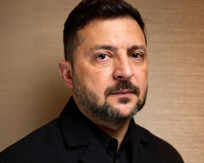
Sitting down with the Guardian in London, Volodymyr Zelenskyy seems cheerful. More than four years after Vladimir Putin’s full-scale invasion, he believes Europe’s biggest war since 1945 is slowly turning in Ukraine’s favour. Zelenskyy says the military situation is the most promising it has been for Kyiv in two and a half years. “We can’t say Russia is losing this war. But we can say they are losing the initiative each day, day by day,” he insists.
Over the past week, the Kremlin has suffered a series of setbacks. Long-range Ukrainian drones have hit Putin’s home city of St Petersburg, setting fire to oil terminals and sending smoke billowing above the skyline. Similar attacks have crippled occupied Crimea. A key supply road is littered with burning lorries and tankers, and the peninsula seized by Russia in 2014 is experiencing severe fuel shortages.
Meanwhile, on the eastern battlefield, Russia’s grinding advance has come to a near halt. According to Zelenskyy—who since 2022 has consistently said he believes that with sufficient support Ukraine can defend against its invader—the Kremlin is losing more than 30,000 soldiers a month, with 23,000-24,000 killed and the rest “heavily” wounded. He suggests the true figure could be even higher. “Totally, this is a very big number. It means that they are not winning the war,” he points out. Ukraine has also lost service personnel, but on a smaller scale.
25:28
Zelenskyy: Russia is losing the initiative – video interview
Moscow’s war may look stuck, but its destruction continues, and in recent months it has intensified its aerial attacks on Ukrainian towns.Attacks on cities appear aimed at terrorizing civilians. One attack last Tuesday involved 73 missiles and 656 drones. Eighteen people were killed in Kyiv and Dnipro, including a three-year-old boy who was buried under the rubble of an apartment building. According to the city’s mayor, the Russians are deliberately using cluster munitions in populated areas.
Last week, Zelenskyy wrote an open letter to Russia’s president, suggesting a face-to-face meeting to de-escalate the terrible conflict. Speaking on Friday at the St. Petersburg economic forum, Putin rejected the offer. He called the letter “rude” and said Russia’s territorial demands—the Donbas region and two southern Ukrainian provinces—remained unchanged. He also insisted Russian forces were advancing along the entire frontline, telling them: “Keep working, brothers.”
Putin’s unyielding stance has led some observers to wonder if he is delusional or being fed false information by his commanders. Zelenskyy says these theories are plausible, but he stresses that “the reason he’s lying doesn’t matter.” He adds that Putin has lied about the war from the start, claiming it was necessary to seize Ukrainian land to “rescue” Russian speakers. Zelenskyy believes these lies serve as a glue to hold different parts of Russian society together.
On the international stage, Russia has faced several recent political setbacks. In April, Putin’s closest ally in Europe, Viktor Orbán, was defeated in Hungary’s general election. Recent Russian efforts to support pro-Kremlin candidates in Moldova and, over the weekend, in Armenia also failed. “They are losing influence in different countries, including in Azerbaijan,” Zelenskyy says. He adds: “They are isolated within Europe and from the United States as well. So they are alone.”
Donald Trump began his second term in 2025 saying he would end the war, and Zelenskyy has carefully praised US diplomatic efforts, despite his difficult meeting in the Oval Office, last summer’s friendly summit between Trump and Putin in Alaska, and cuts to US aid for Kyiv. “I always told President Trump that Putin is lying. He plays games with you, with the White House,” Zelenskyy says, adding that he is grateful to Americans for their “strong support” for his country.
Ukraine’s president admits that Washington’s attention has shifted to the Middle East. “Of course, from the very beginning of the war with Iran, their focus changed,” Zelenskyy says of the Trump administration. He understands why the US has used up “so many missiles and weapons” in its chosen war with Tehran. He notes wistfully that Kyiv—unlike the US’s Gulf allies and Israel—never received “that level of support.” “It’s a pity,” he says.
Since 2022, Ukraine has transformed itself into a drone superpower. Once reliant on Western military aid, Kyiv has become a hub for military industrial production and technical innovation. Several Arab countries have sought its help in shooting down Iranian Shahed drones. The most important weapon Ukraine now lacks, Zelenskyy says, are US-made Patriots. They are the only system capable of intercepting Russian ballistic missiles, which rain down on sleeping Ukrainian civilians every night.
On Sunday, Zelenskyy held talks in Downing Street with Keir Starmer, Germany’s Chancellor Friedrich Merz, and French President Emmanuel Macron. Zelenskyy says he renewed a call to his European allies to “close” Ukraine’s skies—in other words, to help Ukraine fend off large-scale Russian drone and missile attacks. In addition to antiballistic interceptors, he wants financial support to transform Ukraine’s mobilized armed forces into a European-style contract army.Volodymyr Zelenskyy outside 10 Downing Street on Sunday. Photograph: Lauren Hurley/Downing Street
He acknowledges that Patriot missiles are expensive, costing $4 million each. The UK doesn’t have its own anti-ballistic missile program. He believes that London, Paris, Berlin, and other EU countries should work together to create an alternative to the US version. In return, Ukraine is ready to share its hard-earned experience with drone warfare with its European allies. “The UK is one of them. And NATO is very interested in this. This is priceless information. There’s a huge amount of it,” he says.
Zelenskyy is hesitant to discuss future military operations. But long- and mid-range drone attacks have made the return of Crimea—annexed by Russia in 2014—a tempting, if distant, possibility. Ukraine’s forces are busy destroying the peninsula’s logistics and hitting other military and energy targets across occupied southern Ukraine, he says. “It’s all about critical infrastructure. This helps them militarize our Crimea. We’re working on it,” he adds.
For a long time, many Russians have tried to ignore the war raging across the Ukrainian border. Zelenskyy says the purpose of long-range strikes—which have seen drones buzzing above apartment blocks in greater Moscow and St. Petersburg—is to make residents “feel” what war means. He adds: “Victory in this war is when Russian society realizes that the war is awful, that the war is a tragedy not for someone, somewhere, but for themselves. And I think this is the momentum.”
In May, Russian oligarch Roman Abramovich secretly traveled to Kyiv for talks with Zelenskyy. Zelenskyy says he told Abramovich he would never give up the Donbas region, as Moscow wishes. Explaining the meeting, he says: “I think there are different people around Putin. Half of them want to continue this war. Half want to stop. And I think that people from business understand that the economy in Russia is in a terrible state. It’s very close to collapse.”
View image in fullscreen
Volodymyr Zelenskyy: ‘I think there are different people around Putin. Half of them want to continue this war. Half want to stop’
Zelenskyy spoke to the Guardian shortly before going to see King Charles. The two men appear to have developed a warm and trusting relationship. Zelenskyy has previously revealed that the monarch urged Donald Trump during his state visit to the UK last year to support Ukraine, something the US president has been distinctly reluctant to do. If the war continues to go well, could the monarch one day visit Zelenskyy’s own palace in Kyiv?
Ukraine’s president grinned at the question. He nodded his head enthusiastically. “You know, this morning when I spoke by phone with my wife [Olena], with all respect to Keir [Starmer], my wife said best regards to the king. And then to the prime minister,” he confesses. “Ukraine loves his majesty. I would very much like to invite him to Kyiv. Maybe this year. I don’t know from a security standpoint, but of course we want to see him.”
Frequently Asked Questions
Here is a list of FAQs based on the quote and context of President Zelenskyys statements about Russia Putins lies and fighting back
BeginnerLevel Questions
1 What does Zelenskyy mean when he says They are isolated they are alone
He means that Russia and its leader Vladimir Putin have very few real allies left in the world Most countries have condemned the invasion and even Russias traditional partners are keeping their distance
2 Why does Zelenskyy keep talking about Putins lies
He is pointing out that Putin often says things that arent true to justify the war For example Putin claimed Ukraine was a threat to Russia which Zelenskyy says is a complete fabrication
3 How is Ukraine fighting back against Russia
Ukraine is fighting back both militarily and diplomatically Zelenskyy also means fighting back against Russian propaganda
4 Is Ukraine winning the war
Its hard to say winning in a simple way Ukraine has successfully defended its capital and pushed Russian forces back in some areas but the war is long and difficult Zelenskyys message is that Ukraine is resilient and not giving up
5 What is the main point Zelenskyy is trying to make with this quote
His main point is that Russia is weaker than it appears Despite its size and military power it is politically and morally isolated while Ukraine has the support of the free world
IntermediateLevel Questions
6 Does isolated mean Russia has no friends at all
Not literally zero friends but very few Countries like North Korea Iran and Belarus still support Russia but most of the world has imposed sanctions and stopped trading with Russia Zelenskyy is highlighting that Russia is not the superpower it pretends to be
7 How does Zelenskyy use social media to expose Putins lies
He posts daily video updates from Kyiv and other locations These videos show the reality of the war which directly contradicts Russian claims that they are only hitting military targets This is a key part of fighting back with truth