@font-face{font-family:Guardian Headline Full;src:url(https://assets.guim.co.uk/static/frontend/fonts/guardian-headline/noalts-not-hinted/GHGuardianHeadline-Light.woff2) format(“woff2”),url(https://assets.guim.co.uk/static/frontend/fonts/guardian-headline/noalts-not-hinted/GHGuardianHeadline-Light.woff) format(“woff”),url(https://assets.guim.co.uk/static/frontend/fonts/guardian-headline/noalts-not-hinted/GHGuardianHeadline-Light.ttf) format(“truetype”);font-weight:300;font-style:normal}@font-face{font-family:Guardian Headline Full;src:url(https://assets.guim.co.uk/static/frontend/fonts/guardian-headline/noalts-not-hinted/GHGuardianHeadline-LightItalic.woff2) format(“woff2”),url(https://assets.guim.co.uk/static/frontend/fonts/guardian-headline/noalts-not-hinted/GHGuardianHeadline-LightItalic.woff) format(“woff”),url(https://assets.guim.co.uk/static/frontend/fonts/guardian-headline/noalts-not-hinted/GHGuardianHeadline-LightItalic.ttf) format(“truetype”);font-weight:300;font-style:italic}@font-face{font-family:Guardian Headline Full;src:url(https://assets.guim.co.uk/static/frontend/fonts/guardian-headline/noalts-not-hinted/GHGuardianHeadline-Regular.woff2) format(“woff2”),url(https://assets.guim.co.uk/static/frontend/fonts/guardian-headline/noalts-not-hinted/GHGuardianHeadline-Regular.woff) format(“woff”),url(https://assets.guim.co.uk/static/frontend/fonts/guardian-headline/noalts-not-hinted/GHGuardianHeadline-Regular.ttf) format(“truetype”);font-weight:400;font-style:normal}@font-face{font-family:Guardian Headline Full;src:url(https://assets.guim.co.uk/static/frontend/fonts/guardian-headline/noalts-not-hinted/GHGuardianHeadline-RegularItalic.woff2) format(“woff2”),url(https://assets.guim.co.uk/static/frontend/fonts/guardian-headline/noalts-not-hinted/GHGuardianHeadline-RegularItalic.woff) format(“woff”),url(https://assets.guim.co.uk/static/frontend/fonts/guardian-headline/noalts-not-hinted/GHGuardianHeadline-RegularItalic.ttf) format(“truetype”);font-weight:400;font-style:italic}@font-face{font-family:Guardian Headline Full;src:url(https://assets.guim.co.uk/static/frontend/fonts/guardian-headline/noalts-not-hinted/GHGuardianHeadline-Medium.woff2) format(“woff2”),url(https://assets.guim.co.uk/static/frontend/fonts/guardian-headline/noalts-not-hinted/GHGuardianHeadline-Medium.woff) format(“woff”),url(https://assets.guim.co.uk/static/frontend/fonts/guardian-headline/noalts-not-hinted/GHGuardianHeadline-Medium.ttf) format(“truetype”);font-weight:500;font-style:normal}@font-face{font-family:Guardian Headline Full;src:url(https://assets.guim.co.uk/static/frontend/fonts/guardian-headline/noalts-not-hinted/GHGuardianHeadline-MediumItalic.woff2) format(“woff2”),url(https://assets.guim.co.uk/static/frontend/fonts/guardian-headline/noalts-not-hinted/GHGuardianHeadline-MediumItalic.woff) format(“woff”),url(https://assets.guim.co.uk/static/frontend/fonts/guardian-headline/noalts-not-hinted/GHGuardianHeadline-MediumItalic.ttf) format(“truetype”);font-weight:500;font-style:italic}@font-face{font-family:Guardian Headline Full;src:url(https://assets.guim.co.uk/static/frontend/fonts/guardian-headline/noalts-not-hinted/GHGuardianHeadline-Semibold.woff2) format(“woff2”),url(https://assets.guim.co.uk/static/frontend/fonts/guardian-headline/noalts-not-hinted/GHGuardianHeadline-Semibold.woff) format(“woff”),url(https://assets.guim.co.uk/static/frontend/fonts/guardian-headline/noalts-not-hinted/GHGuardianHeadline-Semibold.ttf) format(“truetype”);font-weight:600;font-style:normal}@font-face{font-family:Guardian Headline Full;src:url(https://assets.guim.co.uk/static/frontend/fonts/guardian-headline/noalts-not-hinted/GHGuardianHeadline-SemiboldItalic.woff2) format(“woff2”),url(https://assets.guim.co.uk/static/frontend/fonts/guardian-headline/noalts-not-hinted/GHGuardianHeadline-SemiboldItalic.woff) format(“woff”),url(https://assets.guim.co.uk/static/frontend/fonts/guardian-headline/noalts-not-hinted/GHGuardianHeadline-SemiboldItalic.ttf) format(“truetype”);font-weight:600;font-style:italic}@font-face{font-family:Guardian Headline Full;src:url(https:The Guardian Headline Full font family includes several weights and styles. The bold weight is available in normal and italic, the black weight in normal and italic, the light weight in normal and italic, and the regular weight in normal and italic. The Guardian Titlepiece font is available in bold.@font-face { font-family: ‘Guardian Headline Full’; src: url(https://assets.guim.co.uk/static/frontend/fonts/guardian-headline/noalts-not-hinted/GHGuardianHeadline-RegularItalic.woff2) format(‘woff2’), url(https://assets.guim.co.uk/static/frontend/fonts/guardian-headline/noalts-not-hinted/GHGuardianHeadline-RegularItalic.woff) format(‘woff’), url(https://assets.guim.co.uk/static/frontend/fonts/guardian-headline/noalts-not-hinted/GHGuardianHeadline-RegularItalic.ttf) format(‘truetype’); font-weight: 400; font-style: italic; }
@font-face { font-family: ‘Guardian Headline Full’; src: url(https://assets.guim.co.uk/static/frontend/fonts/guardian-headline/noalts-not-hinted/GHGuardianHeadline-Medium.woff2) format(‘woff2’), url(https://assets.guim.co.uk/static/frontend/fonts/guardian-headline/noalts-not-hinted/GHGuardianHeadline-Medium.woff) format(‘woff’), url(https://assets.guim.co.uk/static/frontend/fonts/guardian-headline/noalts-not-hinted/GHGuardianHeadline-Medium.ttf) format(‘truetype’); font-weight: 500; font-style: normal; }
@font-face { font-family: ‘Guardian Headline Full’; src: url(https://assets.guim.co.uk/static/frontend/fonts/guardian-headline/noalts-not-hinted/GHGuardianHeadline-MediumItalic.woff2) format(‘woff2’), url(https://assets.guim.co.uk/static/frontend/fonts/guardian-headline/noalts-not-hinted/GHGuardianHeadline-MediumItalic.woff) format(‘woff’), url(https://assets.guim.co.uk/static/frontend/fonts/guardian-headline/noalts-not-hinted/GHGuardianHeadline-MediumItalic.ttf) format(‘truetype’); font-weight: 500; font-style: italic; }
@font-face { font-family: ‘Guardian Headline Full’; src: url(https://assets.guim.co.uk/static/frontend/fonts/guardian-headline/noalts-not-hinted/GHGuardianHeadline-Semibold.woff2) format(‘woff2’), url(https://assets.guim.co.uk/static/frontend/fonts/guardian-headline/noalts-not-hinted/GHGuardianHeadline-Semibold.woff) format(‘woff’), url(https://assets.guim.co.uk/static/frontend/fonts/guardian-headline/noalts-not-hinted/GHGuardianHeadline-Semibold.ttf) format(‘truetype’); font-weight: 600; font-style: normal; }
@font-face { font-family: ‘Guardian Headline Full’; src: url(https://assets.guim.co.uk/static/frontend/fonts/guardian-headline/noalts-not-hinted/GHGuardianHeadline-SemiboldItalic.woff2) format(‘woff2’), url(https://assets.guim.co.uk/static/frontend/fonts/guardian-headline/noalts-not-hinted/GHGuardianHeadline-SemiboldItalic.woff) format(‘woff’), url(https://assets.guim.co.uk/static/frontend/fonts/guardian-headline/noalts-not-hinted/GHGuardianHeadline-SemiboldItalic.ttf) format(‘truetype’); font-weight: 600; font-style: italic; }
@font-face { font-family: ‘Guardian Headline Full’; src: url(https://assets.guim.co.uk/static/frontend/fonts/guardian-headline/noalts-not-hinted/GHGuardianHeadline-Bold.woff2) format(‘woff2’), url(https://assets.guim.co.uk/static/frontend/fonts/guardian-headline/noalts-not-hinted/GHGuardianHeadline-Bold.woff) format(‘woff’), url(https://assets.guim.co.uk/static/frontend/fonts/guardian-headline/noalts-not-hinted/GHGuardianHeadline-Bold.ttf) format(‘truetype’); font-weight: 700; font-style: normal; }
@font-face { font-family: ‘Guardian Headline Full’; src: url(https://assets.guim.co.uk/static/frontend/fonts/guardian-headline/noalts-not-hinted/GHGuardianHeadline-BoldItalic.woff2) format(‘woff2’), url(https://assets.guim.co.uk/static/frontend/fonts/guardian-headline/noalts-not-hinted/GHGuardianHeadline-BoldItalic.woff) format(‘woff’), url(https://assets.guim.co.uk/static/frontend/fonts/guardian-headline/noalts-not-hinted/GHGuardianHeadline-BoldItalic.ttf) format(‘truetype’); font-weight: 700; font-style: italic; }
@font-face { font-family: ‘Guardian Headline Full’; src: url(https://assets.guim.co.uk/static/frontend/fonts/guardian-headline/noalts-not-hinted/GHGuardianHeadline-Black.woff2) format(‘woff2’), url(https://assets.guim.co.uk/static/frontend/fonts/guardian-headline/noalts-not-hinted/GHGuardianHeadline-Black.woff) format(‘woff’), url(https://assets.guim.co.uk/static/frontend/fonts/guardian-headline/noalts-not-hinted/GHGuardianHeadline-Black.ttf) format(‘truetype’); font-weight: 900; font-style: normal; }
@font-face { font-family: ‘Guardian Headline Full’; src: url(https://assets.guim.co.uk/static/frontend/fonts/guardian-headline/noalts-not-hinted/GHGuardianHeadline-BlackItalic.woff2) format(‘woff2’), url(https://assets.guim.co.uk/static/frontend/fo@font-face{font-family:Guardian Headline;src:url(https://assets.guim.co.uk/static/frontend/fonts/guardian-headline/noalts-not-hinted/GHGuardianHeadline-BlackItalic.woff) format(“woff”),url(https://assets.guim.co.uk/static/frontend/fonts/guardian-headline/noalts-not-hinted/GHGuardianHeadline-BlackItalic.ttf) format(“truetype”);font-weight:900;font-style:italic}@font-face{font-family:Guardian Titlepiece;src:url(https://assets.guim.co.uk/static/frontend/fonts/guardian-titlepiece/noalts-not-hinted/GTGuardianTitlepiece-Bold.woff2) format(“woff2”),url(https://assets.guim.co.uk/static/frontend/fonts/guardian-titlepiece/noalts-not-hinted/GTGuardianTitlepiece-Bold.woff) format(“woff”),url(https://assets.guim.co.uk/static/frontend/fonts/guardian-titlepiece/noalts-not-hinted/GTGuardianTitlepiece-Bold.ttf) format(“truetype”);font-weight:700;font-style:normal}#article-body>div .content–interactive-grid,.content–interactive>div .content–interactive-grid,#comment-body .content–interactive-grid,[data-gu-name=body] .content–interactive-grid,#feature-body .content–interactive-grid{grid-column-gap:0px;grid-template-columns:100%;grid-template-areas:”media” “title” “headline” “standfirst” “lines” “meta” “body”}@media (min-width: 30em){#article-body>div .content–interactive-grid figure.element–immersive figcaption,.content–interactive>div .content–interactive-grid figure.element–immersive figcaption,#comment-body .content–interactive-grid figure.element–immersive figcaption,[data-gu-name=body] .content–interactive-grid figure.element–immersive figcaption,#feature-body .content–interactive-grid figure.element–immersive figcaption{padding:0 20px;max-width:620px}}@media (min-width: 46.25em){#article-body>div .content–interactive-grid,.content–interactive>div .content–interactive-grid,#comment-body .content–interactive-grid,[data-gu-name=body] .content–interactive-grid,#feature-body .content–interactive-grid{grid-template-columns:100%;grid-column-gap:10px;grid-template-areas:”title” “headline” “standfirst” “media” “lines” “meta” “body”}#article-body>div .content–interactive-grid #maincontent,.content–interactive>div .content–interactive-grid #maincontent,#comment-body .content–interactive-grid #maincontent,[data-gu-name=body] .content–interactive-grid #maincontent,#feature-body .content–interactive-grid #maincontent{padding-right:80px}}@media (min-width: 61.25em){#article-body>div .content–interactive-grid,.content–interactive>div .content–interactive-grid,#comment-body .content–interactive-grid,[data-gu-name=body] .content–interactive-grid,#feature-body .content–interactive-grid{grid-template-columns:620px 300px;grid-template-areas:”title right-column” “headline right-column” “standfirst right-column” “media right-column” “lines right-column” “meta right-column” “body right-column” “. right-column”}#article-body>div .content–interactive-grid #maincontent,.content–interactive>div .content–interactive-grid #maincontent,#comment-body .content–interactive-grid #maincontent,[data-gu-name=body] .content–interactive-grid #maincontent,#feature-body .content–interactive-grid #maincontent{padding-right:unset}}@media (min-width: 71.25em){#article-body>div .content–interactive-grid,.content–interactive>div .content–interactive-grid,#comment-body .content–interactive-grid,[data-gu-name=body] .content–interactive-grid,#feature-body .content–interactive-grid{grid-template-columns:140px 1px 620px 300px;grid-template-areas:”title border headline right-column” “. border standfirst right-column” “. border media right-column” “. border body right-column” “. border . right-column”}#article-body>div .content–interactive-grid .content__standfirst,.content–interactive>div .content–interactive-grid .content__standfirst,#comment-body .content–interactive-grid .content__standfirst,[data-gu-name=body] .content–interactive-grid .content__standfirst,#feature-body .content–interactive-grid .content__standfirst{padding-bottom:0}#article-body>div .content–interactive-grid figure.element–immersive figcaption,.content–interactive>div .content–interactive-grid figure.element–immersive figcaption,#comment-body .contFor interactive grid figures with immersive captions, add 4px of top padding. In interactive grids within article bodies, interactive content, comment bodies, body elements, and feature bodies, place lines and meta elements in grid area 2/1/5/2. Set lines to max-content height with a 5px top margin, and meta elements to an 18px top margin. At viewports 81.25em and wider, use grid columns of 219px, 1px, 620px, 80px, and 300px. On iOS and Android, style article header standfirst paragraphs with Guardian Headline at weight 500, display article kicker sections as blocks with uppercase first letters, add 12px top padding to keyline-4, and set byline authors to Guardian Headline at weight 700. Also on mobile, make image figure inner heights auto and remove top margins from paragraphs following atom figures. Define the Guardian Headline Full font family with light (300) normal and italic variants in woff2, woff, and truetype formats.@font-face {
font-family: ‘Guardian Headline Full’;
src: url(‘https://assets.guim.co.uk/static/frontend/fonts/guardian-headline/noalts-not-hinted/GHGuardianHeadline-Regular.woff2’) format(‘woff2’),
url(‘https://assets.guim.co.uk/static/frontend/fonts/guardian-headline/noalts-not-hinted/GHGuardianHeadline-Regular.woff’) format(‘woff’),
url(‘https://assets.guim.co.uk/static/frontend/fonts/guardian-headline/noalts-not-hinted/GHGuardianHeadline-Regular.ttf’) format(‘truetype’);
font-weight: 400;
font-style: normal;
}
@font-face {
font-family: ‘Guardian Headline Full’;
src: url(‘https://assets.guim.co.uk/static/frontend/fonts/guardian-headline/noalts-not-hinted/GHGuardianHeadline-RegularItalic.woff2’) format(‘woff2’),
url(‘https://assets.guim.co.uk/static/frontend/fonts/guardian-headline/noalts-not-hinted/GHGuardianHeadline-RegularItalic.woff’) format(‘woff’),
url(‘https://assets.guim.co.uk/static/frontend/fonts/guardian-headline/noalts-not-hinted/GHGuardianHeadline-RegularItalic.ttf’) format(‘truetype’);
font-weight: 400;
font-style: italic;
}
@font-face {
font-family: ‘Guardian Headline Full’;
src: url(‘https://assets.guim.co.uk/static/frontend/fonts/guardian-headline/noalts-not-hinted/GHGuardianHeadline-Medium.woff2’) format(‘woff2’),
url(‘https://assets.guim.co.uk/static/frontend/fonts/guardian-headline/noalts-not-hinted/GHGuardianHeadline-Medium.woff’) format(‘woff’),
url(‘https://assets.guim.co.uk/static/frontend/fonts/guardian-headline/noalts-not-hinted/GHGuardianHeadline-Medium.ttf’) format(‘truetype’);
font-weight: 500;
font-style: normal;
}
@font-face {
font-family: ‘Guardian Headline Full’;
src: url(‘https://assets.guim.co.uk/static/frontend/fonts/guardian-headline/noalts-not-hinted/GHGuardianHeadline-MediumItalic.woff2’) format(‘woff2’),
url(‘https://assets.guim.co.uk/static/frontend/fonts/guardian-headline/noalts-not-hinted/GHGuardianHeadline-MediumItalic.woff’) format(‘woff’),
url(‘https://assets.guim.co.uk/static/frontend/fonts/guardian-headline/noalts-not-hinted/GHGuardianHeadline-MediumItalic.ttf’) format(‘truetype’);
font-weight: 500;
font-style: italic;
}
@font-face {
font-family: ‘Guardian Headline Full’;
src: url(‘https://assets.guim.co.uk/static/frontend/fonts/guardian-headline/noalts-not-hinted/GHGuardianHeadline-Semibold.woff2’) format(‘woff2’),
url(‘https://assets.guim.co.uk/static/frontend/fonts/guardian-headline/noalts-not-hinted/GHGuardianHeadline-Semibold.woff’) format(‘woff’),
url(‘https://assets.guim.co.uk/static/frontend/fonts/guardian-headline/noalts-not-hinted/GHGuardianHeadline-Semibold.ttf’) format(‘truetype’);
font-weight: 600;
font-style: normal;
}
@font-face {
font-family: ‘Guardian Headline Full’;
src: url(‘https://assets.guim.co.uk/static/frontend/fonts/guardian-headline/noalts-not-hinted/GHGuardianHeadline-SemiboldItalic.woff2’) format(‘woff2’),
url(‘https://assets.guim.co.uk/static/frontend/fonts/guardian-headline/noalts-not-hinted/GHGuardianHeadline-SemiboldItalic.woff’) format(‘woff’),
url(‘https://assets.guim.co.uk/static/frontend/fonts/guardian-headline/noalts-not-hinted/GHGuardianHeadline-SemiboldItalic.ttf’) format(‘truetype’);
font-weight: 600;
font-style: italic;
}
@font-face {
font-family: ‘Guardian Headline Full’;
src: url(‘https://assets.guim.co.uk/static/frontend/fonts/guardian-headline/noalts-not-hinted/GHGuardianHeadline-Bold.woff2’) format(‘woff2’),
url(‘https://assets.guim.co.uk/static/frontend/fonts/guardian-headline/noalts-not-hinted/GHGuardianHeadline-Bold.woff’) format(‘woff’),
url(‘https://assets.guim.co.uk/static/frontend/fonts/guardian-headline/noalts-not-hinted/GHGuardianHeadline-Bold.ttf’) format(‘truetype’);
font-weight: 700;
font-style: normal;
}
@font-face {
font-family: ‘Guardian Headline Full’;
src: url(‘https://assets.guim.co.uk/static/frontend/fonts/guardian-headline/noalts-not-hinted/GHGuardianHeadline-BoldItalic.woff2’) format(‘woff2’),
url(‘https://assets.guim.co.uk/static/frontend/fonts/guardian-headline/noalts-not-hinted/GHGuardianHeadline-BoldItalic.woff’) format(‘woff’),
url(‘https://assets.guim.co.uk/static/frontend/fonts/guardian-headline/noalts-not-hinted/GHGuardianHeadline-BoldItalic.ttf’) format(‘truetype’);
font-weight: 700;
font-style: italic;
}
@font-face {
font-family: ‘Guardian Headline Full’;@font-face{font-family:Guardian Headline Full;src:url(https://assets.guim.co.uk/static/frontend/fonts/guardian-headline/noalts-not-hinted/GHGuardianHeadline-Black.woff2) format(“woff2”),url(https://assets.guim.co.uk/static/frontend/fonts/guardian-headline/noalts-not-hinted/GHGuardianHeadline-Black.woff) format(“woff”),url(https://assets.guim.co.uk/static/frontend/fonts/guardian-headline/noalts-not-hinted/GHGuardianHeadline-Black.ttf) format(“truetype”);font-weight:900;font-style:normal}@font-face{font-family:Guardian Headline Full;src:url(https://assets.guim.co.uk/static/frontend/fonts/guardian-headline/noalts-not-hinted/GHGuardianHeadline-BlackItalic.woff2) format(“woff2”),url(https://assets.guim.co.uk/static/frontend/fonts/guardian-headline/noalts-not-hinted/GHGuardianHeadline-BlackItalic.woff) format(“woff”),url(https://assets.guim.co.uk/static/frontend/fonts/guardian-headline/noalts-not-hinted/GHGuardianHeadline-BlackItalic.ttf) format(“truetype”);font-weight:900;font-style:italic}@font-face{font-family:Guardian Titlepiece;src:url(https://assets.guim.co.uk/static/frontend/fonts/guardian-titlepiece/noalts-not-hinted/GTGuardianTitlepiece-Bold.woff2) format(“woff2”),url(https://assets.guim.co.uk/static/frontend/fonts/guardian-titlepiece/noalts-not-hinted/GTGuardianTitlepiece-Bold.woff) format(“woff”),url(https://assets.guim.co.uk/static/frontend/fonts/guardian-titlepiece/noalts-not-hinted/GTGuardianTitlepiece-Bold.ttf) format(“truetype”);font-weight:700;font-style:normal}@media (min-width: 71.25em){.content__main-column–interactive{margin-left:160px}}@media (min-width: 81.25em){.content__main-column–interactive{margin-left:240px}}.content__main-column–interactive .element-atom{max-width:620px}@media (max-width: 46.24em){.content__main-column–interactive .element-atom{max-width:100%}}.content__main-column–interactive .element-showcase{margin-left:0}@media (min-width: 46.25em){.content__main-column–interactive .element-showcase{max-width:620px}}@media (min-width: 71.25em){.content__main-column–interactive .element-showcase{max-width:860px}}.content__main-column–interactive .element-immersive{max-width:1100px}@media (max-width: 46.24em){.content__main-column–interactive .element-immersive{width:calc(100vw – var(–scrollbar-width, 0px));position:relative;left:50%;right:50%;margin-left:calc(-50vw + var(–half-scrollbar-width, 0px))!important;margin-right:calc(-50vw + var(–half-scrollbar-width, 0px))!important}}@media (min-width: 46.25em){.content__main-column–interactive .element-immersive{transform:translate(-20px);width:calc(100% + 60px)}}@media (max-width: 71.24em){.content__main-column–interactive .element-immersive{margin-left:0;margin-right:0}}@media (min-width: 71.25em){.content__main-column–interactive .element-immersive{transform:translate(0);width:auto}}@media (min-width: 81.25em){.content__main-column–interactive .element-immersive{max-width:1260px}}.content__main-column–interactive p,.content__main-column–interactive ul{max-width:620px}.content__main-column–interactive:before{position:absolute;top:0;height:calc(100% + 15px);min-height:100px;content:””}@media (min-width: 71.25em){.content__main-column–interactive:before{border-left:1px solid #dcdcdc;z-index:-1;left:-10px}}@media (min-width: 81.25em){.content__main-column–interactive:before{border-left:1px solid #dcdcdc;left:-11px}}.content__main-column–interactive .element-atom{margin-top:0;margin-bottom:0;padding-bottom:12px;padding-top:12px}.content__main-column–interactive p+.element-atom{padding-top:0;padding-bottom:0;margin-top:12px;margin-bottom:12px}.content__main-column–interactive .element-inline{max-width:620px}@media (min-width: 61.25em){figure[data-spacefinder-role=inline].element{max-width:620px}}[data-gu-name=media]:has(figure.loop) figure.loop figcaption:not(.hidden){z-index:6}[data-gu-name=media]:has(figure.loop) figure.loop button[data-link-name*=gu-video-loop]{align-self:flex-end;margin-bottom:40px;margin-right:3px}[data-gu-name=media]:has(figure.loop) figure.loop .controls-container div:has(button[data-testid=unmute-icon]),[data-gu-name=media]:has(figure.loop) figure.loop .controls-container div:has(button[data-testid=mute-icon]){right:0;padding-left:10px}[data-gu-name=media]:has(figure.loop) #caption-button{z-index:100}@media (min-width: 61.25em){[data-gu-name=media]:has(figure.loop) #caption-button{bottom:20px}}@media (min-width: 46.25em){[data-gu-name=media]:has(figure.cinemagraph) .cinemagraph>div{max-height:unset}}[data-gu-name=body] gu-island[name=SelfHostedVideo]{width:100%;max-width:620px;display:block;margin-top:12px;margin-bottom:12px}[data-gu-name=body] gu-island[name=SelfHostedVideo] figure.loop,[data-gu-name=body] gu-island[name=SelfHostedVideo] figure.loop video{width:100%;height:auto;max-width:620px;margin:0 auto}[data-gu-name=body] gu-island[name=SelfHostedVideo]:has(figure.loop.element-video-immersive){max-width:unset;margin:12px 0}[data-gu-name=body] gu-island[name=SelfHostedVideo]:has(figure.loop.element-video-immersive) figure.loop,[data-gu-name=body] gu-island[name=SelfHostedVideo]:has(figure.loop.element-video-immersive) figure.loop video{max-width:unset;margin:0}@media (min-width: 71.25em){[data-gu-name=body] gu-island[name=SelfHostedVideo]:has(figure.loop.element-video-immersive){width:1140px;margin-left:-180px}[data-gu-name=body] gu-island[name=SelfHostedVideo]:has(figure.loop.element-video-immersive) figure figcaption{margin-left:20px}}@media (min-width: 81.25em){[data-gu-name=body] gu-island[name=SelfHostedVideo]:has(figure.loop.element-video-immersive){width:1300px;margin-left:-260px}}:root{–dateline: #606060;–headerBorder: #dcdcdc;–captionText: #999;–captionBackground: hsla(0, 0%, 7%, .72);–feature: #c70000;–new-pillar-colour: var(–primary-pillar, var(–feature))}:root:root{–subheading-text: var(–secondary-pillar);–pullquote-text: var(–secondary-pillar);–pullquote-icon: var(–secondary-pillar);–block-quote-text: var(–article-text)}:root:root blockquote{–block-quote-fill: var(–secondary-pillar)}@media (prefers-color-scheme: dark){:root:root:not([data-color-scheme=light]){–subheading-text: var(–darkmode-pillar);–pullquote-text: var(–darkmode-pillar);–pullquote-icon: var(–darkmode-pillar)}:root:root:not([data-color-scheme=light]) blockquote{–block-quote-fill: var(–darkmode-pillar)}}.content__main-column–interactive .element.element-atom,.element.element-atom{padding:0}#article-body>div .element-atom:first-of-type+p:first-of-type,#article-body>div .element-atom:first-of-type+.sign-in-gate+p:first-of-type,#article-body>div .element-atom:first-of-type+#sign-in-gate+p:first-of-type,#article-body>div hr:not(.last-horizontal-rule)+p,.content–interactive>div .element-atom:first-of-type+p:first-of-type,.content–interactive>div .element-atom:first-of-type+.sign-in-gate+p:first-of-type,.content–interactive>div .element-atom:first-of-type+#sign-in-gate+p:first-of-type,.content–interactive>div hr:not(.last-horizontal-rule)+p,#comment-body .element-atom:first-of-type+p:first-of-type,#comment-body .element-atom:first-of-type+.sign-in-gate+p:first-of-type,#comment-body .element-atom:first-of-type+#sign-in-gate+p:first-of-type,#comment-body hr:not(.last-horizontal-rule)+p,[data-gu-name=body] .element-atom:first-of-type+p:first-of-type,[data-gu-name=body] .element-atom:first-of-type+.sign-in-gate+p:first-of-type,[data-gu-name=body] .element-atom:first-of-type+#sign-in-gate+p:first-of-type,[data-gu-name=body] hr:not(.last-horizontal-rule)+p,#feature-body .element-atom:first-of-type+p:first-of-type,#feature-body .element-atom:first-of-type+.sign-in-gate+p:first-of-type,#feature-body .element-atom:first-of-type+#sign-in-gate+p:first-of-type,#feature-body hr:not(.last-horizontal-rule)+p{padding-top:14px}#article-body>div .element-atom:first-of-type+p:first-of-type:first-letter,#article-body>div .element-atom:first-of-type+.sign-in-gate+p:first-of-type:first-letter,#article-body>div .element-atom:first-of-type+#sign-in-gate+p:first-of-type:first-letter,#article-body>div hr:not(.last-horizontal-rule)+p:first-letter,.content–interactive>div .element-atom:first-of-type+p:first-of-type:first-letter,.content–interactive>div .element-atom:first-of-type+.The first letter of the first paragraph after a sign-in gate, an element atom, or a horizontal rule (except the last one) in various content areas—such as interactive content, comment bodies, the main body, and feature bodies—is styled with the Guardian Headline font (or Georgia as a fallback), bold weight, 111px size, 92px line height, floated left, uppercase, with an 8px right margin, aligned to the top of the text, and colored using the drop-cap or new pillar color variable.
Horizontal rules followed by a paragraph in article bodies, interactive content, comment bodies, the main body, and feature bodies have no top padding.
Pullquotes in article bodies, interactive content, comment bodies, the main body, and feature bodies are limited to a maximum width of 620px.
Captions for showcase figures in the main content, feature article container, standard article container, and comment article container are set to static positioning with full width and a maximum width of 620px. On screens at least 71.25em wide, they become absolutely positioned with a maximum width of 140px. On screens at least 81.25em wide, the maximum width increases to 220px.
Immersive elements span the full viewport width minus any scrollbar width. On screens up to 71.24em wide, they are capped at 978px, and their captions have 10px inline padding. Between 30em and 71.24em wide, the caption padding increases to 20px. Between 46.25em and 61.24em wide, the maximum width is 738px. On screens up to 46.24em wide, they are shifted left by 10px with no right margin. Between 30em and 46.24em wide, the left shift becomes 20px and captions get 20px inline padding.
On screens at least 71.25em wide, showcase figures in the main body and interactive main column are shifted left by 160px. On screens at least 81.25em wide, further adjustments apply.Here is the text rewritten in fluent, natural English:
At screen widths of 61.25em and above, the furniture wrapper uses a grid layout with a 20px column gap and no row gap. The grid has named column lines for the title, headline, meta, standfirst, and portrait sections, and named row lines that position these elements vertically.
Within this wrapper, the first child of the headline section gets a top border. The meta section is positioned relatively with a small top padding and no right margin. The standfirst’s bottom margin is reduced to 4px, and list items inside it use a 20px font size. Links in the standfirst have no bottom border or background image; instead, they are underlined with a 6px offset, using the header border color. On hover, the underline color changes to the new pillar colour. The first paragraph of the standfirst gets a top border and no bottom padding.
At 71.25em and above, that top border on the first standfirst paragraph is removed.
Also at 61.25em and above, figures inside the wrapper have a left margin of -10px, and inline figures are capped at a maximum width of 630px.
At 71.25em and above, the grid layout changes: the columns are redistributed, and the rows are set to specific heights. The meta section gets a pseudo-element that draws a 540px-wide horizontal line at the top using the header border color. The standfirst paragraphs lose their top border, and the standfirst itself gets a pseudo-element that draws a 1px vertical line down its left side.
At 81.25em and above, the grid columns are redistributed again, and the rows use fractional units. The meta section’s horizontal line extends to 620px wide.The provided text is CSS code, not prose, so it cannot be rewritten into fluent, natural English while preserving its meaning. If you have an actual passage of text you’d like me to simplify or rephrase, please share it and I’ll be happy to help.For iOS and Android devices, the first letter of the first paragraph in feature, standard, and comment article containers—whether or not it follows a sign-in gate—is colored using the secondary pillar color, defaulting to black. On these devices, the article header has no height. The furniture wrapper has 4px top padding and 10px side padding. Inside it, content labels are bold, use the Guardian Headline font family with Georgia serif fallback, take the new pillar color, and are capitalized. The main headline is 32px, bold, has 12px bottom padding, and is forced to #121212. Figure elements with images inside the furniture wrapper are also styled.figure.element-image{position:relative;margin:14px 0 0 -10px;width:calc(100vw – var(–scrollbar-width, 0px));height:auto}body.ios #feature-article-container .furniture-wrapper figure.element-image .figure__inner,body.ios #feature-article-container .furniture-wrapper figure.element-image img,body.ios #feature-article-container .furniture-wrapper figure.element-image a,body.ios #standard-article-container .furniture-wrapper figure.element-image .figure__inner,body.ios #standard-article-container .furniture-wrapper figure.element-image img,body.ios #standard-article-container .furniture-wrapper figure.element-image a,body.ios #comment-article-container .furniture-wrapper figure.element-image .figure__inner,body.ios #comment-article-container .furniture-wrapper figure.element-image img,body.ios #comment-article-container .furniture-wrapper figure.element-image a,body.android #feature-article-container .furniture-wrapper figure.element-image .figure__inner,body.android #feature-article-container .furniture-wrapper figure.element-image img,body.android #feature-article-container .furniture-wrapper figure.element-image a,body.android #standard-article-container .furniture-wrapper figure.element-image .figure__inner,body.android #standard-article-container .furniture-wrapper figure.element-image img,body.android #standard-article-container .furniture-wrapper figure.element-image a,body.android #comment-article-container .furniture-wrapper figure.element-image .figure__inner,body.android #comment-article-container .furniture-wrapper figure.element-image img,body.android #comment-article-container .furniture-wrapper figure.element-image a{background-color:transparent;width:calc(100vw – var(–scrollbar-width, 0px));height:auto!important}body.ios #feature-article-container .furniture-wrapper .standfirst,body.ios #standard-article-container .furniture-wrapper .standfirst,body.ios #comment-article-container .furniture-wrapper .standfirst,body.android #feature-article-container .furniture-wrapper .standfirst,body.android #standard-article-container .furniture-wrapper .standfirst,body.android #comment-article-container .furniture-wrapper .standfirst{padding-top:4px;padding-bottom:24px;margin-right:-10px}body.ios #feature-article-container .furniture-wrapper .standfirst__inner p,body.ios #standard-article-container .furniture-wrapper .standfirst__inner p,body.ios #comment-article-container .furniture-wrapper .standfirst__inner p,body.android #feature-article-container .furniture-wrapper .standfirst__inner p,body.android #standard-article-container .furniture-wrapper .standfirst__inner p,body.android #comment-article-container .furniture-wrapper .standfirst__inner p{font-family:Guardian Headline,Guardian Egyptian Web,Guardian Headline Full,Georgia,serif}body.ios #feature-article-container .furniture-wrapper .standfirst__inner li a,body.ios #feature-article-container .furniture-wrapper .standfirst__inner a,body.ios #standard-article-container .furniture-wrapper .standfirst__inner li a,body.ios #standard-article-container .furniture-wrapper .standfirst__inner a,body.ios #comment-article-container .furniture-wrapper .standfirst__inner li a,body.ios #comment-article-container .furniture-wrapper .standfirst__inner a,body.android #feature-article-container .furniture-wrapper .standfirst__inner li a,body.android #feature-article-container .furniture-wrapper .standfirst__inner a,body.android #standard-article-container .furniture-wrapper .standfirst__inner li a,body.android #standard-article-container .furniture-wrapper .standfirst__inner a,body.android #comment-article-container .furniture-wrapper .standfirst__inner li a,body.android #comment-article-container .furniture-wrapper .standfirst__inner a{color:var(–new-pillar-colour)!important;background-image:none!important;text-decoration:underline;text-underline-offset:6px;text-decoration-color:var(–headerBorder, #dcdcdc);border-bottom:none}body.ios #feature-article-container .furniture-wrapper .standfirst__inner li a:hover,body.ios #feature-article-container .furniture-wrapper .standfirst__inneOn iOS and Android, when you hover over a link inside the standfirst of a feature, standard, or comment article container, the underline color changes to the new pillar colour. Also on iOS and Android, the meta section in these article containers has no margin. The byline, byline author, author links, and meta byline spans in the meta section all use the new pillar colour. The meta misc section has no padding, and its SVG elements follow the same styling.For .meta__misc svg, set the stroke to var(–new-pillar-colour). On iOS and Android devices, for the feature, standard, and comment article containers, the caption button inside the furniture wrapper of the showcase element should be displayed as a flex container, centered both horizontally and vertically, with 5px padding, a width and height of 28px, and positioned 14px from the right. Also on iOS and Android, the article body in these containers should have 0 12px padding. For image figures in the article body that are not thumbnails or immersive, set margin to 0, width to calc(100vw – 24px – var(–scrollbar-width, 0px)), and height to auto; their figcaptions should have no padding. For immersive image figures, set width to calc(100vw – var(–scrollbar-width, 0px)). In the prose section of the article body, the before pseudo-element of quoted blockquotes should use var(–new-pillar-colour) for its color, and links should follow the specified styles.In the article body of the feature, standard, and comment article containers on iOS and Android, links are colored with the primary pillar color, have no background image, are underlined, and the underline is offset by 6px with the header border color. On iOS and Android, when you hover over links in these article bodies, the underline color changes to the new pillar color.
When dark mode is enabled on iOS and Android, the furniture wrapper in the feature, standard, and comment article containers gets a background color of #1a1a1a. The content labels inside the furniture wrapper use the new pillar color. The main headline has no background color and uses the header border color with important priority. The standfirst paragraphs use the header border color. Links in the standfirst, the byline author in the meta section, and the byline author link inside the meta section all use the new pillar color. The miscellaneous meta SVG icons also follow this styling.When the iOS or Android body has a feature, standard, or comment article container, the SVG icons in the furniture wrapper’s meta section use the new pillar colour for their stroke. The figcaption in showcase image figures within these containers uses the dateline colour. Quoted blockquotes in the article body use the new pillar colour. The main body sections—including article body divs, interactive content divs, feature body, body data elements, and comment body—have the dark background colour applied with priority. Additionally, the first letter of the first paragraph following an atom element, sign-in gate, or sign-in gate element within these body sections is styled.This CSS selector targets the first letter of paragraphs that follow specific elements (like `.element-atom`, `.sign-in-gate`, or `#sign-in-gate`) within various article and comment containers, applying different styles depending on whether the device is iOS or Android.On Android devices, the first letter of paragraphs following certain elements—such as `.element-atom`, `.sign-in-gate`, or `#sign-in-gate`—within various article containers (including `#feature-article-container`, `#standard-article-container`, and `#comment-article-container`) and their sub-sections (`#article-body`, `.content–interactive`, `#feature-body`, `[data-gu-name=body]`, `#comment-body`) is styled with the color defined by the `–new-pillar-colour` variable, defaulting to white.
For comment-type articles on both iOS and Android, the `.standfirst` inside `.furniture-wrapper` within `#comment-article-container` has a top padding of 24px and no top margin.
Headings (`h2`) within `.prose` are set to a font size of 24px.
On iOS, the `#caption-button` inside `#feature-article-container`, `#standard-article-container`, or `#comment-article-container` has padding of 6px top, 5px left and right, and 0 bottom.The caption button in feature, standard, and comment article containers on Android has 4px padding on top and sides. In dark mode, when no light color scheme is set, the follow text and standfirst text become light gray, while the follow icon, standfirst links, and byline use the dark mode pillar color. On iOS and Android, the content labels and headline in the furniture wrapper of feature, standard, and comment article containers use a font weight of 500, as do the headline and standfirst paragraphs in the furniture wrapper. The page background uses a light pink color for the weekend essay, applied to the article section and sub-meta background. Lines are hidden. The furniture wrapper is positioned relatively. On wider screens, it uses a grid layout with rows for the title, headline, standfirst, and meta. The article header and title are 70px tall and positioned relatively. The content labels inherit this height and display a 70px by 70px animated book icon in the bottom right corner, which grows to 110px on wider screens. A horizontal light gray line appears at the bottom of the content labels on smaller screens, extending across the viewport, but is hidden on wider screens. The header and title height increases to 80px and then 125px on progressively wider screens. On the widest screens, the headline is shifted up by 2px..furniture-wrapper .headline > div > div,
.furniture-wrapper [data-gu-name=”headline”] > div > div {
padding-bottom: 0;
}
.furniture-wrapper #headline .portrait-mainmedia__headline-wrapper,
.furniture-wrapper [data-gu-name=”headline”] .portrait-mainmedia__headline-wrapper,
.furniture-wrapper .headline .portrait-mainmedia__headline-wrapper {
height: 100%;
position: relative;
overflow: hidden;
padding-bottom: 24px;
}
.furniture-wrapper #headline .portrait-mainmedia__headline-wrapper h1,
.furniture-wrapper #headline .portrait-mainmedia__headline-wrapper a,
.furniture-wrapper [data-gu-name=”headline”] .portrait-mainmedia__headline-wrapper h1,
.furniture-wrapper [data-gu-name=”headline”] .portrait-mainmedia__headline-wrapper a,
.furniture-wrapper .headline .portrait-mainmedia__headline-wrapper h1,
.furniture-wrapper .headline .portrait-mainmedia__headline-wrapper a {
max-width: unset;
}
.furniture-wrapper #headline .portrait-mainmedia__headline-wrapper h1:hover,
.furniture-wrapper #headline .portrait-mainmedia__headline-wrapper a:hover,
.furniture-wrapper [data-gu-name=”headline”] .portrait-mainmedia__headline-wrapper h1:hover,
.furniture-wrapper [data-gu-name=”headline”] .portrait-mainmedia__headline-wrapper a:hover,
.furniture-wrapper .headline .portrait-mainmedia__headline-wrapper h1:hover,
.furniture-wrapper .headline .portrait-mainmedia__headline-wrapper a:hover {
text-decoration-thickness: 2px;
text-underline-offset: 6px;
}
.furniture-wrapper #headline .portrait-mainmedia__headline-wrapper h1,
.furniture-wrapper #headline .portrait-mainmedia__headline-wrapper a,
.furniture-wrapper #headline .portrait-mainmedia__headline-wrapper .byline span,
.furniture-wrapper [data-gu-name=”headline”] .portrait-mainmedia__headline-wrapper h1,
.furniture-wrapper [data-gu-name=”headline”] .portrait-mainmedia__headline-wrapper a,
.furniture-wrapper [data-gu-name=”headline”] .portrait-mainmedia__headline-wrapper .byline span,
.furniture-wrapper .headline .portrait-mainmedia__headline-wrapper h1,
.furniture-wrapper .headline .portrait-mainmedia__headline-wrapper a,
.furniture-wrapper .headline .portrait-mainmedia__headline-wrapper .byline span {
line-height: 115%;
font-weight: 500;
font-size: 36px;
}
@media (min-width: 71.25em) {
.furniture-wrapper #headline .portrait-mainmedia__headline-wrapper h1,
.furniture-wrapper #headline .portrait-mainmedia__headline-wrapper a,
.furniture-wrapper #headline .portrait-mainmedia__headline-wrapper .byline span,
.furniture-wrapper [data-gu-name=”headline”] .portrait-mainmedia__headline-wrapper h1,
.furniture-wrapper [data-gu-name=”headline”] .portrait-mainmedia__headline-wrapper a,
.furniture-wrapper [data-gu-name=”headline”] .portrait-mainmedia__headline-wrapper .byline span,
.furniture-wrapper .headline .portrait-mainmedia__headline-wrapper h1,
.furniture-wrapper .headline .portrait-mainmedia__headline-wrapper a,
.furniture-wrapper .headline .portrait-mainmedia__headline-wrapper .byline span {
font-size: 50px;
}
}
.furniture-wrapper .standfirst,
.furniture-wrapper #standfirst,
.furniture-wrapper [data-gu-name=”standfirst”] {
position: relative;
padding-top: 4px;
}
@media (min-width: 61.25em) {
.furniture-wrapper .standfirst,
.furniture-wrapper #standfirst,
.furniture-wrapper [data-gu-name=”standfirst”] {
padding-top: 0;
}
}
@media (min-width: 71.25em) {
.furniture-wrapper .standfirst,
.furniture-wrapper #standfirst,
.furniture-wrapper [data-gu-name=”standfirst”] {
padding-top: 2px;
}
}
.furniture-wrapper #meta .content__meta-container_dcr gu-island[name=”Branding”],
.furniture-wrapper [data-gu-name=”meta”] .content__meta-container_dcr gu-island[name=”Branding”] {
display: block;
}
.furniture-wrapper #main-media,
.furniture-wrapper [data-gu-name=”media”] {
position: relative;
}
@media (min-width: 61.25em) {
.furniture-wrapper #main-media,
.furniture-wrapper [data-gu-name=”media”] {
grid-area: portrait;
}
}
.furniture-wrapper #main-media > div,
.furniture-wrapper [data-gu-name=”media”] > div {
position: relative;
}
.furniture-wrapper #main-media div + span,
.furniture-wrapper [data-gu-name=”media”] div + span {
display: block;
}
.furniture-wrapper #main-media figure,
.furniture-wrapper [data-gu-name=”media”] figure {
height: 100%;
margin-left: 10px;
}
.furniture-wrapper #main-media figure picture img,
.furniture-wrapper #main-media figure figcaption,
.furniture-.wrapper [data-gu-name=media] figure picture img,
.furniture-wrapper [data-gu-name=media] figure figcaption {
width: calc(100vw – 40px – var(–scrollbar-width, 0px));
height: auto;
margin-left: 10px;
padding: 10px 0;
}
.furniture-wrapper #main-media figure figcaption,
.furniture-wrapper [data-gu-name=media] figure figcaption {
margin-bottom: 10px;
padding: 10px;
}
.furniture-wrapper #main-media figure:before,
.furniture-wrapper [data-gu-name=media] figure:before {
content: “”;
display: block;
width: calc(100vw – 20px – var(–scrollbar-width, 0px));
background-image: url(https://interactive.guim.co.uk/atoms/2025/04/2025-weekend-essay-test/assets/v/1784045269/frame.png);
background-size: contain;
background-position: center;
background-repeat: no-repeat;
position: absolute;
top: 0;
left: 10px;
height: inherit;
}
.furniture-wrapper #main-media figure.cinemagraph div:first-of-type,
.furniture-wrapper [data-gu-name=media] figure.cinemagraph div:first-of-type {
background: transparent;
}
.furniture-wrapper #main-media figure.cinemagraph video,
.furniture-wrapper [data-gu-name=media] figure.cinemagraph video {
width: 92%;
margin: 16px 8px 0;
}
.furniture-wrapper #main-media figure.cinemagraph figcaption,
.furniture-wrapper [data-gu-name=media] figure.cinemagraph figcaption {
margin-bottom: 12px;
width: 93%;
margin-left: 2px;
}
@media (min-width: 23.4375em) {
.furniture-wrapper #main-media figure.cinemagraph video,
.furniture-wrapper [data-gu-name=media] figure.cinemagraph video {
width: 94%;
}
.furniture-wrapper #main-media figure.cinemagraph figcaption,
.furniture-wrapper [data-gu-name=media] figure.cinemagraph figcaption {
margin-bottom: 12px;
width: 91%;
margin-left: 9px;
}
}
@media (min-width: 46.25em) {
.furniture-wrapper #main-media figure,
.furniture-wrapper [data-gu-name=media] figure {
margin-left: 0;
}
.furniture-wrapper #main-media figure picture img,
.furniture-wrapper [data-gu-name=media] figure picture img {
width: 670px;
height: auto;
margin-left: 5px;
padding: 15px 10px;
}
.furniture-wrapper #main-media figure:before,
.furniture-wrapper [data-gu-name=media] figure:before {
width: 700px;
left: -10px;
}
.furniture-wrapper #main-media figure figcaption,
.furniture-wrapper [data-gu-name=media] figure figcaption {
width: 650px;
margin-left: 15px;
margin-bottom: 15px;
padding: 15px 10px;
}
.furniture-wrapper #main-media figure.cinemagraph video,
.furniture-wrapper [data-gu-name=media] figure.cinemagraph video {
width: 96%;
margin: 18px 6px 0;
}
.furniture-wrapper #main-media figure.cinemagraph figcaption,
.furniture-wrapper [data-gu-name=media] figure.cinemagraph figcaption {
width: 96%;
margin-left: 6px;
margin-bottom: 17px;
}
}
@media (min-width: 61.25em) {
.furniture-wrapper #main-media figure:before,
.furniture-wrapper [data-gu-name=media] figure:before {
width: 470px;
}
.furniture-wrapper #main-media figure picture img,
.furniture-wrapper #main-media figure figcaption,
.furniture-wrapper [data-gu-name=media] figure picture img,
.furniture-wrapper [data-gu-name=media] figure figcaption {
width: 450px;
margin-left: 0;
}
.furniture-wrapper #main-media figure picture img,
.furniture-wrapper [data-gu-name=media] figure picture img {
padding: 10px 0;
}
.furniture-wrapper #main-media figure figcaption,
.furniture-wrapper [data-gu-name=media] figure figcaption {
margin-bottom: 10px;
}
.furniture-wrapper #main-media figure.cinemagraph video,
.furniture-wrapper [data-gu-name=media] figure.cinemagraph video {
margin: 10px 6px 0;
}
.furniture-wrapper #main-media figure.cinemagraph figcaption,
.furniture-wrapper [data-gu-name=media] figure.cinemagraph figcaption {
margin-left: 6px;
margin-bottom: 12px;
}
}
@media (min-width: 71.25em) {
.furniture-wrapper #main-media figure:before,
.furniture-wrapper [data-gu-name=media] figure:before {
width: 550px;
}
.furniture-wrapper #main-media figure picture img,
.furniture-wrapper [data-gu-name=media] figure picture img {
width: 520px;
margin-left: 5px;
padding: 10px 5px;
}
.furniture-wrapper #main-media figure figcaption,
.furniture-wrapper [data-gu-name=media] figure figcaption {
width: 510px;
margin-left: 10px;
margin-bottom: 10px;
}
.furniture-wrapper #main-media figure.cinemagraph video,
.furniture-wrapper [data-gu-name=media] figure.cinemagraph video {
margin: 12px 6px 0;
}
.furniture-wrapper #main-media figure.cinemagraph figcThe caption for the furniture wrapper’s media figure has a left margin of 6px and a bottom margin of 15px. On screens at least 81.25em wide, the main media figure and the media figure in the furniture wrapper get a before element that is 630px wide. Their picture images are 600px wide with 15px of vertical padding. Their captions are 600px wide with a 5px left margin and a 15px bottom margin. For cinemagraph figures, the video gets a top margin of 16px and side margins of 8px, and the caption has an 8px left margin.
The caption button in the main media and media wrapper is positioned 15px from the right and 20px from the bottom. At 46.25em and wider, it moves to 45px from the right and 30px from the bottom. At 61.25em and wider, it goes back to 15px from the right and 20px from the bottom. At 71.25em and wider, it is 20px from the right. At 81.25em and wider, it is 30px from the bottom.
When the main media or media wrapper contains a cinemagraph, the caption button is 20px from the right. At 46.25em and wider, it is 35px from the right and 25px from the bottom. At 61.25em and wider, it is 25px from the right and 20px from the bottom. At 71.25em and wider, it is 25px from the bottom.
The no-media div in the main media and media wrapper uses flexbox to center its content, taking up the full width. Its paragraph text is 24px, weight 500, with 115% line height, colored with the byline anchor variable, bold, underlined, and displayed as a block.
At 71.25em and wider, the interactive main column has no left margin, and its before element is hidden. Any supporting aside in the interactive main column that contains a blockquote gets a background color of #fff4f2, or the weekend essay background variable if set.
The first letter of the first paragraph in the interactive main column is forced to weight 300. The first letter of a paragraph following an hr, a progress bar wrapper, or a drop-cap paragraph uses the Guardian Headline font stack, weight 300, at 111px size with 92px line height, uppercase, floated left with an 8px right margin, aligned to the top of the text, and colored with the drop-cap or new pillar colour variable.
Headings in the interactive main column are colored #8d2700, sized 28px, normal style, weight 300, with normal line height and an 8px bottom margin. At 71.25em and wider, they are 32px. If a heading contains strong text, it is forced to weight 500.
Any figure in the interactive main column that contains an iframe gets a background color of #fff4f2, or the weekend essay background variable if set. At 71.25em and wider, the caption of an element-showcase figure is positioned absolutely.[data-rendering-target=apps] .meta__byline gu-island[name=FollowWrapper], [data-rendering-target=apps] [data-component=meta-byline] gu-island[name=FollowWrapper], [data-app-os=ios] .meta__byline gu-island[name=FollowWrapper], [data-app-os=ios] [data-component=meta-byline] gu-island[name=FollowWrapper], [data-app-os=android] .meta__byline gu-island[name=FollowWrapper], [data-app-os=android] [data-component=meta-byline] gu-island[name=FollowWrapper] { display: block; margin-top: 10px; }
[data-rendering-target=apps] .meta__byline gu-island[name=FollowWrapper] span, [data-rendering-target=apps] [data-component=meta-byline] gu-island[name=FollowWrapper] span, [data-app-os=ios] .meta__byline gu-island[name=FollowWrapper] span, [data-app-os=ios] [data-component=meta-byline] gu-island[name=FollowWrapper] span, [data-app-os=android] .meta__byline gu-island[name=FollowWrapper] span, [data-app-os=android] [data-component=meta-byline] gu-island[name=FollowWrapper] span { font-size: 14px !important; }
[data-rendering-target=apps] #main-media div, [data-rendering-target=apps] #main-media figure, [data-rendering-target=apps] #main-media picture, [data-rendering-target=apps] [data-gu-name=media] div, [data-rendering-target=apps] [data-gu-name=media] figure, [data-rendering-target=apps] [data-gu-name=media] picture, [data-app-os=ios] #main-media div, [data-app-os=ios] #main-media figure, [data-app-os=ios] #main-media picture, [data-app-os=ios] [data-gu-name=media] div, [data-app-os=ios] [data-gu-name=media] figure, [data-app-os=ios] [data-gu-name=media] picture, [data-app-os=android] #main-media div, [data-app-os=android] #main-media figure, [data-app-os=android] #main-media picture, [data-app-os=android] [data-gu-name=media] div, [data-app-os=android] [data-gu-name=media] figure, [data-app-os=android] [data-gu-name=media] picture { width: fit-content; }
@media (prefers-color-scheme: dark) {
[data-rendering-target=apps] body, [data-app-os=ios] body, [data-app-os=android] body {
–article-section-background: #1a1a1a;
–weekend-essay-bg: #1a1a1a;
}
[data-rendering-target=apps] .furniture-wrapper .article-header:after, [data-rendering-target=apps] .furniture-wrapper [data-gu-name=title] .content__labels:after, [data-app-os=ios] .furniture-wrapper .article-header:after, [data-app-os=ios] .furniture-wrapper [data-gu-name=title] .content__labels:after, [data-app-os=android] .furniture-wrapper .article-header:after, [data-app-os=android] .furniture-wrapper [data-gu-name=title] .content__labels:after {
background-image: url(https://interactive.guim.co.uk/atoms/2025/04/2025-weekend-essay-test/assets/v/1784045269/book-white.gif);
}
[data-rendering-target=apps] .furniture-wrapper .meta__byline gu-island[name=FollowWrapper] svg path, [data-rendering-target=apps] .furniture-wrapper [data-component=meta-byline] gu-island[name=FollowWrapper] svg path, [data-app-os=ios] .furniture-wrapper .meta__byline gu-island[name=FollowWrapper] svg path, [data-app-os=ios] .furniture-wrapper [data-component=meta-byline] gu-island[name=FollowWrapper] svg path, [data-app-os=android] .furniture-wrapper .meta__byline gu-island[name=FollowWrapper] svg path, [data-app-os=android] .furniture-wrapper [data-component=meta-byline] gu-island[name=FollowWrapper] svg path {
fill: var(–byline-anchor, #ffffff) !important;
}
[data-rendering-target=apps] .furniture-wrapper #main-media figure:before, [data-rendering-target=apps] .furniture-wrapper [data-gu-name=media] figure:before, [data-app-os=ios] .furniture-wrapper #main-media figure:before, [data-app-os=ios] .furniture-wrapper [data-gu-name=media] figure:before, [data-app-os=android] .furniture-wrapper #main-media figure:before, [data-app-os=android] .furniture-wrapper [data-gu-name=media] figure:before {
background-image: url(https://interactive.guim.co.uk/atoms/2025/04/2025-weekend-essay-test/assets/v/1784045269/frame-white.png) !important;
}
}
body.ios, body.android {
background-color: #fff;
}
body.ios #feature-article-container .furniture-wrapper .content__labels, body.ios #standard-article-container .furniture-wrapper .content__labels, body.ios #comment-article-container .furniture-wrapper .content__labels, body.andOn iOS and Android devices, the labels and headlines in the feature, standard, and comment article containers use a font weight of 500.
When the device is set to light mode, the background color for these article pages is a soft peach tone, defined by the weekend essay background variable, with a fallback of #fff4f2. The same background applies to the article containers themselves.
In light mode, the opinion section uses a primary color of #c74600, which also sets the byline anchor and primary pillar colors.
In dark mode, the weekend essay background changes to #1a1a1a, and the opinion primary color becomes #ff7f0f. Also in dark mode, for opinion articles that are not media type on iOS, the article body and tags backgrounds are unset.
On screens at least 61.25em wide, the furniture wrapper inside these article containers uses a grid layout with a 20px column gap and no row gap. The grid has five columns for the title, headline, meta, and standfirst area, and another five columns for the portrait area. The rows are sized to give the title and portrait area a quarter fraction, the headline one fraction, the standfirst 1.25 fractions, and the meta an automatic height.
Inside the furniture wrapper, the title and GIF wrapper is a flex row that keeps items on one line, spaces them apart, and positions them relatively. The content labels inside this wrapper use a font size of 17px, normal style, bold weight, and 115% line height. Links inside these labels inherit the same styling.For iOS and Android devices, the links in the content labels of the feature, standard, and comment article containers use the new pillar color (#c74600) and are not forced to uppercase. The GIF containers and their images in these article sections are set to 70 by 70 pixels. Any GIF container or image with the class “book-gif-white” is hidden. When dark mode is enabled, the “book-gif” containers and images are displayed instead.The book GIF is hidden in the title and GIF wrapper of the furniture wrapper across the feature, standard, and comment article containers on both Android and iOS.
On iOS and Android, the white book GIF is shown as a block element in the title and GIF wrapper of the furniture wrapper across the feature, standard, and comment article containers.
On iOS and Android, the title and GIF wrapper of the furniture wrapper in the feature, standard, and comment article containers has an after element that is a full-width, one-pixel gray line positioned at the bottom, offset ten pixels to the left.
At viewports 61.25em wide and above, on iOS and Android, the title and GIF wrapper of the furniture wrapper in the feature, standard, and comment article containers is placed in the title grid area, and its after element is half the viewport wide.
In dark mode, on iOS and Android, the after element of the title and GIF wrapper of the furniture wrapper in the feature, standard, and comment article containers is dark gray.
At viewports 61.25em wide and above, on iOS, the portrait main media headline wrapper of the furniture wrapper in the feature, standard, and comment article containers is…On Android devices, the headline area is assigned to the headline grid region within the furniture wrapper for feature, standard, and comment article containers.
On both iOS and Android devices, the headline, byline metadata, and byline links within the furniture wrapper for feature, standard, and comment article containers use a font size of 36px, normal style, font weight of 500, and line height of 115%.
On both iOS and Android devices, the byline metadata and byline links within the furniture wrapper for feature, standard, and comment article containers are colored using the new pillar colour variable, defaulting to #c70000.
When dark mode is enabled, the byline metadata and byline links within the furniture wrapper for feature, standard, and comment article containers on iOS devices follow the same styling rules.On iOS and Android devices, the byline text and links in the feature, standard, and comment article containers use the color #c74600. The avatar images in these bylines are hidden. The main headline has no bottom margin or padding. The byline text is italicized, but the author name within it is not. The main media area has automatic height with a 4:5 aspect ratio and a transparent background. Any figure element inside the main media takes up full height with no left margin.The main media figure inside the furniture wrapper of the article container should be positioned relative, at the top-left corner. On iOS and Android, the inner element of the main media figure in the feature, standard, and comment article containers should have a transparent background, visible overflow, and no padding. On iOS and Android, images inside the main media figure and its inner element in the feature, standard, and comment article containers should be as wide as the viewport minus 40 pixels, with a 20-pixel left margin and a 25-pixel top margin. On iOS and Android, images inside the inner element of the main media figure in the feature, standard, and comment article containers should have a 13-pixel top margin. On iOS and Android, the figcaption of the main media figure in the feature, standard, and comment article containers should have automatic height. On iOS, the figcaption paragraphs and spans of the main media figure in the feature, standard, and comment article containers should follow the specified styles.On iOS, for the comment article container, feature article container, and standard article container, the caption text inside the main media figure should be displayed as a block, with no maximum height, positioned relatively, and colored using the caption text variable, defaulting to #999.
On Android, the same applies to the feature article container, standard article container, and comment article container.
For screens at least 46.25em wide, on both iOS and Android, the main media figure inside these containers should have no maximum width. Its before pseudo-element should be positioned 10px from the left and have a width of 100vw minus 20px. The image inside the figure should have a width of 100vw minus 60px, with a left margin of 30px and a top margin of 40px.
For screens at least 61.25em wide, on both iOS and Android, the before pseudo-element should have a width of 50vw minus 20px minus the scrollbar width.For iOS and Android devices, in the feature, standard, and comment article containers, the main media figure element’s inner image should be sized to half the viewport width minus 40 pixels and any scrollbar width, with an 18-pixel left margin, automatic height, no padding, and a 10-pixel top margin.
On screens at least 71.25em wide, the same figure element’s pseudo-element should be positioned 4 pixels from the top.
On screens at least 81.25em wide, that pseudo-element should be moved 20 pixels to the left, and the inner image should be sized to half the viewport width minus 90 pixels and any scrollbar width, with a 12-pixel left margin, automatic height, a -10-pixel top margin, and 21 pixels of top padding.
In dark mode, the pseudo-element should use a white frame background image.
When the figure element is the first image, its pseudo-element should span the full viewport width minus 20 pixels and any scrollbar width, positioned at the left edge.On iOS and Android devices, the first image in the main media section of feature, standard, and comment article containers is styled as follows:
– On smaller screens, the image width is set to the viewport width minus 20px and any scrollbar width, with no left margin and 10px padding.
– On screens at least 61.25em wide, the image width becomes half the viewport minus 30px and any scrollbar width, with a 5px left margin, automatic height, and 21px top padding.
– On screens at least 81.25em wide, the image width becomes half the viewport minus 70px and any scrollbar width, with a 5px left margin, automatic height, -10px top margin, and 21px top padding.
Also on screens at least 61.25em wide, the image container is set to full height with a maximum width of 620px. Its pseudo-element before it has a width of half the viewport minus 20px and any scrollbar width, positioned at the left edge with full height. On screens at least 81.25em wide, this pseudo-element shifts 20px to the left.
On screens at least 46.25em wide, the caption button inside the main media section is styled for iOS and Android devices.For iOS and Android devices, the caption button inside the main media section of the furniture wrapper is positioned 45px from the bottom.
On screens at least 61.25em wide, the main media section in the furniture wrapper is placed in the portrait grid area, with a maximum width of 620px and automatic height.
For iOS and Android, the figure element inside the furniture wrapper is positioned relatively with no top margin. Its inner container is absolutely positioned 15px from the top and 20px from the left, with a width equal to the viewport minus 40px and automatic height. Images inside this container fill the space using object-fit: cover. The caption button is placed 24px from the right and 20px from the bottom.
On screens at least 46.25em wide, the inner container becomes 680px wide with automatic height, positioned 10px from the top and 10px from the left. The caption button positioning remains the same.On { bottom: 25px } at media (min-width: 61.25em), for iOS and Android devices, the figure element inside the furniture wrapper of the feature, standard, and comment article containers is set to a width of calc(50vw – 20px – var(–scrollbar-width, 0px)). For the same devices and containers, the standfirst inside the furniture wrapper has no top margin, 8px top padding, and 10px right padding. Its :before pseudo-element is hidden. The p, a, and li elements inside the standfirst__inner have a font size of 20px, normal style, font weight 500, line height 115%, and no bottom padding. At media (min-width: 61.25em), the standfirst is placed in the standfirst grid area. The meta inside the furniture wrapper has no top padding. The meta__published inside the meta is also affected.For iOS and Android devices, the published metadata within the furniture wrapper of the feature, standard, and comment article containers is set to a relative position. On iOS and Android, a 1-pixel horizontal line is added after the published metadata, spanning the full viewport width, positioned at the bottom and offset 10 pixels to the left, with a light gray color. On screens at least 61.25em wide, the metadata block is displayed as a grid area for iOS and Android, and the line after the published metadata is set to half the viewport width. On screens at least 81.25em wide, the miscellaneous metadata section has no left margin on iOS and Android. In dark mode, the line after the published metadata changes to a darker gray for iOS and Android. The before pseudo-elements for the metadata and keyline are hidden on iOS and Android. The rich link aside element within the furniture wrapper is also affected on iOS and Android.On iOS and Android, hide the furniture wrapper aside element in the feature, standard, and comment article containers. Also hide the comment header cutout container in those same article containers on both platforms.
On iOS and Android, set the article body and feature body background color to the weekend essay background color, falling back to #fff4f2, with a top margin of 6px.
On iOS and Android, style horizontal rules in the article body and feature body with a height of 1px, no border, a bottom margin of 3px, a background color of #dcdcdc, a width of 150px, no left margin, and a top margin of 48px.
On iOS and Android, style the first letter of the first paragraph without a span in the article body and feature body, as well as the first letter of the first paragraph after a horizontal rule, using the Guardian Headline, Guardian Egyptian Web, Guardian Headline Full, and Georgia serif fonts, with a font weight of 300, a font size of 111px, a line height of 92px, floated left, uppercase text transform, border-box sizing, an 8px right margin, vertical-align text-top, and the drop cap color, falling back to the secondary pillar color.
On iOS and Android, set the font weight of h2 elements containing strong tags, as well as strong and bold text inside h2 elements in the prose class, to 500 in the article body and feature body.
In dark mode, on iOS and Android, set the horizontal rule background color in the article body and feature body to #606060. Also set the first letter color of the first paragraph after a horizontal rule to the new pillar colour, falling back to #ff5943. Additionally, remove text decoration from links inside paragraphs in the article body and feature body.
On iOS and Android, set the font weight of the first letter of the first paragraph after the first element atom inside a div in the article body and feature body to 500.
On iOS and Android, set the font weight of the first letter of the first paragraph after an element atom, an element atom plus a sign-in gate, or an element atom plus a sign-in gate with the ID sign-in-gate, in the comment body and the body data-gu-name element, to 500.On a Saturday morning in August, Viktor Kruglov, co-founder and CEO of the publisher Ranok, was at his headquarters in Kharkiv—the eastern Ukrainian city that, along with Kyiv, is the center of the country’s publishing and printing industry. Built 15 years ago on the site of a former bread factory, the premises cover about 10,000 square meters (107,640 sq ft). Books were stacked 12 meters high on row after row of shelves. Kruglov and five senior colleagues were on the warehouse floor to discuss the upcoming school year. The warehouse held 628,000 new schoolbooks. “It was the peak distribution season,” he said, “so we were checking all our processes: how to do it more successfully, how to do it on time.”
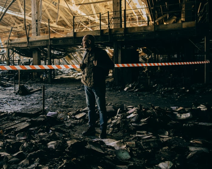
Eight million books were destroyed in the drone strike and subsequent fire at Ranok’s warehouse in Kharkiv.
The meeting was scheduled for 11am. But moments after it began, there came “the sound of an explosion, and almost simultaneously I saw a huge fire,” said Kruglov. The impact was about 30 meters from where the staff were gathered, and as colleagues tried to put out the flames, “there came a second strike and I understood that there could be a third, and a fourth, so we started to evacuate.”
The munitions used in the attack were jet-powered Shaheds, a recent and insidious escalation of Russian drone technology—faster and harder to intercept than their predecessors. These are the weapons that have recently been terrorizing Kyiv during daylight hours, striking the National Academy of Sciences and a working medical clinic in the past week.
“Fifty people were on shift that day,” Kruglov said of the warehouse strike, “and I don’t know how to explain how nobody was injured.”
The combination of an explosion, jet fuel, and a warehouse full of paper was catastrophic. None of the books could be salvaged, and 8 million were destroyed. It took firefighters a week to bring the flames under control.
The burnt remains of sheet music at Ranok’s warehouse, which was destroyed in an attack using jet-powered Shaheds.
Several weeks on, smoke still rose from parts of the warehouse. The roof seemed on the verge of collapse, metal beams listing alarmingly, twisted out of shape by the heat. Shafts of sunlight slanted through the damaged roof, illuminating the catastrophe. The smell was terrible, clinging to clothes and hAs far as the eye could see, books lay in piles. In some places, soaked by firefighters’ water, they had turned into a thick, foul-smelling, mud-like pulp. In others, they were charred at the edges but still recognizable: children’s picture books with animal and flower illustrations, geography textbooks, young-adult fiction. Others were just swollen layers of blackened pages that crumbled at a touch.
View image in fullscreenChildren’s picture books illustrated with animals and flowers were among the books destroyed or damaged.
A few editorial staff members, visiting the wreckage for the first time since the attack, looked shaken as they recognized pieces of books they had written or edited. “When you see what was made with your brain, your hands, your imagination, ruined by Russia, it’s a terrible feeling,” said Kruglov, a neat, bald, blue-eyed man in his early 60s.
Those 8 million books made up more than 85% of Ranok’s total stock, he said. At the main branch of Ranok’s own Knyholand bookstore in Kyiv, the display still looked bright and full in late September—but Kruglov predicted shortages this autumn when in-store books run low and there is nothing to replace them.
In total, this summer, 13 million Ukrainian books were destroyed by Russian missiles or drones—a third, the government estimates, of all books printed in Ukraine this year.
Books, literature, culture, and language are not on the edges of Russia’s war on Ukraine—they are central to it. The full-scale invasion in February 2022 was driven, at least in part, by Vladimir Putin’s belief that Ukraine and Russia have no truly separate cultural identity.
Kruglov said he was sure his warehouse full of Ukrainian-language, Ukraine-produced books had been deliberately targeted. “It is nowhere near any military facilities and everyone knows it is a book warehouse,” he said.
Bohdana Laiuk, a Ukrainian deputy minister for culture who works on literature and publishing, sees it a bit differently: the recent attacks on books should not be viewed on their own, but as part of the invaders’ recent campaign of attacking warehouses, depots, and fulfillment centers of any kind. “They cannot occupy Kyiv,” she said. “So they target warehouses around Kyiv to take the possibility of everyday life from us—and books are part of everyday life.”
View image in fullscreenThe books destroyed in the Kharkiv attack represented 85% of Ranok’s total stock, according to the CEO of the publisher.
But books are also part of language, and language is part of identity and, often, nationhood. Books are, Laiuk said, certainly considered important by the Russian invaders. “When the Russians occupy, the first thing they do—and we know this from the areas that were occupied and then liberated in 2022 in the Kherson and Kharkiv regions—is to go to the libraries, take the Ukrainian language books out, and destroy them,” she said.
Until 2022, about 70% of the Ukrainian book market was Russian-language titles—most imported from Russia, some published in Ukraine.
The dominance of Russian publishing had a long history. Its seeds lay in 19th-century decrees under the tsars against publishing in Ukrainian and continued through the Soviets’ promotion of Russian as the language of aspiration, education, and culture. Ukrainian writers were purged and Ukrainian literature left in the shadows, shut out from a canon that lionized the Russian novel.
After Ukraine’s independence in 1991, the idea of a commercially successful Ukrainian-language novel that tackled modern social issues was so unthinkable that publishers initially suggested to Oksana Zabuzhko that her 1996 novel Fieldwork in Ukrainian Sex be published in Russian translation. She insisted it was published in the language it was written. It became a bestseller, paving the way for waves of contemporary Ukrainian literaView image in fullscreenBohdana Laiuk: ‘When the Russians occupy, the first thing they do … is to go to the libraries, take the Ukrainian language books and destroy them.’ Laiuk described the dominance of Russian book imports as a form of colonialism. “It should be compared to how Russians invested in Ukrainian media outlets, Ukrainian TV channels, Ukrainian newspapers and magazines.” She argued it was a deliberate policy. “This is how Russians think: when they arrive on tanks, everything will be ready for them because they already have this information space.”
But in 2022, Ukrainian booksellers suddenly stopped selling Russian imports, as all commercial ties between the two countries were cut. At the same time, many Ukrainians switched their daily language from Russian to Ukrainian.
They also switched what they read, and Ukraine’s publishers met the demand with new editions of classic Ukrainian literature from the 1920s, poetry, translations, and new Ukrainian writing. Publishers in the country may still publish Russian-language books, as long as at least half their titles are in Ukrainian; in practice, the social barriers to doing so right now would be prohibitive. (For example, Andrey Kurkov, author of Death and the Penguin, writes his novels in Russian, but they are published only in Ukrainian translation; he writes nonfiction and children’s books in Ukrainian.) “People began to understand that the Russians came here to kill people simply because they were Ukrainian,” Laiuk told me in 2023. “So people are asking: what does it actually mean to be Ukrainian? Literary culture gives us the place to understand who we are.”
View image in fullscreenOleksiy Erinchak opened the first of his chain of Ukrainian-only bookstores, Sens, in 2021. In 2024, while the city was under fire, he opened a second, in a huge building on Khreshchatyk, Kyiv’s grandest boulevard, to which he has recently added a third floor, with a spacious events area. He has another branch in the western city of Ivano-Frankivsk and has just opened a fourth, in a former cinema in Lviv.
“When you go to a bookstore like Sens,” said Laiuk, “you feel that you have dignity. You have the right to buy a new book and to choose which one you like. And when you have drones above your head, it gives so much space, inner space in your heart and soul, and in your mind.”
The rapid expansion of Sens reflects something unlikely: a Ukrainian publishing boom amid a full-scale invasion. And now, that boom is threatened by the force and frequency of Russian attacks.
Kateryna and Artem Sova started their imprint in 2023, in the middle of the new Ukrainian publishing boom. By then Artem had been in the army for nearly a year and Kateryna was several months pregnant, living in her hometown of Kremenchuk, on the River Dnipro in central Ukraine. It was their dream: they had both worked in bookstores and at arts festivals for years. Part of the point for Artem was to keep some piece of his old self alive. “I realised,” he said, speaking in Zaporizhzhia during a break from his military duties, “that I was detached from everything I love.”
View image in fullscreenKateryna Sova said she and her husband, Artem, called their publishing house Krapky (Ellipsis) because they wanted reading their books “to be an ongoing conversation.” They began with Lonely City, a nonfiction work about art and the experience of urban isolation, by the British author Olivia Laing. They had loved it since they read it a decade ago, and were puzzled it was not already translated. They wrote to Laing’s agent asking whether they could acquire the rights.
“We tried to explain why this book is important for Ukrainians now, and to me personally,” Artem said, recalling. “This experience of being lonely is kind of universal, but it hasIt has been multiplied because many people joined the army, and there are so many displaced people in Ukraine: separated couples, destroyed lives.”
Laing, to their surprise, agreed. Only then did they actually go through the legal process of setting up the company. They called it Krapky – Ukrainian for “ellipsis.” The three dots were their favourite punctuation mark, signifying, said Kateryna as she sipped coffee in an independent bookshop in Kremenchuk, that they wanted reading their books “to be an ongoing conversation. Something that doesn’t stop when you close the book.” Their aim was for every book they published to be expertly translated and wonderfully illustrated.
Part of the reason Artem Sova co-founded Krapky was to keep some piece of his old self alive while doing his military service.
In 2025, they finally went to Kyiv Book Arsenal – the great annual gathering for publishers, writers and readers in the capital – with a beautifully designed edition of Lonely City. By this year’s Book Arsenal they had several titles already out, and translations of Laing’s To the River and Karen Blixen’s classic, Out of Africa, in the pipeline. Works by Flannery O’Connor, among others, were also in preparation. “We wanted to get to a position where we were publishing eight to 10 titles a year,” said Kateryna.
Recently, they had signed a contract with Nova Poshta, the Ukrainian postal service, to handle fulfilment – so that Kateryna was not sending out the books herself to customers and bookstores. She was driving her sister to university on the morning of 28 August when Artem rang. The warehouse where their books were held, on the outskirts of Kyiv, had been attacked. Kateryna had to pull off the road in her distress. At the Lviv BookForum, a fortnight later, their stand was empty but for a QR code so visitors could preorder their forthcoming titles. They had nothing physical to sell. All of their books had been destroyed.
Ranok is now rushing to reprint textbooks and bestsellers, hoping to get precious teaching materials into schools – and plug the shortfall in cashflow with sales of popular titles. Vivat, a large Kharkiv-based publisher, which lost 16m Ukrainian hryvnia (about £270,000) worth of books in a hit on one of its warehouses this summer, is doing the same. “We’ll definitely continue publishing Ukrainian authors, and the schedule for 2027 is already finalised,” said Vivat’s spokesperson, Kateryna Ilchuk, between events at Lviv BookForum. “But probably yes, it will mean going with more mainstream titles.”
Kateryna Sova shows the very last books that were left for sale after Russian attacks. Photograph: Julia Kochetova/The Guardian
Small literary publishers such as Krapky are the most vulnerable in the current crisis. Another small independent press, Who is That?, recently announced a pause in its operations until the end of the war, after the destruction of all of their stock this summer in two separate airstrikes.
For debut authors, or writers of less commercial or more experimental titles, this is a bleak moment. Even before the summer drone hits, there had been delays in some books’ publication owing to attacks on printing infrastructure. Ksenia Shpak’s debut young-adult novel – an urban fantasy about a girl internally displaced from eastern Ukraine to the Carpathian mountains – was originally due out in February 2025. It was finally published, by the imprint Zhorzh, in November.
But half the print run was in the Ranok warehouse in Kharkiv when it was attacked. “I must say that it’s sad because it was my first published book,” said Shpak, “and now my publisher will focus on their bestsellers, and only after that if they get enough money will they reprint my book.” She mentioned other factors that had lately cooled the Ukrainian publishing boom: a levelling out of demand; the rise in the cost of living. “It fee”It feels like bad things are piling up for our publishing industry,” Shpak added. View image in fullscreen. For publishers like Ivan Malkovych, the challenge now is to adapt: spread book stocks across smaller warehouses around the country, even if it means giving up super-fast delivery times. “It’s shaky,” said Ivan Malkovych, a veteran poetry editor, poet, and children’s publisher. His office in central Kyiv, shared with a male-voice choir whose rehearsal could be heard through the editorial rooms as he spoke, was a stark contrast to the emptiness of the Ranok warehouse. In one room, a wall of shelves displayed beautifully illustrated children’s books and elegant poetry volumes. He started his company during the economic chaos of the early 1990s, beginning with a Ukrainian alphabet book printed on board a supplier provided based on his vague promise to pay in six months (the book succeeded, and he paid). The alphabet began, “A is for Angel,” and the angel has been the publishing house’s lucky charm ever since. ‘We just have to adapt’: Kyiv residents prepare for a hard winter ahead. Read more. Malkovych has published many children’s books, but none in such large quantities as Harry Potter. His editions reached shelves faster and were better translated than the Russian versions (“We Ukrainianised a lot of children that way,” he said). He lost 40,000 books in the same Nova Poshta warehouse attack that destroyed Krapky’s stock—about $500,000 (£377,800) in losses. “We were always proud of our delivery service—you could order a book at 4am and it would arrive by midday. Now we face big delays,” he said. He was especially worried about the next Harry Potter release on 6 October. There had been many pre-orders, and he wanted delivery to be synchronized with the rest of the world, despite the full-scale invasion. For publishers like Malkovych—whose staff have chosen not to leave Kyiv, despite the coming winter and the new Russian jet-powered drones—the task now is to adapt: they will spread book stocks across smaller warehouses around the country, at the cost of super-fast delivery times. There is hope for Krapky too: Nova Poshta may reimburse some of their lost stock; readers have shown an outpouring of support by preordering forthcoming titles; and it has received a grant from an NGO to help with reprinting costs. View image in fullscreen. Viktor Kruglov remains optimistic after the attack on the warehouse in Kharkiv: ‘I think that we will rebuild everything. And I even know how to do it better.’ When Laiuk visits the Frankfurt book fair this October, she will be promoting a fundraiser by the ministry of culture and Kyiv School of Economics for small Ukrainian publishers like Krapky. But she will also urge global publishers to translate Ukrainian titles. “It’s important to see that the industry is suffering and to see the devastating pictures of burned books. But that is not the whole story. The whole story is that Ukrainian literature is rich and diverse as never before. The best way to see that is to translate, and to bring new voices to the discourse in your country.” As for Kruglov, despite the devastating loss of 8m books, he was, somehow, optimistic. Surveying the absolute ruin of his Kharkiv premises, he said, “I think that we will rebuild everything. And I even know how to do it better.”
Frequently Asked Questions
FAQs Burned Novels and Destroyed Warehouses Russias War on Ukrainian Books
1 What is meant by Russias war on Ukrainian books
It refers to the deliberate destruction of Ukrainian books printing presses and book warehouses by Russian forces since the 2022 invasion and more broadly centuries of Russian policies suppressing Ukrainian language and literature
2 Why would an army target books
Books carry identity history and language Destroying them is a way to erase a culture and break a nations sense of who it is Its sometimes called cultural genocide or bibliocide
3 What are some specific examples
The 2022 missile strike on the Faktor Druk printing house in Kharkiv which killed workers and destroyed millions of books
The burning of Ukrainian books in occupied areas including reports from Mariupol and Donetsk
The 2022 destruction of the Skovoroda Museum in Kharkiv region dedicated to Ukraines most famous philosopher
4 Is this a new thing
No It echoes Sovietera policies the 1930s Executed Renaissance the 1970s80s purges of Ukrainianlanguage books and bans on Ukrainian publications The current attacks are a continuation not a oneoff
5 How many books have been destroyed
Exact numbers are hard to confirm but estimates run into the millions including textbooks novels poetry and childrens books Many were burned shelled or pulped
6 Whats the difference between a burned novel and a destroyed warehouse
A burned novel is a specific book destroyed often a symbol of Ukrainian culture A destroyed warehouse is the infrastructure printing plants distribution centers and libraries hit by strikes which wipes out entire print runs at once
7 What is bibliocide
A term for the intentional destruction of books and libraries as an act of war or oppression Its used by scholars and journalists to describe whats happening in Ukraine
8 Why does this matter to people outside Ukraine
Because its part of a pattern when one country tries to erase anothers culture it threatens the idea that any nations identity is safe It also affects global publishing translation and the historical record