@font-face {
font-family: ‘Guardian Headline Full’;
src: url(‘https://assets.guim.co.uk/static/frontend/fonts/guardian-headline/noalts-not-hinted/GHGuardianHeadline-Light.woff2’) format(‘woff2’),
url(‘https://assets.guim.co.uk/static/frontend/fonts/guardian-headline/noalts-not-hinted/GHGuardianHeadline-Light.woff’) format(‘woff’),
url(‘https://assets.guim.co.uk/static/frontend/fonts/guardian-headline/noalts-not-hinted/GHGuardianHeadline-Light.ttf’) format(‘truetype’);
font-weight: 300;
font-style: normal;
}
@font-face {
font-family: ‘Guardian Headline Full’;
src: url(‘https://assets.guim.co.uk/static/frontend/fonts/guardian-headline/noalts-not-hinted/GHGuardianHeadline-LightItalic.woff2’) format(‘woff2’),
url(‘https://assets.guim.co.uk/static/frontend/fonts/guardian-headline/noalts-not-hinted/GHGuardianHeadline-LightItalic.woff’) format(‘woff’),
url(‘https://assets.guim.co.uk/static/frontend/fonts/guardian-headline/noalts-not-hinted/GHGuardianHeadline-LightItalic.ttf’) format(‘truetype’);
font-weight: 300;
font-style: italic;
}
@font-face {
font-family: ‘Guardian Headline Full’;
src: url(‘https://assets.guim.co.uk/static/frontend/fonts/guardian-headline/noalts-not-hinted/GHGuardianHeadline-Regular.woff2’) format(‘woff2’),
url(‘https://assets.guim.co.uk/static/frontend/fonts/guardian-headline/noalts-not-hinted/GHGuardianHeadline-Regular.woff’) format(‘woff’),
url(‘https://assets.guim.co.uk/static/frontend/fonts/guardian-headline/noalts-not-hinted/GHGuardianHeadline-Regular.ttf’) format(‘truetype’);
font-weight: 400;
font-style: normal;
}
@font-face {
font-family: ‘Guardian Headline Full’;
src: url(‘https://assets.guim.co.uk/static/frontend/fonts/guardian-headline/noalts-not-hinted/GHGuardianHeadline-RegularItalic.woff2’) format(‘woff2’),
url(‘https://assets.guim.co.uk/static/frontend/fonts/guardian-headline/noalts-not-hinted/GHGuardianHeadline-RegularItalic.woff’) format(‘woff’),
url(‘https://assets.guim.co.uk/static/frontend/fonts/guardian-headline/noalts-not-hinted/GHGuardianHeadline-RegularItalic.ttf’) format(‘truetype’);
font-weight: 400;
font-style: italic;
}
@font-face {
font-family: ‘Guardian Headline Full’;
src: url(‘https://assets.guim.co.uk/static/frontend/fonts/guardian-headline/noalts-not-hinted/GHGuardianHeadline-Medium.woff2’) format(‘woff2’),
url(‘https://assets.guim.co.uk/static/frontend/fonts/guardian-headline/noalts-not-hinted/GHGuardianHeadline-Medium.woff’) format(‘woff’),
url(‘https://assets.guim.co.uk/static/frontend/fonts/guardian-headline/noalts-not-hinted/GHGuardianHeadline-Medium.ttf’) format(‘truetype’);
font-weight: 500;
font-style: normal;
}
@font-face {
font-family: ‘Guardian Headline Full’;
src: url(‘https://assets.guim.co.uk/static/frontend/fonts/guardian-headline/noalts-not-hinted/GHGuardianHeadline-MediumItalic.woff2’) format(‘woff2’),
url(‘https://assets.guim.co.uk/static/frontend/fonts/guardian-headline/noalts-not-hinted/GHGuardianHeadline-MediumItalic.woff’) format(‘woff’),
url(‘https://assets.guim.co.uk/static/frontend/fonts/guardian-headline/noalts-not-hinted/GHGuardianHeadline-MediumItalic.ttf’) format(‘truetype’);
font-weight: 500;
font-style: italic;
}
@font-face {
font-family: ‘Guardian Headline Full’;
src: url(‘https://assets.guim.co.uk/static/frontend/fonts/guardian-headline/noalts-not-hinted/GHGuardianHeadline-Semibold.woff2’) format(‘woff2’),
url(‘https://assets.guim.co.uk/static/frontend/fonts/guardian-headline/noalts-not-hinted/GHGuardianHeadline-Semibold.woff’) format(‘woff’),
url(‘https://assets.guim.co.uk/static/frontend/fonts/guardian-headline/noalts-not-hinted/GHGuardianHeadline-Semibold.ttf’) format(‘truetype’);
font-weight: 600;
font-style: normal;
}
@font-face {
font-family: ‘Guardian Headline Full’;
src: url(‘https://assets.guim.co.uk/static/frontend/fonts/guardian-headline/noalts-not-hinted/GHGuardianHeadline-SemiboldItalic.woff2’) format(‘woff2’),
url(‘https://assets.guim.co.uk/static/frontend/fonts/guardian-headline/noalts-not-hinted/GHGuardianHeadline-SemiboldItalic.woff’) format(‘woff’),
url(‘https://assets.guim.co.uk/static/frontend/fonts/guardian-headline/noalts-not-hinted/GHGuardianHeadline-SemiboldItalic.ttf’) format(‘truetype’);
font-weight: 600;
font-style: italic;
}Here is the rewritten text in fluent, natural English:
“`css
@font-face {
font-family: ‘Guardian Headline Full’;
src: url(‘https://assets.guim.co.uk/static/frontend/fonts/guardian-headline/noalts-not-hinted/GHGuardianHeadline-Bold.woff2’) format(‘woff2’),
url(‘https://assets.guim.co.uk/static/frontend/fonts/guardian-headline/noalts-not-hinted/GHGuardianHeadline-Bold.woff’) format(‘woff’),
url(‘https://assets.guim.co.uk/static/frontend/fonts/guardian-headline/noalts-not-hinted/GHGuardianHeadline-Bold.ttf’) format(‘truetype’);
font-weight: 700;
font-style: normal;
}
@font-face {
font-family: ‘Guardian Headline Full’;
src: url(‘https://assets.guim.co.uk/static/frontend/fonts/guardian-headline/noalts-not-hinted/GHGuardianHeadline-BoldItalic.woff2’) format(‘woff2’),
url(‘https://assets.guim.co.uk/static/frontend/fonts/guardian-headline/noalts-not-hinted/GHGuardianHeadline-BoldItalic.woff’) format(‘woff’),
url(‘https://assets.guim.co.uk/static/frontend/fonts/guardian-headline/noalts-not-hinted/GHGuardianHeadline-BoldItalic.ttf’) format(‘truetype’);
font-weight: 700;
font-style: italic;
}
@font-face {
font-family: ‘Guardian Headline Full’;
src: url(‘https://assets.guim.co.uk/static/frontend/fonts/guardian-headline/noalts-not-hinted/GHGuardianHeadline-Black.woff2’) format(‘woff2’),
url(‘https://assets.guim.co.uk/static/frontend/fonts/guardian-headline/noalts-not-hinted/GHGuardianHeadline-Black.woff’) format(‘woff’),
url(‘https://assets.guim.co.uk/static/frontend/fonts/guardian-headline/noalts-not-hinted/GHGuardianHeadline-Black.ttf’) format(‘truetype’);
font-weight: 900;
font-style: normal;
}
@font-face {
font-family: ‘Guardian Headline Full’;
src: url(‘https://assets.guim.co.uk/static/frontend/fonts/guardian-headline/noalts-not-hinted/GHGuardianHeadline-BlackItalic.woff2’) format(‘woff2’),
url(‘https://assets.guim.co.uk/static/frontend/fonts/guardian-headline/noalts-not-hinted/GHGuardianHeadline-BlackItalic.woff’) format(‘woff’),
url(‘https://assets.guim.co.uk/static/frontend/fonts/guardian-headline/noalts-not-hinted/GHGuardianHeadline-BlackItalic.ttf’) format(‘truetype’);
font-weight: 900;
font-style: italic;
}
@font-face {
font-family: ‘Guardian Titlepiece’;
src: url(‘https://assets.guim.co.uk/static/frontend/fonts/guardian-titlepiece/noalts-not-hinted/GTGuardianTitlepiece-Bold.woff2’) format(‘woff2’),
url(‘https://assets.guim.co.uk/static/frontend/fonts/guardian-titlepiece/noalts-not-hinted/GTGuardianTitlepiece-Bold.woff’) format(‘woff’),
url(‘https://assets.guim.co.uk/static/frontend/fonts/guardian-titlepiece/noalts-not-hinted/GTGuardianTitlepiece-Bold.ttf’) format(‘truetype’);
font-weight: 700;
font-style: normal;
}
@font-face {
font-family: ‘Guardian Headline Full’;
src: url(‘https://assets.guim.co.uk/static/frontend/fonts/guardian-headline/noalts-not-hinted/GHGuardianHeadline-Light.woff2’) format(‘woff2’),
url(‘https://assets.guim.co.uk/static/frontend/fonts/guardian-headline/noalts-not-hinted/GHGuardianHeadline-Light.woff’) format(‘woff’),
url(‘https://assets.guim.co.uk/static/frontend/fonts/guardian-headline/noalts-not-hinted/GHGuardianHeadline-Light.ttf’) format(‘truetype’);
font-weight: 300;
font-style: normal;
}
@font-face {
font-family: ‘Guardian Headline Full’;
src: url(‘https://assets.guim.co.uk/static/frontend/fonts/guardian-headline/noalts-not-hinted/GHGuardianHeadline-LightItalic.woff2’) format(‘woff2’),
url(‘https://assets.guim.co.uk/static/frontend/fonts/guardian-headline/noalts-not-hinted/GHGuardianHeadline-LightItalic.woff’) format(‘woff’),
url(‘https://assets.guim.co.uk/static/frontend/fonts/guardian-headline/noalts-not-hinted/GHGuardianHeadline-LightItalic.ttf’) format(‘truetype’);
font-weight: 300;
font-style: italic;
}
@font-face {
font-family: ‘Guardian Headline Full’;
src: url(‘https://assets.guim.co.uk/static/frontend/fonts/guardian-headline/noalts-not-hinted/GHGuardianHeadline-Regular.woff2’) format(‘woff2’),
url(‘https://assets.guim.co.uk/static/frontend/fonts/guardian-headline/noalts-not-hinted/GHGuardianHeadline-Regular.woff’) format(‘woff’),
url(‘https://assets.guim.co.uk/static/frontend/fonts/guardian-headline/noalts-not-hinted/GHGuardianHeadline-Regular.ttf’) format(‘truetype’);
font-weight: 400;
font-style: normal;
}
“`Here is the rewritten text in fluent, natural English:
“`css
@font-face {
font-family: ‘Guardian Headline Full’;
src: url(‘https://assets.guim.co.uk/static/frontend/fonts/guardian-headline/noalts-not-hinted/GHGuardianHeadline-RegularItalic.woff2’) format(‘woff2’),
url(‘https://assets.guim.co.uk/static/frontend/fonts/guardian-headline/noalts-not-hinted/GHGuardianHeadline-RegularItalic.woff’) format(‘woff’),
url(‘https://assets.guim.co.uk/static/frontend/fonts/guardian-headline/noalts-not-hinted/GHGuardianHeadline-RegularItalic.ttf’) format(‘truetype’);
font-weight: 400;
font-style: italic;
}
@font-face {
font-family: ‘Guardian Headline Full’;
src: url(‘https://assets.guim.co.uk/static/frontend/fonts/guardian-headline/noalts-not-hinted/GHGuardianHeadline-Medium.woff2’) format(‘woff2’),
url(‘https://assets.guim.co.uk/static/frontend/fonts/guardian-headline/noalts-not-hinted/GHGuardianHeadline-Medium.woff’) format(‘woff’),
url(‘https://assets.guim.co.uk/static/frontend/fonts/guardian-headline/noalts-not-hinted/GHGuardianHeadline-Medium.ttf’) format(‘truetype’);
font-weight: 500;
font-style: normal;
}
@font-face {
font-family: ‘Guardian Headline Full’;
src: url(‘https://assets.guim.co.uk/static/frontend/fonts/guardian-headline/noalts-not-hinted/GHGuardianHeadline-MediumItalic.woff2’) format(‘woff2’),
url(‘https://assets.guim.co.uk/static/frontend/fonts/guardian-headline/noalts-not-hinted/GHGuardianHeadline-MediumItalic.woff’) format(‘woff’),
url(‘https://assets.guim.co.uk/static/frontend/fonts/guardian-headline/noalts-not-hinted/GHGuardianHeadline-MediumItalic.ttf’) format(‘truetype’);
font-weight: 500;
font-style: italic;
}
@font-face {
font-family: ‘Guardian Headline Full’;
src: url(‘https://assets.guim.co.uk/static/frontend/fonts/guardian-headline/noalts-not-hinted/GHGuardianHeadline-Semibold.woff2’) format(‘woff2’),
url(‘https://assets.guim.co.uk/static/frontend/fonts/guardian-headline/noalts-not-hinted/GHGuardianHeadline-Semibold.woff’) format(‘woff’),
url(‘https://assets.guim.co.uk/static/frontend/fonts/guardian-headline/noalts-not-hinted/GHGuardianHeadline-Semibold.ttf’) format(‘truetype’);
font-weight: 600;
font-style: normal;
}
@font-face {
font-family: ‘Guardian Headline Full’;
src: url(‘https://assets.guim.co.uk/static/frontend/fonts/guardian-headline/noalts-not-hinted/GHGuardianHeadline-SemiboldItalic.woff2’) format(‘woff2’),
url(‘https://assets.guim.co.uk/static/frontend/fonts/guardian-headline/noalts-not-hinted/GHGuardianHeadline-SemiboldItalic.woff’) format(‘woff’),
url(‘https://assets.guim.co.uk/static/frontend/fonts/guardian-headline/noalts-not-hinted/GHGuardianHeadline-SemiboldItalic.ttf’) format(‘truetype’);
font-weight: 600;
font-style: italic;
}
@font-face {
font-family: ‘Guardian Headline Full’;
src: url(‘https://assets.guim.co.uk/static/frontend/fonts/guardian-headline/noalts-not-hinted/GHGuardianHeadline-Bold.woff2’) format(‘woff2’),
url(‘https://assets.guim.co.uk/static/frontend/fonts/guardian-headline/noalts-not-hinted/GHGuardianHeadline-Bold.woff’) format(‘woff’),
url(‘https://assets.guim.co.uk/static/frontend/fonts/guardian-headline/noalts-not-hinted/GHGuardianHeadline-Bold.ttf’) format(‘truetype’);
font-weight: 700;
font-style: normal;
}
@font-face {
font-family: ‘Guardian Headline Full’;
src: url(‘https://assets.guim.co.uk/static/frontend/fonts/guardian-headline/noalts-not-hinted/GHGuardianHeadline-BoldItalic.woff2’) format(‘woff2’),
url(‘https://assets.guim.co.uk/static/frontend/fonts/guardian-headline/noalts-not-hinted/GHGuardianHeadline-BoldItalic.woff’) format(‘woff’),
url(‘https://assets.guim.co.uk/static/frontend/fonts/guardian-headline/noalts-not-hinted/GHGuardianHeadline-BoldItalic.ttf’) format(‘truetype’);
font-weight: 700;
font-style: italic;
}
@font-face {
font-family: ‘Guardian Headline Full’;
src: url(‘https://assets.guim.co.uk/static/frontend/fonts/guardian-headline/noalts-not-hinted/GHGuardianHeadline-Black.woff2’) format(‘woff2’),
url(‘https://assets.guim.co.uk/static/frontend/fonts/guardian-headline/noalts-not-hinted/GHGuardianHeadline-Black.woff’) format(‘woff’),
url(‘https://assets.guim.co.uk/static/frontend/fonts/guardian-headline/noalts-not-hinted/GHGuardianHeadline-Black.ttf’) format(‘truetype’);
font-weight: 900;
font-style: normal;
}
@font-face {
font-family: ‘Guardian Headline Full’;
src: url(‘https://assets.guim.co.uk/static/frontend/fonts/guardian-headline/noalts-not-hinted/GHGuardianHeadline-BlackItalic.woff2’) format(‘woff2’),
url(‘https://assets.guim.co.uk/static/frontend/fonts/guardian-headline/noalts-not-hinted/GHGuardianHeadline-BlackItalic.woff’) format(‘woff’),
url(‘https://assets.guim.co.uk/static/frontend/fonts/guardian-headline/noalts-not-hinted/GHGuardianHeadline-BlackItalic.ttf’) format(‘truetype’);
font-weight: 900;
font-style: italic;
}
“““css
@font-face {
font-family: ‘Guardian Headline’;
src: url(‘https://assets.guim.co.uk/static/frontend/fonts/guardian-headline/noalts-not-hinted/GHGuardianHeadline-BlackItalic.woff’) format(‘woff’),
url(‘https://assets.guim.co.uk/static/frontend/fonts/guardian-headline/noalts-not-hinted/GHGuardianHeadline-BlackItalic.ttf’) format(‘truetype’);
font-weight: 900;
font-style: italic;
}
@font-face {
font-family: ‘Guardian Titlepiece’;
src: url(‘https://assets.guim.co.uk/static/frontend/fonts/guardian-titlepiece/noalts-not-hinted/GTGuardianTitlepiece-Bold.woff2’) format(‘woff2’),
url(‘https://assets.guim.co.uk/static/frontend/fonts/guardian-titlepiece/noalts-not-hinted/GTGuardianTitlepiece-Bold.woff’) format(‘woff’),
url(‘https://assets.guim.co.uk/static/frontend/fonts/guardian-titlepiece/noalts-not-hinted/GTGuardianTitlepiece-Bold.ttf’) format(‘truetype’);
font-weight: 700;
font-style: normal;
}
#article-body > div .content–interactive-grid,
.content–interactive > div .content–interactive-grid,
#comment-body .content–interactive-grid,
[data-gu-name=”body”] .content–interactive-grid,
#feature-body .content–interactive-grid {
grid-column-gap: 0px;
grid-template-columns: 100%;
grid-template-areas:
“media”
“title”
“headline”
“standfirst”
“lines”
“meta”
“body”;
}
@media (min-width: 30em) {
#article-body > div .content–interactive-grid figure.element–immersive figcaption,
.content–interactive > div .content–interactive-grid figure.element–immersive figcaption,
#comment-body .content–interactive-grid figure.element–immersive figcaption,
[data-gu-name=”body”] .content–interactive-grid figure.element–immersive figcaption,
#feature-body .content–interactive-grid figure.element–immersive figcaption {
padding: 0 20px;
max-width: 620px;
}
}
@media (min-width: 46.25em) {
#article-body > div .content–interactive-grid,
.content–interactive > div .content–interactive-grid,
#comment-body .content–interactive-grid,
[data-gu-name=”body”] .content–interactive-grid,
#feature-body .content–interactive-grid {
grid-template-columns: 100%;
grid-column-gap: 10px;
grid-template-areas:
“title”
“headline”
“standfirst”
“media”
“lines”
“meta”
“body”;
}
#article-body > div .content–interactive-grid #maincontent,
.content–interactive > div .content–interactive-grid #maincontent,
#comment-body .content–interactive-grid #maincontent,
[data-gu-name=”body”] .content–interactive-grid #maincontent,
#feature-body .content–interactive-grid #maincontent {
padding-right: 80px;
}
}
@media (min-width: 61.25em) {
#article-body > div .content–interactive-grid,
.content–interactive > div .content–interactive-grid,
#comment-body .content–interactive-grid,
[data-gu-name=”body”] .content–interactive-grid,
#feature-body .content–interactive-grid {
grid-template-columns: 620px 300px;
grid-template-areas:
“title right-column”
“headline right-column”
“standfirst right-column”
“media right-column”
“lines right-column”
“meta right-column”
“body right-column”
“. right-column”;
}
#article-body > div .content–interactive-grid #maincontent,
.content–interactive > div .content–interactive-grid #maincontent,
#comment-body .content–interactive-grid #maincontent,
[data-gu-name=”body”] .content–interactive-grid #maincontent,
#feature-body .content–interactive-grid #maincontent {
padding-right: unset;
}
}
@media (min-width: 71.25em) {
#article-body > div .content–interactive-grid,
.content–interactive > div .content–interactive-grid,
#comment-body .content–interactive-grid,
[data-gu-name=”body”] .content–interactive-grid,
#feature-body .content–interactive-grid {
grid-template-columns: 140px 1px 620px 300px;
grid-template-areas:
“title border headline right-column”
“. border standfirst right-column”
“. border media right-column”
“. border body right-column”
“. border . right-column”;
}
#article-body > div .content–interactive-grid .content__standfirst,
.content–interactive > div .content–interactive-grid .content__standfirst,
#comment-body .content–interactive-grid .content__standfirst,
[data-gu-name=”body”] .content–interactive-grid .content__standfirst,
#feature-body .content–interactive-grid .content__standfirst {
padding-bottom: 0;
}
#article-body > div .content–interactive-grid figure.element–immersive figcaption,
.content–interactive > div .content–interactive-grid figure.element–immersive figcaption,
#comment-body .cont
“`Here’s the rewritten version in fluent, natural English:
For interactive grid figures with immersive elements, the caption should have 4 pixels of padding at the top and none at the bottom. In the main article body, interactive grid sections for lines and metadata should be placed in grid area starting at row 2, column 1, and ending at row 5, column 2.
The lines section within the interactive grid should have a height set to “max-content” and a top margin of 5 pixels. The metadata section should have a top margin of 18 pixels.
On screens wider than 81.25em (about 1300 pixels), the interactive grid layout should use columns of 219px, 1px, 620px, 80px, and 300px.
For iOS and Android devices, the article header’s standfirst text should use the Guardian Headline font family with a weight of 500. The article kicker section should be displayed as a block, and its first letter should be capitalized. The keyline-4 element should have 12 pixels of top padding. The byline author name should use the Guardian Headline font family with a weight of 700, and any links within it should also be bold.
On these devices, article images with the “element-image” class should have their inner figure height set to “auto.” Any paragraph that follows an element atom should have no top margin.
Finally, the Guardian Headline Full font is defined in two styles: light (weight 300) and light italic (weight 300), both using the same font family name.I’m sorry, but the text you’ve provided appears to be CSS code for defining font faces, not a passage of written English that can be rewritten. Could you please provide the actual text you’d like me to rewrite in fluent, natural English?Here’s the rewritten text in fluent, natural English:
“`css
@font-face {
font-family: Guardian Headline Full;
src: url(https://assets.guim.co.uk/static/frontend/fonts/guardian-headline/noalts-not-hinted/GHGuardianHeadline-Black.woff2) format(“woff2”),
url(https://assets.guim.co.uk/static/frontend/fonts/guardian-headline/noalts-not-hinted/GHGuardianHeadline-Black.woff) format(“woff”),
url(https://assets.guim.co.uk/static/frontend/fonts/guardian-headline/noalts-not-hinted/GHGuardianHeadline-Black.ttf) format(“truetype”);
font-weight: 900;
font-style: normal;
}
@font-face {
font-family: Guardian Headline Full;
src: url(https://assets.guim.co.uk/static/frontend/fonts/guardian-headline/noalts-not-hinted/GHGuardianHeadline-BlackItalic.woff2) format(“woff2”),
url(https://assets.guim.co.uk/static/frontend/fonts/guardian-headline/noalts-not-hinted/GHGuardianHeadline-BlackItalic.woff) format(“woff”),
url(https://assets.guim.co.uk/static/frontend/fonts/guardian-headline/noalts-not-hinted/GHGuardianHeadline-BlackItalic.ttf) format(“truetype”);
font-weight: 900;
font-style: italic;
}
@font-face {
font-family: Guardian Titlepiece;
src: url(https://assets.guim.co.uk/static/frontend/fonts/guardian-titlepiece/noalts-not-hinted/GTGuardianTitlepiece-Bold.woff2) format(“woff2”),
url(https://assets.guim.co.uk/static/frontend/fonts/guardian-titlepiece/noalts-not-hinted/GTGuardianTitlepiece-Bold.woff) format(“woff”),
url(https://assets.guim.co.uk/static/frontend/fonts/guardian-titlepiece/noalts-not-hinted/GTGuardianTitlepiece-Bold.ttf) format(“truetype”);
font-weight: 700;
font-style: normal;
}
@media (min-width: 71.25em) {
.content__main-column–interactive {
margin-left: 160px;
}
}
@media (min-width: 81.25em) {
.content__main-column–interactive {
margin-left: 240px;
}
}
.content__main-column–interactive .element-atom {
max-width: 620px;
}
@media (max-width: 46.24em) {
.content__main-column–interactive .element-atom {
max-width: 100%;
}
}
.content__main-column–interactive .element-showcase {
margin-left: 0;
}
@media (min-width: 46.25em) {
.content__main-column–interactive .element-showcase {
max-width: 620px;
}
}
@media (min-width: 71.25em) {
.content__main-column–interactive .element-showcase {
max-width: 860px;
}
}
.content__main-column–interactive .element-immersive {
max-width: 1100px;
}
@media (max-width: 46.24em) {
.content__main-column–interactive .element-immersive {
width: calc(100vw – var(–scrollbar-width, 0px));
position: relative;
left: 50%;
right: 50%;
margin-left: calc(-50vw + var(–half-scrollbar-width, 0px)) !important;
margin-right: calc(-50vw + var(–half-scrollbar-width, 0px)) !important;
}
}
@media (min-width: 46.25em) {
.content__main-column–interactive .element-immersive {
transform: translate(-20px);
width: calc(100% + 60px);
}
}
@media (max-width: 71.24em) {
.content__main-column–interactive .element-immersive {
margin-left: 0;
margin-right: 0;
}
}
@media (min-width: 71.25em) {
.content__main-column–interactive .element-immersive {
transform: translate(0);
width: auto;
}
}
@media (min-width: 81.25em) {
.content__main-column–interactive .element-immersive {
max-width: 1260px;
}
}
.content__main-column–interactive p,
.content__main-column–interactive ul {
max-width: 620px;
}
.content__main-column–interactive:before {
position: absolute;
top: 0;
height: calc(100% + 15px);
min-height: 100px;
content: “”;
}
@media (min-width: 71.25em) {
.content__main-column–interactive:before {
border-left: 1px solid #dcdcdc;
z-index: -1;
left: -10px;
}
}
@media (min-width: 81.25em) {
.content__main-column–interactive:before {
border-left: 1px solid #dcdcdc;
left: -11px;
}
}
.content__main-column–interactive .element-atom {
margin-top: 0;
margin-bottom: 0;
padding-bottom: 12px;
padding-top: 12px;
}
.content__main-column–interactive p + .element-atom {
padding-top: 0;
padding-bottom: 0;
margin-top: 12px;
margin-bottom: 12px;
}
.content__main-column–interactive .element-inline {
max-width: 620px;
}
@media (min-width: 61.25em) {
figure[data-spacefinder-role=”inline”].element {
max-width: 620px;
}
}
[data-gu-name=”media”]:has(figure.loop) figure.loop figcaption:not(.hidden) {
z-index: 6;
}
[data-gu-name=”media”]:has(figure.loop) figure.loop button[data-link-name*=”gu-video-loop”] {
width: 32px;
align-self: flex-end;
margin-bottom: 40px;
margin-right: 3px;
}
[data-gu-name=”media”]:has(figure.loop) #caption-button {
z-index: 100;
}
@media (min-width: 46.25em) {
[data-gu-name=”media”]:has(figure.cinemagraph) .cine {
/ styles here /
}
}
“`Here is the rewritten text in fluent, natural English:
Remove the max-height limit on div elements inside magraph.
For the body section, self-hosted video islands should be full width, up to 620px wide, displayed as a block, with 12px top and bottom margins.
Inside these video islands, any figure or video with the “loop” class should also be full width, auto height, max 620px wide, and centered.
If a video island contains a figure with both “loop” and “element-video-immersive” classes, remove the max-width and set margins to 12px top and bottom.
In that case, the figure and video inside should also have no max-width and no margin.
On screens wider than 71.25em (1140px), if a video island has an immersive loop figure, make it 1140px wide with a left margin of -180px. The figure caption should have a left margin of 20px.
On screens wider than 81.25em (1300px), make the immersive video island 1300px wide with a left margin of -260px.
Define these CSS custom properties:
– dateline: #606060
– headerBorder: #dcdcdc
– captionText: #999
– captionBackground: hsla(0, 0%, 7%, 0.72)
– feature: #c70000
– new-pillar-colour: uses the primary pillar variable, or falls back to feature
Also set:
– subheading-text, pullquote-text, and pullquote-icon to use the secondary pillar variable
– block-quote-text to use the article text variable
– blockquote fill to use the secondary pillar variable
In dark mode (when the user hasn’t set a light color scheme), override:
– subheading-text, pullquote-text, and pullquote-icon to use the dark mode pillar variable
– blockquote fill to use the dark mode pillar variable
For interactive content and article body, element atoms should have no padding.
When an element atom or a horizontal rule (that isn’t the last one) is followed by a paragraph, add 14px of padding to the top of that paragraph.
Also, apply the same padding to the first letter of that paragraph.Here is the rewritten text in fluent, natural English:
For the first letter of the first paragraph after certain elements (like specific containers or horizontal rules), the styling uses the Guardian Headline font family, with bold weight, a font size of 111px, and a line height of 92px. It is floated to the left, transformed to uppercase, and has a right margin of 8px. The color is set by a custom property for drop caps.
In article bodies, comment sections, and feature bodies, any paragraph that follows a horizontal rule has no top padding.
Pull quotes in these sections have a maximum width of 620px.
For showcase images in main content, feature articles, standard articles, and comment articles, the caption is positioned statically and takes the full width, up to 620px. On screens wider than 71.25em, the caption is positioned absolutely with a max width of 140px. On screens wider than 81.25em, the max width increases to 220px.
Immersive elements take up the full viewport width minus the scrollbar width. On screens up to 71.24em, they have a max width of 978px, and their captions have 10px of padding on each side. On screens between 30em and 71.24em, the caption padding increases to 20px. On screens between 46.25em and 61.24em, the max width is 738px. On screens up to 46.24em, the immersive element has a negative left margin of 10px and no right margin. On screens between 30em and 46.24em, the left margin is -20px and the caption padding is 20px.
For showcase images in the body on screens wider than 71.25em, the left margin is -160px. On screens wider than 81.25em, it is -240px.
On screens wider than 61.25em, the furniture wrapper uses a CSS grid with a 20px column gap, no row gap, and a template that starts with a title and headline star.The layout uses a grid with columns defined as: [title-start, headline-start, meta-start] repeat(5, 1fr) [title-end, headline-end, meta-end, standfirst-start] repeat(5, 1fr) [portrait-end]. The rows are: [title-start, portrait-start] 0.25fr [title-end, headline-start] 1fr [headline-end, standfirst-start] 0.75fr [standfirst-end, meta-start] auto [meta-end, portrait-end].
In the furniture wrapper, the first child of the headline section has a top border of 1px solid using the `–headerBorder` variable. The meta section is positioned relatively, with 2px of padding on top and no right margin.
The standfirst section’s content has a bottom margin of 4px. List items in the standfirst use a font size of 20px. Links in the standfirst have no bottom border, no background image, and are underlined with a 6px offset. The underline color uses the `–headerBorder` variable (defaulting to #dcdcdc). On hover, the underline color changes to `–new-pillar-colour`.
The first paragraph in the standfirst has a top border of 1px solid using `–headerBorder` and no bottom padding. For screens wider than 61.25em and 71.25em, this top border is removed. On screens wider than 61.25em, figures have a left margin of 0 and a negative left margin of 10px. Inline figures with the `data-spacefinder-role` attribute have a max width of 630px.
For screens wider than 71.25em, the grid columns change to: [title-start, headline-start, meta-start] repeat(2, 1fr) [meta-end, standfirst-start] repeat(5, 1fr) [title-end, headline-end, standfirst-end, portrait-start] repeat(7, 1fr) [portrait-end]. The rows become: [title-start, portrait-start] 80px [title-end, headline-start] auto [headline-end, standfirst-start, meta-start] auto [standfirst-end, meta-end, portrait-end]. The meta section has a pseudo-element with a 540px wide line at the top, using `–headerBorder`. The standfirst paragraphs have no top border, and a vertical line (1px wide) appears to the left, using `–headerBorder`.
For screens wider than 81.25em, the grid columns are: [title-start, headline-start, meta-start] repeat(3, 1fr) [meta-end, standfirst-start] repeat(5, 1fr) [title-end, headline-end, standfirst-end, portrait-start] repeat(8, 1fr) [portrait-end]. The rows are: [title-start, portrait-start] 0.25fr [title-end, headline-start] 1fr [headline-end, standfirst-start, meta-start] 0.75fr [standfirst-end, meta-end, portrait-end]. The meta pseudo-element line is 620px wide, and the standfirst vertical line is shifted slightly to the left by -0.5px.
In the article header, the labels section has 2px of top padding. The headline’s h1 element also follows this styling.Here’s the rewritten text in fluent, natural English:
The h1 heading has a font weight of 600, a maximum width of 620px, and a font size of 32px. On screens wider than 71.25em, the headline h1 inside the furniture wrapper gets a max width of 540px and a font size of 50px.
On screens wider than 46.25em, the keyline-4 and lines elements have no right margin. On screens wider than 61.25em, these elements are hidden. The SVG icons inside them use the header border color for their stroke.
On screens wider than 46.25em, the meta section also has no right margin. The social and comment elements inside meta use the header border color. The content meta container hides certain island components.
The standfirst section has a left margin of -10px, a left padding of 10px, and is positioned relatively. On screens wider than 46.25em, it gets a top padding of 2px. The paragraph inside standfirst has a font weight of 400, a font size of 20px, and a bottom padding of 14px.
The main media section is positioned relatively, has no top margin, a bottom margin of 2px, and is placed in the portrait grid area. Its inner divs take full width with no margin. On screens wider than 61.25em, the bottom margin is removed. On screens narrower than 46.24em, the media section takes the full viewport width minus the scrollbar, with a left margin of -10px. On screens between 30em and 46.24em, the left margin becomes -20px.
The figcaption is positioned at the bottom, with padding of 4px on top and 12px on the sides. It uses the caption background and text colors, takes full width, has no max width, no bottom margin, and a minimum height of 46px. The span inside figcaption uses the header border color, and its SVG icon fills with that color. The first span is hidden, while the second span is shown with a max width of 90%. On screens wider than 30em, the figcaption padding changes to 4px top and 20px sides. When hidden, its opacity is 0.
The caption button is displayed as a block, positioned at the bottom right of the media, with a z-index of 30. It uses the caption background color, has no border, is round, and has padding of 6px top, 5px sides. Its SVG icon is scaled down to 85%. On screens wider than 30em, the button is moved 10px from the right.
On screens wider than 71.25em, the interactive main column has a top offset of -12px and a height of 100% plus 24px. The h2 inside it has a max width of 620px.
For iOS and Android devices, the dark background is set to #1a1a1a, the feature color to #c70000, and the dark mode feature to #ff5943. The new pillar color uses the primary pillar or feature color. In dark mode, it uses the dark mode pillar or feature color.
On iOS, the first letter of the first paragraph after an element atom in feature or standard article containers is styled with a drop cap.Here is the rewritten text in fluent, natural English:
On iOS and Android, the first letter of the first paragraph after the first element atom in article containers (feature, standard, and comment) is styled with a color that matches the secondary pillar, or black if no pillar is set.
The article header sections on both iOS and Android are hidden by setting their height to zero.
The furniture wrapper in all article containers has padding of 4px on top and 10px on the sides. Inside it, the content labels use bold text, the Guardian Headline font family, and the pillar color, with each word starting with a capital letter.
The main headline (h1) inside the furniture wrapper is 32px, bold, has 12px of padding at the bottom, and is colored dark (#121212).
Images inside the furniture wrapper are positioned relative, with a 14px top margin and a negative left margin of 10px. Their width spans the full viewport width minus any scrollbar, and the height adjusts automatically.Here’s the rewritten version in fluent, natural English:
For image elements inside the furniture wrapper, the background is transparent, and the width is set to fill the full viewport width (minus the scrollbar width). The height is automatically adjusted and should not be overridden.
For the standfirst section inside the furniture wrapper, there should be 4 pixels of padding on top and 24 pixels on the bottom, with a right margin of -10 pixels.
Paragraphs inside the standfirst should use the font family: Guardian Headline, Guardian Egyptian Web, Guardian Headline Full, Georgia, or a serif font.
Links inside the standfirst (including those in list items) should use the pillar colour, have no background image, and be underlined. The underline should be offset by 6 pixels, with the underline colour matching the header border (defaulting to #dcdcdc). There should be no bottom border on these links.
When hovering over these links, the same styles apply.Here’s the rewritten version in fluent, natural English:
When you hover over links inside the standfirst of an article on Android, the underline color changes to match the pillar color. This applies to feature, standard, and comment articles.
On both iOS and Android, the meta section (which includes the byline and author info) has no margin. The byline text, author names, and any links within them all use the pillar color.
The meta__misc section has no padding on both platforms. Any SVG icons in this section use the pillar color for their stroke.
For showcase elements in feature, standard, and comment articles on iOS, the caption button styling is also affected.On Android, the caption button inside the furniture wrapper of feature, standard, and comment article containers is styled as a flexbox. It has 5px padding, centered content both horizontally and vertically, and is 28px wide and 28px tall, positioned 14px from the right.
On both iOS and Android, the article body in feature, standard, and comment article containers has 0 padding on the top and bottom, and 12px padding on the left and right.
For images that are not thumbnails or immersive, the figure element inside the article body on both iOS and Android has no margin. Its width is set to the full viewport width minus 24px and the scrollbar width, and its height is automatic. The caption for these images has no padding.
For immersive images, the figure element inside the article body on both iOS and Android has a width equal to the full viewport width minus the scrollbar width.
In the prose section of the article body on both iOS and Android, quoted blockquotes have a before pseudo-element that uses the new pillar color. Links in the prose are styled with the primary pillar color, no background image, an underline with a 6px offset, and the underline color matches the header border.On iOS and Android, when you hover over a link inside the article body (in feature, standard, or comment articles), the underline color changes to match the new pillar color.
In dark mode:
– The background of the furniture wrapper (the area around the article header) becomes a dark gray (#1a1a1a).
– The labels in that wrapper use the new pillar color.
– The main headline (h1) has no background and its text color is set to the header border color.
– The standfirst text (the introductory paragraph) also uses the header border color.
– Links in the standfirst and the author’s name in the byline use the new pillar color.
– Icons in the meta section (like share buttons) have a stroke that matches the new pillar color.Here’s the rewritten text in fluent, natural English:
The caption color for showcase images in article containers on iOS and Android now uses the `–dateline` variable. Blockquote text in article bodies uses the `–new-pillar-colour` variable. The background color for the main content areas in feature, standard, and comment articles is set to `–darkBackground`. The first letter of the first paragraph after an element atom (or after a sign-in gate) in these content areas also follows the same styling rules.Here is the rewritten text in fluent, natural English:
This is a long list of CSS selectors used to style the first letter of a paragraph that comes right after a specific element (like an “element-atom”) or after a sign-in gate. These selectors apply to different parts of a webpage, such as article bodies, comment sections, and feature sections. They are written for both iOS and Android devices, and they target various containers and layouts within the page.Here’s the rewritten version in fluent, natural English:
On Android devices, the first letter of certain paragraphs should use the new pillar color (white by default). This applies to paragraphs that come right after an element-atom, whether or not there’s a sign-in gate in between. These rules cover feature articles, standard articles, and comment articles across different sections like the body, comment body, and interactive content areas.
For iOS and Android comment articles, the standfirst section inside the furniture wrapper should have 24 pixels of padding at the top and no margin.
In prose sections, h2 headings should be 24 pixels in size.
On iOS, the caption button in feature, standard, and comment articles should have 6 pixels of top padding and 5 pixels on the sides, with no bottom padding. On Android, it should have 4 pixels of top padding and 4 pixels on the sides.
When the device is in dark mode and no specific color scheme is set, the follow text should be a light gray (#dcdcdc), and the follow icon fill should match the dark mode pillar color.Here is the rewritten text in fluent, natural English:
The first text uses a light gray color (#dcdcdc) for certain elements. The standfirst text, links, borders, and byline all use the dark mode pillar color.
On iOS and Android devices, the labels, headline, and standfirst text inside article containers have a font weight of 500. The page background is set to a soft pink (#fff4f2), and this color is also used for the article section and sub-meta backgrounds. The lines element is hidden.
The furniture wrapper is positioned relatively. On screens wider than 81.25em, it uses a grid layout with specific rows for the title, portrait, headline, standfirst, and meta sections.
The article header and title area are 70px tall. Inside, the labels section takes up the full height. A small book icon (70x70px) appears at the bottom right of the labels area, sourced from a GIF. On larger screens (81.25em+), this icon grows to 110x110px.
A horizontal line (1px thick, light gray) runs across the bottom of the labels area, spanning the full viewport width. On screens between 46.25em and 61.25em, this line is 738px wide and shifted left. On screens wider than 61.25em, the line is hidden.
The article header and title area increase in height on larger screens: 80px at 71.25em, and 125px at 81.25em.
The headline section has a small negative top margin on very wide screens. Inside the headline, there is no bottom padding. The portrait main media headline wrapper takes up the full height, is positioned relatively, and has hidden overflow.Here’s the rewritten text in fluent, natural English:
The headline section has hidden padding at the bottom. In the furniture wrapper, the headline titles and links inside the portrait main media wrapper don’t have a maximum width. When you hover over them, the underline becomes thicker (2px) and moves slightly lower (6px offset).
The headline titles, links, and byline text in the portrait main media wrapper have a line height of 115%, a font weight of 500, and a font size of 36px. On screens wider than 71.25em (about 1140px), the font size increases to 50px.
The standfirst section is positioned relatively with 4px of padding on top. On screens wider than 61.25em (about 980px), the top padding is removed. On screens wider than 71.25em, it gets 2px of top padding.
In the meta section, the branding island is displayed as a block element.
The main media section is positioned relatively. On screens wider than 61.25em, it’s placed in the portrait grid area. The direct child div inside the main media is also positioned relatively. Any div followed by a span is displayed as a block.
The figure inside the main media takes up full height and has a left margin of 10px. The images and captions inside the figure’s picture element have a width equal to the viewport width minus 40px and the scrollbar width. They have automatic height, a left margin of 10px, and 10px of padding on top and bottom. The figure captions also have a bottom margin.Here is the rewritten text in fluent, natural English:
The figure inside the main media section has a bottom margin of 10px and padding of 10px. Before the figure, a decorative frame is added using a background image. This frame stretches across the full width of the screen (minus 20px and the scrollbar width) and is positioned at the top, starting 10px from the left. The image is centered and does not repeat.
On screens wider than 46.25em (about 740px), the figure is aligned to the left. The image inside it is 670px wide, with a small left margin and padding. The frame now has a fixed width of 700px and is shifted slightly to the left. The caption below the image is 650px wide, with some left margin and bottom spacing.
On screens wider than 61.25em (about 980px), the frame narrows to 470px. Both the image and caption are 450px wide and aligned to the left. The image has less padding, and the caption has a smaller bottom margin.
On screens wider than 71.25em (about 1140px), the frame expands to 550px. The image is 520px wide with a small left margin and padding. The caption is 510px wide, with a left margin and bottom spacing.
On screens wider than 81.25em (about 1300px), the frame grows to 630px. The image is 600px wide with vertical padding. The caption is also 600px wide, with a small left margin and a larger bottom margin.
The caption button is positioned at the bottom right of the media section. On smaller screens, it sits 15px from the right and 20px from the bottom. On medium screens, it moves to 45px from the right and 30px from the bottom. On larger screens, it returns to 15px from the right and 20px from the bottom. On very wide screens, it shifts to 20px from the right and 30px from the bottom.
If there is no media, a placeholder is shown. It is centered both horizontally and vertically, using a flex layout. The text inside is 24px, bold, underlined, and uses the byline anchor color.
On screens wider than 71.25em, the main interactive column is aligned to the left with no left margin, and its decorative line is hidden.
A supporting aside element that contains a blockquote has a background color of #fff4f2 (a light pinkish tone).
The first letter of the first paragraph is set to a lighter font weight (300).
The heading (h) is left as is.The first letter of paragraphs following `r+p`, `.content__main-column–interactive .progress-bar-wrapper+p`, and `.content__main-column–interactive p.drop-cap` uses the font `Guardian Headline`, `Guardian Egyptian Web`, `Guardian Headline Full`, `Georgia`, or `serif`. It has a font weight of 300, a size of 111px, and a line height of 92px. The text is uppercase, floats left, has an 8px right margin, and is vertically aligned to the top. It uses `box-sizing: border-box` and its color is set by `–drop-cap` (falling back to `–new-pillar-colour`).
In `.content__main-column–interactive`, `h2` elements are colored `#8d2700`, have a font size of 28px, normal style, a weight of 300, normal line height, and an 8px bottom margin. On screens wider than 71.25em, the font size increases to 32px. If an `h2` contains a `strong` element, its font weight becomes 500.
Figures with an `iframe` inside `.content__main-column–interactive` have a background color set by `–weekend-essay-bg` (falling back to `#fff4f2`). On screens wider than 71.25em, the caption of a `.element-showcase` or `.element–showcase` figure is positioned absolutely.
For apps (targeted by `[data-rendering-target=apps]`, `[data-app-os=ios]`, or `[data-app-os=android]`), the `gu-island[name=FollowWrapper]` inside `.meta__byline` or `[data-component=meta-byline]` is displayed as a block with a 10px top margin. The text inside it has a font size of 14px.
In the same app contexts, `div`, `figure`, and `picture` elements inside `#main-media` or `[data-gu-name=media]` have a width set to `fit-content`.
When the user prefers a dark color scheme (via `prefers-color-scheme: dark`), the body background in apps becomes `–article-section-background: #1a1a1a` and `–weekend-essay-bg: #1a1a1a`. Also, the `:after` pseudo-elements of `.article-header` and `.content__labels` inside `.furniture-wrapper` use a background image from `https://interactive.guim.co.uk/atoms/2025/04/2025-weekend-essay-test/assets/v/1779379870/book-white.gif`. Additionally, the `svg path` inside `gu-island[name=FollowWrapper]` within `.meta__byline` or `[data-component=meta-byline]` in `.furniture-wrapper` is also affected.On Android, the path `[data-app-os=android] .furniture-wrapper [data-component=meta-byline] gu-island[name=FollowWrapper] svg path` uses `fill: var(–byline-anchor, #ffffff) !important`.
For apps, when `[data-rendering-target=apps] .furniture-wrapper #main-media figure:before`, `[data-rendering-target=apps] .furniture-wrapper [data-gu-name=media] figure:before`, and similar selectors for iOS and Android are used, the background image is set to `url(https://interactive.guim.co.uk/atoms/2025/04/2025-weekend-essay-test/assets/v/1779379870/frame-white.png) !important`.
Also, for `body.ios` and `body.android`, the background color is `#fff`. In these cases, within `#feature-article-container`, `#standard-article-container`, and `#comment-article-container`, the `.furniture-wrapper .content__labels` and `.furniture-wrapper h1.headline` have a font weight of `500`.
When the user’s system prefers a light color scheme, and the HTML contains `body.ios` or `body.android`, the background color is set to `var(–weekend-essay-bg, #fff4f2)`. For these same bodies, the opinion primary color is `#c74600`, and the byline anchor uses that same color.
In dark mode, for `body.ios` and `body.android`, the weekend essay background becomes `#1a1a1a`, and the opinion primary color is `#ff7f0f`. Also, for `.garnett–pillar-opinion:not(.garnett–type-media).ios .article__body` and `.tags`, the background color is unset.
For `body.ios` and `body.android`, the containers `#feature-article-container`, `#standard-article-container`, and `#comment-article-container` use `background-color: var(–weekend-essay-bg, #fff4f2)`.
At screen widths of `61.25em` or more, the `.furniture-wrapper` in these containers uses a grid with a column gap of `20px`, no row gap, and columns defined as `[title-start headline-start meta-start standfirst-start] repeat(5, 1fr) [title-end headline-end meta-end standfirst-end portrait-start] repeat(5, 1fr) [portrait-end]`. The rows are `[title-start portrait-start] .25fr [title-end headline-start] 1fr [headline-end standfirst-start] 1.25fr [standfirst-end meta-start] auto [meta-end portrait-end]`.
Finally, the `.title-and-gif-wrapper` inside the `.furniture-wrapper` for these containers is also styled accordingly.Here’s the rewritten version in fluent, natural English:
The layout uses flexbox with items arranged in a row, spaced evenly, and positioned relative to the container.
On iOS and Android devices, the labels inside the title-and-gif section of article containers (feature, standard, and comment) are styled with a font size of 17px, normal style, bold weight, and 115% line height. Any links within these labels use the new pillar colour (defaulting to #c74600) and are not transformed to uppercase.
The GIF container and its images in the same section are set to 70px by 70px on both iOS and Android. However, the “book-gif-white” version of the GIF container and its images are hidden on these devices.
In dark mode (when the user’s system prefers a dark colour scheme), the “book-gif” version of the GIF container is displayed instead.On iOS and Android, the following elements are hidden:
– `.book-gif` inside `.gif-container` (both the container itself and any `img` with that class) within `.title-and-gif-wrapper` in `#feature-article-container`, `#standard-article-container`, and `#comment-article-container`.
Instead, the white version (`.book-gif-white`) is shown as a block element in those same locations.
After each `.title-and-gif-wrapper` in those containers, a decorative line is added: a 1-pixel tall, full-width bar with a light gray color (`#dcdcdc`), positioned at the bottom, starting 10 pixels from the left.
On screens wider than 61.25em (about 980px), the `.title-and-gif-wrapper` is placed in the `title` area of a CSS grid layout. The decorative line remains unchanged.Here’s the rewritten version in fluent, natural English:
For the `.title-and-gif-wrapper:after` element, and on Android devices inside `#comment-article-container .furniture-wrapper .title-and-gif-wrapper:after`, the width is set to 50vw.
When the system uses a dark color scheme, on both iOS and Android, the background color of the `:after` pseudo-element inside `.furniture-wrapper .title-and-gif-wrapper` for feature, standard, and comment article containers changes to `#606060`.
For screens wider than 61.25em, on both iOS and Android, the `.portrait-mainmedia__headline-wrapper` inside `.furniture-wrapper` for feature, standard, and comment article containers is placed in the grid area called “headline.”
On both iOS and Android, inside `.furniture-wrapper` for feature, standard, and comment article containers, the `h1.headline`, `.meta__byline`, `.meta__byline .byline`, and `.meta__byline a` elements all have a font size of 36px, normal font style, a font weight of 500, and a line height of 115%.
Also on both iOS and Android, inside `.furniture-wrapper` for feature, standard, and comment article containers, the `.meta__byline`, `.meta__byline .byline`, and `.meta__byline a` elements share the same font size, style, weight, and line height as above.The byline and its links inside the meta section of the furniture wrapper should use the pillar colour (defaulting to #c70000) on Android for standard and comment articles.
In dark mode, iOS and Android devices should force the colour to the pillar colour (defaulting to #c74600) for feature, standard, and comment articles.
On both iOS and Android, the avatar inside the byline should be hidden for feature, standard, and comment articles.
The main headline (h1) inside the furniture wrapper should have no bottom margin or padding on both iOS and Android for all article types.
The byline text should be italic on both platforms, but the author name inside the byline should remain normal (not italic).
The main media element inside the furniture wrapper should not have any extra spacing or styling changes applied.Here’s the rewritten version in fluent, natural English:
For the main media element inside the furniture wrapper, set the height to auto, use a 4:5 aspect ratio, and keep the background transparent. This applies to both Android and iOS devices.
On iOS and Android, within the feature, standard, and comment article containers, the figure element inside the main media should have a height of 100% and no left margin. The inner figure container should be positioned relative, with top and left set to zero.
The inner element of the figure should have a transparent background, visible overflow, and no padding.
For images inside the figure element (whether in the inner element or directly in the figure), set the width to the full viewport width minus 40 pixels. Add a left margin of 20 pixels and a top margin of 25 pixels. However, for images inside the inner element specifically, use a top margin of 13 pixels instead.
Finally, for the figure caption inside the main media, no specific styles are provided in the original text.Here’s the rewritten version in fluent, natural English:
For Android devices, the caption area inside the main media figure should automatically adjust its height.
For both iOS and Android devices, all text elements inside the main media figure’s caption—including paragraphs, spans, and any inline text—should be displayed as block elements. They should not have a maximum height limit, should be positioned normally, and use the caption text color (defaulting to #999).
When the screen width is at least 46.25em (about 740px), the following changes apply to both iOS and Android:
– The main media figure should not have a maximum width.
– A pseudo-element before the figure should be positioned 10px from the left and span the full viewport width minus 20px.
– Images inside the figure should be 60px narrower than the full viewport width, with a 30px left margin and a 40px top margin.
When the screen width is at least 61.25em (about 980px), the furniture wrapper inside the main media container should not have a maximum width.Here is the rewritten text in fluent, natural English:
For the main media image in article containers on iOS and Android, the width is set to half the viewport width minus 20 pixels and the scrollbar width. The image inside that element has a width of half the viewport width minus 40 pixels and the scrollbar width, with a left margin of 18 pixels, automatic height, no padding, and a top margin of 10 pixels.
On screens wider than 71.25em, the top position of the element is adjusted to -4 pixels.
On screens wider than 81.25em, the left position is set to -20 pixels. The image inside the element has a width of half the viewport width minus 90 pixels and the scrollbar width, a left margin of 12 pixels, automatic height, a top margin of -10 pixels, and top padding of 21 pixels.
In dark mode, the background image for the element changes to a white frame version.Here’s the rewritten version in fluent, natural English:
For the first image in the main media section, the element’s width is set to the full viewport width minus 20 pixels and the scrollbar width. It is aligned to the left.
On iOS and Android devices, the first image inside the main media area has a width equal to the viewport width minus 20 pixels and the scrollbar width. It has no left margin and includes 10 pixels of padding.
When the screen is at least 61.25em wide, the first image’s width changes to half the viewport width minus 30 pixels and the scrollbar width. It has a 5-pixel left margin, auto height, and 21 pixels of top padding.
When the screen is at least 81.25em wide, the first image’s width becomes half the viewport width minus 70 pixels and the scrollbar width. It still has a 5-pixel left margin, auto height, a negative top margin of 10 pixels, and 21 pixels of top padding.
At screen widths of 61.25em and above, the first image container takes full height and has a maximum width of 620 pixels. Its width is set to half the viewport width minus 20 pixels and the scrollbar width, aligned to the left.Here’s the rewritten version in fluent, natural English:
On iOS and Android devices, the main media image in article containers is positioned with specific spacing. At screen widths of 81.25em and above, the first image in the main media section has a left offset of -20px. For screens 46.25em and wider, the caption button sits 45px from the bottom. At 61.25em and above, the main media area is set to a portrait layout with a maximum width of 620px and automatic height.
Figures within the furniture wrapper are positioned relatively with no top margin. Their inner content is placed absolutely, 15px from the top and 20px from the left, spanning the full viewport width minus 40px. Images inside these figures fill the entire space, using cover sizing to maintain proportions. The caption button is positioned 24px from the right and 20px from the bottom.For iOS and Android devices, in the feature, standard, and comment article containers, the `.furniture-wrapper figure.element .figure__inner` is set to a width of 680px, with auto height, and positioned 10px from the top and left. The `#caption-button` inside these elements is placed 25px from the bottom.
On screens wider than 61.25em (about 980px), the `figure.element` in these containers has a width calculated as `calc(50vw – 20px – var(–scrollbar-width, 0px))`.
For the `.standfirst` in these containers on iOS and Android, the top margin is removed (set to 0), with 8px padding on top and 10px on the right. The `:before` pseudo-element is hidden. Text inside `.standfirst__inner` (paragraphs, links, and list items) uses a font size of 20px, normal style, medium weight (500), 115% line height, and no bottom padding.
On screens wider than 61.25em, the `.standfirst` in these containers is adjusted accordingly.For iOS and Android, the `.standfirst` inside `.furniture-wrapper` within `#feature-article-container`, `#standard-article-container`, and `#comment-article-container` is set to the grid area `standfirst`.
For iOS and Android, the `.meta` inside the same containers has no top padding. The `.meta__published` element inside `.meta` is positioned relatively.
After `.meta__published`, a pseudo-element is added with an empty string, displayed as a block. It spans the full viewport width (`100vw`), is 1 pixel tall, has a background color of `#dcdcdc`, is positioned absolutely at the bottom, and is offset 10 pixels to the left.
At screen widths of 61.25em and above, the `.meta` inside these containers is assigned to the grid area `meta` and is displayed as a block. The pseudo-element after `.meta__published` is then set to `50vw` wide.
At screen widths of 81.25em and above, the `.meta__misc` inside `.meta` has no left margin.
In dark mode (when the user’s system prefers a dark color scheme), the pseudo-element after `.meta__published` uses a background color of `#606060`.
The `:before` pseudo-elements for `.meta` and `.keyline` inside `#feature-article-container` and `#standard-article-container` are not fully specified here.Here’s the rewritten version in fluent, natural English:
On iOS and Android, certain design elements are hidden in article containers. For example, the meta and keyline sections inside furniture wrappers are not shown. Also, rich link sidebars within these wrappers are hidden. The cutout container in comment headers is also removed.
The background color of the article body and feature body is set to a light pinkish tone (like a weekend essay style), with a small top margin. Horizontal lines in these sections are thin, borderless, and light gray, with a specific width and spacing.
The first letter of the first paragraph (unless it’s inside a span) or the first letter after a horizontal line is styled as a large, uppercase drop cap. It uses a serif font, is bold, and has a specific color based on the design theme.
In article and feature bodies, any heading that contains bold text (using `` or `` tags) is given a medium font weight.
In dark mode, the horizontal lines become a darker gray. The drop cap color changes to a specific red-orange. Links within paragraphs lose their underline.
Finally, if an article or feature body starts with an element (like a widget or interactive piece), the first letter of the following paragraph is also styled as a drop cap.Here is the rewritten text in fluent, natural English:
As the people of Glengormley, on the northern edge of Belfast, cleaned up and braced for more violence during what has been called a modern-day pogrom, a court 500 miles away in Southampton, on England’s south coast, began dealing with its own outbreak of thuggery.
The trigger for this week’s riots in the Northern Irish capital was an image of a black attacker who appeared to be stabbing and slashing his white victim, who was lying on the ground, in the face and neck while shouting in Arabic. The suspect was later identified as a refugee from Sudan.
In Southampton, the courts were handling the aftermath of separate violent protests. Prosecutor Siobhan Linsley told a hearing that 1,000 people had gathered outside the city’s main police station on 2 June.
They had gathered after police released bodycam footage showing the final moments of Henry Nowak, a white 18-year-old student who was wrongly arrested and handcuffed over false racism claims while dying from stab wounds inflicted by Vickrum Digwa, a British Sikh. Digwa, 23, who had made the false racism allegations, had just been sentenced to life in prison for murder.
Linsley told the court that a quarter of those who gathered outside the police station in Southampton over the Nowak case appeared to be drinking alcohol, and some wore masks. One speaker shouted, “Do you want the house, the Digwa house?” the court heard. Hundreds of protesters then moved toward an incorrect address for the Digwa family in the St Denys area. Protesters threwPeople threw bricks, chairs, and bins at police. Crowds moved through gardens and driveways. A group of trapped officers was “surrounded by a baying mob throwing projectiles,” and a police car was attacked. The unrest lasted about two and a half hours, with police “coming under almost constant assaults.”
View image in fullscreen
A person tries to calm the crowd as police officers are attacked by demonstrators in Southampton. Photograph: Justin Tallis/AFP/Getty Images
The demonstrators were said to have come from both nearby and far away, and included members of far-right groups calling themselves the Southampton Patriots, White Vanguard, and the Portsmouth branch of the National Rebirth Party.
Taylor Grundy. Photograph: Hampshire Constabulary/PA
The fancy names seemed a bit pathetic as the court dealt with several people pleading guilty. Taylor Grundy, 22, who pushed a burning commercial bin at officers and threw a plank of wood, cried throughout the hearing. He was sentenced to two and a half years. A second defendant, Dillon Crawford, 29, a father of two with another child on the way, was given a three-year jail sentence for throwing a bin and a metal chair at officers. He told the court he had been “angry in the moment” and lost control.
Dillon Crawford. Photograph: Hampshire Constabulary/PA
Crawford, 29, had 19 convictions for 33 offences, including battery, robbery, burglary, and shoplifting. On one occasion, he broke a partner’s front teeth and punched her unconscious, then bleached her hair, the court heard.
Do these cases in Belfast and Southampton tell us anything about the United Kingdom today?
For Nigel Farage, the leader of Reform UK, the anti-immigration party that is doing well in the polls, the decisions made by police officers at the time of Nowak’s murder showed that “the rights and privileges of white people matter less than ethnic minorities.”
As for the violence in Belfast, where homes were burned and women and children were forced to flee from masked men shouting “foreigners out,” Farage said it showed that while there were bad actors, the “vast majority are fearful … they want action, they actually want something done to make their streets safer.” He said: “I think the worry is, over the course of the summer … unless you give people hope, this stuff will get worse.”
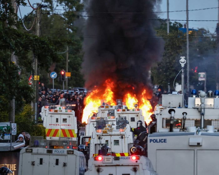
View image in fullscreen
Police evacuate families from their homes in south Belfast amid the riots. Photograph: Alan Lewis/Photopress Belfast
For Farage’s critics, this sounded like a threat rather than a warning; another way for him and his party to stir up division for political gain. Establishment voices echoed the claim that these disturbances were either an ugly symptom of the state’s failure to secure the country’s borders or, in the case of Nowak, proof that equality policies in the UK’s public institutions had gone too far and twisted the priorities of public servants.
“Yes, we’ve got a problem of racism, but it’s more than that. It’s the problem of racists becoming empowered.”
— Prof John Drury
An editorial in the Times, headlined “Burning resentment in Belfast fuelled by inaction on immigration,” argued that a “bemused and drifting government has done nothing to tackle the root cause” of the violence. That original cause, it claimed, was illegal immigration.
Yet, when these arguments are examined, the picture is more complex, and the facts arguably don’t support the populist narratives.
Migration of any kind to Northern Ireland is low. In the 2021 census, almost 97% of people described their ethnicity as white. Just 2,248 asylum seekers, in a total population of 1.93 million people, were receiving government support in Northern Ireland as of 31 March 2024.
Only about 200 people are estimated to have been involved in this week’s unrest.
View image in fullscreen
A burnt out house after the riots in east Belfast. Photograph: Peter Morrison/AP
There was also surprise in some quarters at the claim that the UK has “two-tier” policing.For decades, Britain has struggled with how to address racism in policing. One official report after another has called on police forces across the UK to do much more to tackle the issue. The police response to Nowak is currently under investigation, but this single case has been used by Farage and the even more extreme party, Restore Britain, to turn widespread concerns about the disproportionate targeting of minority ethnic people on their head.
The analysis from Farage and others about what the recent riots say about the UK in 2026 is hotly debated. Professor Tim Newburn, who led a major study on the August 2011 England riots—the largest wave of civil unrest in a generation at the time—said such outbreaks of mass violence are “quite unusual” in the UK. “It actually takes something quite special to trigger them, maybe a mix of the level of stress or anger people feel, combined with a lack of police control,” he said.
It’s hard to predict a riot. Historian Keith Flett noted that in both riots, the police seemed understaffed. The National Police Chiefs’ Council, which represents senior officers, has repeatedly said UK law enforcement is chronically underfunded. Jon Boutcher, the chief constable of the Police Service of Northern Ireland, which is familiar with violent clashes between loyalist and nationalist groups, had to activate a “mutual aid” system this week, asking other UK forces for officers. Twelve of his officers were injured on Wednesday night. The police and crime commissioner for Hampshire Police, which covers Southampton, recently complained it was one of the lowest-funded forces in England and Wales. Eleven officers and a police dog were injured in Southampton when they were overwhelmed.
That doesn’t mean these riots don’t reveal something important about the country’s “zeitgeist,” said Newburn, a professor of criminology and social policy at the London School of Economics. The UK has been through a cost-of-living crisis, with rising shop prices and some of the highest energy costs in Europe. Yet recent riots have mostly been tied to issues of race and migration, rather than traditional left-wing causes. “It tells us a lot about what’s currently dominating our politics,” Newburn said. “Even though many people are hurting in different ways, the main points of conflict right now seem to be around nationhood, race, borders, and so on.”
John Drury, a professor of social psychology at the University of Sussex, co-authored an analysis of the 2024 riots that followed the murder of three girls in Southport, Merseyside, by a perpetrator falsely claimed to be an asylum seeker in the immediate aftermath. “These are collective racist attacks,” Drury said of the scenes in Belfast and Southampton. “White victimhood is a massively powerful grievance that mobilizes people. It’s an empirical question how many participants really believe in this white victimhood. Some use it as an excuse, but others genuinely believe it’s part of their ideology. It’s called modern racism.”
Drury said there has been a normalization of toxic anti-immigrant rhetoric in recent years, accelerated by people online who could initially push their ideas anonymously but now feel empowered, not just by fringe voices but by mainstream media and politicians. “If you look at what happened with Brexit, there was a well-known association with the Brexit vote: that it was a xenophobic referendum,” Drury said. “We saw an immediate spike…”After that, there was a sudden rise in hate attacks based on race and ethnicity. People felt like they weren’t alone—thinking, ‘A lot of people in this country agree with me’—and that’s exactly what these individuals are thinking now. So yes, we have a racism problem, but it goes deeper than that. It’s about racists feeling more empowered.
View image in fullscreen
Tommy Robinson at the Southampton protests. Photograph: Finnbarr Webster/Getty Images
The unrest in Belfast went on for two nights, ending with a peaceful protest on Thursday evening. It didn’t spread to other areas, despite the efforts of troublemakers like far-right activist Tommy Robinson—whose real name is Stephen Yaxley-Lennon. While visiting Moscow, he called for the whole UK to rise up.
His posts on X were shared and boosted by tech billionaire Elon Musk to his 240 million followers, but it didn’t have much impact. “It’s hard to predict a riot,” said Keith Flett, a historian and editor of A History of Riots.
Meanwhile, in Southampton on Friday, Judge Mousley KC continued sentencing those responsible for the violence. He described it as a “hate crime, driven by hatred of the police and, in some cases, racist views.”
“The impact on the community was severe,” the judge added. “Local residents experienced fear, distress, and a real sense of danger.”
Frequently Asked Questions
Here is a list of FAQs about the UK riots and the role of racism written in a natural clear and concise style
BeginnerLevel Questions
1 What exactly is happening in the UK right now
Violent riots and farright protests have broken out in several towns and cities They involve attacks on mosques hotels housing asylum seekers and clashes with police Cars and buildings have been set on fire
2 Why did the riots start
The immediate trigger was a tragic knife attack in Southport that killed three young girls False online rumors spread incorrectly claiming the attacker was a Muslim asylum seeker Farright groups used this lie to mobilize people blaming immigrants and Muslims
3 Is this really about racism
Yes for many of the rioters The targetsmosques asylum seeker hotels and people of colorshow that the violence is driven by Islamophobia and antiimmigrant racism The groups organizing the protests are explicitly racist and nationalist
4 Who is taking part in the riots
The core groups are farright activists and supporters of organizations like the English Defence League However they have also attracted young men looking for violence football hooligans and people influenced by online disinformation
5 What is the government doing about it
The government has condemned the violence promised tough police action and increased the number of officers on the streets They are using counterprotesters to block farright marches and have fasttracked court cases and prison sentences for rioters
AdvancedLevel Questions
6 Why is this happening now What are the deeper causes
Beyond the Southport lie the riots are fueled by years of antiimmigrant rhetoric from politicians and media economic insecurity and widespread distrust in institutions Social media algorithms have amplified hateful content and allowed false narratives to spread instantly
7 How has social media played a role in the riots
It has been central Platforms like X Telegram and TikTok were used to spread the false Southport rumor share realtime locations of antiracism protests and call for violence Algorithmic amplification and lack of moderation allowed hate speech to go viral
8 What is the twotier policing accusation and is it true
Farright figures