News has never been easier to access, but for many, that’s the very issue. Overwhelmed by a constant flood of information and updates, more people worldwide are choosing to tune out.
The reasons differ: some are put off by the sheer amount of news, others by the emotional weight of negative stories or a general distrust of the media. In online communities focused on mindfulness and mental health, people share strategies for stepping back—from setting limits to cutting out news entirely.
Mardette Burr, a retiree in Arizona, stopped watching the news about eight years ago. She says, “Now that I don’t watch the news, I just don’t have that anxiety. I don’t have dread. There were times I’d be up at two or three in the morning, upset about something happening in the world that I had little control over.”
She’s not alone. According to a June survey by the Reuters Institute for the Study of Journalism, news avoidance has reached a record high globally. This year, 40% of respondents across nearly 50 countries said they sometimes or often avoid the news, up from 29% in 2017—the highest figure on record.
The numbers were even higher in the US (42%) and the UK (46%). The main reason people gave for actively avoiding news was its negative impact on their mood. Respondents also said they felt worn out by the volume of news, tired of excessive coverage of war and conflict, and powerless to act on the information they received.
Julian Burrett, a British marketing professional, has intentionally disconnected from the news since the pandemic, after feeling almost addicted to constant negative updates. He’s deleted most news apps from his phone and avoids TV news. Last year, he started a small Reddit community, r/newsavoidance, to discuss the pros and cons, tips, and tools for avoiding news.
Others who spoke to The Guardian described different approaches. One person checks the news just once a week to stay informed without feeling overwhelmed. Another has avoided news for years, citing its effect on his mood and a broader distrust in the press. A man from Maryland said recent political developments left him feeling “enraged,” so he now limits himself to scanning headlines.
Research suggests that frequent exposure to news—especially through TV and social media, and particularly coverage of tragic or distressing events—can harm mental health.@font-face {
font-family: Guardian Headline Full;
src: url(https://assets.guim.co.uk/static/frontend/fonts/guardian-headline/noalts-not-hinted/GHGuardianHeadline-Regular.woff2) format(“woff2”),
url(https://assets.guim.co.uk/static/frontend/fonts/guardian-headline/noalts-not-hinted/GHGuardianHeadline-Regular.woff) format(“woff”),
url(https://assets.guim.co.uk/static/frontend/fonts/guardian-headline/noalts-not-hinted/GHGuardianHeadline-Regular.ttf) format(“truetype”);
font-weight: 400;
font-style: normal;
}
@font-face {
font-family: Guardian Headline Full;
src: url(https://assets.guim.co.uk/static/frontend/fonts/guardian-headline/noalts-not-hinted/GHGuardianHeadline-RegularItalic.woff2) format(“woff2”),
url(https://assets.guim.co.uk/static/frontend/fonts/guardian-headline/noalts-not-hinted/GHGuardianHeadline-RegularItalic.woff) format(“woff”),
url(https://assets.guim.co.uk/static/frontend/fonts/guardian-headline/noalts-not-hinted/GHGuardianHeadline-RegularItalic.ttf) format(“truetype”);
font-weight: 400;
font-style: italic;
}
@font-face {
font-family: Guardian Headline Full;
src: url(https://assets.guim.co.uk/static/frontend/fonts/guardian-headline/noalts-not-hinted/GHGuardianHeadline-Medium.woff2) format(“woff2”),
url(https://assets.guim.co.uk/static/frontend/fonts/guardian-headline/noalts-not-hinted/GHGuardianHeadline-Medium.woff) format(“woff”),
url(https://assets.guim.co.uk/static/frontend/fonts/guardian-headline/noalts-not-hinted/GHGuardianHeadline-Medium.ttf) format(“truetype”);
font-weight: 500;
font-style: normal;
}
@font-face {
font-family: Guardian Headline Full;
src: url(https://assets.guim.co.uk/static/frontend/fonts/guardian-headline/noalts-not-hinted/GHGuardianHeadline-MediumItalic.woff2) format(“woff2”),
url(https://assets.guim.co.uk/static/frontend/fonts/guardian-headline/noalts-not-hinted/GHGuardianHeadline-MediumItalic.woff) format(“woff”),
url(https://assets.guim.co.uk/static/frontend/fonts/guardian-headline/noalts-not-hinted/GHGuardianHeadline-MediumItalic.ttf) format(“truetype”);
font-weight: 500;
font-style: italic;
}
@font-face {
font-family: Guardian Headline Full;
src: url(https://assets.guim.co.uk/static/frontend/fonts/guardian-headline/noalts-not-hinted/GHGuardianHeadline-Semibold.woff2) format(“woff2”),
url(https://assets.guim.co.uk/static/frontend/fonts/guardian-headline/noalts-not-hinted/GHGuardianHeadline-Semibold.woff) format(“woff”),
url(https://assets.guim.co.uk/static/frontend/fonts/guardian-headline/noalts-not-hinted/GHGuardianHeadline-Semibold.ttf) format(“truetype”);
font-weight: 600;
font-style: normal;
}
@font-face {
font-family: Guardian Headline Full;
src: url(https://assets.guim.co.uk/static/frontend/fonts/guardian-headline/noalts-not-hinted/GHGuardianHeadline-SemiboldItalic.woff2) format(“woff2”),
url(https://assets.guim.co.uk/static/frontend/fonts/guardian-headline/noalts-not-hinted/GHGuardianHeadline-SemiboldItalic.woff) format(“woff”),
url(https://assets.guim.co.uk/static/frontend/fonts/guardian-headline/noalts-not-hinted/GHGuardianHeadline-SemiboldItalic.ttf) format(“truetype”);
font-weight: 600;
font-style: italic;
}
@font-face {
font-family: Guardian Headline Full;
src: url(https://assets.guim.co.uk/static/frontend/fonts/guardian-headline/noalts-not-hinted/GHGuardianHeadline-Bold.woff2) format(“woff2”),
url(https://assets.guim.co.uk/static/frontend/fonts/guardian-headline/noalts-not-hinted/GHGuardianHeadline-Bold.woff) format(“woff”),
url(https://assets.guim.co.uk/static/frontend/fonts/guardian-headline/noalts-not-hinted/GHGuardianHeadline-Bold.ttf) format(“truetype”);
font-weight: 700;
font-style: normal;
}
@font-face {
font-family: Guardian Headline Full;
src: url(https://assets.guim.co.uk/static/frontend/fonts/guardian-headline/noalts-not-hinted/GHGuardianHeadline-BoldItalic.woff2) format(“woff2”),
url(https://assets.guim.co.uk/static/frontend/fonts/guardian-headline/noalts-not-hinted/GHGuardianHeadline-BoldItalic.woff) format(“woff”),
url(https://assets.guim.co.uk/static/frontend/fonts/guardian-headline/noalts-not-hinted/GHGuardianHeadline-BoldItalic.ttf) format(“truetype”);
font-weight: 700;
font-style: italic;
}
@font-face {
font-family: Guardian Headline Full;
src: url(https://assets.guim.co.uk/static/frontend/fonts/guardian-headline/noalts-not-hinted/GHGuardianHeadline-Black.woff2) format(“woff2”),
url(https://assets.guim.co.uk/static/frontend/fonts/guardian-headline/noalts-not-hinted/GHGuardianHeadline-Black.woff) format(“woff”),
url(https://assets.guim.co.uk/static/frontend/fonts/guardian-headline/noalts-not-hinted/GHGuardianHeadline-Black.ttf) format(“truetype”);
font-weight: 900;
font-style: normal;
}This text contains CSS code that defines fonts and layout styles for a webpage. It specifies font families, weights, styles, and sources for different typefaces. It also includes media queries to adjust margins, widths, and positioning of elements based on screen size. Additionally, it sets rules for spacing, borders, and colors for various components.This CSS code applies specific styles to various elements on a webpage. It adds 14px top padding to certain paragraphs, styles the first letter of some paragraphs with a large, bold, uppercase font, and adjusts the layout of captions and immersive elements. It also includes responsive design rules that change element widths, margins, and padding based on screen size, ensuring proper display across different devices.The furniture wrapper uses a grid layout with specific column and row definitions. It applies a top border to the first child of headline elements and adjusts the meta section with relative positioning and padding. Standfirst content has a bottom margin, and list items within it use a 20px font size. Links in the standfirst are underlined with a custom color that changes on hover.
For larger screens (min-width: 61.25em), figures are adjusted with negative margins and inline elements have a max width of 630px. At 71.25em and above, the grid layout changes, adding a top border to the meta section and removing borders from standfirst paragraphs. A vertical line is added before the standfirst. At 81.25em, the grid is updated again, and the meta border width increases to 620px.
Labels in the title or article header have top padding, and headline h1 elements have a specified font weight.The headline font size is 32px, with a maximum width of 620px. On larger screens (over 71.25em), the headline adjusts to 50px and a max width of 540px. For medium screens (over 46.25em), right margins are removed from certain elements. On wider screens (over 61.25em), some decorative lines are hidden.
The meta section and social icons use a border color matching the header. Some meta elements are hidden by default. The standfirst (subheading) has left padding and adjusts its top padding on medium screens. Its text is set to 20px with a bottom padding of 14px.
Main media elements are positioned relatively, with adjusted margins on different screen sizes. On small screens, they span the full viewport width. Captions are styled with a background color and positioned at the bottom. A caption toggle button appears in the bottom right.
The interactive content column has specific styling for headings. Dark mode uses custom colors for borders and features. Some navigation-adjacent sections are hidden. The wrapper has a dark background, with padding and margins that adjust based on screen size. On very large screens (over 81.25em), it extends with sidebars matching the background color and a border.This CSS code defines styles for a webpage layout, particularly for a “furniture-wrapper” class. It sets colors, borders, and hover effects for various elements like headlines, meta information, and standfirst text. The styles use CSS variables for colors, ensuring consistency and easy theming. Media queries adjust the layout for different screen sizes, such as adding or removing borders on larger screens. The design emphasizes a dark background with contrasting text and accent colors for links and interactive elements.This CSS code styles elements for a webpage layout. It sets list items in the standfirst section to a light gray color. For wider screens, it adds decorative borders and background colors to the sides of the content wrapper, adjusting their width based on the viewport size. It also styles SVG strokes and social/meta elements with a border color from a variable. Headings (h2) are set to a light font weight by default, but switch to bold if they contain a strong tag. Finally, it defines custom font faces for the “Guardian Headline Full” font family, including light, light italic, and regular weights with their respective file sources.The Guardian uses a custom font called “Guardian Headline Full” in various styles and weights, including regular, medium, semibold, bold, and black, each available in both normal and italic versions. These fonts are provided in multiple formats (WOFF2, WOFF, and TTF) to ensure compatibility across different browsers and devices.This CSS code defines two custom fonts: “Guardian Headline” in a bold italic style and “Guardian Titlepiece” in a bold regular style. It also sets up color variables for dark mode on iOS and Android devices, adjusting the main accent color when dark mode is enabled. Additionally, it includes styling rules for article containers on iOS and Android, such as removing header height, adjusting padding, and setting the color for the first letter of specific paragraphs.For Android devices, the content labels in the comment article container use a bold, capitalized font in the Guardian or Georgia typeface, with a color defined by the new-pillar variable.
On both iOS and Android, headlines in feature, standard, and comment article containers are set to 32px, bold, with 12px bottom padding and a dark gray color.
Images in these containers are positioned relatively, with a left margin of -10px and a top margin of 14px. Their width adjusts to the viewport minus the scrollbar, and height is set to auto.
The inner elements of these images, including links and images themselves, have a transparent background, matching the adjusted width and auto height.
Standfirst sections have top and bottom padding of 4px and 24px respectively, with a right margin of -10px.
Paragraphs within the standfirst use the Guardian or Georgia font family.For iOS and Android devices, links within the standfirst section of feature, standard, and comment articles are styled with a specific color, underlined with an offset, and have no background image or bottom border. On hover, the underline color changes to match the text color.
Additionally, the meta section in these article types has no margin, and elements like bylines, authors, and related links are consistently styled without extra spacing.For comment articles on iOS and Android, the byline and author names use the new pillar color. The meta misc section has no padding, and its SVG icons use the same color for strokes. The caption button in showcase elements is centered with specific dimensions and positioning. Article body padding is set to 0 on the sides. Non-thumbnail, non-immersive images span the viewport width minus margins and have no caption padding. Immersive image elements are also styled consistently.On iOS and Android devices, immersive images in article bodies are set to the full viewport width, minus the scrollbar width.
For quoted text in articles, the color before the quote uses the new pillar color.
Links in the article text are styled with the primary pillar color, underlined with an offset, and the underline color matches the header border. On hover, the underline changes to the new pillar color.
In dark mode, the furniture wrapper background becomes dark gray. Labels within it use the new pillar color. Headlines lose their background and adopt the header border color. Standfirst paragraphs and links also use the header border color.For iOS and Android devices, the following styling applies across feature, standard, and comment article containers:
– Author byline links and standfirst links use the new pillar color.
– SVG icons in the meta section use the new pillar color for strokes.
– Showcase image captions use the dateline color.
– Blockquotes with the “quoted” class use the new pillar color.
– Various body content containers (such as article-body, feature-body, comment-body, and interactive content divs) are styled consistently.On Android devices, the comment section and related article content areas use a dark background color.
On iOS devices, the first letter of paragraphs following certain elements (like atoms, sign-in gates, or specific containers) is styled differently across various article types (feature, standard, comment).This CSS code targets the first letter of paragraphs that follow specific elements, such as `.element-atom`, `.sign-in-gate`, or `#sign-in-gate`, across various article containers and body types on iOS and Android devices.For Android devices, the first letter of the first paragraph after certain elements in comment articles will be set to the new pillar color, defaulting to white.
On both iOS and Android, in comment articles, the standfirst element within the furniture wrapper has a top padding of 24px and no top margin.
Headings at level 2 (h2) in prose are set to a font size of 24px.
Caption buttons in article containers on iOS have padding of 6px on top, 5px on the sides, and 0 on the bottom. On Android, the padding is 4px on top and sides, and 0 on the bottom.
In dark mode, unless light mode is forced, the following colors are defined:
– Follow text and standfirst text: #dcdcdc
– Follow icon fill, standfirst link text, standfirst link border, and byline: use the dark mode pillar color
A dark background color variable is set to #1a1a1a.
Article headers in feature, standard, and comment articles on iOS and Android are hidden (opacity 0).
Furniture wrappers in these articles have no margin.
Content labels within furniture wrappers use the new pillar color, defaulting to the dark mode feature color.
Headline elements (h1) in furniture wrappers are set to color #dcdcdc.
Links within article headers or title elements in furniture wrappers on both iOS and Android… (incomplete)This CSS code defines styles for article titles, metadata, and bylines on both iOS and Android platforms. It sets the color of article title links to a specific variable, applies a repeating linear gradient as a background for metadata sections, and styles the byline text in a light gray color. Links within the metadata are also colored using the same variable as the titles. Additionally, it targets SVG elements within the metadata for consistent styling.This CSS code applies specific styling to elements on iOS and Android devices. It sets the stroke color for SVG elements in the meta section of comment articles to a variable color, defaulting to a dark mode feature color.
For alert labels across feature, standard, and comment articles, it forces the text color to a light gray (#dcdcdc).
Icons within the meta section are styled to use the same variable color for both the icon itself and its :before pseudo-element.
On larger screens (min-width: 71.25em), additional styling is applied to meta containers, including a class for keyline borders. The code appears to be incomplete, as the final selector is cut off.For iOS and Android devices, the following styles apply:
– On standard and comment article pages, the meta section displays a top border using the specified color variable.
– The meta misc elements have their default margin removed and a left margin of 20px.
– Paragraphs and unordered lists in the article body have a maximum width of 620px.
– Blockquotes with the “quoted” class use the secondary pillar color for their decorative element.
– Links in the article body are styled with the primary pillar color, an underline, and a specific offset and color for the underline. On hover, the underline color changes to the secondary pillar color.
– In dark mode, the color for the blockquote decorative element switches to the dark mode pillar color.
Note: The text appears to be incomplete, as it cuts off mid-sentence.For decades, Roxane Cohen Silver has studied the effects of consuming media about crises, including 9/11, the Covid-19 pandemic, climate disasters, and mass shootings. “Greater exposure leads to higher levels of distress in people’s mental health reports—more anxiety, depression, and symptoms of post-traumatic and acute stress,” said Silver, a professor of psychology, medicine, and public health at the University of California, Irvine.
In recent years, her research has identified political polarization as a major source of stress for Americans. Similarly, political issues ranked highest in last year’s American Psychological Association Stress in America poll, with the economy and the spread of misinformation also featuring prominently.
Silver noted that the rise of smartphones and social media has dramatically increased opportunities for exposure to distressing content. “There’s ample opportunity to be exposed to news constantly, whether through push notifications on phones or by consuming news across multiple platforms at once,” she said.
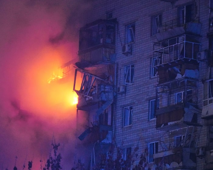
Viewing graphic imagery, in particular, is linked to psychological distress—a growing concern in an era when disturbing images of tragedies circulate widely, often beyond the control of news organizations.
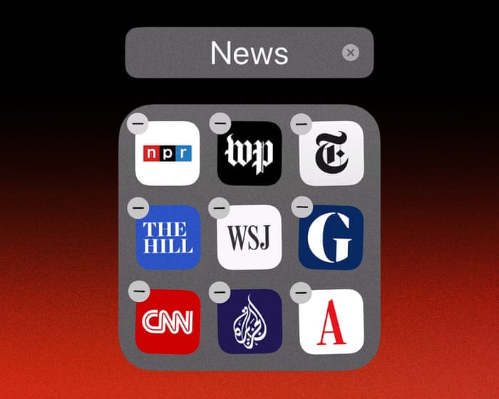
A growing body of online advice encourages healthier ways to consume news. Much of it focuses on setting boundaries so people can seek out information intentionally when they’re ready, rather than being bombarded by a constant stream. Suggestions include subscribing to newsletters or summaries from trusted sources, turning off news alerts, and limiting social media use.
“People can stay informed without doomscrolling,” Silver said. Applying insights from her research to her own life, she reads news online but avoids videos, television, and social media. “I don’t see any psychological or physical benefit from consuming those kinds of images,” she explained. “So if I’m reading a story and there’s a video, I don’t click on it.”
She recommends setting specific times for reading the news rather than staying immersed in it constantly, emphasizing that a sense of control over exposure can be helpful.
Benjamin Toff, director of the Minnesota Journalism Center at the…In his book “Avoiding the News,” a University of Minnesota researcher examines the trend of news avoidance. He highlights an important difference between people who consistently avoid the news and those who simply limit their intake—the latter, he notes, is “perfectly healthy.”
“We live in a world where news is available around the clock, and it’s easy to be overwhelmed by constant information. But that doesn’t mean you have to be,” he said.
What concerns him and his co-authors is when stepping back from the news becomes a pattern that widens social gaps, making some groups less involved in political life.
“The more you disconnect from the news, the harder it is to understand what’s happening with any given issue,” he explained.
The authors found that consistent news avoidance is more common among young people, women, and those from lower socioeconomic backgrounds.
“If you share our belief that everyone should have equal opportunities to engage politically—to vote, to speak up about important issues—then we see news disengagement as a problem,” Toff said.
Frequently Asked Questions
Of course Here is a list of FAQs about why people are turning away from the news designed to sound natural and provide clear direct answers
General Beginner Questions
1 Why are so many people avoiding the news these days
People are avoiding the news because it often feels overwhelming negative and emotionally draining leading to stress and anxiety
2 Isnt it important to stay informed
Yes staying informed is important but constant exposure to a 247 news cycle especially negative or alarmist reporting can be harmful to mental wellbeing People are seeking a healthier balance
3 What is news avoidance or doomscrolling
News avoidance is consciously choosing to limit or stop consuming news
Doomscrolling is the opposite the habit of endlessly scrolling through bad news online often worsening anxiety
4 Is this just about being lazy or uninformed
No For many its a deliberate act of selfcare They are choosing to protect their mental health rather than disengaging out of laziness
Deeper Reasons Problems
5 What specific things about the news push people away
Common reasons include
Negativity Bias News focuses heavily on crises conflict and tragedy
Polarization Feeling like news outlets are pushing an agenda rather than reporting facts
Feeling of Powerlessness Constant bad news can make people feel theres nothing they can do to help
Information Overload Its simply too much to keep up with all the time
6 Doesnt avoiding the news make you ignorant about important issues
It can which is why many news avoiders dont cut it out completely They often switch to getting news in a more controlled way like from curated summaries or less frequently to stay informed without the burnout
7 Are certain groups of people more likely to avoid the news
Research shows that younger people and women are more likely to actively avoid the news often citing the toll it takes on their mood and mental health
Personal Impact Benefits
8 What are the benefits of taking a break from the news
People report
Reduced anxiety and stress levels
Improved mood and a more positive outlook