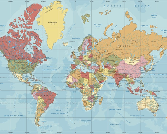
Африканският съюз призовава най-широко използваната световна карта да бъде заменена с такава, която отразява по-точно истинския размер на континента. На пръв поглед това може да изглежда като проблем на експертите по география, а не на политическите лидери. Но в политиката символите имат тежест. От векове проекцията на Меркатор, създадена през 16-ти век, за да подпомага европейските мореплаватели в навигацията, завладяванията и търговията, незабелязано влияе върху това как възприемаме света.
Чрез разтягане на височините и компресиране на областите близо до екватора проекцията на Меркатор изкривява относителните размери на континентите. Европа и Северна Америка изглеждат непропорционално големи, докато Африка и Южна Америка са смалени. Гренландия често изглежда почти с един и същ размер като Африка, въпреки че в действителност Африка е 14 пъти по-голяма. Общото впечатление е, че глобалният север е централен и доминиращ, докато югът е периферен и маргинален.
Подобни картографски неточности може да бъдат опростени, ако се ограничават до морски карти. Но от поколения тази карта се представя както пред политическите决策ци, така и пред учениците, като незабелязано затвърждава светоглед, който издига могъщите и смалява другите. Ученият Марк Монмоние твърди в книгата си „Румб линии и картографски войни“, че империите са били движени повече от политика и икономика, отколкото от училищните атласи – мнение, което е повторено от критици, смятащи, че проекцията на Меркатор е надценена като инструмент на западния империализъм. Вярно е, че колониализмът не е имал нужда от карти, за да се оправдае, но картите са помогнали за нормализирането на неговата перспектива.
Има по-добри алтернативи на проекцията на Меркатор. Проекцията Equal Earth, въведена през 2018 г., предлага по-точна представа за площ, като същевременно поддържа визуално интуитивно оформление. По-ранни опити, като проекциите на Гуд или Питърс, също са се стремили да коригират дисбаланса. Нито една плоска карта не може перфектно да представи сферичен свят – някакъв компромис е неизбежен. Но целта не е перфектността, а честността. А честността означава да се признае изкривяването, където то е най-важно.
Този дебат съществува отдавна, но получи по-широко внимание чрез телевизионната драма на Аарон Соркин „Западното крило“. В незабравима сцена от 2001 г. група картографи обясняват на прес-секретар на Белия дом как картата на Меркатор е подвела хората да мислят, че Гренландия е толкова голяма колкото Африка. Моментът е изигран за смях, но има сериозно послание: започването с грешна карта може да доведе до грешни заключения. Тази идея намира отзвук и извън картографията. Ефективното лидерство, независимо дали в бизнеса или политиката, зависи от точно разбиране на реалността. Визията без истина е просто фантазия. Великите лидери успяват не само като си представят бъдещето, но и като настояват за яснота относно настоящето – а яснотата започва с факти, а не с изкривяванията на остарели предразсъдъци.
Проекцията на Меркатор несъмнено е родена от европейските приоритети по времето на империите. Продължаването да се използва като карта по подразбиране увековечава тези приоритети. Приемането на проекция като Equal Earth е не само по-географски точно, но и символично значимо. Тя потвърждава, че Африка не трябва да бъде смалявана на хартия, когато в действителност е огромна както по размер, така и по потенциал. Критиците може да отхвърлят промяната на картите като просто символична, но символите оформят възприятията, а възприятията движат решенията. Ако Африка е нарисувана малка, може и да се отнасят с нея като с малка; нарисувана в мащаб, нейният мащаб и обещание стават невъзможно да бъдат пренебрегвани. Позицията на Африканския съюз изглежда по-скоро правилна, отколкото грешна. Това не е педантизъм – това е лидерство.
Често задавани въпроси
Често задавани въпроси относно гледната точка на The Guardian за Африка и точните карти
1 Какво има предвид The Guardian под това, че мащабът и потенциалът на Африка изискват внимание
The Guardian подчертава, че Африка често е неправилно представяна на карти и че разпознаването на истинския й размер помага да се осветят огромните й ресурси, нарастващото население и икономическите възможности.
2 Защо точните карти на Африка са важни
Точните карти коригират погрешните схващания за размера и разнообразието на Африка, помагайки на хората да разберат по-добре нейния реален мащаб, геополитическо значение и потенциал за глобално сътрудничество и инвестиции.
3 Какво не е наред с начина, по който Африка обикновено се показва на световните карти
Много карти използват проекции, които изкривяват размера на сухоземни маси близо до полюсите, правейки Африка да изглежда много по-малка в сравнение с региони като Европа или Северна Америка, отколкото е в действителност.
4 Можете ли да дадете пример за това как размерът на Африка е неправилно представян
На типична карта на Меркатор Гренландия изглежда приблизително с един и същ размер като Африка, но в действителност Африка е около 14 пъти по-голяма от Гренландия.
5 Как точното представяне на Африка влияе на възприятията на хората
То противодейства на остарели стереотипи, насърчава уважение към разнообразието и значимостта на континента и подтиква към по-информирани дискусии за търговия, развитие и култура.
6 Какви са някои ползи от използването на карти, които показват истинския мащаб на Африка
Те насърчават справедливост в глобалното представителство, поддържат образователна точност и помагат на политическите决策ци, инвеститорите и обществеността да вземат по-добри решения, базирани на реалност, а не на изкривяване.
7 Има ли широко използвани картографски проекции, които показват Африка точно
Да, проекции като тази на Питърс или проекцията Equal Earth се стремят да представят площите на земите по-пропорционално, въпреки че нито една плоска карта не може да бъде перфектна поради изкривяването на земната кривина.
8 Как мога да намеря или използвам карти, които изобразяват Африка точно
Потърсете карти, обозначени като „равноплощни“ или „авталични“, използвайте цифрови инструменти като уебсайта The True Size, за да сравнявате държави, или се обърнете към ресурси от географски организации, които приоритизират точността.
9 Дали The Guardian създава собствени точни карти на Африка
The Guardian често публикува статии и визуализации, които използват точни представяния, но обикновено разчита на данни от картографи и експерти, вместо да създава собствени карти.