Three cartographers have expressed surprise that the UN has adopted their map almost universally. The map was designed to show the true sizes of Africa and Europe more accurately, though a few unhappy diplomats have complained. The creators of the Equal Earth projection wanted to offer an alternative to the widely used Mercator map from the 16th century. Critics have long argued that the Mercator map makes northern hemisphere countries look bigger than they really are, subtly reinforcing ideas about where global power lies. “It has been a very busy week for me,” said Tom Patterson, a well-known US national parks cartographer who had to come out of retirement virtually after being flooded with questions from governments about the details of the new projection.:root{–highlight-color: #cda500;–highlighted-text-color: #121212;–info-color: #0077b6;–news-grey-01: #dcdcdc;–news-grey-02: #c8c8c8;–news-grey-03: #a1a1a1;–news-grey-04: #707070;–news-grey-05: #494949;–news-grey-06: #383838;–news-core-01: #0077b6;–news-core-02: #00b2ff;–news-core-03: #e33824;–news-core-04: #23b4a9;–news-core-05: #494949;–news-core-06: #cca36e}}div#maincontent:focus{box-shadow:none!important}@use “interactive-style-library/source/mq.scss” as ;@use “interactive-style-library/source/typography.scss” as ;@use “interactive-style-library/visuals/charts.scss” as *;svelte-scroller-outer.svelte-11yjorf{display:block;position:relative}svelte-scroller-background.svelte-11yjorf{display:block;position:relative;width:100%}svelte-scroller-foreground.svelte-11yjorf{display:block;position:relative;z-index:2}svelte-scroller-foreground.svelte-11yjorf:after{content:” “;display:block;clear:both}svelte-scroller-background-container.svelte-11yjorf{display:block;position:absolute;width:100%;max-width:100%;pointer-events:none;will-change:transform}.graticule.svelte-16lw687{fill:none;stroke:#111;stroke-width:.45;opacity:1}.indicatrix.svelte-1r0p5rl{fill:var(–news-core-03);fill-opacity:.2;stroke:var(–news-core-03);stroke-width:1}.globe-root.svelte-clpgpl{position:absolute;inset:0;pointer-events:none;z-index:1}canvas.svelte-clpgpl{display:block;width:100%;height:100%;pointer-events:none}canvas.rotatable.svelte-clpgpl{pointer-events:auto;cursor:grab;touch-action:none}canvas.rotatable.svelte-clpgpl:active{cursor:grabbing}.morph-root.svelte-lr1ni4{position:absolute;inset:0;pointer-events:none;z-index:2}svg.svelte-lr1ni4{display:block;width:100%;height:100%}.world-shape.svelte-lr1ni4{fill:#8aa9a8;stroke:#8aa9a8;stroke-width:.75}.morph-sphere.svelte-lr1ni4{fill:var(–ocean-color);stroke:#202020;stroke-width:1.5}.map-root.svelte-1uhl0qp{position:relative;width:100%;height:100%;min-height:0;flex:1 1 auto;align-self:stretch}svg.svelte-1uhl0qp{display:block;width:100%;height:100%;overflow:visible}.country.svelte-1uhl0qp,.antarctica-overlay.svelte-1uhl0qp{fill:var(–land-color)}.antarctica.svelte-1uhl0qp{visibility:hidden}.sphere-ocean.svelte-1uhl0qp{fill:var(–ocean-color)!important;stroke:none}.sphere-ocean-group.svelte-1uhl0qp,.sphere-stroke-group.svelte-1uhl0qp{display:var(–sphere-display)}.graticule-group.svelte-1uhl0qp{display:var(–graticule-display)}.indicatrices-group.svelte-1uhl0qp{display:var(–indicatrices-display)}.antarctica-group.svelte-1uhl0qp{display:var(–antarctica-display)}.sphere-stroke.svelte-1uhl0qp{fill:none!important;stroke:#202020;stroke-width:1.5}.transition-indicatrices.svelte-1uhl0qp{fill:var(–news-core-03);fill-opacity:.2;stroke:var(–news-core-03);stroke-width:1}.atom.svelte-17odzvm{background:var(–primary-bg-color);–ocean-color: #f2fcff;–land-color: #8aa9a8}.map-stage.svelte-17odzvm{width:calc(100% – 20px);height:100vh;margin:0 auto;overflow:visible}.atom.svelte-17odzvm .scrolly{position:relative}.steps.svelte-17odzvm{position:relative;z-index:1;width:min(100% – 32px,1100px);margin:0 auto;padding-bottom:100vh}section.svelte-17odzvm{width:min(100%,320px);height:100vh;margin-left:auto;display:flex;align-items:center;color:var(–secondary-text-color)}section.svelte-17odzvm div:where(.svelte-17odzvm){width:100%;height:-webkit-fit-content;height:-moz-fit-content;height:fit-content;padding:24px;background:var(–tertiary-bg-color);border-left:4px solid transparent;box-shadow:0 3px 12px #2020201f;box-sizing:border-box;transition:border-color .18s ease}section.active.svelte-17odzvm{color:var(–primary-text-color)}section.active.svelte-17odzvm div:where(.svelte-17odzvm){border-color:var(–news-core-03)}section.svelte-17odzvm p:where(.svelte-17odzvm){font-family:GuardianTextEgyptian,Guardian Text Egyptian Web,Georgia,serif;font-size:1.0625rem;line-height:1.4;font-weight:400;font-style:normal;–source-text-decoration-thickness: 2px;margin:0}section.svelte-17odzvm b,section.svelte-17odzvm strong{font-weight:700}@media (max-width: 46.24em){.map-stage.svelte-17odzvm{min-height:420px}section.svelte-17The UN General Assembly voted this month to adopt the new map, which more accurately represents the sizes of all continents, particularly Africa. It is hoped the projection will gradually replace Mercator on school walls and government websites. Put forward by Togo, the proposal was hugely successful, with 164 countries voting in favour. The only “no” vote came from the US, whose UN representative, Yaryna Ferencevych, said resolutions such as the “correct the map” effort were “barnacles on our work here”. The US is one of the countries that appears smaller on the new projection. It also makes Greenland – a territorial prize Donald Trump has openly coveted as a “big beautiful piece of ice” – seem significantly less dominant.
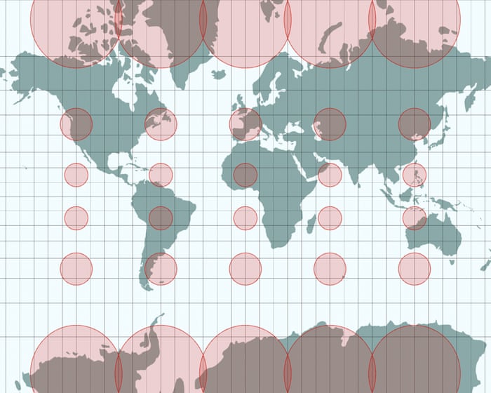
Map showing how Greenland and Europe seem bigger in size than Africa in the Mercator projection, while looking smaller in comparison in the Equal Earth projection.
Six other nations abstained from the vote, and Patterson said he had been contacted by diplomats from government embassies in Washington DC looking for clarification.
Japan asked for a revision because it said the map made the disputed Kuril Islands appear to belong to Russia by putting them in the same shade of yellow. Ukraine also abstained, as Russian-occupied Crimea was a different colour to the rest of the country. Ukraine’s representatives at the UN said this opened a “Pandora’s box” and violated international law.
The cartographers see these objections as stemming from something of a misunderstanding. The map voted on at the UN is simply a mathematical projection of the land and sea, without human-made borders or shading. The confusion arose due to a website run by Patterson that offers free Equal Earth projections. He had annotated these with geopolitical lines and the names of countries, and has been rushing this week to update them, including switching colours and changing spellings, such as Turkey to Türkiye.
“I view the Equal Earth maps as living documents and am grateful for the many helpful suggestions that I have received,” he said.
Patterson developed the new projection in 2018 with a California-based software engineer, Bojan Šavrič, the “maths wizard” of the trio, and Bernhard Jenny, an associate professor at Monash University in Melbourne, Australia.
Jenny said people generally believed maps were accurate representations of the Earth, but that logic breaks down because we live on a curved surface. This creates a problem, as a sphere cannot easily be transformed into a flat rectangle.
“It’s like the orange peel analogy,” said Jenny. “You have to tear it and stretch it, and it’s not possible to flatten it out … so you have to make compromises.”
One global map, called the Goode homolosine projection, looks strikingly like a ripped-up orange peel. Its main problems are that it is not very pleasing to the human eye and not very easy to use for navigation – something the flawed Mercator excels at, because north is always up.
View image in fullscreen. The Goode homolosine projection. Photograph: Tobias Jung.
For Jenny, cartography is about aesthetics as well as science. “We cartographers say cartography is the art and science of making maps. So it’s kind of the combination of the two.”
Equal Earth is not the first attempt to address Mercator’s shortcomings. Several other projections were developed in the past century, including the Gall-Peters model, which shows the true relative sizes of land masses, but which often appears oddly elongated, almost like the continents are drooping. Jenny said: “There was a lot of backlash from cartographers who said: ‘Well, it looks like clothes are hung up to dry.'”
There are always compromises when making maps. Spend any amount of time with a cartographer and what might seem like fundamental truths quickly break down. “Which way is up?” or “Where is the centre” are not simple questions for cartographers.Ancient Islamic maps were oriented with south at the top, placing the holy city of Mecca in the viewer’s line of sight. For a long time, world maps have been presented from a London-centric perspective, with Greenwich at the center.
A copy of a south-up map originally made by the Arab geographer Muhammad al-Idrisi. Photograph: UniversalImagesGroup/Getty Images
“You have to make compromises,” said Jenny. The Equal Earth map, for example, wouldn’t be useful for navigation, since countries on the edges get squeezed. In fact, if any country had a right to be upset, it would be New Zealand, which is stretched, distorted, and pushed to the edge of the map.
“A map is never neutral,” said Jenny. “So you cannot please everyone.”
Šavrič, who worked on the mathematical formula, said he never imagined eight years ago that the trio’s research would be discussed at the highest levels.
“What pleases me more is that this creates a valuable opportunity to strengthen map literacy and raise awareness that there is no single map projection capable of providing a completely ‘true’ representation of the world,” he said. “Every map projection involves trade-offs. I particularly appreciate that the [UN] resolution does not completely ban the Mercator projection or mandate a single replacement for all maps.”
The Chinese mapmaker Hao Xiaoguang’s vertical world map, which he created in 2021. Photograph: TPG/Getty Images
Jenny was also thrilled, watching on from Australia. “It’s kind of a cartographer’s dream, right?” he said. “The fact that the UN is debating map projections for an entire hour is already totally thrilling for cartographers, and then it was our map projection. I mean, what else can you ask for?”
He does, however, have a hunch that another factor helped the Equal Earth map: the power of a good name. “I think, definitely, that you know what it is immediately,” said Jenny. If they had called it the “Šavrič-Patterson-Jenny projection,” he joked, maybe it wouldn’t have done so well.
Header image is A Correct Sea Chart of the Whole World, According to Wright’s Commonly Called Mercator’s Projection, made in 1728. Courtesy of the David Rumsey Map Collection
Frequently Asked Questions
Here is a list of FAQs based on the topic of decolonizing cartography and the cartographers challenging Western bias in maps
Beginner Questions
What does A map is never neutral actually mean
It means that every map is created by someone with a specific goal perspective or set of beliefs The choices they makelike what to include what to leave out and how to name placesreflect their bias There is no such thing as a completely objective or neutral map
Why are maps so important
Maps are a powerful way of showing what is real and what matters They shape how we see the world define borders and understand history Because they are often treated as factual the biases within them can become accepted as truth
What is Western bias in cartography
It is the tendency for maps to be created from a European or North American point of view This often means placing Europe at the center of the world using Western names for places and prioritizing Western ideas of borders and property over Indigenous or local ways of understanding land
Who are the cartographers mentioned in the title
They are a diverse group of mapmakers artists and geographers who are creating maps that challenge the traditional Western perspective They include Indigenous cartographers critical geographers and artists who use maps to tell stories that have been ignored or erased
What is a simple example of a biased map
The most common example is the Mercator projection It is a map of the world that makes countries near the poles like Greenland and Russia look much larger than they actually are while making countries near the equator like those in Africa look much smaller This visually diminishes the importance of the Global South
Intermediate Questions
What are some common problems with traditional Western maps
Common problems include
The North is Up convention This is a cultural choice not a geographical fact It can imply that the Northern Hemisphere is superior
Erasing Indigenous presence Many maps show empty land that was and is actively managed and inhabited by Indigenous peoples
Colonial naming Using names given by colonizers instead of the original Indigenous names for mountains rivers and regions
Borders over relationships Prioritizing political borders that divide people rather than showing cultural linguistic or ecological connections